---
# Content: CC BY-NC-SA 4.0 | Code: MIT - see /LICENSE.md
title: "Computer vision fundamentals"
---
{{< include /_common-imports.qmd >}}
## Images are just arrays {#sec-cv-intro}
You've worked with image data before, even if you didn't think of it as computer vision. Screenshot comparison in visual regression testing, thumbnail generation for CDN pipelines, colour palette extraction for UI theming. These all reduce to reading a grid of numbers and deriving a decision from it. An image is a two-dimensional array of pixel intensities. A greyscale image is a single matrix; a colour image stacks three, one each for red, green, and blue. No special data type, no exotic format: just numbers arranged in a grid.
This is fundamentally different from text, where the raw input (a string of characters) carries no inherent numerical structure and must be converted to numbers before any algorithm can process it (@sec-nlp-representation). Images *arrive* as numbers. The challenge isn't converting them; it's deciding which numbers matter. A 256×256 greyscale image has 65,536 pixel values. A 1080p colour image has over six million. Most of those values are redundant (neighbouring pixels are correlated) or irrelevant (the background tells you nothing about the subject). The representation problem in computer vision is about compressing that raw grid into a feature vector that preserves the information a classifier needs and discards everything else.
This chapter works through that problem using handwritten digit images, small enough to visualise every step, rich enough to demonstrate real trade-offs. We'll compare three representation strategies: using raw pixels directly, compressing them with PCA (@sec-pca), and engineering spatial features by hand. The classifier stays the same throughout (logistic regression, @sec-from-numbers-to-decisions) so any difference in performance comes entirely from the representation. The lesson, as in the natural language processing chapter (@sec-nlp-representation), is that how you encode the input matters more than which algorithm processes it.
We'll stay within the classical machine learning toolkit. Modern computer vision is dominated by deep learning, specifically convolutional neural networks that learn feature representations directly from raw pixels. That's beyond this book's scope. But the statistical foundations are identical, and understanding why hand-crafted representations work (and where they fail) is the clearest path to understanding what deep learning automates.
::: {.callout-note}
## Engineering Bridge
If you've built a visual regression testing system, the kind that takes screenshots before and after a deploy and flags pixel-level differences, you've already implemented a primitive image classifier. The "features" are the pixel differences, and the "decision boundary" is a threshold on how many pixels changed. The system works because the task is narrow: same page versus different page. But if you tried to use pixel-differencing to classify *what* changed (a layout shift versus a colour change versus new content), it would fail — raw pixel differences don't encode the semantic structure you'd need. That progression from pixel comparison to semantic understanding is the progression this chapter traces.
:::
## The data: handwritten digits {#sec-cv-data}
Scikit-learn includes a dataset of 1,797 handwritten digit images, each 8×8 pixels with integer intensities from 0 (white) to 16 (black). Ten classes (digits 0 through 9), roughly 180 images each. The images are small (far smaller than anything you'd encounter in production) but the classification problem is genuine: different people write the same digit in different ways, and some digit pairs (3 and 8, 4 and 9) are visually similar enough to confuse both humans and classifiers.
```{python}
#| label: cv-data-overview
#| echo: true
from sklearn.datasets import load_digits

digits = load_digits()
print(f"Images: {digits.images.shape[0]:,}")
print(f"Image size: {digits.images.shape[1]}×{digits.images.shape[2]} pixels")
print(f"Pixel range: [{digits.data.min():.0f}, {digits.data.max():.0f}]")
print(f"Classes: {len(np.unique(digits.target))} (digits 0–9)")
print(f"\nSamples per class:")
for digit, count in zip(*np.unique(digits.target, return_counts=True)):
    print(f"  Digit {digit}: {count}")
```
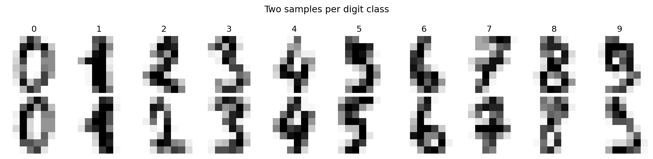
Each image is a matrix of numbers. Visualising a grid of samples shows the intra-class variation, the diversity of handwriting styles within a single digit, that the classifier must handle.
```{python}
#| label: fig-cv-sample-digits
#| echo: true
#| fig-cap: "Sample images from the digits dataset. Each 8×8 image is a matrix of pixel intensities from 0 (white) to 16 (black). The variation within each class — different stroke widths, tilts, and proportions — is what makes classification non-trivial."
#| fig-alt: "Grid of twenty handwritten digit images in two rows. Top row: one sample each of digits 0 through 9, labelled above each column. Bottom row: a second sample per digit. The two samples of each digit differ visibly in stroke thickness, tilt, and completeness — for example, the two fours have different proportions and the two eights differ in loop closure."
fig, axes = plt.subplots(2, 10, figsize=(12, 3))
for row in range(2):
    for col in range(10):
        idx = np.where(digits.target == col)[0][row]
        axes[row, col].imshow(digits.images[idx], cmap='Greys',
                               interpolation='nearest')
        axes[row, col].axis('off')
        if row == 0:
            axes[row, col].set_title(str(col), fontsize=11)

plt.suptitle('Two samples per digit class', fontsize=12)
plt.tight_layout()
fig.patch.set_alpha(0)
plt.show()
```
## Raw pixels as features {#sec-cv-raw-pixels}
The simplest representation is the most direct: flatten each 8×8 image into a 64-element vector and use each pixel position as a feature. This preserves all the information, and because each position is fixed, a linear classifier can learn position-specific weights: "ink at position (3, 4) suggests a 4." What it cannot do is generalise across positions: a digit shifted one pixel to the right becomes a completely different point in 64-dimensional space, and the classifier has no built-in mechanism to treat nearby positions as similar. (Contrast this with bag of words (@sec-nlp-representation), which *discards* positional information entirely; raw pixels sit at the opposite extreme, encoding position rigidly.)
```{python}
#| label: fig-cv-pixel-matrix
#| echo: true
#| fig-cap: "An image of the digit 4 shown as both a visual and a numerical matrix. Each cell's value is its pixel intensity. The stroke pattern that reads as '4' is encoded entirely in these 64 numbers."
#| fig-alt: "Two panels. The first panel shows an 8-by-8 greyscale image of a handwritten digit 4. The second panel shows the same image as a grid of numbers, where each cell displays the integer pixel intensity from 0 to 16. Darker cells in the image correspond to higher numbers. The diagonal stroke and vertical bar of the 4 appear as clusters of high-intensity values."
fig, (ax1, ax2) = plt.subplots(1, 2, figsize=(8, 4))

sample_idx = np.where(digits.target == 4)[0][0]
sample_img = digits.images[sample_idx]

ax1.imshow(sample_img, cmap='Greys', interpolation='nearest')
ax1.set_title('Visual', fontsize=11)
ax1.axis('off')

ax2.imshow(sample_img, cmap='Greys', interpolation='nearest', alpha=0.3)
for i in range(8):
    for j in range(8):
        colour = 'white' if sample_img[i, j] > 8 else 'black'
        ax2.text(j, i, f'{sample_img[i, j]:.0f}', ha='center', va='center',
                fontsize=8, fontweight='bold', color=colour)
ax2.set_title('Numerical', fontsize=11)
ax2.axis('off')

plt.suptitle('Image of digit 4 = matrix of numbers', fontsize=12)
plt.tight_layout()
fig.patch.set_alpha(0)
ax1.patch.set_alpha(0)
ax2.patch.set_alpha(0)
plt.show()
```
The flattened pixel vector for this image is a point in 64-dimensional space. Different digits occupy different regions of that space, but the regions overlap, and a sloppy "4" can look more like a "9" to a classifier, just as it might to a human. We split the data into training and test sets, using `stratify=digits.target` to ensure each digit class is represented proportionally in both splits, following the same principle as a stratified test suite that ensures every module gets coverage.
```{python}
#| label: cv-raw-pixel-baseline
#| echo: true
from sklearn.model_selection import train_test_split
from sklearn.linear_model import LogisticRegression
from sklearn.metrics import classification_report

# Split pixels, labels, and 2D images together so indices stay aligned
X_train, X_test, y_train, y_test, img_train, img_test = train_test_split(
    digits.data, digits.target, digits.images,
    test_size=0.3, random_state=42, stratify=digits.target
)

lr_raw = LogisticRegression(max_iter=5000, random_state=42)
lr_raw.fit(X_train, y_train)

y_pred_raw = lr_raw.predict(X_test)
accuracy_raw = (y_pred_raw == y_test).mean()

print(f"Logistic regression on raw pixels (64 features)")
print(f"Test accuracy: {accuracy_raw:.3f}\n")
print(classification_report(y_test, y_pred_raw))
```
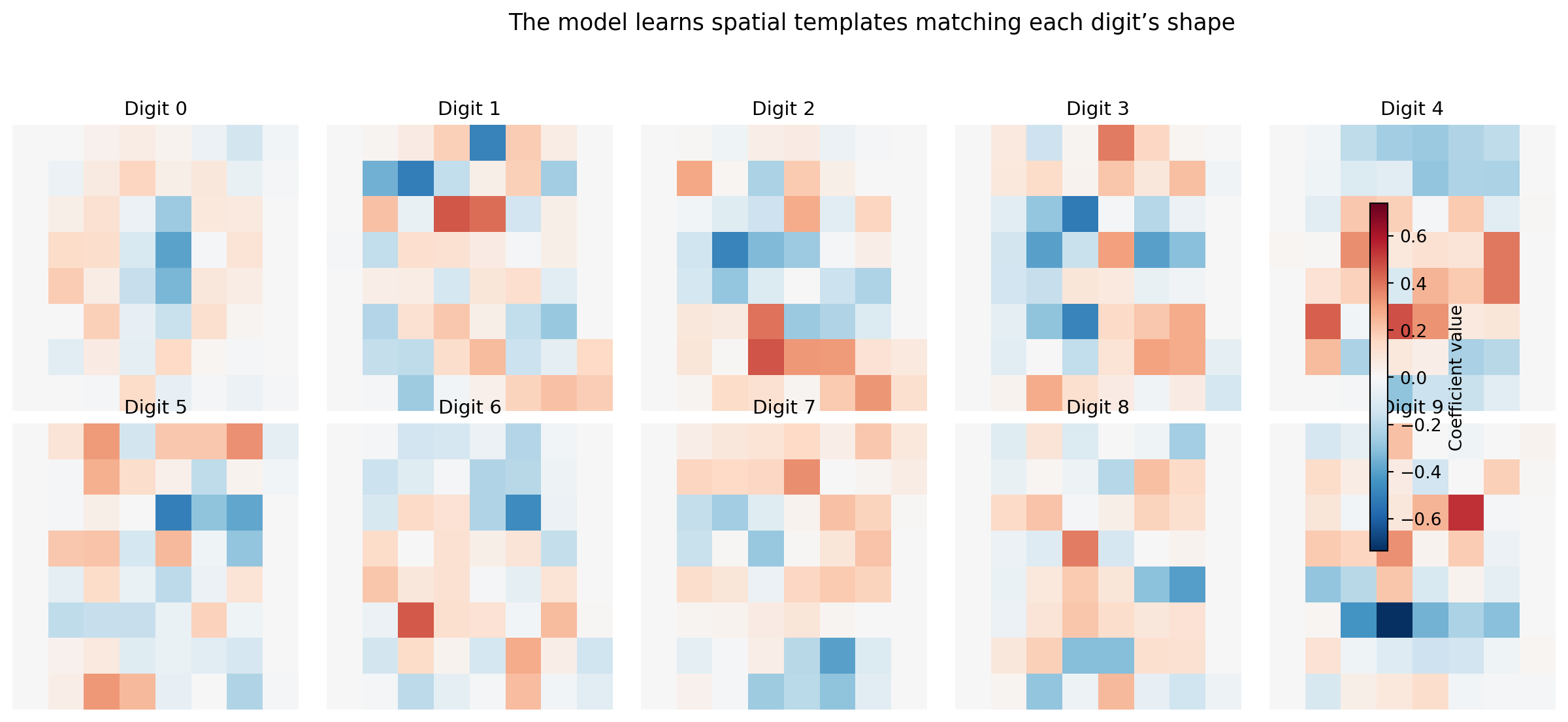
Logistic regression on raw pixels already achieves strong accuracy on this dataset. But the number, whatever it is, is less interesting than *what the model learned*. Because logistic regression assigns one coefficient per feature per class, and each feature is a pixel position, we can reshape the coefficients back into 8×8 images to see exactly what the model looks for.
```{python}
#| label: fig-cv-coefficients
#| echo: true
#| fig-cap: "Logistic regression coefficients for each digit, reshaped as 8×8 images. Positive weights (blue on the colourbar) increase the probability of that digit; negative weights (red) decrease it. The model learns spatial templates — the '0' detector responds to a ring of ink, the '1' detector to a narrow vertical stroke."
#| fig-alt: "Grid of ten 8-by-8 heatmaps in two rows of five, one per digit class, with a shared colourbar on the right indicating coefficient magnitude from negative (red) to positive (blue). Digit 0 shows a ring of positive weights with negative weights in the centre. Digit 1 shows a narrow vertical positive stripe. Digit 8 shows a double-loop positive pattern. Each template is a recognisable, slightly blurred version of the digit's shape."
global_limit = np.abs(lr_raw.coef_).max()
fig, axes = plt.subplots(2, 5, figsize=(14, 6))
for i, ax in enumerate(axes.ravel()):
    coef_img = lr_raw.coef_[i].reshape(8, 8)
    im = ax.imshow(coef_img, cmap='RdBu_r', vmin=-global_limit, vmax=global_limit,
                   interpolation='nearest')
    ax.set_title(f'Digit {i}', fontsize=11)
    ax.axis('off')

fig.colorbar(im, ax=axes.ravel().tolist(), shrink=0.6, label='Coefficient value')
plt.suptitle('The model learns spatial templates matching each digit\u2019s shape',
             fontsize=13)
plt.tight_layout(rect=[0, 0, 0.9, 0.94])
fig.patch.set_alpha(0)
plt.show()
```
The coefficient maps are recognisable templates. The "0" detector has positive weights in a ring and negative weights in the centre, so it activates when ink appears around the perimeter and the middle is empty. The "1" detector has a narrow vertical stripe. The "8" detector responds to a double-loop pattern. This interpretability is a direct consequence of using a linear model on pixel features: each coefficient says "ink at this position makes this digit more or less likely," and the colourbar lets you compare magnitudes across digit classes.
This is *free model debugging*. You didn't have to instrument anything, build any tooling, or run any post-hoc analysis. The structure of logistic regression exposes its internal representation directly, which is an explicit advantage over black-box models like random forests or neural networks where the learned patterns are opaque. The interpretability check serves the same purpose as the top-words-per-category plot in @sec-nlp-interpretation: verifying that the model has learned genuine signal rather than artefacts. If the "3" detector responded strongly to corner pixels that happen to be noisy in the training data, that would be a warning.
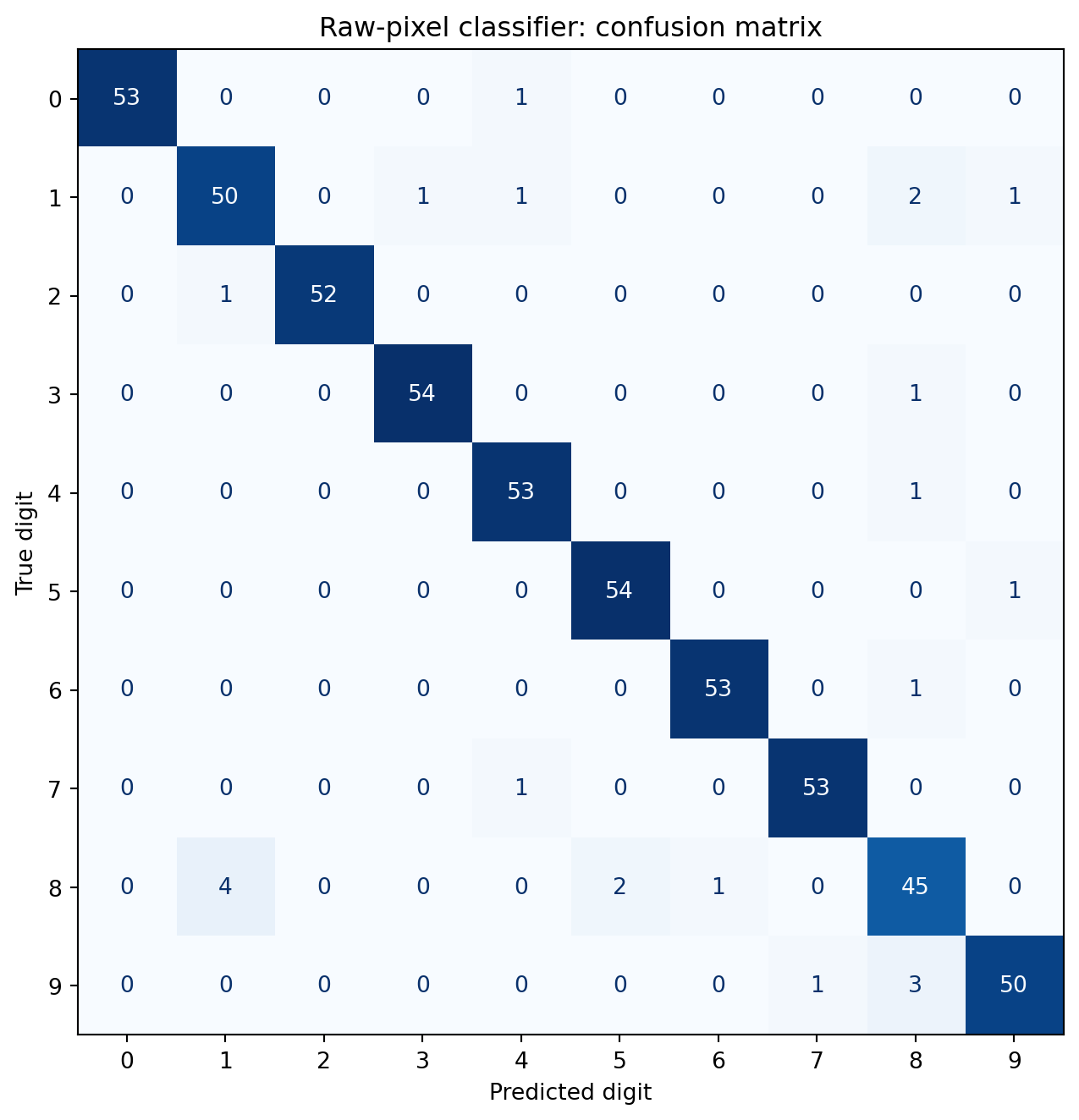
The confusion matrix reveals which digits the model finds hardest to distinguish.
```{python}
#| label: fig-cv-confusion
#| echo: true
#| fig-cap: "Confusion matrix for the raw-pixel classifier. The classifier achieves high accuracy across all classes. The most notable errors involve digits that share structural elements — for example, 3 confused with 5, or 8 confused with 9."
#| fig-alt: "A ten-by-ten confusion matrix heatmap with predicted digit on the horizontal axis and true digit on the vertical axis. Each cell shows the numerical count of true-class versus predicted-class pairs, with a blue colour gradient reinforcing magnitude. Diagonal cells have high counts, showing that correct predictions dominate. Off-diagonal cells are mostly zero, with small non-zero counts between visually similar digit pairs such as 3 and 5, and 8 and 9."
from sklearn.metrics import confusion_matrix, ConfusionMatrixDisplay

cm = confusion_matrix(y_test, y_pred_raw)

fig, ax = plt.subplots(figsize=(8, 7))
disp = ConfusionMatrixDisplay(cm, display_labels=range(10))
disp.plot(ax=ax, cmap='Blues', colorbar=False)
ax.set_xlabel('Predicted digit')
ax.set_ylabel('True digit')
ax.set_title('Raw-pixel classifier: confusion matrix')
plt.tight_layout()
fig.patch.set_alpha(0)
ax.patch.set_alpha(0)
plt.show()
```
The error patterns make geometric sense. Where errors do occur, they tend to involve digits that share structural elements: curves (3 and 5), closed loops (8 and 9), or vertical strokes (1 and 7). These ambiguities aren't model failures; they reflect genuine visual similarity in the data. A human sorting through handwritten digits at speed would make similar mistakes.
## Reducing dimensions: PCA on images {#sec-cv-pca}
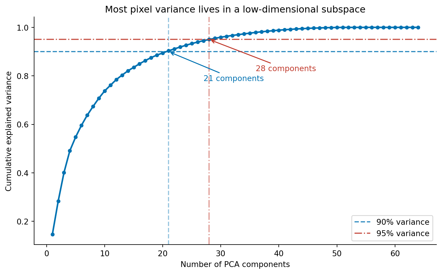
Sixty-four features for an 8×8 image are manageable. But a 256×256 greyscale image has 65,536 pixels, and a 1080p colour image has over six million. Raw pixel vectors become impractical at realistic resolutions, not because any individual classifier can't handle high dimensions, but because the features are massively redundant. Adjacent pixels are highly correlated: knowing that pixel (3, 4) is dark makes it very likely that pixel (3, 5) is also dark. PCA (@sec-pca) exploits exactly this redundancy, finding the directions of maximum variance in pixel space and projecting onto a smaller set of components that capture most of the information.
```{python}
#| label: fig-cv-pca-variance
#| echo: true
#| fig-cap: "Cumulative explained variance as a function of PCA components. Around 21 components capture 90% of the variance in the 64-pixel images, and roughly 30 capture 95%. The redundancy among neighbouring pixels means most of the information lives in a much lower-dimensional subspace."
#| fig-alt: "Line chart with number of PCA components on the horizontal axis (1 to 64) and cumulative explained variance on the vertical axis (0 to 1). The curve rises steeply, reaching approximately 0.9 at around 21 components and approximately 0.95 at around 30 components, then flattens towards 1.0. A blue dashed horizontal line marks the 90 percent threshold, with an annotated arrow indicating approximately 21 components. A red dash-dot horizontal line marks the 95 percent threshold, with an annotated arrow indicating approximately 30 components. The two lines use different colours and different dash patterns so they are distinguishable without relying on colour alone."
from sklearn.decomposition import PCA

# Fit on training data only — avoid leakage (see note below)
# We apply PCA without prior standardisation: all pixels share the same
# 0–16 intensity scale, so standardising per-pixel is unnecessary and
# could amplify noise in low-variance (mostly-white) pixel positions.
# See Ch. 13 for when standardisation before PCA is required.
pca_full = PCA()
pca_full.fit(X_train)

cumvar = np.cumsum(pca_full.explained_variance_ratio_)

fig, ax = plt.subplots(figsize=(8, 5))
ax.plot(range(1, len(cumvar) + 1), cumvar, 'o-', color='#0072B2',
        markersize=4, linewidth=2)

# 90% threshold — dashed line (--) for accessibility: distinct from 95% line
n90 = np.argmax(cumvar >= 0.90) + 1
ax.axhline(0.90, color='#0072B2', linestyle='--', alpha=0.8, label='90% variance')
ax.axvline(n90, color='#0072B2', linestyle='--', alpha=0.4)
ax.annotate(f'{n90} components', xy=(n90, 0.90),
            xytext=(n90 + 6, 0.78), fontsize=10,
            arrowprops=dict(arrowstyle='->', color='#0072B2', lw=1.2),
            color='#0072B2')

# 95% threshold — dash-dot line (-.) for accessibility: distinct from 90% line
n95 = np.argmax(cumvar >= 0.95) + 1
ax.axhline(0.95, color='#c0392b', linestyle='-.', alpha=0.85, label='95% variance')
ax.axvline(n95, color='#c0392b', linestyle='-.', alpha=0.5)
ax.annotate(f'{n95} components', xy=(n95, 0.95),
            xytext=(n95 + 8, 0.82), fontsize=10,
            arrowprops=dict(arrowstyle='->', color='#c0392b', lw=1.2),
            color='#c0392b')

ax.set_xlabel('Number of PCA components')
ax.set_ylabel('Cumulative explained variance')
ax.set_title('Most pixel variance lives in a low-dimensional subspace')
ax.legend()
ax.spines[['top', 'right']].set_visible(False)
fig.patch.set_alpha(0)
ax.patch.set_alpha(0)
plt.tight_layout()
plt.show()
```
Around 21 components capture 90% of the total variance, and 30 capture 95%. The first few components carry the most information; each additional component contributes less. This is the scree pattern we saw in @sec-choosing-components, the "elbow" where adding more components yields diminishing returns.
Mathematically, PCA flattens each image into a vector $\mathbf{x} \in \mathbb{R}^{64}$ and projects it onto a lower-dimensional subspace:
$$\mathbf{z} = W^T (\mathbf{x} - \bar{\mathbf{x}})$$
where $W$ contains the principal component directions (learned from the training data) and $\bar{\mathbf{x}}$ is the mean image. The original image can be approximately reconstructed as $\hat{\mathbf{x}} = \bar{\mathbf{x}} + W\mathbf{z}$ (where $\hat{\mathbf{x}}$ denotes the reconstructed approximation). With all 64 components the reconstruction is exact, a lossless rotation of the coordinate system. With 20 components, we keep only the directions that capture the most variance and discard the rest.
::: {.callout-note}
## Engineering Bridge
Fitting PCA on the training data only (line `pca_full.fit(X_train)`) is a correctness requirement, not a convention. If we fitted on the full dataset before splitting, the principal components would encode statistical patterns from the test set, and the transformer would have "seen the future." This is analogous to a data race in a concurrent system, where a read observes uncommitted state. Scikit-learn's `Pipeline` class prevents this by ensuring transformers are re-fit inside each cross-validation fold, just as transaction isolation prevents concurrent reads from seeing uncommitted writes.
:::
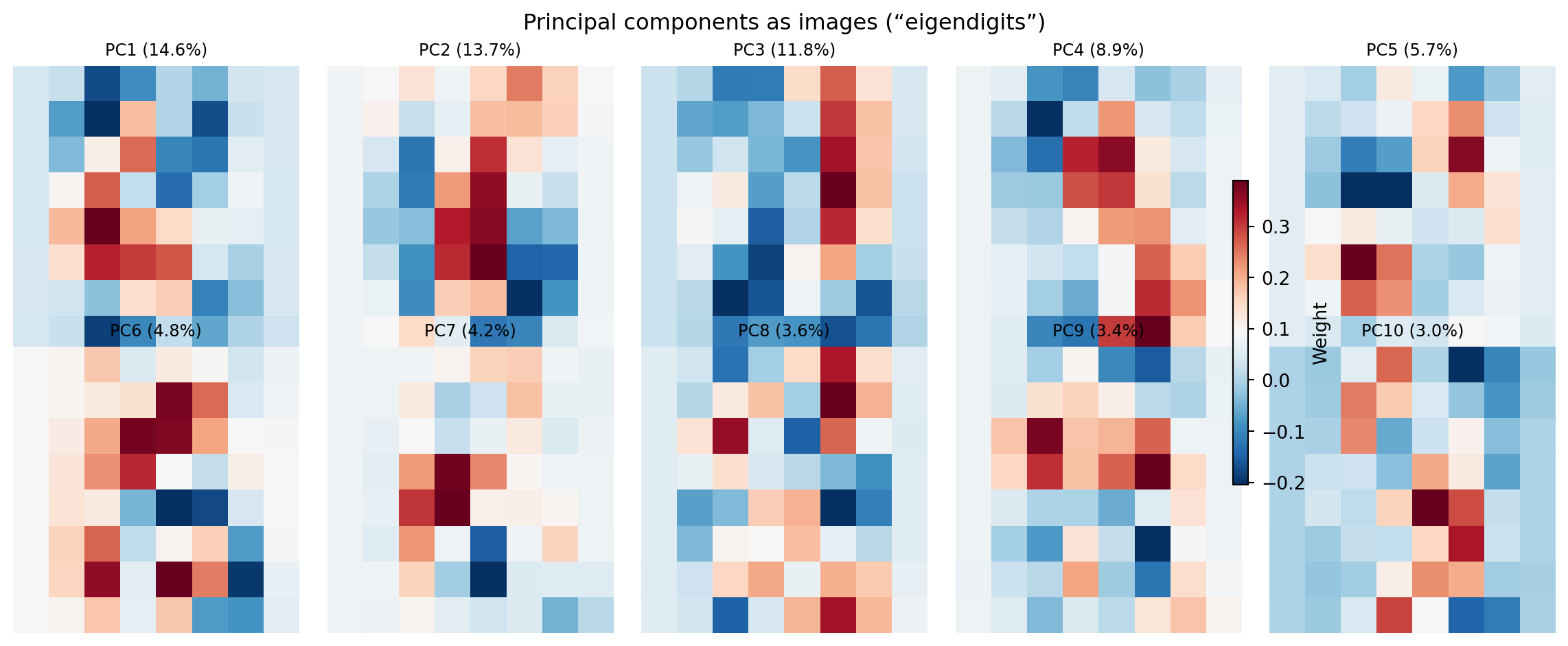
What do these components look like? Each principal component is a 64-dimensional vector, a weighting over pixel positions, that we can reshape back to 8×8 and visualise as an image. These are sometimes called **eigendigits** (by analogy with eigenfaces in face recognition).
```{python}
#| label: fig-cv-eigendigits
#| echo: true
#| fig-cap: "The first ten principal components reshaped as 8×8 images, with a shared colourbar. Early components capture broad structural contrasts (the dominant axes of variation); later components capture finer alternating patterns."
#| fig-alt: "Grid of ten 8-by-8 images arranged in two rows of five, rendered with a blue-to-red diverging colour map and a shared colourbar on the right. The first component shows a broad structural contrast. Later components show increasingly complex alternating patterns of positive and negative regions, corresponding to finer spatial structures."
fig, axes = plt.subplots(2, 5, figsize=(12, 5))
for i, ax in enumerate(axes.ravel()):
    im = ax.imshow(pca_full.components_[i].reshape(8, 8), cmap='RdBu_r',
                   interpolation='nearest')
    pct = pca_full.explained_variance_ratio_[i] * 100
    ax.set_title(f'PC{i+1} ({pct:.1f}%)', fontsize=9)
    ax.axis('off')

fig.colorbar(im, ax=axes.ravel().tolist(), shrink=0.6, label='Weight')
plt.suptitle('Principal components as images (\u201ceigendigits\u201d)', fontsize=12)
plt.tight_layout()
fig.patch.set_alpha(0)
plt.show()
```
The first component captures the dominant axis of variation across the dataset: roughly, which region of the image contains the most ink. Early components capture broad structural contrasts; later components capture finer alternating patterns, analogous to higher spatial frequencies. Together, these form a vocabulary of visual building blocks. Any digit image can be reconstructed as a weighted combination of these components, much as any text document is a weighted combination of topic vectors. The difference, as noted in @sec-nlp-topics, is that PCA coefficients can be negative (a component can be subtracted as well as added) which makes PCA components harder to interpret as distinct visual "types" than NMF topics.
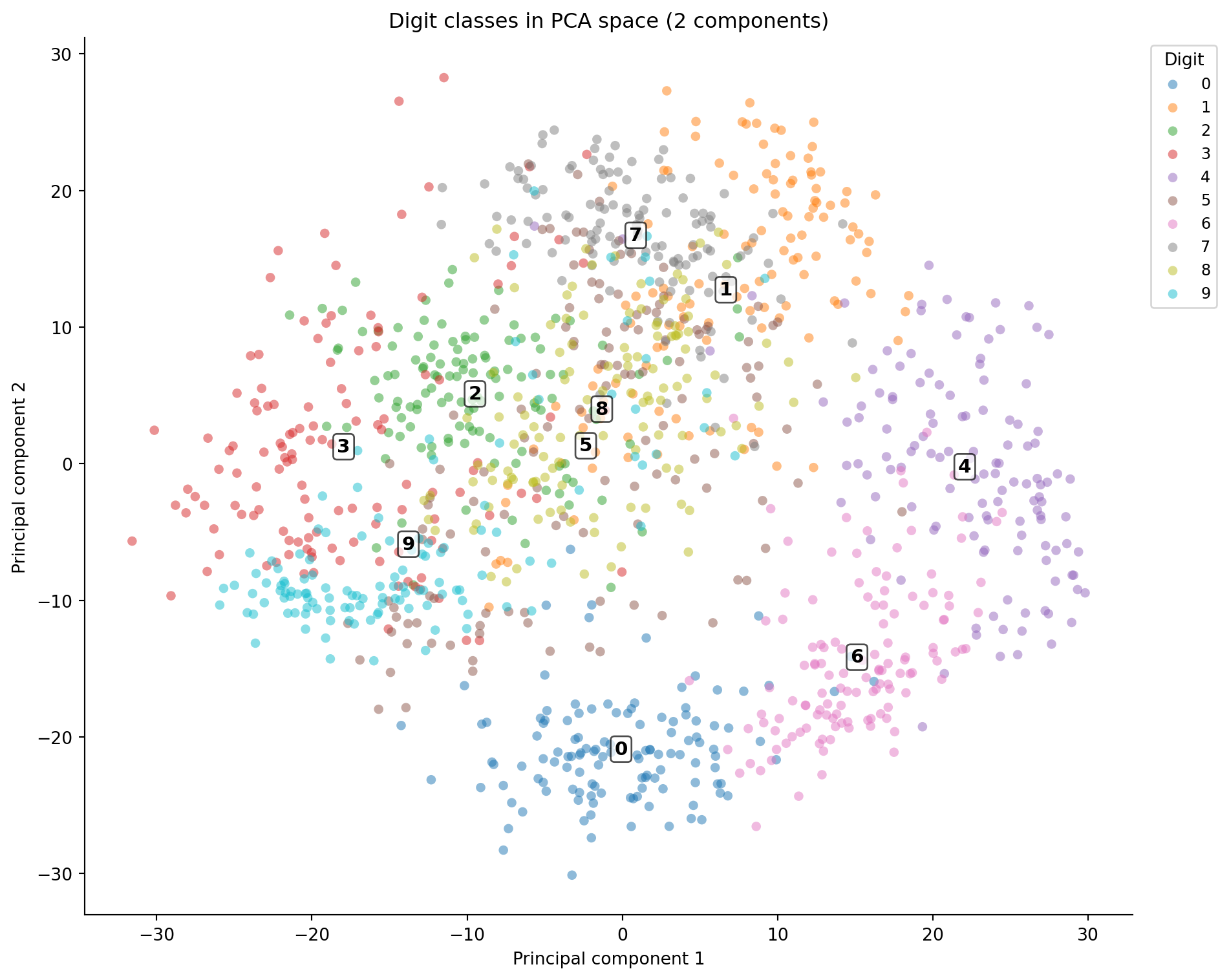
Projecting the data onto the first two components gives a 2D map of the digit space, analogous to the PCA visualisation in @sec-pca-visualisation.
```{python}
#| label: fig-cv-pca-projection
#| echo: true
#| fig-cap: "Digits projected onto the first two principal components. Digit numerals mark cluster centroids. Some classes separate clearly; others overlap heavily in the centre, reflecting genuine visual similarity."
#| fig-alt: "Scatter plot with PCA component 1 on the horizontal axis and component 2 on the vertical axis. Points are coloured by digit class. Digit numerals are annotated at each cluster centroid so classes can be identified without relying on colour alone. Several clusters at the edges are well-separated while others overlap in the centre."
X_pca_2d = pca_full.transform(X_train)[:, :2]

fig, ax = plt.subplots(figsize=(10, 8))
for digit in range(10):
    mask = y_train == digit
    ax.scatter(X_pca_2d[mask, 0], X_pca_2d[mask, 1],
               alpha=0.5, s=30, edgecolors='none', label=str(digit))

# Annotate cluster centroids so classes are identifiable without colour
for digit in range(10):
    mask = y_train == digit
    cx, cy = X_pca_2d[mask, 0].mean(), X_pca_2d[mask, 1].mean()
    ax.annotate(str(digit), xy=(cx, cy), fontsize=11, fontweight='bold',
                ha='center', va='center',
                bbox=dict(boxstyle='round,pad=0.2', fc='white', alpha=0.7))

ax.legend(title='Digit', bbox_to_anchor=(1.01, 1), loc='upper left',
          ncol=1, fontsize=9)
ax.set_xlabel('Principal component 1')
ax.set_ylabel('Principal component 2')
ax.set_title('Digit classes in PCA space (2 components)')
ax.spines[['top', 'right']].set_visible(False)
fig.patch.set_alpha(0)
ax.patch.set_alpha(0)
plt.tight_layout()
plt.show()
```
Two components aren't enough to separate all ten classes; the overlap in the centre is substantial. But 20 components, capturing 90% of variance, should be enough for a classifier, and the code below verifies this.
```{python}
#| label: cv-pca-classification
#| echo: true
pca_20 = PCA(n_components=20)
X_pca_train = pca_20.fit_transform(X_train)
X_pca_test = pca_20.transform(X_test)

lr_pca = LogisticRegression(max_iter=5000, random_state=42)
lr_pca.fit(X_pca_train, y_train)

y_pred_pca = lr_pca.predict(X_pca_test)
accuracy_pca = (y_pred_pca == y_test).mean()

print(f"Logistic regression on PCA features (20 components)")
print(f"Test accuracy: {accuracy_pca:.3f}")
print(f"\nRaw pixels (64 features): {accuracy_raw:.3f}")
print(f"PCA (20 features):        {accuracy_pca:.3f}")
print(f"Dimension reduction:      {1 - 20/64:.0%}")
```
PCA reduces the feature count by nearly 70% with only a small accuracy reduction. The discarded components contain mostly noise, high-frequency pixel variations that don't help distinguish digit classes. This is the same bias-variance trade-off from @sec-bias-variance: discarding noisy features can actually *improve* generalisation by preventing the classifier from fitting to irrelevant variation. (PCA also maximises *variance*, not *class separability*; in cases where the most discriminating directions aren't the highest-variance ones, Linear Discriminant Analysis provides a classification-aware alternative, though covering it in depth is beyond this book's scope.)
::: {.callout-note}
## Engineering Bridge
PCA on images is structurally similar to **lossy compression**. JPEG stores the discrete cosine transform (DCT) of each image block and discards high-frequency coefficients, the visual equivalent of dropping the last principal components. The trade-off is the same: fewer coefficients mean a smaller representation but more information loss. The key difference is that JPEG's DCT basis is *fixed*, the same mathematical cosine functions for every image, while PCA learns a *data-adaptive* basis from the training set. PCA adapts to the statistical structure of your specific images, like a per-dataset custom codec, whereas DCT uses a general-purpose spatial frequency basis. If you've tuned JPEG quality settings, balancing file size against visual artefacts, you've worked through the same dimensionality-versus-fidelity trade-off that the PCA variance curve quantifies.
:::
## Engineering hand-crafted features {#sec-cv-features}
Raw pixels and PCA both treat the image as a flat collection of correlated numbers. Neither encodes explicit spatial relationships: the fact that a vertical stroke in the left half suggests a "4" or "1," while a closed loop suggests a "0" or "8." Hand-crafted features inject geometric knowledge into the representation. Instead of asking "what are the pixel values?" they ask "where is the ink concentrated? How is it oriented? Is the shape symmetric?"
We'll extract features that capture different aspects of each image's spatial structure.
```{python}
#| label: cv-feature-extraction
#| echo: true
def extract_spatial_features(images):
    """Extract 25 hand-crafted spatial features from 8×8 digit images."""
    feature_rows = []

    # Explicit loop for readability; a vectorised implementation would be faster
    for img in images:
        # Quadrant means (4 features) — where is the ink concentrated?
        quadrant_means = [
            img[:4, :4].mean(), img[:4, 4:].mean(),
            img[4:, :4].mean(), img[4:, 4:].mean(),
        ]

        # Row and column projections (8 + 8 features) — density profiles
        row_projections = img.sum(axis=1).tolist()
        col_projections = img.sum(axis=0).tolist()

        # Gradient magnitude: |∇I| = √((∂I/∂x)² + (∂I/∂y)²)
        gy, gx = np.gradient(img)
        grad_mag = np.sqrt(gx**2 + gy**2)
        gradient_stats = [grad_mag.mean(), grad_mag.std()]

        # Horizontal symmetry — left-right correlation
        left = img[:, :4].ravel()
        right_flipped = img[:, 4:][:, ::-1].ravel()
        symmetry = (
            np.corrcoef(left, right_flipped)[0, 1]
            if np.std(left) > 0 and np.std(right_flipped) > 0
            else 0.0
        )

        # Ink density — fraction of pixels above a fixed threshold
        # (fixed at 4 so the measure is comparable across images)
        ink_density = (img > 4).mean()

        # Centre-vs-edge ratio
        centre = img[2:6, 2:6]
        border_mean = (img.sum() - centre.sum()) / (img.size - centre.size)
        centre_ratio = centre.mean() / (border_mean + 1e-6)  # +1e-6 prevents division by zero for blank borders

        feature_rows.append(
            quadrant_means + row_projections + col_projections
            + gradient_stats + [symmetry, ink_density, centre_ratio]
        )

    return np.array(feature_rows)

X_spatial_train = extract_spatial_features(img_train)
X_spatial_test = extract_spatial_features(img_test)

print(f"Spatial features shape: {X_spatial_train.shape}")
print(f"Features per image: {X_spatial_train.shape[1]}")
```
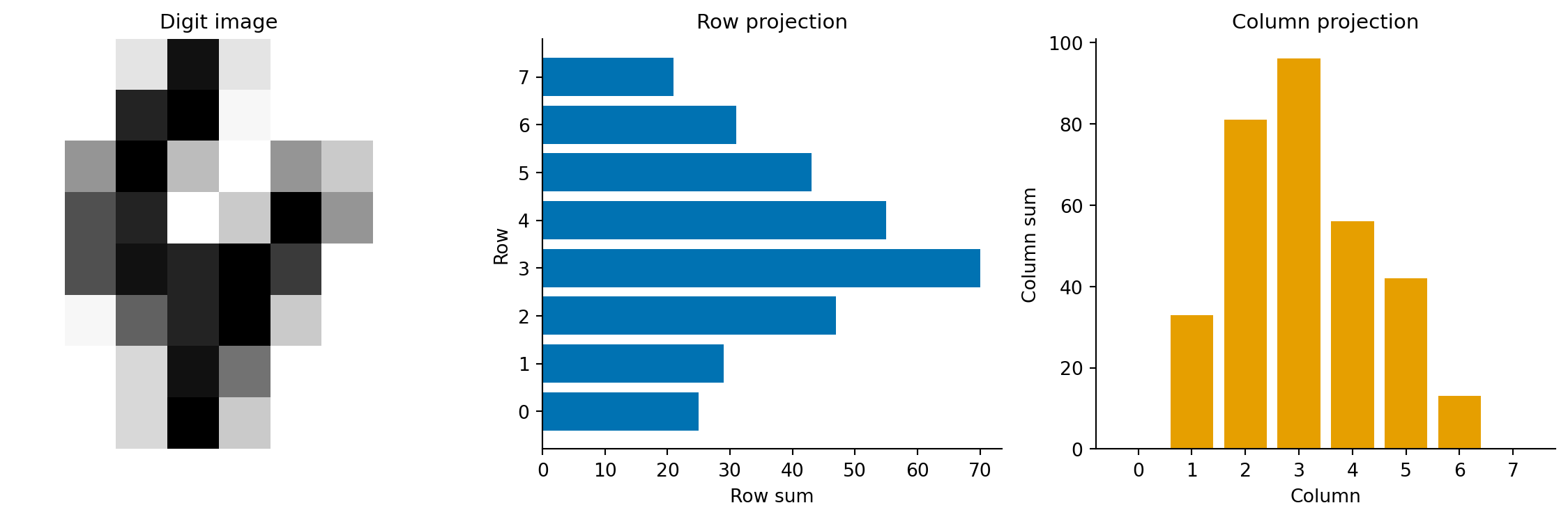
Twenty-five features, each encoding a different geometric property. The quadrant means capture where the ink mass sits. The row and column projections form a density profile, a compact summary of the digit's horizontal and vertical distribution. Gradient statistics measure edge strength via the gradient magnitude $\|\nabla I\|_{i,j} = \sqrt{(\partial I/\partial x)^2 + (\partial I/\partial y)^2}$. Digits with sharp strokes have higher gradient magnitude than those with broad, diffuse strokes. Symmetry distinguishes "0" and "8" (highly symmetric) from "2" and "7" (asymmetric).
```{python}
#| label: fig-cv-feature-profile
#| echo: true
#| fig-cap: "Spatial feature profiles for a sample digit 4. The row projection (sum of intensities across each row) and column projection (sum of intensities down each column) summarise the digit's shape as compact 1D signals."
#| fig-alt: "Three panels. The first shows an 8-by-8 greyscale image of a handwritten digit 4. The second shows a horizontal bar chart of row sums, with higher values in the middle rows where the crossbar and vertical stroke appear. The third shows a vertical bar chart of column sums."
sample_4 = img_train[y_train == 4][0]
feats_4 = extract_spatial_features(sample_4[np.newaxis, :])[0]

fig, (ax1, ax2, ax3) = plt.subplots(1, 3, figsize=(12, 4))

ax1.imshow(sample_4, cmap='Greys', interpolation='nearest')
ax1.set_title('Digit image', fontsize=11)
ax1.axis('off')

# Row projections are features 4–11
row_proj = feats_4[4:12]
ax2.barh(range(7, -1, -1), row_proj, color='#0072B2', edgecolor='none')
ax2.set_xlabel('Row sum')
ax2.set_ylabel('Row')
ax2.set_title('Row projection', fontsize=11)
ax2.set_yticks(range(8))
ax2.set_yticklabels(range(7, -1, -1))
ax2.spines[['top', 'right']].set_visible(False)

# Column projections are features 12–19
col_proj = feats_4[12:20]
ax3.bar(range(8), col_proj, color='#E69F00', edgecolor='none')
ax3.set_xlabel('Column')
ax3.set_ylabel('Column sum')
ax3.set_title('Column projection', fontsize=11)
ax3.set_xticks(range(8))
ax3.spines[['top', 'right']].set_visible(False)

plt.tight_layout()
fig.patch.set_alpha(0)
ax1.patch.set_alpha(0)
ax2.patch.set_alpha(0)
ax3.patch.set_alpha(0)
plt.show()
```
```{python}
#| label: cv-spatial-classification
#| echo: true
from sklearn.preprocessing import StandardScaler
from sklearn.pipeline import Pipeline

# Scale spatial features — they're on different scales
# (row sums range 0–128, symmetry ranges -1–1)
pipe_spatial = Pipeline([
    ('scaler', StandardScaler()),
    ('clf', LogisticRegression(max_iter=5000, random_state=42)),
])
pipe_spatial.fit(X_spatial_train, y_train)

y_pred_spatial = pipe_spatial.predict(X_spatial_test)
accuracy_spatial = (y_pred_spatial == y_test).mean()

print(f"Logistic regression on spatial features (25 features)")
print(f"Test accuracy: {accuracy_spatial:.3f}")
```
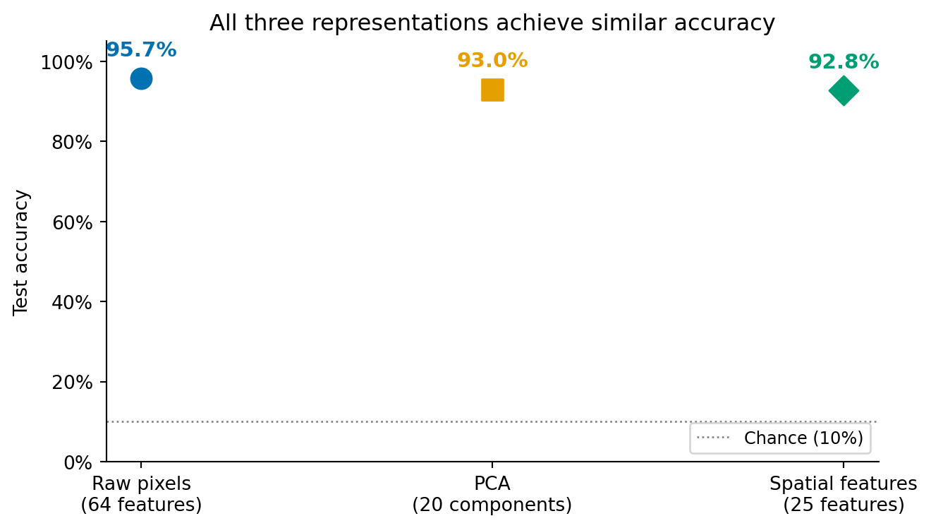
Now let's see all three representations side by side.
```{python}
#| label: fig-cv-comparison
#| echo: true
#| fig-cap: "Classification accuracy for three representation strategies, all using logistic regression. The differences are modest but meaningful: raw pixels and PCA (a near-lossless compression) perform similarly, while the hand-crafted spatial features, which deliberately discard pixel-level detail, trade a small accuracy drop for compactness and interpretability."
#| fig-alt: "Dot plot with three labelled points showing test accuracy for raw pixels (64 features), PCA (20 components), and spatial features (25 features). Each point is annotated with its accuracy percentage. The first two points are close to each other, reflecting that PCA retains most of the pixel information. The spatial features point is slightly lower, reflecting the information discarded by the hand-crafted representation."
approaches = ['Raw pixels\n(64 features)', 'PCA\n(20 components)',
              'Spatial features\n(25 features)']
accuracies = [accuracy_raw, accuracy_pca, accuracy_spatial]
colours = ['#0072B2', '#E69F00', '#009E73']

fig, ax = plt.subplots(figsize=(7, 4))
markers = ['o', 's', 'D']
for i, (approach, acc, col, marker) in enumerate(
        zip(approaches, accuracies, colours, markers)):
    ax.scatter(i, acc, color=col, s=120, zorder=5, marker=marker)
    ax.annotate(f'{acc:.1%}', xy=(i, acc), xytext=(0, 12),
                textcoords='offset points', ha='center',
                fontsize=11, fontweight='bold', color=col)

ax.axhline(0.10, color='grey', linestyle=':', linewidth=1.0,
           label='Chance (10%)')
ax.set_xticks(range(len(approaches)))
ax.set_xticklabels(approaches)
ax.set_ylabel('Test accuracy')
ax.set_ylim(0.0, 1.05)
ax.set_title('All three representations achieve similar accuracy')
ax.legend(loc='lower right', fontsize=9)
ax.spines[['top', 'right']].set_visible(False)
ax.yaxis.set_major_formatter(plt.matplotlib.ticker.PercentFormatter(xmax=1.0))
fig.patch.set_alpha(0)
ax.patch.set_alpha(0)
plt.tight_layout()
plt.show()
```
The comparison tells an instructive story. Raw pixels and PCA achieve similar accuracy, which is expected. PCA with all 64 components would be a lossless rotation of the coordinate system (no information discarded, only the axes changed), but we used 20 components, which discards roughly 10% of the total variance. The small accuracy gap reflects the regularisation benefit of discarding those noisy dimensions, as discussed in @sec-bias-variance.
Spatial features perform slightly lower because they're a *lossy* compression that discards information the classifier could have used, specifically pixel-level details that the 25 features don't capture. But they use fewer features, are more interpretable (each feature has a clear geometric meaning), and would scale to larger images where raw pixels would not.
The key lesson echoes @sec-nlp-summary: the choice of representation has more impact on classification performance than swapping in a fancier algorithm. A logistic regression model on well-chosen features outperforms a complex model on poorly chosen ones.
::: {.callout-tip}
## Author's Note
The representation problem in computer vision is the mirror image of text processing. In the NLP chapter (@sec-nlp-representation), the hard part was getting from text to numbers: bag of words, TF-IDF, vocabulary construction. With images, the numbers are already there, but there are far too many of them, and most carry redundant information. My initial assumption was that having data already in numerical form was a pure advantage. In one sense it is: you don't need a vocabulary or tokeniser. But the raw pixel representation is maximally redundant (neighbouring pixels are highly correlated) and minimally semantic: knowing that pixel (3, 4) is bright tells you nothing about the digit without the surrounding context. What genuinely surprised me was that *discarding* most of the raw data (70% of pixels via PCA) left accuracy almost unchanged. My engineering instinct says more data is always better. But pixels aren't independent observations; they're correlated measurements of the same underlying structure. Throwing away the redundant ones doesn't lose information; it removes noise. The representation problem in computer vision isn't about converting data to numbers; it's about converting a flood of correlated numbers into a handful of meaningful ones.
:::
## Where classical methods reach their limits {#sec-cv-limits}
The digits dataset is a controlled environment. The images are centred, uniformly sized, greyscale, and just 8×8 pixels. Real-world computer vision problems are none of these things. Understanding where classical methods break down clarifies what deep learning actually solves.
Scale is the first wall you hit. An 8×8 image has 64 features, but a 224×224 colour ImageNet image has 150,528 — and that's small by modern standards. Raw pixel classification becomes computationally impractical at these dimensions, and the curse of dimensionality makes it statistically fragile: with more features than training samples, overfitting is almost guaranteed. PCA can compress the features, but fitting PCA on millions of dimensions requires substantial computation and memory, and the linear subspace it finds may not capture the non-linear structure of natural images.
The lack of translation invariance is the second problem, and it's worth seeing concretely. A handwritten "3" shifted one pixel to the right looks like a completely different point in 64-dimensional pixel space, even though it's obviously the same digit.
```{python}
#| label: cv-translation-demo
#| echo: true
# Demonstrate the translation invariance problem
sample_3 = img_train[y_train == 3][0]
shifted_3 = np.zeros_like(sample_3)
shifted_3[:, 1:] = sample_3[:, :-1]  # shift one pixel right

pixel_distance = np.linalg.norm(sample_3.ravel() - shifted_3.ravel())
proj_original = sample_3.sum(axis=1)
proj_shifted = shifted_3.sum(axis=1)
proj_distance = np.linalg.norm(proj_original - proj_shifted)

print(f"Pixel vector distance after 1px shift: {pixel_distance:.1f}")
print(f"Row projection distance:               {proj_distance:.1f}")
print(f"\nThe raw pixel vector changes substantially,")
print(f"but the row projection barely moves.")
```
Our spatial features partially handle this (quadrant means and projection profiles are somewhat shift-tolerant, as the demonstration shows) but raw pixels and PCA have no built-in notion that nearby spatial positions should be treated similarly. Convolutional neural networks solve this architecturally by applying the same learned filter at every position in the image.
Feature generality is the third limitation. The spatial features we engineered (quadrant means, gradient statistics, symmetry) work for digit classification because they capture the geometric properties that distinguish digits. For a different task (classifying satellite imagery, detecting tumours in medical scans, recognising faces) these features would be useless. Each domain requires its own hand-crafted features, designed by someone who understands both the imagery and the classification task. Deep learning bypasses this bottleneck by learning domain-appropriate features directly from labelled examples.
Finally, there's distribution shift, the most common failure mode an engineer encounters in production. The training images look different from the images the model sees in deployment: different cameras, lighting conditions, resolutions, or even JPEG compression artefacts. This is the computer vision equivalent of a production bug that tests missed because the test inputs weren't representative. Classical features are especially vulnerable because they were engineered for a specific data distribution; when that distribution changes, the features may capture the wrong properties entirely.
Despite these limitations, the evaluation framework transfers entirely. Confusion matrices, precision-recall analysis, the train/test methodology, PCA for visualisation, interpretability through coefficient inspection — all of these apply identically whether the features were hand-crafted or learned by a neural network. The pipeline structure is the same: represent, train, evaluate, interpret. Deep learning changes the first step; everything else remains.
That framing is honest, but it would mislead if it left the impression that the choice is always "classical for toy problems, deep learning for everything else." In production, four well-defined situations make the classical pipeline the *right* call rather than a fallback — and one of them is common enough to deserve its own worked case.
## When classical methods are still the right call {#sec-cv-when-classical}
Reach for hand-crafted features and a linear model first when any of the following holds.
*The visual domain is constrained.* If the camera position, lighting, framing, and object class are all under your control — fixed-mount industrial cameras, medical microscopy, document scanners, conveyor-belt inspection — the variability that defeats classical features simply does not exist. The model only ever sees images that look like its training set. Spending an order of magnitude more compute and data to learn invariances you have already engineered out of the problem is wasteful.
*The labelled dataset is small.* Deep learning's appetite for data is real: convolutional networks need thousands to millions of labelled examples per class to outperform classical pipelines. Many real problems give you 50–500 labels and no realistic path to ten times that. With small data, a high-capacity model overfits faster than it generalises; a five-feature logistic regression with regularisation is more robust because there is less for it to memorise. If your labelled set is small enough to fit in a spreadsheet, the classical pipeline is almost always the better starting point.
*Interpretability is non-negotiable.* In regulated industries — medical devices, financial decisions, automotive safety — a model whose decisions cannot be explained to an auditor, a patient, or a court is not deployable, regardless of its accuracy. Coefficients on hand-crafted features tell a clean story: "the system flagged this part because the maximum gradient magnitude was 4.2, above the 3.5 threshold the model learned." That sentence is hard to write about a CNN's pre-softmax logits. Interpretability is not a virtue; it is sometimes a regulatory requirement, and it forecloses certain architectures entirely.
*Latency or compute budgets are tight.* Inference on edge hardware — embedded controllers, smartphones, browsers, IoT sensors — is bounded by RAM, by power draw, and often by the absence of a GPU. A classical feature extractor plus a logistic regression runs in microseconds on a microcontroller; a CNN typically does not run on the same device at all without quantisation, pruning, or a dedicated accelerator. The deployment cost of "just use deep learning" can be the entire reason a product is not viable.
These four conditions are not exotic. They describe most industrial-inspection systems, much of medical imaging that runs on the device rather than in the cloud, a large fraction of document and barcode pipelines, and many domain-specific tools where the operator already understands the visual problem. The next section walks through the canonical example.
## Worked case: surface defect inspection on a production line {#sec-cv-defect-inspection}
A factory making aluminium sheet wants to flag defective sheets before they leave the inspection station. A line-scan camera produces small greyscale patches (here we'll use 32×32 for illustration). Most patches are clean; a small fraction contain scratches or surface contamination. The detection model has to: (a) run within the line's takt time on an embedded controller, (b) explain its decision so operators know which station upstream to investigate, and (c) generalise from the few hundred labelled defects the QA team has been able to collect.
This is exactly where classical methods win. We simulate the data, extract four physically-motivated features, fit a logistic regression, and report what the model actually learned.
```{python}
#| label: cv-defect-data
#| echo: true
inspection_rng = np.random.default_rng(2026)

def make_clean_patch():
    """Uniform aluminium-like surface: low-amplitude isotropic noise."""
    return inspection_rng.normal(loc=0.55, scale=0.045, size=(32, 32)).clip(0, 1)

def make_defective_patch():
    """Clean surface plus one defect: a scratch (bright streak) or a
    pit (dark blob). Defect severity varies, and the faintest defects
    sit only marginally above the surface noise — so detection is a
    genuinely hard problem, as it is on a real inspection line."""
    patch = make_clean_patch()
    if inspection_rng.random() < 0.5:
        # Scratch: bright linear streak of variable contrast
        row = inspection_rng.integers(4, 28)
        length = inspection_rng.integers(8, 22)
        col_start = inspection_rng.integers(0, 32 - length)
        amplitude = inspection_rng.uniform(0.06, 0.16)
        patch[row, col_start:col_start + length] += amplitude
        patch[row + 1, col_start:col_start + length] += amplitude * 0.57
    else:
        # Pit: small dark blob of variable depth
        cy, cx = inspection_rng.integers(6, 26, size=2)
        depth = inspection_rng.uniform(0.06, 0.14)
        patch[cy - 2:cy + 2, cx - 2:cx + 2] -= depth
    return patch.clip(0, 1)

n_clean, n_defect = 400, 100  # realistic class imbalance: defects are rare
patches = np.stack(
    [make_clean_patch() for _ in range(n_clean)]
    + [make_defective_patch() for _ in range(n_defect)]
)
labels = np.array([0] * n_clean + [1] * n_defect)

print(f"Patches: {len(patches)} ({n_clean} clean, {n_defect} defective)")
```
The features are chosen by understanding the *physics* of the defect, not by training on more data. A scratch is a localised high-gradient feature; a pit is a localised low-intensity feature; a clean surface is uniform. Four scalars per patch capture this:
```{python}
#| label: cv-defect-features
#| echo: true
def extract_inspection_features(patches):
    """Four physically-motivated features per patch."""
    # 1. Intensity standard deviation — clean surfaces are uniform.
    std = patches.std(axis=(1, 2))

    # 2. Maximum gradient magnitude — scratches create sharp edges.
    grad_y = np.abs(np.diff(patches, axis=1))
    grad_x = np.abs(np.diff(patches, axis=2))
    max_grad = np.maximum(grad_y.max(axis=(1, 2)), grad_x.max(axis=(1, 2)))

    # 3. Darkest-pixel intensity — pits create localised dark regions.
    min_intensity = patches.min(axis=(1, 2))

    # 4. Brightest-pixel intensity — scratches create localised bright regions.
    max_intensity = patches.max(axis=(1, 2))

    return pd.DataFrame({
        'intensity_std': std,
        'max_gradient': max_grad,
        'min_intensity': min_intensity,
        'max_intensity': max_intensity,
    })

features = extract_inspection_features(patches)
print(features.describe().round(3))
```
Train a regularised logistic regression on the standardised features and report what it learned:
```{python}
#| label: cv-defect-classifier
#| echo: true
X_train_d, X_test_d, y_train_d, y_test_d = train_test_split(
    features, labels, test_size=0.2, random_state=42, stratify=labels
)

inspection_pipeline = Pipeline([
    ('scale', StandardScaler()),
    ('clf', LogisticRegression(C=1.0, class_weight='balanced', random_state=42)),
])
inspection_pipeline.fit(X_train_d, y_train_d)

y_pred_d = inspection_pipeline.predict(X_test_d)
print("Defect classifier — held-out performance:\n")
print(classification_report(y_test_d, y_pred_d,
                            target_names=['clean', 'defective']))

coefficients = pd.Series(
    inspection_pipeline.named_steps['clf'].coef_[0],
    index=features.columns,
).sort_values(ascending=False)
print("\nLearned coefficients (positive = pushes towards 'defective'):")
print(coefficients.round(3).to_string())
```
The coefficients are a complete decision rule, and for this fitted model they line up with the physics. Intensity standard deviation carries the largest positive weight: a non-uniform surface is the single strongest indicator that *something* is wrong. Brightest-pixel intensity is also positive — a bright streak is exactly what a scratch produces — while darkest-pixel intensity pushes the *opposite* way: a low minimum intensity (a dark pit) is associated with the defective class, so its coefficient comes out negative. Maximum gradient, which you might expect to be a strong positive signal for scratches, ends up with only a small (and here slightly negative) weight. That is not a claim that sharper edges mean cleaner metal; it is a collinearity effect. Maximum gradient and intensity standard deviation both measure surface non-uniformity and are strongly correlated, so once the model has intensity standard deviation it extracts little extra from maximum gradient — the same coefficient-splitting behaviour that multicollinearity produces in linear models (@sec-regression-pitfalls). The QA team can still read the dominant terms and know which sensor readings to investigate when the line throws an alert. There is no equivalent rule extractable from a CNN.
Performance-wise, the recall on the rare "defective" class matters more than overall accuracy: a missed defect is shipped to the customer. The held-out report shows the trade-off in action. Recall on the defective class is high — the model catches most defects — but its precision is well below 1.0: a fair fraction of the patches it flags turn out to be clean. That is deliberate. The `class_weight='balanced'` argument tells the optimiser to weight the rare defective examples more heavily, buying recall at the cost of precision — the same threshold-tuning calculus from @sec-roc-auc and @sec-class-imbalance applied to a different domain. In this context it is the right call: a false alarm just means re-inspecting a clean sheet, whereas a missed defect reaches the customer. None of this requires a GPU, a labelled dataset of millions of images, or any of the deep-learning machinery that the previous section established as out of scope. The classical pipeline is not a stepping stone here; it is the deployable answer.
## Summary {#sec-cv-summary}
1. **Images are numerical arrays.** A greyscale image is a 2D matrix of pixel intensities; a colour image stacks three such matrices. The classification pipeline is the same as for any structured data: represent, train, evaluate.
2. **Raw pixels work for small images but don't scale.** Flattening an image into a pixel vector preserves all information but encodes no spatial structure. For small images like 8×8 digits, this is sufficient. For realistic image sizes, the dimensionality becomes intractable.
3. **PCA compresses redundant pixel information.** Adjacent pixels are correlated, so most of the variance lives in a low-dimensional subspace. Twenty PCA components can capture 90% of the variance in 64-pixel images, achieving comparable classification accuracy with roughly 30% of the features.
4. **Hand-crafted features encode domain knowledge.** Spatial features like quadrant means, projection profiles, and gradient statistics capture geometric properties that distinguish digit classes. They are more compact and interpretable than raw pixels but require domain expertise for each new task.
5. **Representation matters more than algorithm complexity.** The same logistic regression classifier performs differently on different representations — and the gap between representations is larger than the gap you'd get from swapping in a more powerful algorithm on the same features.
6. **Classical pipelines are the right call when the problem allows it.** Constrained visual domains, small labelled sets, hard interpretability requirements, and tight latency or compute budgets all favour hand-crafted features and a regularised linear model — not as a stepping stone to deep learning, but as the deployable answer. Industrial inspection is the canonical example.
## Exercises {#sec-cv-exercises}
1. Train a gradient boosting classifier (`GradientBoostingClassifier` with `n_estimators=200, max_depth=4`) on the raw pixel features and compare its accuracy with logistic regression. Does a non-linear model benefit from the raw pixel representation? Why or why not?
2. Apply t-SNE (@sec-tsne) to `X_train` (using `random_state=42`) and compare the 2D visualisation with the PCA projection in @fig-cv-pca-projection. What structure does t-SNE reveal that PCA misses? Which digit pairs that overlap in PCA space become separated in t-SNE space?
3. Add at least two new features to the `extract_spatial_features` function — for instance, the number of light-to-dark transitions per row (a simple edge count) or projections along the two main diagonals. Does classification accuracy improve? What does the result tell you about the marginal value of additional hand-crafted features?
4. **Conceptual:** The digits dataset has 8×8 images (64 pixels). A modern smartphone camera produces 4032×3024 images (over 12 million pixels per channel). For each of the three approaches — raw pixels, PCA, and hand-crafted features — describe the most severe scaling challenge it would face at this resolution. Which approach degrades most in classification performance, and which scales best?
5. **Conceptual:** In the natural language processing chapter (@sec-nlp-summary), logistic regression performed well on sparse TF-IDF features partly because text data has high dimensionality and extreme sparsity. Image pixel features are dense (every pixel has a value) rather than sparse. Would you expect tree-based models to perform relatively better on image features than on text features? Why might sparsity favour linear models while density favours tree-based models?