---
# Content: CC BY-NC-SA 4.0 | Code: MIT - see /LICENSE.md
title: "Distributions: the type system of uncertainty"
---
{{< include /_common-imports.qmd >}}
## Types constrain values {#sec-distributions}
Every programming language has a type system. When you declare a variable as `uint8`, you're making a statement about the world: this value is an integer, it's non-negative, and it falls between 0 and 255. The type doesn't tell you *which* value you'll get — it tells you what values are *possible* and what operations make sense.
Probability distributions play a similar role for uncertain quantities. When a statistician says "daily website visitors follow a Poisson distribution with $\lambda = 1\text{,}000$" (where $\lambda$ is the expected rate, as we saw in the previous chapter), they're declaring something like a type, with one important difference we'll get to shortly. They're saying: this quantity is a non-negative integer, values near 1,000 are most likely, and the probability of any specific count is determined by a precise mathematical rule.
```{python}
#| label: type-analogy
#| echo: true
# A uint8 constrains the domain: integers in [0, 255]
# A Poisson(1,000) constrains the domain: non-negative integers,
# with a specific probability for each value

from scipy import stats

poisson_dist = stats.poisson(mu=1000)

# Unlike isinstance() which gives a binary yes/no,
# pmf tells you *how likely* a specific value is.
# pmf = "probability mass function" — defined properly in the next section
print(f"P(visitors = 1,000) = {poisson_dist.pmf(1000):.4f}")
print(f"P(visitors = 500)  = {poisson_dist.pmf(500):.6f}")
print(f"P(visitors = -1)   = {poisson_dist.pmf(-1):.4f}")  # Impossible — outside the domain
```
The last line is the key insight. A Poisson distribution assigns zero probability to negative values, just as a `uint8` makes negative numbers unrepresentable. The distribution *encodes constraints about the real-world process* — customers can't un-visit your website.
Here's where the analogy diverges from types: type membership is binary: a value either is or isn't a `uint8`. A distribution gives you a *degree* of plausibility, a probability that grades smoothly from likely to implausible. Getting 1,000 visitors is typical; 500 is surprising; -1 is structurally impossible. That last category *is* the type-like constraint; the first two have no equivalent in a type system. Unlike types, distributions are also modelling choices that the data can contradict — more on this later in @sec-choosing.
## Discrete vs continuous: two kinds of type {#sec-discrete-continuous}
In the same way that programming distinguishes between integers and floating-point numbers, statistics distinguishes between **discrete** and **continuous** distributions.
**Discrete distributions** describe quantities that can only take specific, countable values. The number of bugs filed this sprint. The number of servers in a cluster that fail overnight. The number of heads in ten coin flips. These are counts — you can't have 3.7 bugs.
**Continuous distributions** describe quantities that can take any value within a range (or the entire real line). Response latency. Temperature. A person's height. These are measurements — the precision is limited only by your instrument, not by the nature of the quantity.
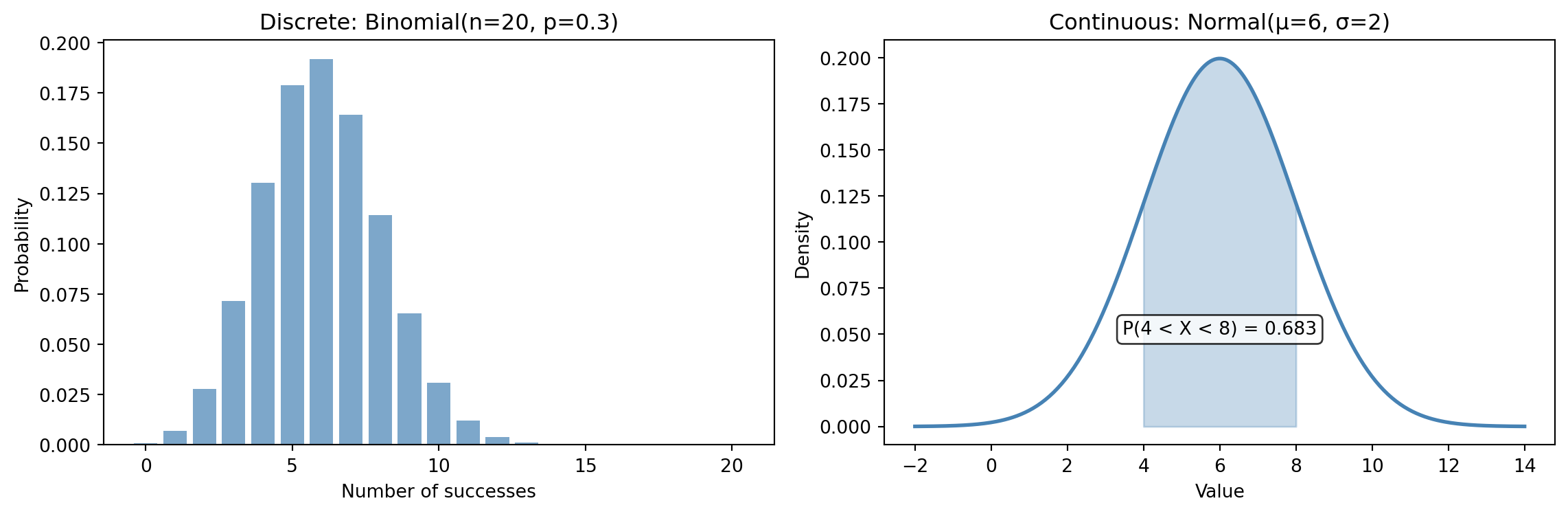
This distinction matters because it determines how we describe probabilities. For a discrete distribution, we can ask "what is the probability of *exactly* this value?" and get a meaningful answer. For a continuous distribution, the probability of any *exact* value is technically zero — we can only ask about ranges (see @fig-discrete-vs-continuous).
```{python}
#| label: fig-discrete-vs-continuous
#| echo: true
#| fig-cap: "Discrete distributions assign probability to specific points (left). Continuous distributions assign probability to intervals — the shaded area under the curve (right)."
#| fig-alt: "Two-panel figure. The left panel shows a bar chart of the Binomial(20, 0.3) distribution with bars at each integer from 0 to 20, peaking around 6. The right panel shows the Normal(6, 2) density curve with the area between 4 and 8 shaded in orange and labelled with its probability of 0.683."
fig, (ax1, ax2) = plt.subplots(1, 2, figsize=(12, 4.5))
fig.patch.set_alpha(0)

# Discrete: Binomial — n = number of trials, p = probability of success
# (formally introduced in the distribution tour below)
x_discrete = np.arange(0, 21)
binom_dist = stats.binom(n=20, p=0.3)
ax1.bar(x_discrete, binom_dist.pmf(x_discrete), color='#0072B2', alpha=0.7)
ax1.set_xlabel('Number of successes')
ax1.set_ylabel('Probability')
ax1.set_title('Discrete: probability at a point')

# Continuous: Normal — mu (μ) = mean, sigma (σ) = standard deviation
# (formally introduced in the distribution tour below)
x_continuous = np.linspace(-2, 14, 300)
norm_dist = stats.norm(loc=6, scale=2)
# pdf = "probability density function" — defined properly in the next section
ax2.plot(x_continuous, norm_dist.pdf(x_continuous), color='#E69F00', linewidth=2)
# Shade the region between 4 and 8
x_fill = np.linspace(4, 8, 100)
ax2.fill_between(x_fill, norm_dist.pdf(x_fill), alpha=0.3, color='#E69F00')
ax2.set_xlabel('Value')
ax2.set_ylabel('Density')
ax2.set_title('Continuous: probability as an area')
ax2.annotate(f"P(4 < X < 8) = {norm_dist.cdf(8) - norm_dist.cdf(4):.3f}",
             xy=(6, 0.15), fontsize=10, ha='center',
             bbox=dict(boxstyle='round', facecolor='white', alpha=0.8))

for ax in (ax1, ax2):
    ax.patch.set_alpha(0)
    ax.spines['top'].set_visible(False)
    ax.spines['right'].set_visible(False)
    ax.yaxis.grid(True, linestyle=':', alpha=0.4, color='grey')
    ax.set_axisbelow(True)

plt.tight_layout()
plt.show()
```
Notice the y-axis labels: the discrete panel uses **probability**; the continuous panel uses **density**. For a continuous distribution, the y-axis values aren't probabilities — they're *probability densities*. The actual probability comes from the area under the curve over an interval. This is why we shaded the region between 4 and 8: that area *is* the probability.
::: {.callout-tip}
## Author's Note
The "probability of an exact value is zero" result feels paradoxical at first. A measurement of 47.3ms clearly happened, so how can its probability be zero? The resolution is that continuous distributions describe idealisations. In practice, every measurement has finite precision: you're really asking about the interval [47.25, 47.35), which has a perfectly well-defined probability. The continuous model is a useful abstraction over what's always, in practice, a discrete measurement.
:::
## PMF, PDF, CDF: the distribution's API {#sec-pmf-pdf-cdf}
Every distribution exposes the same conceptual interface: a set of functions that let you query it in different ways. If you think of a distribution as a class, these are its core methods.
The **probability mass function** (PMF) applies to discrete distributions. It answers: *what is the probability of exactly this value?*
$$
P(X = k) = \text{pmf}(k)
$$
For a fair six-sided die, $\text{pmf}(3) = 1/6$. For our Poisson(1,000), $\text{pmf}(1\text{,}000) \approx 0.0126$.
The **probability density function** (PDF) applies to continuous distributions. It gives the density at a point — not a probability directly, but the ingredient for computing one over an interval. Think of it as a rate: just as "events per second" isn't a count of events, density isn't a probability — you need to integrate over an interval (multiply by a width) to get one.
$$
f(x) = \text{pdf}(x)
$$
Here $f(x)$ denotes the density function — not the deterministic signal $f(x)$ from the previous chapter. The reuse of the same letter is an unfortunate convention, but standard in statistics. Note also that the actual formula for $f(x)$ varies by distribution; the equation above is an "interface definition" showing what the function computes, not how it's defined.
The **cumulative distribution function** (CDF) works for both. It answers: *what is the probability of getting a value less than or equal to this?*
$$
F(x) = P(X \leq x) = \text{cdf}(x)
$$
By convention, uppercase $F$ for the CDF, lowercase $f$ for the PDF — you'll see this throughout the book.
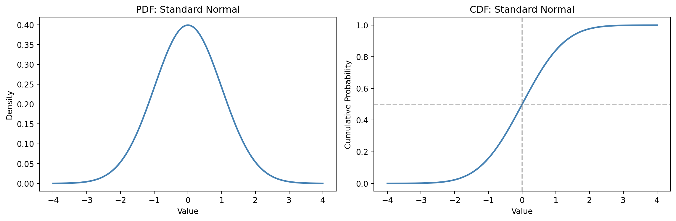
The CDF is the most useful of the three, because it lets you answer range questions directly (@fig-cdf-example). For continuous distributions, the probability of a value falling between $a$ and $b$ is simply $F(b) - F(a)$. For discrete distributions, be careful with the endpoints: $F(b) - F(a) = P(a < X \leq b)$, which excludes the left boundary. If you need $P(a \leq X \leq b)$ for integer-valued data, use $F(b) - F(a - 1)$.
```{python}
#| label: fig-cdf-example
#| echo: true
#| fig-cap: "The CDF transforms a distribution into cumulative probabilities, making range queries trivial."
#| fig-alt: "Two-panel figure. The left panel shows the standard normal PDF as a symmetric bell curve. The right panel shows the corresponding S-shaped CDF, rising from 0 to 1, with dashed guide lines marking the median at x=0 and cumulative probability 0.5."
fig, (ax1, ax2) = plt.subplots(1, 2, figsize=(12, 4))
fig.patch.set_alpha(0)

x = np.linspace(-4, 4, 300)
norm = stats.norm(loc=0, scale=1)

# PDF — shade P(X <= 0) to link visually with CDF(0) = 0.5
ax1.plot(x, norm.pdf(x), '#0072B2', linewidth=2)
x_shade = np.linspace(-4, 0, 200)
ax1.fill_between(x_shade, norm.pdf(x_shade), alpha=0.25, color='#0072B2',
                 label='P(X ≤ 0) = 0.5')
ax1.set_title('PDF: Standard Normal')
ax1.set_ylabel('Density')
ax1.set_xlabel('Value')
ax1.legend(fontsize=9)

# CDF
ax2.plot(x, norm.cdf(x), '#0072B2', linewidth=2)
ax2.axhline(y=0.5, color='grey', linestyle='--', alpha=0.7)
ax2.axvline(x=0, color='grey', linestyle='--', alpha=0.7)
ax2.annotate('CDF(0) = 0.5\n(same area as shading)',
             xy=(0, 0.5), xytext=(1.3, 0.35),
             arrowprops=dict(arrowstyle='->', color='grey'),
             fontsize=9, color='#555555')
ax2.set_title('CDF: cumulative probability up to x')
ax2.set_ylabel('Cumulative probability')
ax2.set_xlabel('Value')

for ax in (ax1, ax2):
    ax.patch.set_alpha(0)
    ax.spines['top'].set_visible(False)
    ax.spines['right'].set_visible(False)

plt.tight_layout()
plt.show()
```
```{python}
#| label: cdf-queries
#| echo: true
norm = stats.norm(loc=0, scale=1)

# Range query: P(-1 < X ≤ 1) — for continuous distributions, same as P(-1 ≤ X ≤ 1)
prob = norm.cdf(1) - norm.cdf(-1)
print(f"P(-1 < X ≤ 1) = {prob:.4f}")

# Tail query: P(X > 2) — "how unusual is a value above 2?"
print(f"P(X > 2) = {1 - norm.cdf(2):.4f}")

# Inverse query: "what value marks the 95th percentile?"
print(f"95th percentile = {norm.ppf(0.95):.4f}")
```
That last function, `ppf`, is scipy's name for the **quantile function** (the inverse of the CDF). It answers: *given a probability, what value corresponds to it?* If you've ever read a percentile off a Grafana dashboard, you've used the quantile function. You'll use `ppf` constantly when computing confidence intervals in later chapters.
::: {.callout-note}
## Engineering Bridge
If you've designed APIs, this pattern should look familiar. `scipy.stats` uses a class hierarchy: a base class `rv_generic` defines the shared interface (`.cdf()`, `.ppf()`, `.rvs()` for random samples, `.mean()`, `.var()`), while `rv_discrete` adds `.pmf()` and `rv_continuous` adds `.pdf()`. Every distribution — `binom`, `poisson`, `norm`, `expon`, `uniform` — inherits from the appropriate branch. You learn the interface once, and it works for every distribution. It's polymorphism applied to probability. (One quirk: `stats.norm` isn't itself a class. It's a pre-created *instance* of the class `norm_gen` (a subclass of `rv_continuous`), exposed at module level under a lowercase name. So `stats.norm(0, 1)` isn't instantiating a class — it's calling that instance, which returns a *frozen* distribution with the parameters baked in. It constructs an object even though it doesn't look like it.)
:::
::: {.callout-tip}
## Author's Note
There's something unexpectedly satisfying about the `scipy.stats` interface. In most engineering work, uncertainty is something you handle defensively: retry logic, circuit breakers, fallback values. Here, uncertainty is an *object with methods*. You can query it, invert it, sample from it. The distribution is not a problem to be managed but a thing you can manipulate precisely. The shift from defensive handling to precise manipulation is a surprisingly useful mental model to carry forward.
:::
## A tour of the essential distributions {#sec-distribution-tour}
You don't need to memorise dozens of distributions. In practice, a handful cover the vast majority of situations you'll encounter. What matters is developing an intuition for *which* distribution fits *which* kind of process.
### Normal (Gaussian) {#sec-normal}
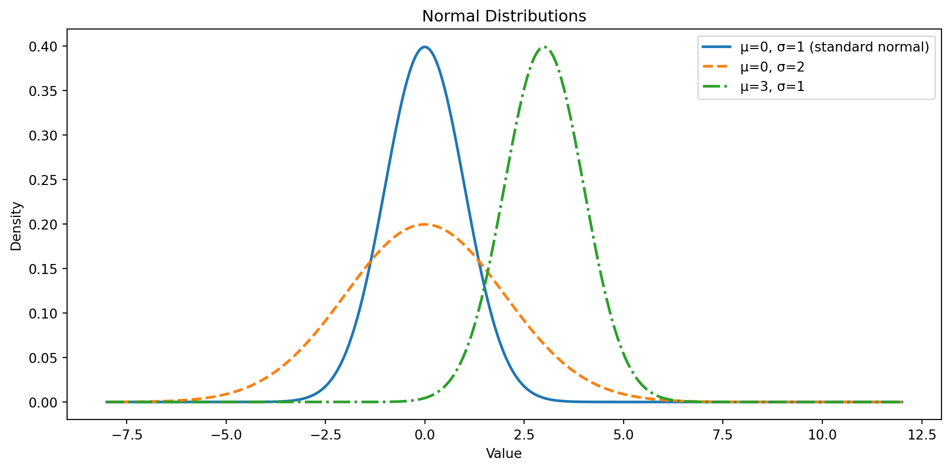
The normal distribution is the workhorse of statistics. If you've ever heard "bell curve," this is it — symmetric around a central value, tapering off equally in both directions. It's fully described by two parameters: the mean $\mu$ (where it's centred) and the standard deviation $\sigma$ (how spread out it is). (If Greek letters or the $X \sim \mathcal{N}(\mu, \sigma^2)$ shorthand are unfamiliar, @sec-greek-letters and @sec-distribution-notation in Appendix A are quick references.) It arises naturally whenever many small, independent effects add together — which turns out to be surprisingly often.
$$
f(x) = \frac{1}{\sigma\sqrt{2\pi}} \exp\left(-\frac{(x - \mu)^2}{2\sigma^2}\right)
$$
In plain English: values near $\mu$ are most likely, and the probability drops off symmetrically as you move away. For the normal distribution specifically, about 68% of values fall within one $\sigma$ of the mean, 95.4% within two, and 99.7% within three. This is often summarised as the "68-95-99.7 rule," though be warned: exact 95% coverage requires $\pm 1.96$ standard deviations, not exactly $\pm 2$. The difference matters when computing confidence intervals later. This pattern is unique to the normal's bell shape — other distributions with the same standard deviation will not follow it. @fig-normal-distribution shows how the two parameters move and stretch the curve.
```{python}
#| label: fig-normal-distribution
#| echo: true
#| fig-cap: "Normal distributions with different means and standard deviations. The shape is always symmetric and bell-shaped."
#| fig-alt: "Three overlapping normal distribution curves with distinct colours and linestyles. The standard normal (mean 0, SD 1, solid blue line) is the tallest and narrowest. A wider curve with the same mean but SD 2 (dashed orange line) is shorter and more spread out. A third curve with mean 3 and SD 1 (dash-dot green line) has the same shape as the standard normal but is shifted to the right."
x = np.linspace(-8, 12, 300)
fig, ax = plt.subplots(figsize=(10, 5))
fig.patch.set_alpha(0)
ax.patch.set_alpha(0)

params = [(0, 1, 'μ=0, σ=1 (standard normal)', '-', '#0072B2'),
          (0, 2, 'μ=0, σ=2 (wider spread)', '--', '#E69F00'),
          (3, 1, 'μ=3, σ=1 (shifted right)', '-.', '#009E73')]

for mu, sigma, label, ls, colour in params:
    ax.plot(x, stats.norm(mu, sigma).pdf(x), linewidth=2, label=label,
            linestyle=ls, color=colour)

ax.set_xlabel('Value')
ax.set_ylabel('Density')
ax.set_title('Same family, different centre and spread')
ax.spines['top'].set_visible(False)
ax.spines['right'].set_visible(False)
ax.yaxis.grid(True, linestyle=':', alpha=0.4, color='grey')
ax.set_axisbelow(True)
ax.legend()
plt.tight_layout()
plt.show()
```
When to reach for it: measurements that result from many small, independent additive effects — heights, test scores, measurement errors, aggregated metrics. The **Central Limit Theorem** (which we'll explore properly in the chapter on probability) tells us that when you average many independent observations, the distribution of that average tends towards a normal — regardless of the underlying distribution's shape. This is why the normal distribution appears everywhere.
When *not* to use it: data that is bounded (can't go below zero), heavily skewed (asymmetric, with a long tail stretching in one direction), or has thick tails (extreme values are more probable than a normal distribution would predict). If your data has a hard floor or ceiling, the normal distribution is the wrong type. A common alternative for positive, right-skewed data is the **lognormal** distribution — where the *logarithm* of the data follows a normal distribution. Response latencies, file sizes, and request durations often follow a lognormal distribution. You'll see it used in @sec-descriptive-stats.
### Binomial {#sec-binomial}
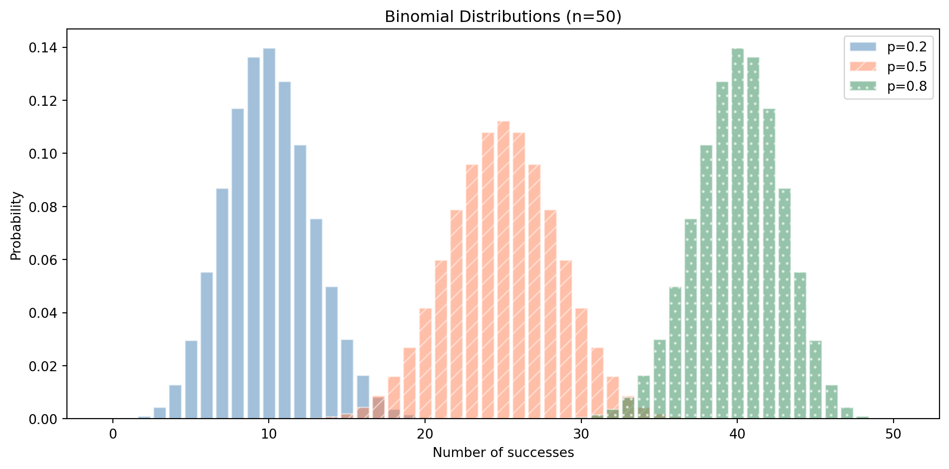
The binomial distribution models the number of successes in a fixed number of independent yes/no trials (independent meaning the outcome of one trial doesn't affect any other), each with the same probability of success. It has two parameters: $n$ (number of trials) and $p$ (probability of success on each trial).
$$
P(X = k) = \binom{n}{k} p^k (1-p)^{n-k}
$$
Here $\binom{n}{k}$ (read "$n$ choose $k$") counts the number of ways to pick $k$ successes out of $n$ trials. In code terms: run a boolean experiment $n$ times, count how many return `True`. Each individual yes/no experiment is called a **Bernoulli trial**. @fig-binomial-distribution shows how the success probability $p$ shifts where the mass concentrates.
```{python}
#| label: fig-binomial-distribution
#| echo: true
#| fig-cap: "Binomial distributions model 'how many successes out of n trials?' Different probabilities produce different shapes."
#| fig-alt: "Bar chart showing three binomial distributions with n=50 and different success probabilities. The p=0.2 distribution (blue) peaks around 10, p=0.5 (orange) is symmetric and peaks at 25, and p=0.8 (green) peaks around 40. Each uses a distinct colour and hatching pattern for accessibility."
fig, ax = plt.subplots(figsize=(10, 5))
fig.patch.set_alpha(0)
ax.patch.set_alpha(0)
n = 50
x = np.arange(0, n + 1)

hatches = ['', '//', '..']
for (p, c), h in zip([(0.2, '#0072B2'), (0.5, '#E69F00'), (0.8, '#009E73')], hatches):
    ax.bar(x, stats.binom(n, p).pmf(x), alpha=0.5, label=f"p={p}", color=c,
           edgecolor='white', hatch=h)

ax.set_xlabel('Number of successes')
ax.set_ylabel('Probability')
ax.set_title(f"The success probability sets where the count concentrates (n={n})")
ax.spines['top'].set_visible(False)
ax.spines['right'].set_visible(False)
ax.yaxis.grid(True, linestyle=':', alpha=0.4, color='grey')
ax.set_axisbelow(True)
ax.legend()
plt.tight_layout()
plt.show()
```
When to reach for it: A/B test conversion counts, the number of defective items in a batch, the number of servers that respond within an SLO, pass/fail rates in a test suite. Any time you're counting successes out of a known total with a fixed success rate per trial.
### Poisson {#sec-poisson}
The Poisson distribution models the number of events occurring in a fixed interval of time or space, when events happen independently at a constant average rate. It has a single parameter: $\lambda$, the expected number of events.
$$
P(X = k) = \frac{\lambda^k e^{-\lambda}}{k!}
$$
In words: the probability of seeing exactly $k$ events, given an expected rate of $\lambda$. You don't need to compute this by hand — `poisson.pmf(k)` does it for you.
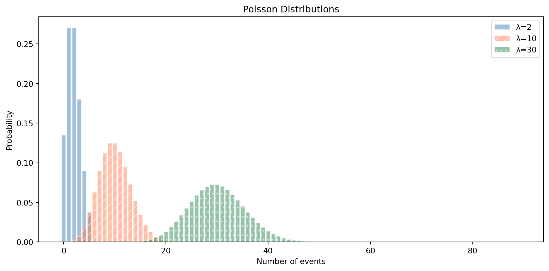
We already met this in @sec-stochastic with website visitors. The Poisson is notable because its single parameter $\lambda$ controls both the centre *and* the spread of the distribution — the **variance** (the average squared deviation from the mean, a measure of how spread out the distribution is) equals the mean. This is also a diagnostic tool: if your count data has a variance much larger than its mean (a common phenomenon called *overdispersion*), the Poisson model is a poor fit. @fig-poisson-distribution shows how the shape changes as $\lambda$ grows.
```{python}
#| label: fig-poisson-distribution
#| echo: true
#| fig-cap: "Poisson distributions for different event rates. As λ increases, the distribution becomes more symmetric and approximately normal."
#| fig-alt: "Line chart showing three Poisson distributions with distinct colours and linestyles. Lambda=2 (solid blue line) is heavily right-skewed with most mass near zero. Lambda=10 (dashed orange line) is moderately skewed and centred around 10. Lambda=30 (dash-dot green line) is nearly symmetric and bell-shaped, centred around 30."
fig, ax = plt.subplots(figsize=(10, 5))
fig.patch.set_alpha(0)
ax.patch.set_alpha(0)

x_max = 55
x = np.arange(0, x_max)
colours = ['#0072B2', '#E69F00', '#009E73']
linestyles = ['-', '--', '-.']

for lam, c, ls in zip([2, 10, 30], colours, linestyles):
    pmf_vals = stats.poisson(lam).pmf(x)
    ax.plot(x, pmf_vals, color=c, linestyle=ls, linewidth=2, label=f"λ={lam}")
    ax.fill_between(x, pmf_vals, alpha=0.15, color=c)

ax.set_xlabel('Number of events')
ax.set_ylabel('Probability')
ax.set_title('Poisson: as λ grows, the distribution becomes approximately normal')
ax.set_xlim(-1, x_max)
ax.spines['top'].set_visible(False)
ax.spines['right'].set_visible(False)
ax.yaxis.grid(True, linestyle=':', alpha=0.4, color='grey')
ax.set_axisbelow(True)
ax.legend()
plt.tight_layout()
plt.show()
```
When to reach for it: events per time period — requests per second, errors per hour, customer arrivals per day, commits per week. The key assumptions are that events are independent and the rate is constant. If those assumptions break down (events cluster, or the rate changes over time), you need a different model.
The Poisson also arises as an approximation to the Binomial: when $n$ is large and $p$ is small (many trials, each with a tiny probability), the Binomial($n$, $p$) is well-approximated by a Poisson($\lambda = np$). If you have thousands of requests each with a tiny failure probability, you can use the simpler Poisson instead of the Binomial.
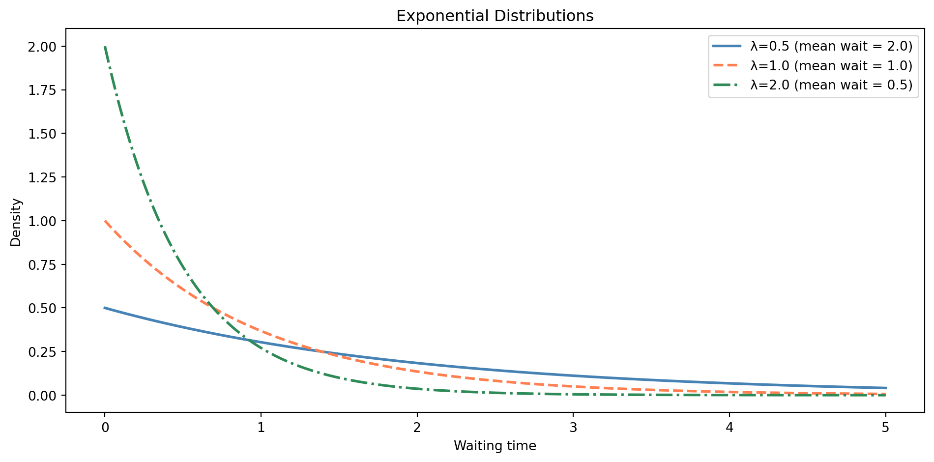
### Exponential {#sec-exponential}
If the Poisson distribution models *how many* events happen in a time period, the exponential distribution models *how long you wait* between events. They're two sides of the same process. The parameter $\lambda$ is the same rate parameter — if events arrive at rate $\lambda$ per unit time, the waiting time between events follows an exponential distribution.
$$
f(x) = \lambda e^{-\lambda x}, \quad x \geq 0
$$
In words: the density starts high at $x = 0$ and decays exponentially — short waits are most common, long waits are increasingly rare. Notice the domain constraint: $x \geq 0$. You can't have a negative waiting time.
A word of caution: `scipy.stats` parameterises the exponential using `scale = 1/λ` (the mean waiting time), not the rate $\lambda$ directly. If the rate is 2 events per hour, you write `stats.expon(scale=0.5)`, not `stats.expon(2)`. Getting this wrong is one of the most common `scipy` mistakes. @fig-exponential-distribution shows how a higher rate compresses the waiting times towards zero.
```{python}
#| label: fig-exponential-distribution
#| echo: true
#| fig-cap: "Exponential distributions are always right-skewed and bounded below by zero. Higher rates mean shorter expected waiting times."
#| fig-alt: "Line chart showing three exponential distribution curves with distinct colours and linestyles. Lambda=0.5 (solid blue line) has a gentle decay (mean wait 2.0), lambda=1.0 (dashed orange line) decays faster (mean wait 1.0), and lambda=2.0 (dash-dot green line) drops steeply (mean wait 0.5). All start at their highest density at x=0 and decay towards zero."
fig, ax = plt.subplots(figsize=(10, 5))
fig.patch.set_alpha(0)
ax.patch.set_alpha(0)
x = np.linspace(0, 5, 300)

# scipy parameterises exponential by scale = 1/lambda
for lam, c, ls in [(0.5, '#0072B2', '-'), (1.0, '#E69F00', '--'), (2.0, '#009E73', '-.')]:
    ax.plot(x, stats.expon(scale=1/lam).pdf(x), linewidth=2,
            label=f"λ={lam} (mean wait = {1/lam:.1f})", color=c, linestyle=ls)

ax.set_xlabel('Waiting time')
ax.set_ylabel('Density')
ax.set_title('Higher rates mean shorter waits')
ax.spines['top'].set_visible(False)
ax.spines['right'].set_visible(False)
ax.yaxis.grid(True, linestyle=':', alpha=0.4, color='grey')
ax.set_axisbelow(True)
ax.legend()
plt.tight_layout()
plt.show()
```
When to reach for it: time between failures, time between customer arrivals, time between events in a log stream. The exponential distribution has a remarkable property called **memorylessness**: the probability of waiting another $t$ minutes doesn't depend on how long you've already waited. This makes it a natural model for processes with no "ageing" — the system doesn't wear out over time.
```{python}
#| label: memorylessness
#| echo: true
# Memorylessness: P(wait > 15 | already waited 5) = P(wait > 10)
exp_dist = stats.expon(scale=10)  # mean wait = 10 minutes

p_conditional = (1 - exp_dist.cdf(15)) / (1 - exp_dist.cdf(5))
p_unconditional = 1 - exp_dist.cdf(10)
print(f"P(X > 15 | X > 5) = {p_conditional:.4f}")
print(f"P(X > 10)         = {p_unconditional:.4f}")
```
::: {.callout-note}
## Engineering Bridge
If you've ever configured retry logic with exponential backoff, you've been working with the exponential distribution's **survival function** — the complement of the CDF, giving the probability of *still waiting* after time $t$: $P(X > t) = e^{-\lambda t}$. And if you've sized queues or load balancers, the Poisson–exponential pair is what underlies the capacity maths: arrivals are Poisson-distributed, service times are exponential, and together they determine how long your queue will get.
:::
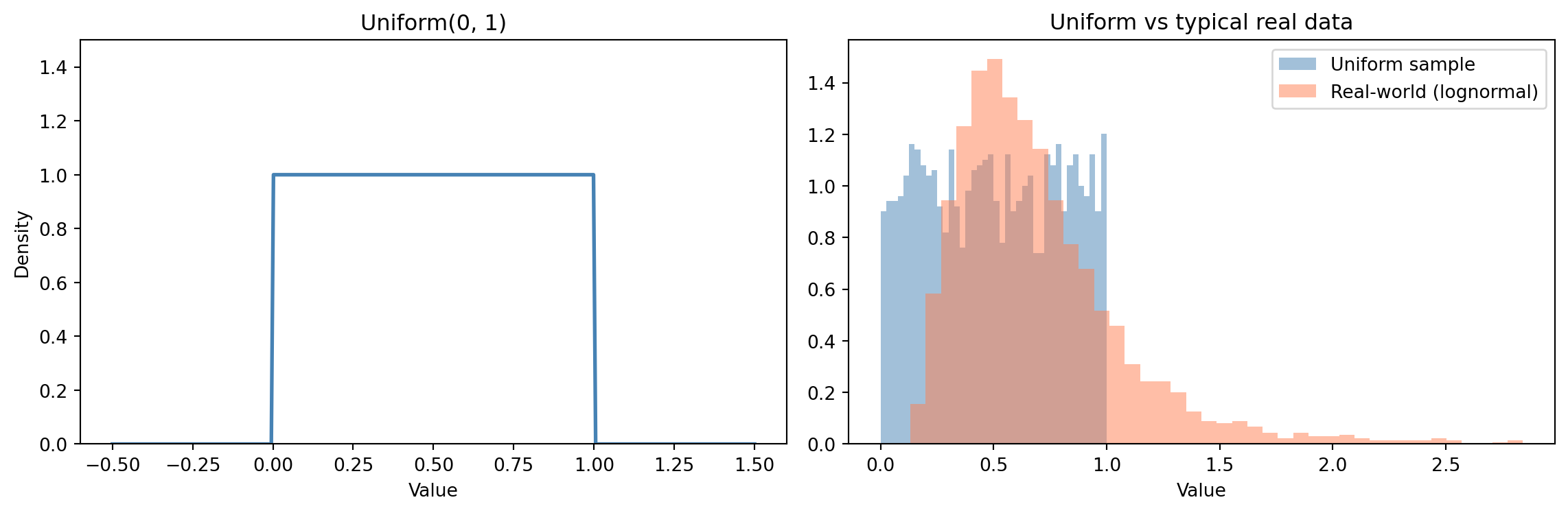
### Uniform {#sec-uniform}
The uniform distribution is the simplest: every value in a range is equally likely. It has two parameters, $a$ and $b$, defining the interval.
$$
f(x) = \frac{1}{b - a}, \quad a \leq x \leq b
$$
In words: the density is a constant: every value in $[a, b]$ is equally likely, and the total area under the curve is 1.
This is what `random.uniform(a, b)` gives you (and `random.randint(a, b)` is its discrete counterpart — the discrete uniform). Like the exponential, `scipy.stats` has a surprising parameterisation: `stats.uniform(loc=a, scale=b-a)`, not `stats.uniform(a, b)`. So `Uniform(0, 1)` happens to be `stats.uniform(0, 1)` only because `loc=0` and `scale=1` coincide with the endpoints; `Uniform(2, 5)` is `stats.uniform(loc=2, scale=3)`.
The uniform is rarely a good model for real-world data, as @fig-uniform-distribution makes plain, but it's fundamental as a building block. Random number generators produce uniform samples, which are then *transformed* into other distributions — feed uniform random numbers through a distribution's PPF, and out come samples from that distribution.
```{python}
#| label: fig-uniform-distribution
#| echo: true
#| fig-cap: "The uniform distribution assigns equal probability to every value in a range — a useful starting point, but rarely what real data looks like."
#| fig-alt: "Two-panel figure. The left panel shows the Uniform(0,1) PDF as a flat horizontal line at density 1.0 between 0 and 1. The right panel compares histograms of a uniform sample (flat) and an exponential sample (right-skewed, concentrated near zero with a long tail), showing that real-world data is rarely uniform."
rng = np.random.default_rng(42)
fig, (ax1, ax2) = plt.subplots(1, 2, figsize=(12, 4))
fig.patch.set_alpha(0)

# Uniform PDF
x = np.linspace(-0.5, 1.5, 300)
ax1.plot(x, stats.uniform(0, 1).pdf(x), '#0072B2', linewidth=2)
ax1.set_title('Uniform(0, 1)')
ax1.set_xlabel('Value')
ax1.set_ylabel('Density')
ax1.set_ylim(0, 1.3)

# Uniform sample vs real data (exponential, already introduced this chapter)
uniform_samples = rng.uniform(0, 1, 2000)
expo_samples = rng.exponential(scale=0.5, size=2000)
ax2.hist(uniform_samples, bins=40, alpha=0.5, color='#0072B2',
         label='Uniform sample', density=True)
ax2.hist(expo_samples[expo_samples < 3], bins=40, alpha=0.5,
         color='#E69F00', label='Real-world (exponential)', density=True)
ax2.set_title('Real data is rarely uniform')
ax2.set_xlabel('Value')
ax2.set_ylabel('Density')
ax2.legend()

for ax in (ax1, ax2):
    ax.patch.set_alpha(0)
    ax.spines['top'].set_visible(False)
    ax.spines['right'].set_visible(False)

plt.tight_layout()
plt.show()
```
When to reach for it: random seeds, shuffling, and Monte Carlo methods (using random draws to approximate quantities that are hard to compute exactly). In modelling, the uniform distribution represents *maximum ignorance* — when you genuinely have no reason to prefer any value over another.
## Choosing the right distribution {#sec-choosing}
With these five distributions in your toolkit, you can model a wide range of real-world phenomena. The choice comes down to understanding the nature of the quantity you're modelling, and @tbl-distribution-choice summarises it.
| Question | Distribution | Engineering example |
| :--- | :--- | :--- |
| Counting successes out of *n* trials? | Binomial(*n*, *p*) | 8/10 canary nodes healthy |
| Counting events in a time/space interval? | Poisson($\lambda$) | 47 errors in the last hour |
| Measuring time between events? | Exponential($\lambda$) | 3.2 hours between incidents |
| Measuring a quantity affected by many small factors? | Normal($\mu$, $\sigma$) | Aggregated daily latency |
| All values in a range equally likely? | Uniform(*a*, *b*) | Random partition assignment |
: A quick mental model for choosing distributions. {#tbl-distribution-choice}
Real-world data often comes from a *mixture* of processes — cache hits and cache misses, fast-path and slow-path requests — producing distributions with multiple peaks or heavy tails that no single distribution captures well. Recognising when you're looking at a mixture is an important diagnostic skill that we'll develop in @sec-descriptive-stats.
::: {.callout-note}
## Engineering Bridge
When you set a monitoring alert at the 99th percentile, you're implicitly making a distributional assumption. You're saying: "values beyond this point are so unlikely under normal operation that they warrant investigation." Understanding the distribution lets you set thresholds that balance false positives against missed incidents. If your data is normally distributed, the 99th percentile is about 2.3 standard deviations above the mean. If it's exponentially distributed, it's much further out. The wrong distributional assumption gives you the wrong threshold — and either a pager that never fires or one that never stops.
:::
But here's the critical thing: the distribution is a *modelling choice*, not a fact about the universe. When you say "this data follows a normal distribution," you're saying "a normal distribution is a useful approximation of the data-generating process." Your model is always a simplification of the process itself. Sometimes the data will reveal that your choice was wrong — we'll cover how to check this with goodness-of-fit tests and diagnostic plots in later chapters.
::: {.callout-tip}
## Author's Note
There's a temptation to search for the "correct" distribution for each dataset, as though there's always one right answer. In practice, multiple distributions might fit the data reasonably well, and the choice often depends on what questions you're trying to answer. A normal approximation to a binomial might be perfectly adequate for a quick calculation, even though the binomial is more "correct." The real question is: what goes wrong if you pick the wrong one? Usually, your confidence intervals will be too wide or too narrow, or your tail probabilities will be off. That's why we always check — but the check comes later. This is engineering pragmatism applied to statistics: use the model that's good enough for the decision at hand.
:::
## Parameters are configuration {#sec-parameters}
Once you've chosen a distribution family, you still need to pin down the specific values that configure it. Every distribution is parameterised. The normal distribution takes $\mu$ and $\sigma$. The Poisson takes $\lambda$. The binomial takes $n$ and $p$. These parameters are the *configuration* of the distribution — they control its shape, location, and spread.
In many real-world problems, we *know* the distribution family (the "type") but we *don't know* the parameters (the "configuration"). If distributions are types and parameters are configuration, then statistical inference is reverse-engineering the config from the observed behaviour — something you've done every time you diagnosed a misconfigured service from its symptoms. We'll build this out properly in Part 2.
::: {.callout-note}
## Engineering Bridge
The twelve-factor app draws a hard line between three things: *code* (version-controlled, identical across deployments), *config* (varies by environment, injected from outside), and *data* (the running content the system manages). A statistical model lines up against the same three boxes. The distribution family — Normal, Poisson, Binomial — is the *code*: a structural commitment baked in at design time, the same across every dataset you apply it to. The parameters — $\mu$, $\sigma$, $\lambda$, $p$ — are the *config*: they vary with context (this dataset, this period, this user segment) and have to be supplied from outside the model, either from prior knowledge or from data. The observations are the *data*: the running content the model processes.
The trichotomy clarifies what statistical inference is doing. You're not changing the code (the family); you're discovering the right config (the parameters) for this environment. And as with twelve-factor configuration, getting the right values into the right slot is what turns a generic model into one fit for the specific system in front of you.
:::
```{python}
#| label: parameter-estimation-preview
#| echo: true
rng = np.random.default_rng(42)

# The "true" process: response times follow an exponential distribution
# with a mean of 50ms (lambda = 1/50 = 0.02)
true_mean = 50
response_times = stats.expon(scale=true_mean).rvs(size=500, random_state=rng)

# We observe the data, but don't know the true parameter.
# Our best estimate of the mean is the sample mean (the ordinary average
# of the observed data). This is called a "maximum likelihood estimate" —
# a concept we'll formalise in Part 2.
estimated_mean = np.mean(response_times)
print(f"True mean:      {true_mean} ms")
print(f"Estimated mean: {estimated_mean:.1f} ms")
print(f"Sample size:    {len(response_times)}")
```
The estimate is close but not exact. With more data, it would get closer. This tension — between the true parameter and our estimate of it — is where the entire field of statistical inference lives.
## Worked example: modelling deployment failures {#sec-worked-example-deployments}
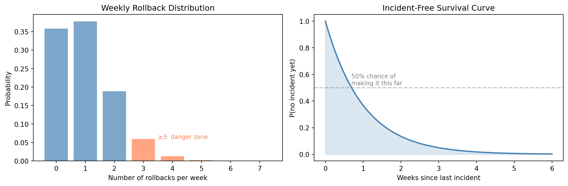
Let's bring this together with a realistic scenario. Your team deploys to production roughly 20 times per week. Historically, about 5% of deployments cause an incident that requires a rollback. You want to answer three questions:
1. What's the probability of *zero* rollbacks in a given week?
2. What's the probability of 3 or more rollbacks?
3. How many rollback-free weeks can you expect between incidents?
```{python}
#| label: worked-example
#| echo: true
# Model: each deployment is a Bernoulli trial (success/failure)
# Number of rollbacks in 20 deployments → Binomial(n=20, p=0.05)
n_deployments = 20
p_failure = 0.05
rollbacks = stats.binom(n=n_deployments, p=p_failure)

# Q1: P(zero rollbacks this week)
print(f"P(0 rollbacks)  = {rollbacks.pmf(0):.4f}")

# Q2: P(3 or more rollbacks) = 1 - P(X <= 2)
print(f"P(≥3 rollbacks) = {1 - rollbacks.cdf(2):.4f}")

# Q3: Time between incidents
# With n=20 and p=0.05, expected failures per week = np = 1.0
# Since n is moderate and p is small, Binomial(20, 0.05) ≈ Poisson(λ=1)
# As we saw in the Exponential section: if event counts are Poisson,
# waiting times between events are Exponential (two views of the same process).
# (This assumes deployments happen at a roughly constant rate — a simplification)
time_between = stats.expon(scale=1)  # scale = 1/λ = 1 week

print(f"\nExpected time between incidents: {time_between.mean():.1f} weeks")
print(f"P(>2 weeks without incident)   = {1 - time_between.cdf(2):.4f}")
print(f"P(>4 weeks without incident)   = {1 - time_between.cdf(4):.4f}")
```
```{python}
#| label: fig-worked-example-viz
#| echo: true
#| fig-cap: "Left: probability of k rollbacks per week. Right: probability of surviving t weeks without an incident."
#| fig-alt: "Two-panel figure. The left panel is a bar chart of weekly rollback counts, with bars at 0 through 7. Most probability mass is at 0 and 1 rollback; bars at 3 and above are highlighted in orange as the danger zone. The right panel shows an exponential survival curve in blue declining from 1.0, with a dashed line at 50% probability corresponding to about 0.7 weeks."
fig, (ax1, ax2) = plt.subplots(1, 2, figsize=(12, 4))
fig.patch.set_alpha(0)

# Left: Binomial PMF for weekly rollbacks
n, p = 20, 0.05
x = np.arange(0, 7)
rollbacks = stats.binom(n, p)
bar_colors = ['#E69F00' if k >= 3 else '#0072B2' for k in x]
ax1.bar(x, rollbacks.pmf(x), color=bar_colors, alpha=0.7)
ax1.set_xlabel('Number of rollbacks per week')
ax1.set_ylabel('Probability')
ax1.set_title('Most weeks see zero or one rollback')
ax1.annotate('≥3: danger zone', xy=(3.5, 0.06), fontsize=9, color='#c0392b')

# Right: Exponential survival function
t = np.linspace(0, 6, 200)
survival = stats.expon(scale=1)
ax2.plot(t, 1 - survival.cdf(t), '#0072B2', linewidth=2)
ax2.fill_between(t, 1 - survival.cdf(t), alpha=0.2, color='#0072B2')
ax2.set_xlabel('Weeks since last incident')
ax2.set_ylabel('P(no incident yet)')
ax2.set_title('The chance of staying incident-free decays fast')
ax2.axhline(y=0.5, color='grey', linestyle='--', alpha=0.7)
ax2.axvline(x=0.693, color='grey', linestyle=':', alpha=0.5)
ax2.annotate('50% chance of\nmaking it this far',
             xy=(0.69, 0.52), fontsize=9, color='#555555', ha='left')

for ax in (ax1, ax2):
    ax.patch.set_alpha(0)
    ax.spines['top'].set_visible(False)
    ax.spines['right'].set_visible(False)

plt.tight_layout()
plt.show()
```
@fig-worked-example-viz puts both views side by side. Notice how we used two different distributions for the same underlying process. The *binomial* models the count of failures in a fixed number of trials. The *exponential* models the waiting time between failures. Same process, different questions, different distribution types. Choosing the right distribution is really about choosing the right framing for your question.
## Summary {#sec-distributions-summary}
1. **Distributions are the type system of uncertainty** — they constrain what values are possible and assign probabilities to outcomes, just as types constrain the domain and behaviour of variables.
2. **Discrete distributions (PMF) assign probability to points; continuous distributions (PDF) assign density to intervals** — the distinction mirrors the integer/float divide, and determines which mathematical tools apply.
3. **Five distributions cover most practical situations** — Normal (measurements), Binomial (success counts), Poisson (event counts), Exponential (waiting times), and Uniform (maximum ignorance). Learn to recognise which process maps to which distribution.
4. **Distributions expose a consistent API** — PMF/PDF, CDF, PPF, and random sampling. Learn the interface once through `scipy.stats`, and you can work with any distribution.
5. **Parameters are configuration, not truth** — choosing a distribution family is a modelling decision; estimating its parameters from data is the domain of statistical inference.
## Exercises {#sec-distributions-exercises}
1. Your API receives roughly 100 requests per minute. Using the Poisson distribution, calculate the probability of receiving more than 120 requests in a given minute. Then simulate 10,000 minutes and verify your answer empirically. How close is the simulation to the analytical result?
2. A deployment pipeline has 8 stages, each with a 98% pass rate (independent of each other). Model the number of stages that pass using a binomial distribution. What is the probability that all 8 stages pass? What is the probability that at least 6 pass? For the second question, explain why the full binomial distribution is necessary — why can't you answer it by multiplying $0.98$ by itself repeatedly?
3. Plot the PDFs of a Normal(50, 10), an Exponential with mean 50, and a Uniform(0, 100) on the same axes. All three have a mean of 50. What's visually different about them, and what does that tell you about the kind of uncertainty each one represents?
4. **Conceptual:** The type system analogy says distributions are like types. Where does this analogy break down? Consider: can a value "belong to" more than one distribution? Can you have subtyping or inheritance relationships between distributions? What would a "type error" look like in the statistical sense?