---
# Content: CC BY-NC-SA 4.0 | Code: MIT - see /LICENSE.md
title: "Probability: from error handling to inference"
---
{{< include /_common-imports.qmd >}}
## Composing uncertainty like error handling {#sec-probability}
Every engineer who has designed a distributed system has done probability without calling it that. Suppose you have three independent services, each with 99.5% uptime. What's the probability that all three are up simultaneously?
```{python}
#| label: uptime-composition
#| echo: true
# Three independent services, each 99.5% available
p_up = 0.995

# All three up: multiply independent probabilities (AND rule)
p_all_up = p_up ** 3
print(f"P(all three up)  = {p_all_up:.6f}  ({p_all_up * 100:.2f}%)")

# At least one down: complement rule
p_at_least_one_down = 1 - p_all_up
print(f"P(≥1 down)       = {p_at_least_one_down:.6f}  ({p_at_least_one_down * 100:.2f}%)")
```
You've just used two rules of probability: the **multiplication rule** for independent events and the **complement rule**. These aren't abstract axioms; they're the same arithmetic you use when calculating error budgets and composing SLOs. The only difference is that statistics names the rules explicitly and extends them to situations where "independence" doesn't hold and events aren't as clean as "up or down."
Distributions (@sec-distributions) and descriptive statistics (@sec-descriptive-stats) gave us tools for summarising data we already had. Probability works in the other direction: it gives us the rules for reasoning about *what data we should expect* given what we know about the process that generates it.
The uptime example was simple because the events were binary, independent, and we knew the probabilities exactly. Real problems rarely stay this clean. What if deployments fail more often during peak hours? What if service failures are correlated? The rules of probability give us the general toolkit for handling these complications.
## The rules of probability {#sec-probability-rules}
All of probability rests on a small set of rules. If you know these four, you can derive almost everything else.
**Complement rule.** The probability of something *not* happening is one minus the probability of it happening.
$$
P(\text{not } A) = 1 - P(A)
$$
You use this instinctively. "99.5% uptime" means "0.5% downtime." The complement rule is why error budgets work: the budget *is* $1 - \text{SLO}$.
**Addition rule (OR).** The probability of *either* $A$ or $B$ occurring is the sum of their individual probabilities, minus the overlap (to avoid double-counting).
$$
P(A \cup B) = P(A) + P(B) - P(A \cap B)
$$
The $\cup$ symbol means "union" (OR) and $\cap$ means "intersection" (AND), the same set operations you'd find in any programming language. (Appendix A collects this notation for reference: @sec-probability-notation for the probability symbols and @sec-set-notation for the set operations.) If the events are mutually exclusive (they can't both happen), the intersection is empty and the formula simplifies to $P(A) + P(B)$.
**Multiplication rule (AND).** The probability of *both* $A$ and $B$ occurring depends on whether they're independent.
$$
P(A \cap B) = P(A) \times P(B \mid A)
$$
Here $P(B \mid A)$ means "the probability of $B$ given that $A$ has occurred"; we'll define this precisely in a moment. If $A$ and $B$ are independent (knowing $A$ happened tells you nothing about $B$), this simplifies to $P(A) \times P(B)$. That's the calculation we did with the three services. But independence is an assumption, not a given, and the failure modes are familiar: just as "independent" microservices often turn out to share a database, a network link, or a cloud availability zone, "independent" events can be driven by a hidden common cause. When independence breaks down, you need the full conditional version of the rule.
**Conditional probability.** The probability of $A$ given that $B$ has already occurred:
$$
P(A \mid B) = \frac{P(A \cap B)}{P(B)}
$$
In plain English: restrict your attention to the world where $B$ is true, then ask how often $A$ also happens.
Let's make this concrete. Imagine you've collected deployment outcomes across different times of day.
```{python}
#| label: joint-probability-table
#| echo: true
from scipy import stats

rng = np.random.default_rng(42)

# Simulate deployment outcomes by time of day
n = 1000
time_of_day = rng.choice(['off-peak', 'peak'], size=n, p=[0.6, 0.4])

# Failure rate is higher during peak hours
peak_mask = time_of_day == 'peak'
outcome = np.where(
    rng.random(n) < np.where(peak_mask, 0.10, 0.03),
    'failure', 'success'
)

deployments = pd.DataFrame({'time': time_of_day, 'outcome': outcome})

# Joint probability table: crosstab counts co-occurrences of two categorical
# variables; normalize='all' converts counts to proportions (joint probabilities)
joint = pd.crosstab(deployments['time'], deployments['outcome'], normalize='all')
print('Joint probability table:')
print(joint.round(4))

# Conditional probability: P(failure | peak)
peak_rows = deployments[deployments['time'] == 'peak']
p_failure_given_peak = (peak_rows['outcome'] == 'failure').mean()
print(f"\nP(failure | peak) = {p_failure_given_peak:.4f}")

# Compare with P(failure) overall
p_failure = (deployments['outcome'] == 'failure').mean()
print(f"P(failure)        = {p_failure:.4f}")
```
The table above is a **joint probability table**: each cell shows the probability of a particular combination of time and outcome. The conditional probability $P(\text{failure} \mid \text{peak})$ is notably higher than the overall failure rate. Time of day and deployment outcome aren't independent; knowing when a deployment happened changes your estimate of its outcome.
::: {.callout-note}
## Engineering Bridge
Conditional probability is the `WHERE` clause of probability. When you write `SELECT COUNT(*) FROM deployments WHERE time = 'peak' AND outcome = 'failure'` and divide by `SELECT COUNT(*) FROM deployments WHERE time = 'peak'`, you're computing $P(\text{failure} \mid \text{peak})$ exactly. The conditional restricts the denominator to a subset of the data, just like a `WHERE` clause restricts the rows. If you've ever computed a metric "sliced by" some dimension in a dashboard, you've computed a conditional probability.
:::
## Bayes' theorem: updating beliefs {#sec-bayes}
The conditional probability formula can be rearranged into one of the most useful results in statistics. Starting from:
$$
P(A \mid B) = \frac{P(A \cap B)}{P(B)} \quad \text{and} \quad P(B \mid A) = \frac{P(A \cap B)}{P(A)}
$$
we can substitute to get **Bayes' theorem**:
$$
P(A \mid B) = \frac{P(B \mid A) \times P(A)}{P(B)}
$$
Each term has a name. In the Bayesian framing, where $A$ is a hypothesis and $B$ is observed data: $P(A)$ is the **prior**: what you believed before seeing the data. $P(B \mid A)$ is the **likelihood**: how probable the data is if your hypothesis is correct. $P(A \mid B)$ is the **posterior**: your updated belief after seeing the data. And $P(B)$ is the **normalising constant** (also called the "evidence") that ensures the posterior is a valid probability.
This isn't just algebra. Bayes' theorem describes a *process*: start with a belief, observe data, update the belief. It's the formal machinery for learning from evidence.
Here's a scenario every on-call engineer has lived. Your monitoring system fires an alert. Should you wake up the team?
```{python}
#| label: bayes-alerting
#| echo: true
# Monitoring alert scenario
p_incident = 0.02           # 2% of the time, there's a real incident
p_alert_given_incident = 0.95   # Alert fires 95% of the time when there IS an incident
p_alert_given_no_incident = 0.05  # Alert fires 5% of the time when there ISN'T one

# P(alert) via the law of total probability:
# enumerate every way an alert can fire, weight by probability of each path
p_alert = (
    p_alert_given_incident * p_incident +
    p_alert_given_no_incident * (1 - p_incident)
)

# Bayes' theorem: P(incident | alert)
p_incident_given_alert = (
    p_alert_given_incident * p_incident / p_alert
)

print(f"P(incident)          = {p_incident:.4f}")
print(f"P(alert)             = {p_alert:.4f}")
print(f"P(incident | alert)  = {p_incident_given_alert:.4f}")
print(f"\nWhen the alert fires, there's only a {p_incident_given_alert:.0%} chance "
      f"of a real incident.")
```
A detector with 95% **sensitivity** (it catches 95% of real incidents) and only a 5% false positive rate (it fires on 5% of *non-incidents*) still produces alerts that are mostly noise. Out of every 100 alerts that fire, roughly 72 are false alarms. Note that this 72% is the share of *alerts* that are false ($1 - \text{precision}$), not the 5% false positive rate discussed above — the two differ precisely because the base rate is so low. The prior dominates: real incidents are so rare (a **base rate** of $P(\text{incident}) = 0.02$) that even a low false positive rate generates more noise than signal. This is why alert fatigue is a mathematical inevitability when base rates are low and thresholds aren't adjusted.
Notice the denominator calculation in the code: we computed $P(\text{alert})$ by enumerating all the ways an alert can fire, via a real incident *or* via a false positive, and summing. This is the **law of total probability**, the probabilistic equivalent of handling every branch of an enum. You'll see this pattern whenever you need the denominator of Bayes' theorem.
::: {.callout-tip}
## Author's Note
The unsettling thing about this calculation is that the two numbers engineers normally use to evaluate a detector — sensitivity and false positive rate — are insufficient on their own. The base rate of the event dominates the posterior probability. A detector that looks excellent by any internal metric can still produce mostly-noise alerts in production, simply because real incidents are rarer than the false positive rate. The practical upshot: before evaluating any classifier or detector, the first question should be "what's the base rate?" If the answer is "very low," even a low false positive rate may not save you.
:::
We'll return to Bayesian reasoning as a full inference framework in *Bayesian inference: updating beliefs with evidence*. For now, the key insight is that probability isn't static; it updates as evidence arrives.
## From one sample to many: the sampling distribution {#sec-sampling-distribution}
Here's a question that doesn't come up in deterministic software but is central to statistics: *if you collected a different sample, how different would your answer be?*
In @sec-location, we computed the sample mean of some response times, a single number summarising 2,000 observations. That mean was a *point estimate* of the true population mean. But if we'd measured a different batch of requests, we'd have got a different sample mean. And a different one again the next time. The distribution of those sample means — across all possible samples of the same size — is the **sampling distribution**.
This isn't just a philosophical point. It's the mechanism that lets us quantify how much we should trust any single estimate.
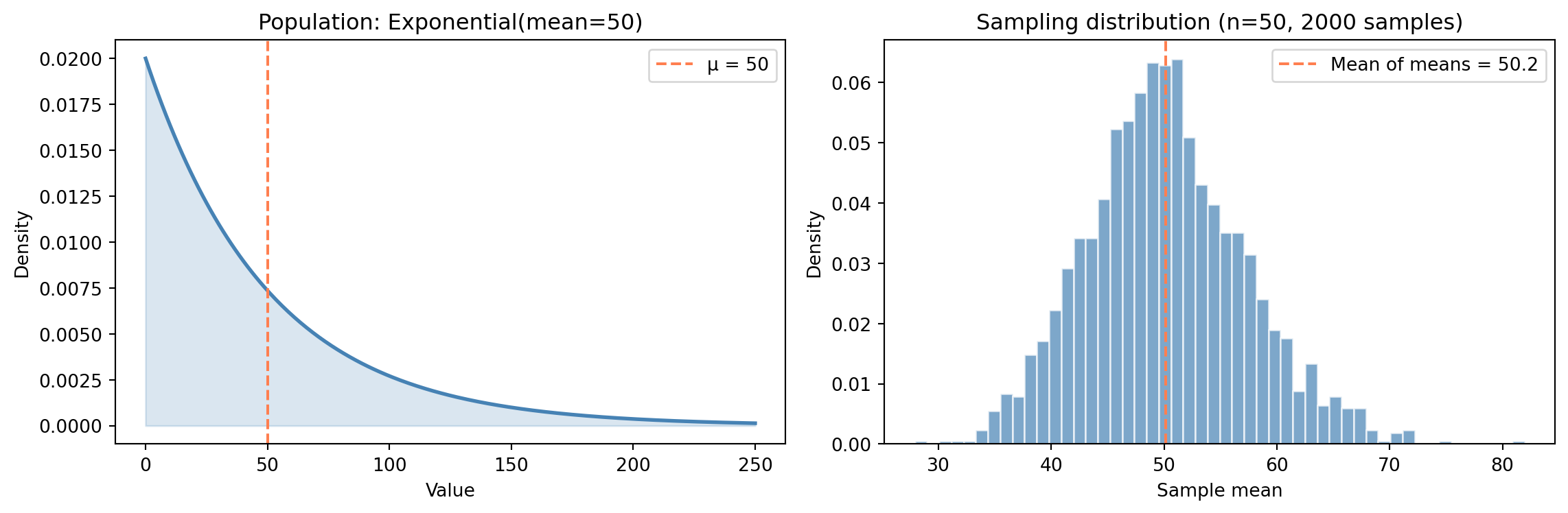
```{python}
#| label: fig-sampling-distribution
#| echo: true
#| fig-cap: "The population is heavily right-skewed, but the sampling distribution of the mean is approximately normal — a preview of the Central Limit Theorem."
#| fig-alt: "Two-panel figure. The first panel shows the exponential population distribution, which is heavily right-skewed with most density near zero and a long tail, with a blue curve and an orange dashed vertical line at the population mean. The second panel shows a histogram of 2,000 sample means in blue, which forms a symmetric bell shape centred on the true population mean of 50, despite the skewed population."
rng = np.random.default_rng(42)

population_mean = 50
n_samples = 2000
sample_size = 50

# Draw many samples from a skewed population
# stats.expon(scale=μ) parameterises by mean, not rate — scale = 1/λ
population = stats.expon(scale=population_mean)
sample_means = [
    population.rvs(size=sample_size, random_state=rng).mean()
    for _ in range(n_samples)
]

fig, (ax1, ax2) = plt.subplots(1, 2, figsize=(12, 4))
fig.patch.set_alpha(0)

# Left: population distribution
x = np.linspace(0, 200, 300)
ax1.plot(x, population.pdf(x), '#0072B2', linewidth=2)
ax1.fill_between(x, population.pdf(x), alpha=0.2, color='#0072B2')
ax1.axvline(population_mean, color='#E69F00', linestyle='--', linewidth=1.5,
            label=f'μ = {population_mean}')
ax1.set_xlabel('Value')
ax1.set_ylabel('Density')
ax1.set_title('Population: Exponential(mean=50)')
ax1.legend()

# Right: sampling distribution of the mean
ax2.hist(sample_means, bins=50, density=True, color='#0072B2', alpha=0.7,
         edgecolor='white')
ax2.axvline(np.mean(sample_means), color='#E69F00', linestyle='--', linewidth=1.5,
            label=f'Mean of means = {np.mean(sample_means):.1f}')
ax2.set_xlabel('Sample mean')
ax2.set_ylabel('Density')
ax2.set_title(f"Sampling distribution (n={sample_size}, {n_samples} samples)")
ax2.legend()

for ax in (ax1, ax2):
    ax.patch.set_alpha(0)
    ax.spines['top'].set_visible(False)
    ax.spines['right'].set_visible(False)
    ax.yaxis.grid(True, linestyle=':', alpha=0.4, color='grey')
    ax.set_axisbelow(True)

plt.tight_layout()
plt.show()
```
Three things stand out in @fig-sampling-distribution. The **shape** has changed entirely: the population is dramatically right-skewed, but the sampling distribution of the mean looks approximately normal. The **centre** is right where it should be: the sampling distribution sits on the true population mean $\mu = 50$. And the **spread** has contracted sharply: averaging 50 observations smooths out the noise, producing a distribution far narrower than the population itself.
None of these are coincidences. They all follow from a single theorem.
## The Central Limit Theorem {#sec-clt}
The **Central Limit Theorem** (CLT) says: take the mean of $n$ independent observations, each drawn from the *same* distribution (statisticians call this "identically distributed"; together, "independent and identically distributed," or **i.i.d.**), with finite mean $\mu$ and finite variance $\sigma^2$. As $n$ grows, the distribution of that sample mean approaches a Normal distribution:
$$
\bar{X}_n \;\approx\; \text{Normal}\!\left(\mu,\; \frac{\sigma^2}{n}\right) \quad \text{for large } n
$$
Here $\bar{X}_n$ denotes the sample mean of $n$ observations; the capital letter signals that it's a random variable (it varies from sample to sample), while the bar indicates averaging. A quick note on notation: @sec-normal introduced the Normal in the form $\text{Normal}(\mu, \sigma)$, using the standard deviation $\sigma$. Here we've written it as $\text{Normal}(\mu, \sigma^2/n)$, using the variance $\sigma^2/n$. These are the same distribution written two ways — the algebra of sample means is cleaner in variance form, and you'll see both conventions in practice. The equivalent standard-deviation form of the spread is $\sigma/\sqrt{n}$, which is how the third CLT implication below expresses the same quantity.
In plain English: it doesn't matter what the underlying data looks like: skewed, **bimodal** (two peaks), uniform, or anything else. Average enough of it and the result is approximately normal. This holds regardless of the shape of the original distribution, provided the observations are independent of one another, drawn from the same distribution, and the variance is finite.
The CLT has three implications that underpin almost all of **inferential statistics**, the branch of statistics concerned with drawing conclusions about a population from a sample. First, the **shape converges to normal**: the sampling distribution of the mean is approximately normal, even when the population isn't. Second, the **centre converges to $\mu$** (the true population mean): sample means are *unbiased*, meaning they don't systematically overshoot or undershoot. Third, the **spread shrinks as $\sigma / \sqrt{n}$** (where $\sigma$ is the population standard deviation): the variability of the sample mean *decreases* as the sample size increases, at a rate of $1/\sqrt{n}$.
Let's see this in action across four very different populations.
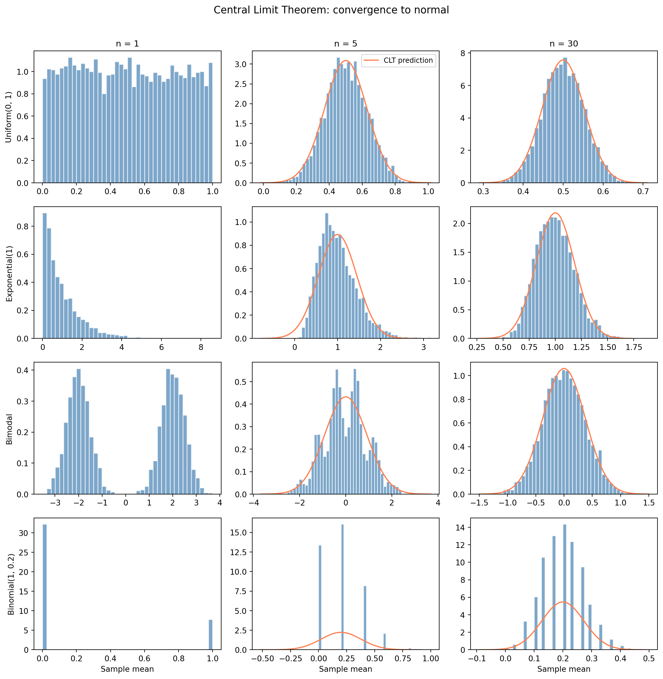
```{python}
#| label: fig-clt-grid
#| echo: true
#| fig-cap: "The Central Limit Theorem at work. Each row is a different population shape. Each column increases the sample size. The overlaid orange curves (for n > 1) show the CLT-predicted normal distribution."
#| fig-alt: "A 4-by-3 grid of histograms. Each row starts from a different population shape (uniform, exponential, bimodal, binomial). The leftmost column (n=1) shows the raw population shape with no overlay — each distribution looks completely different. The middle column (n=5) shows partial convergence, with an orange normal curve overlay showing the CLT prediction. The rightmost column (n=30) shows all four converging to match the orange normal curve closely, regardless of the starting distribution."
rng = np.random.default_rng(42)

n_simulations = 5000
sample_sizes = [1, 5, 30]

# Four different population shapes
def draw_uniform(size):
    return rng.uniform(0, 1, size)

def draw_exponential(size):
    return rng.exponential(scale=1, size=size)

def draw_bimodal(size):
    # Mixture of two normals
    mix = rng.choice([0, 1], size=size, p=[0.5, 0.5])
    return np.where(mix == 0,
                    rng.normal(-2, 0.5, size),
                    rng.normal(2, 0.5, size))

def draw_binomial(size):
    return rng.binomial(n=1, p=0.2, size=size).astype(float)

# Theoretical mean and variance for each population
populations = [
    ('Uniform(0, 1)', draw_uniform, 0.5, 1/12),
    ('Exponential(1)', draw_exponential, 1.0, 1.0),
    ('Bimodal', draw_bimodal, 0.0, 4.25),  # E[X]=0, Var = 0.5*(0.25+4) + 0.5*(0.25+4) = 4.25
    ('Binomial(1, 0.2)', draw_binomial, 0.2, 0.16),
]

fig, axes = plt.subplots(4, 3, figsize=(12, 12))
fig.patch.set_alpha(0)

for row, (name, draw_fn, mu_pop, var_pop) in enumerate(populations):
    for col, n in enumerate(sample_sizes):
        means = [draw_fn(n).mean() for _ in range(n_simulations)]
        ax = axes[row, col]
        ax.patch.set_alpha(0)
        ax.spines['top'].set_visible(False)
        ax.spines['right'].set_visible(False)
        ax.hist(means, bins=40, density=True, color='#0072B2', alpha=0.7,
                edgecolor='white')

        if n > 1:
            # Overlay CLT-predicted normal (theoretical, not fitted)
            se_predicted = np.sqrt(var_pop / n)
            x_line = np.linspace(mu_pop - 4 * se_predicted,
                                 mu_pop + 4 * se_predicted, 200)
            ax.plot(x_line, stats.norm(mu_pop, se_predicted).pdf(x_line),
                    '#E69F00', linewidth=1.5,
                    label='CLT prediction' if row == 0 and col == 2 else None)

        if row == 0:
            ax.set_title(f"n = {n}", fontsize=11)
        if col == 0:
            # Left column shows density; the row's population is labelled
            # separately (below) so the axis quantity isn't conflated with
            # the categorical row name.
            ax.set_ylabel('Density', fontsize=10)
            ax.annotate(name, xy=(-0.32, 0.5), xycoords='axes fraction',
                        ha='center', va='center', rotation=90,
                        fontsize=11, fontweight='bold')
        if row == 3:
            ax.set_xlabel('Sample mean')

# Add a single legend for the orange curve (top-right panel, most visible)
axes[0, 2].legend(loc='upper right', fontsize=9)

plt.suptitle('The starting shape disappears — all four distributions converge',
             y=1.01, fontsize=13)
plt.tight_layout()
plt.show()
```
With $n = 1$, the "mean" of a single observation is just the observation itself, so the leftmost column shows the raw population shape; each looks completely different. The middle column ($n = 5$) already shows convergence beginning: the sharp edges and asymmetries soften. By $n = 30$, all four are well-approximated by a Normal distribution (the orange curve). Averaging has erased the starting shape.
A common rule of thumb says $n = 30$ is "enough" for the CLT to kick in, and for these four populations it's visually convincing. But heavily skewed or heavy-tailed distributions — the kind you encounter with network latencies or file sizes — can require hundreds or thousands of observations before the normal approximation becomes reliable. Treat $n = 30$ as a starting point, not a guarantee.
This is why the normal distribution from @sec-normal appears so often in practice. It's not that the world is inherently normal — it's that *averages* are approximately normal, and most of the statistics we compute (means, proportions, and regression coefficients, all of which are linear combinations of the data, a generalised form of averaging covered in *Linear regression: your first model*) are approximately normal in large samples.
## Standard error: the precision of an estimate {#sec-standard-error}
The CLT tells us that the spread of the sampling distribution is $\sigma / \sqrt{n}$. This quantity has its own name: the **standard error** (SE).
$$
\text{SE} = \frac{\sigma}{\sqrt{n}}
$$
In practice, we rarely know $\sigma$ (the true population standard deviation), so we estimate the standard error using the sample standard deviation $s$:
$$
\widehat{\text{SE}} = \frac{s}{\sqrt{n}}
$$
The hat on $\widehat{\text{SE}}$ is statistical notation meaning "estimated from data": we don't know the true SE (which depends on $\sigma$), so we estimate it using $s$. In practice, most authors drop the hat and simply write SE, since the context makes it clear whether the true or estimated version is meant. We'll follow that convention from here on. The standard error tells you how precisely you've estimated the mean. A small SE means your sample mean is likely close to the true mean; a large SE means it could be far off.
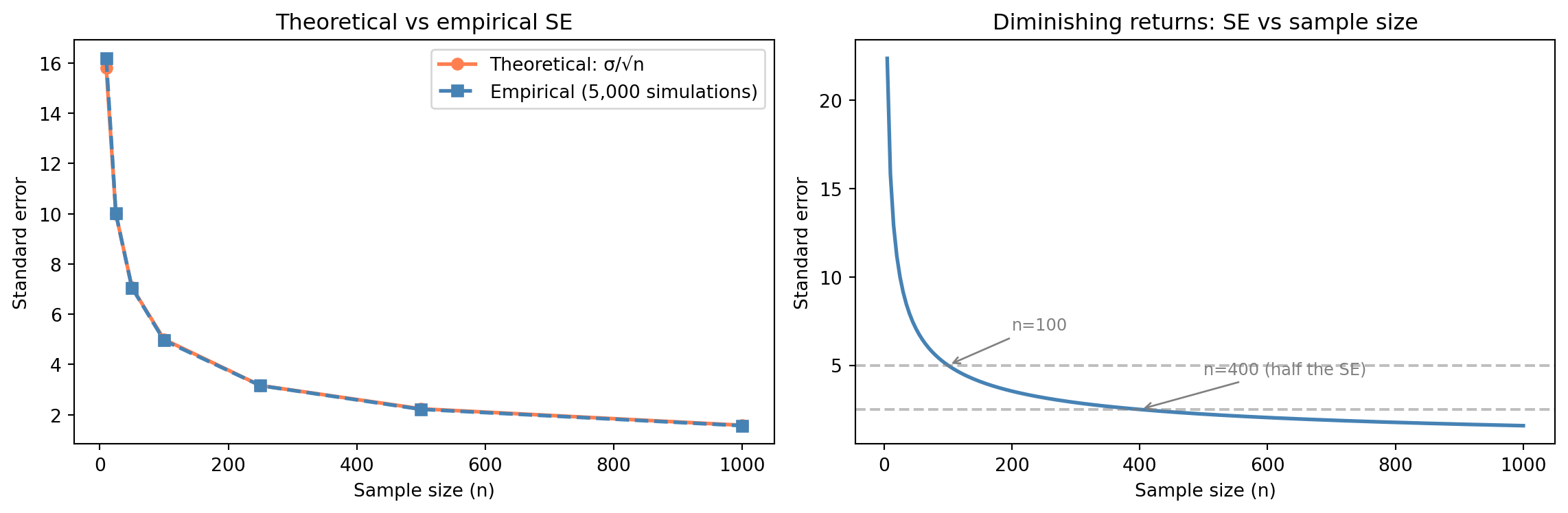
The $\sqrt{n}$ in the denominator has a critical implication: **doubling your precision requires quadrupling your data**. Going from $n = 100$ to $n = 400$ halves the standard error. Going from 400 to 1,600 halves it again. There are diminishing returns to collecting more data: each additional observation contributes less to precision than the last.
```{python}
#| label: fig-standard-error
#| echo: true
#| fig-cap: "Theoretical vs empirical standard error as sample size grows, and the diminishing returns curve — quadruple the data for double the precision."
#| fig-alt: "Two-panel figure. The first panel plots theoretical SE (solid orange line with circle markers) and empirical SE (dashed blue line with square markers) against sample size; both curves decline together, confirming the theory. The second panel shows a smooth SE-vs-n curve with annotations showing the SE values at n=100 and n=400, illustrating that quadrupling the data halves the standard error."
rng = np.random.default_rng(42)

# Population: Exponential with mean 50 (sigma = 50 for exponential)
population_sigma = 50
sample_sizes = [10, 25, 50, 100, 250, 500, 1000]

theoretical_se = [population_sigma / np.sqrt(n) for n in sample_sizes]
empirical_se = []

for n in sample_sizes:
    means = [rng.exponential(scale=50, size=n).mean()
             for _ in range(5000)]
    empirical_se.append(np.std(means))

fig, (ax1, ax2) = plt.subplots(1, 2, figsize=(12, 4))
fig.patch.set_alpha(0)

# Left: theoretical vs empirical
ax1.plot(sample_sizes, theoretical_se, '#E69F00', linewidth=2, marker='o',
         label='Theoretical: σ/√n')
ax1.plot(sample_sizes, empirical_se, '#0072B2', linewidth=2, marker='s',
         linestyle='--', label='Empirical (5,000 simulations)')
ax1.set_xlabel('Sample size (n)')
ax1.set_ylabel('Standard error')
ax1.set_title('Theoretical vs empirical SE')
ax1.legend()

# Right: SE as a function of n (continuous curve)
n_range = np.linspace(5, 1000, 200)
se_100 = population_sigma / np.sqrt(100)
se_400 = population_sigma / np.sqrt(400)
ax2.plot(n_range, population_sigma / np.sqrt(n_range), '#E69F00', linewidth=2)
ax2.axhline(y=se_100, color='grey', linestyle='--', alpha=0.7)
ax2.annotate(f"n=100  (SE={se_100:.1f})", xy=(100, se_100),
             xytext=(200, se_100 + 2),
             arrowprops=dict(arrowstyle='->', color='grey'), fontsize=9,
             color='grey')
ax2.axhline(y=se_400, color='grey', linestyle='--', alpha=0.7)
ax2.annotate(f"n=400  (SE={se_400:.1f})", xy=(400, se_400),
             xytext=(500, se_400 + 2),
             arrowprops=dict(arrowstyle='->', color='grey'), fontsize=9,
             color='grey')
ax2.set_xlabel('Sample size (n)')
ax2.set_ylabel('Standard error')
ax2.set_title('Diminishing returns: SE vs sample size')

for ax in (ax1, ax2):
    ax.patch.set_alpha(0)
    ax.spines['top'].set_visible(False)
    ax.spines['right'].set_visible(False)
    ax.yaxis.grid(True, linestyle=':', alpha=0.4, color='grey')
    ax.set_axisbelow(True)

plt.tight_layout()
plt.show()
```
::: {.callout-note}
## Engineering Bridge
The $\sqrt{n}$ curve is the **capacity planning problem of statistical precision**. Every engineer knows the economics of diminishing returns — doubling your server count doesn't halve your latency. The standard error follows a similar economic pattern: you can always buy more precision with more data, but the cost-per-unit-of-precision increases quadratically. Halving the SE requires 4× the data. Halving it again requires 16×. The SE does keep shrinking — there's no hard ceiling — but the economics become unfavourable fast. This is why sample size calculations matter: they tell you the point at which collecting more data isn't worth the cost.
:::
::: {.callout-tip}
## Author's Note
The engineering instinct is that more data is always better: log everything, store it all, analyse later. The $\sqrt{n}$ relationship says otherwise. Data has *diminishing marginal returns*, and the diminishing is steep: going from 100 to 10,000 observations is transformative; going from 10,000 to 1,000,000 barely moves the needle on precision. What makes this surprising is not that diminishing returns exist (engineers understand diminishing returns), but that the rate is so aggressive: the precision gain from each additional observation drops as $1/\sqrt{n}$. The right question is not "can I collect more data?" but "how precise do I actually need to be?", answered through sample size calculations before the data is collected, not after.
:::
## Worked example: can we trust this A/B test result? {#sec-worked-example-probability}
Let's put these ideas together with a scenario you'll encounter in practice. Your team has run an A/B test on a checkout flow. The control group had a 12.0% conversion rate ($n = 1\text{,}000$), and the variant had a 13.5% conversion rate ($n = 1\text{,}000$). That's a 1.5 percentage point difference. Is this real, or could it be noise?
We're not going to answer this question fully here; that's what hypothesis testing and confidence intervals are for. But we *can* use the tools from this chapter to frame the question precisely. We know the standard error of each proportion, and therefore the SE of their difference, so we can ask: how many standard errors apart are these two estimates?
```{python}
#| label: ab-test-computation
#| echo: true
# Observed data
p_control = 0.120
p_variant = 0.135
n_ab = 1000

# Standard errors for proportions: SE = sqrt(p(1-p)/n)
# For binary outcomes (convert/don't), variance = p(1-p) — from the
# Bernoulli distribution (see @sec-distributions). Dividing by n and
# taking the square root gives the SE of the estimated proportion.
se_control = np.sqrt(p_control * (1 - p_control) / n_ab)
se_variant = np.sqrt(p_variant * (1 - p_variant) / n_ab)

# We use the observed proportions as plug-in estimates (substituting
# sample values where the formula calls for unknown population values)
print(f"Control: p = {p_control:.3f}, SE = {se_control:.4f}")
print(f"Variant: p = {p_variant:.3f}, SE = {se_variant:.4f}")

# How far apart are they in standard-error units?
# SE of a difference: variances add for independent samples, then take sqrt.
# Note: a formal hypothesis test would pool the proportions under H₀,
# giving a slightly different SE (negligible when the proportions are
# similar, but more material when they diverge). We'll see that approach
# in the hypothesis testing chapter.
se_diff = np.sqrt(se_control**2 + se_variant**2)
z = (p_variant - p_control) / se_diff
print(f"\nSE of the difference: {se_diff:.4f}")
# z-score: how many standard errors the difference is from zero
print(f"Difference in SE units (z): {z:.2f}")
```
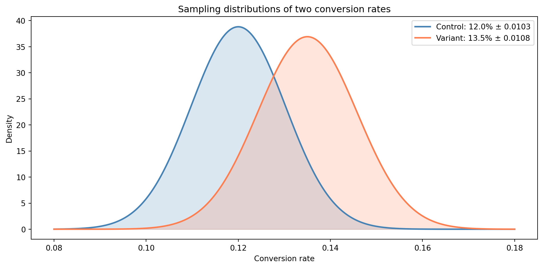
```{python}
#| label: fig-ab-test-framing
#| echo: true
#| fig-cap: "The sampling distributions of the two conversion rates overlap substantially. The observed difference might be real — or it might be sampling noise."
#| fig-alt: "Two overlapping bell curves representing the sampling distributions of the control (12.0%, blue) and variant (13.5%, orange) conversion rates. The curves share a wide region of overlap, illustrating that the observed difference could plausibly be due to sampling noise rather than a genuine effect."
# Sampling distributions (by CLT, approximately normal)
x = np.linspace(0.08, 0.18, 300)

fig, ax = plt.subplots(figsize=(10, 5))
fig.patch.set_alpha(0)
ax.patch.set_alpha(0)

ax.plot(x, stats.norm(p_control, se_control).pdf(x), '#0072B2', linewidth=2,
        label=f'Control: {p_control:.1%}  (SE = {se_control*100:.2f} pp)')
ax.fill_between(x, stats.norm(p_control, se_control).pdf(x), alpha=0.3,
                color='#0072B2')
ax.plot(x, stats.norm(p_variant, se_variant).pdf(x), '#E69F00', linewidth=2,
        linestyle='--',
        label=f'Variant: {p_variant:.1%}  (SE = {se_variant*100:.2f} pp)')
ax.fill_between(x, stats.norm(p_variant, se_variant).pdf(x), alpha=0.3,
                color='#E69F00')

ax.set_xlabel('Conversion rate')
ax.set_ylabel('Density')
ax.set_title('1.5 pp difference, but distributions overlap substantially')
ax.legend()
ax.spines['top'].set_visible(False)
ax.spines['right'].set_visible(False)
ax.yaxis.grid(True, linestyle=':', alpha=0.4, color='grey')
ax.set_axisbelow(True)
plt.tight_layout()
plt.show()
```
The two distributions share a wide band of overlap. The 1.5 percentage point difference *could* be a genuine improvement — or it could be the kind of variation you'd expect from two samples drawn from the same underlying rate. The **z-score** (a standardised measure of "how many standard errors away from zero") of roughly 1.0 tells us the difference is about one standard error from zero, well within the range of ordinary sampling noise. A z-score above roughly 1.96 is the conventional threshold for treating the difference as statistically significant; at 1.0, we're not close. We'll establish why that threshold matters in *Hypothesis testing: the unit test of data science*.
To resolve this properly, we need formal tools: a way to quantify the probability that the observed difference arose by chance (hypothesis testing), a way to express the range of plausible true values (confidence intervals), and a structured approach to designing and interpreting these experiments (A/B testing methodology). Those are exactly the topics of the next three chapters: *Hypothesis testing: the unit test of data science*, *Confidence intervals: error bounds for estimates*, and *A/B testing: deploying experiments*.
## Summary {#sec-probability-summary}
1. **Probability has a small set of composable rules** — complement, addition, multiplication, and conditioning. These are the same rules you use for SLO composition and error budgets, now formalised.
2. **Bayes' theorem turns conditional probability into a learning process** — it updates prior beliefs in light of evidence. The base rate of the event you're detecting matters at least as much as the accuracy of your detector.
3. **The sampling distribution describes the variability of an estimate** — if you collected a different sample, you'd get a different answer. The sampling distribution tells you how much those answers would vary.
4. **The Central Limit Theorem says that averages are approximately normal** — regardless of the shape of the underlying population, for large enough $n$. This is the theoretical foundation of most inferential statistics.
5. **The standard error quantifies the precision of an estimate** — it shrinks as $\sigma / \sqrt{n}$, meaning you get diminishing returns from additional data. Knowing the SE lets you move from "here is the sample mean" to "here is how much we should trust the sample mean" — which is exactly where inference begins.
## Exercises {#sec-probability-exercises}
1. A notification system delivers alerts through three independent channels: email (98% delivery rate), SMS (95%), and push notification (90%). What is the probability that a user receives an alert through *at least one* channel? Compute this analytically using the complement rule, then verify by simulating 100,000 alerts using `numpy`.
2. The Central Limit Theorem works for any distribution with finite variance. Use `scipy.stats.poisson(mu=3)` to explore this: draw 5,000 samples of sizes $n \in \{1, 5, 15, 50\}$, compute the mean of each, and plot the four sampling distributions. For each, overlay a normal distribution with the CLT-predicted mean and standard deviation. At what sample size does the normal approximation become convincing? As an extension, you can use `scipy.stats.probplot` to create a **QQ plot** (quantile-quantile plot) for the $n = 50$ case — it plots your data's quantiles against a theoretical distribution's quantiles, where points falling on the diagonal indicate a good fit.
3. Using an Exponential distribution with mean 100, compute the theoretical standard error for sample sizes $n \in \{25, 100, 400, 1600\}$. Verify each empirically by drawing 10,000 samples. Plot both the theoretical and empirical SE values against $n$ on the same axes. How does the $4\times$ rule (quadruple data, halve SE) hold up in practice?
4. A code-coverage tool claims to detect bugs with 80% accuracy (it flags 80% of real bugs). It also has a 10% false positive rate (it flags 10% of clean code). In a mature codebase, suppose 3% of functions actually contain a bug. Using Bayes' theorem, calculate $P(\text{bug} \mid \text{flagged})$. Now repeat the calculation for base rates of 1%, 5%, and 20%. What does this tell you about the usefulness of the tool across different codebases?
5. **Conceptual:** This chapter opened by comparing probability rules to error-handling composition in distributed systems. Where does this analogy break down? Consider: what happens when events aren't independent? When "failure" isn't binary? When the probability of failure changes over time? Identify at least two ways the clean algebraic composition of probabilities in the opening example doesn't map to real-world systems, and explain what kinds of statistical tools you might reach for — or what questions you'd want to ask — in each case.