---
# Content: CC BY-NC-SA 4.0 | Code: MIT - see /LICENSE.md
title: "Dimensionality reduction: refactoring your feature space"
---
{{< include /_common-imports.qmd >}}
## When fifteen dashboards tell the same story {#sec-too-many-features}
Your platform team monitors 500 microservices, each emitting 15 metrics: CPU utilisation (mean and p99), memory utilisation (mean and p99), disk I/O, network throughput, garbage collection stats, request latency at three percentiles, error rates, and thread pool usage. That's 7,500 time series feeding your dashboards. But watch what happens when a service degrades: CPU mean and p99 spike together. All three latency percentiles move in lockstep. Disk reads and writes rise in tandem. Most of those 15 metrics are telling you the same story in slightly different words.
This is dimensionality's cost. Beyond the dashboard clutter, high-dimensional data causes real analytical problems. Distances between points become less meaningful as dimensions grow; in a space with hundreds of features, every pair of observations is roughly the same distance apart, which makes similarity-based methods (nearest neighbours, clustering) unreliable. Models need exponentially more data to fill a high-dimensional space. And standard scatter plots can't show more than three dimensions directly, which rules out the exploratory visualisations we've relied on throughout this book.
The correlations we explored in @sec-relationships are the root cause. When features move together, they carry redundant information. Dimensionality reduction exploits this redundancy: it finds a smaller set of composite variables that capture most of the variation in the original data, discarding the rest as noise. Think of it as refactoring a bloated class: extracting the essential interface from 15 correlated public fields.
```{python}
#| label: telemetry-data-generation
#| echo: true
#| code-fold: true
#| code-summary: "Expand to see telemetry data simulation (500 services, 15 metrics)"
rng = np.random.default_rng(42)
n = 500

# Three latent service types with distinct resource profiles
service_type = rng.choice(['web', 'database', 'batch'], size=n, p=[0.45, 0.30, 0.25])
type_labels = pd.Categorical(service_type, categories=['web', 'database', 'batch'])

# Base profiles for each type (latent factors)
profiles = {
    'web':      {'cpu': 45, 'mem': 35, 'disk': 10, 'net': 60, 'gc': 20, 'latency': 50,  'error': 1.0, 'threads': 70},
    'database': {'cpu': 30, 'mem': 75, 'disk': 80, 'net': 30, 'gc': 10, 'latency': 20,  'error': 0.3, 'threads': 40},
    'batch':    {'cpu': 85, 'mem': 60, 'disk': 40, 'net': 15, 'gc': 40, 'latency': 200, 'error': 2.0, 'threads': 90},
}

def generate_metrics(stype, rng):
    p = profiles[stype]
    # Correlated CPU metrics — mean and p99 share a latent factor
    cpu_base = rng.normal(p['cpu'], 8)
    cpu_mean = cpu_base + rng.normal(0, 2)
    cpu_p99 = cpu_base + rng.normal(12, 3)

    # Correlated memory metrics
    mem_base = rng.normal(p['mem'], 10)
    memory_mean = mem_base + rng.normal(0, 2)
    memory_p99 = mem_base + rng.normal(8, 2)

    # Disk I/O
    disk_read = max(0, rng.normal(p['disk'], 5))
    disk_write = max(0, rng.normal(p['disk'] * 0.6, 4))

    # Network I/O
    net_in = max(0, rng.normal(p['net'], 8))
    net_out = max(0, rng.normal(p['net'] * 0.8, 6))

    # GC metrics — correlated with memory pressure
    gc_pause = max(0, rng.normal(p['gc'], 5) + 0.2 * (mem_base - p['mem']))
    gc_freq = max(0, rng.normal(p['gc'] * 0.5, 3) + 0.1 * (mem_base - p['mem']))

    # Latency percentiles — highly correlated, just shifted
    latency_base = rng.normal(p['latency'], 15)
    latency_p50 = max(1, latency_base + rng.normal(0, 3))
    latency_p95 = max(1, latency_base * 1.5 + rng.normal(0, 5))
    latency_p99 = max(1, latency_base * 2.2 + rng.normal(0, 8))

    error_rate = max(0, rng.normal(p['error'], 0.5))
    thread_util = np.clip(rng.normal(p['threads'], 10), 0, 100)

    return [cpu_mean, cpu_p99, memory_mean, memory_p99,
            disk_read, disk_write, net_in, net_out,
            gc_pause, gc_freq, latency_p50, latency_p95,
            latency_p99, error_rate, thread_util]

feature_names = ['cpu_mean', 'cpu_p99', 'memory_mean', 'memory_p99',
                 'disk_read_mbps', 'disk_write_mbps', 'network_in_mbps',
                 'network_out_mbps', 'gc_pause_ms', 'gc_frequency',
                 'request_latency_p50', 'request_latency_p95',
                 'request_latency_p99', 'error_rate_pct',
                 'thread_pool_utilisation']

rows = [generate_metrics(st, rng) for st in service_type]
telemetry = pd.DataFrame(rows, columns=feature_names)
telemetry['service_type'] = type_labels
```
```{python}
#| label: fig-correlation-heatmap
#| echo: true
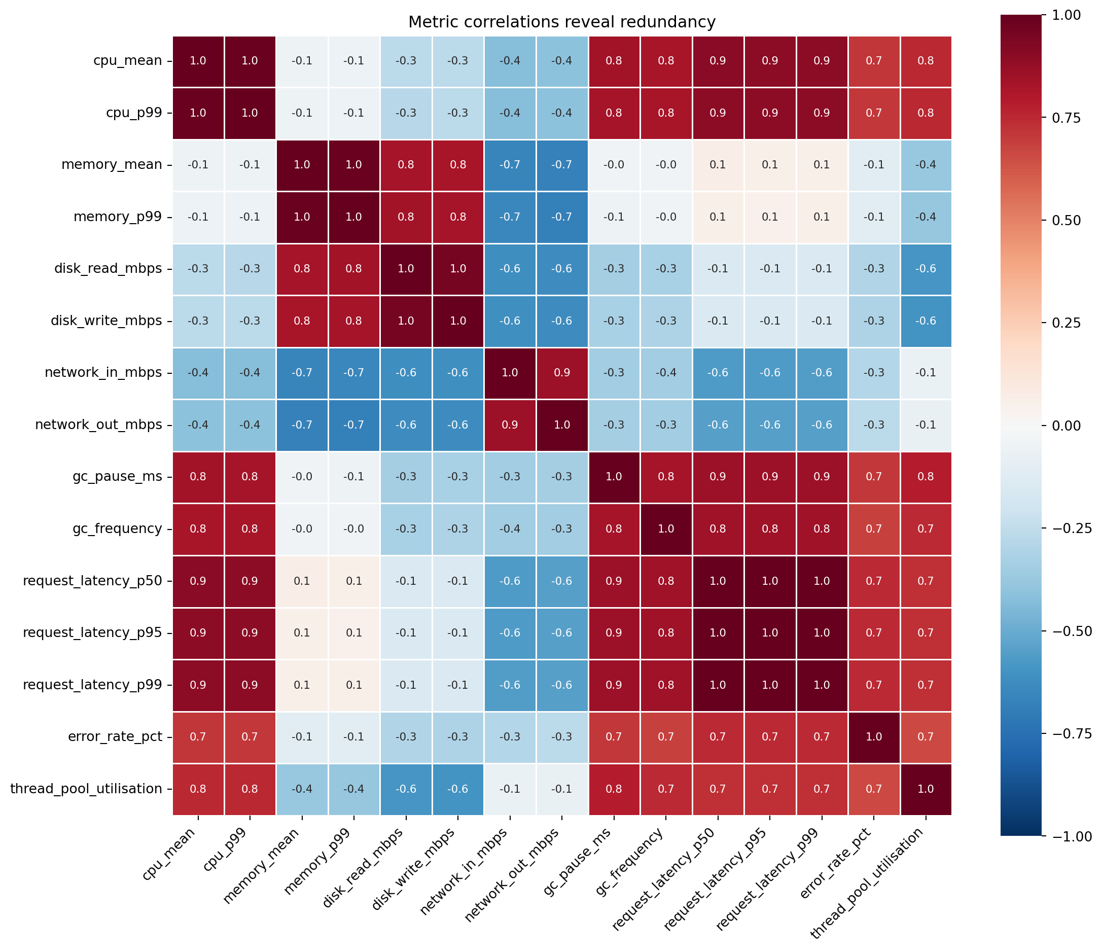
#| fig-cap: "Correlation matrix of 15 service metrics. Strong blocks of correlated pairs — CPU mean with CPU p99, the three latency percentiles, disk read with disk write — reveal the redundancy that dimensionality reduction exploits."
#| fig-alt: "Heatmap showing pairwise Pearson correlations between 15 service telemetry metrics. Distinct blocks of high correlation are visible: CPU mean and CPU p99 are strongly correlated, the three latency percentiles form a tight block, and disk read and write are tightly coupled. Many cross-group correlations are weak, confirming that a few latent factors drive the structure."
import seaborn as sns

fig, ax = plt.subplots(figsize=(12, 10))
fig.patch.set_alpha(0)
ax.patch.set_alpha(0)
corr = telemetry[feature_names].corr()
sns.heatmap(corr, annot=True, fmt='.1f', cmap='RdBu_r', center=0,
            square=True, linewidths=0.5, ax=ax, annot_kws={'size': 8},
            vmin=-1, vmax=1)
ax.set_title('Metric correlations reveal redundancy')
ax.set_xticklabels(ax.get_xticklabels(), rotation=45, ha='right')
plt.tight_layout()
plt.show()
```
@fig-correlation-heatmap confirms what you'd expect. CPU mean and p99 correlate strongly; they're driven by the same underlying load. The three latency percentiles form a tight block. Disk reads and writes move together. These correlation blocks are redundant information, and each block can be summarised by a single composite variable without losing much.
## Variance as information {#sec-variance-as-information}
**Principal Component Analysis** (PCA) rests on a specific definition of "information": **variance**. A feature that takes the same value for every observation tells you nothing; it can't distinguish one service from another. A feature with high variance separates observations and carries discriminating power. This aligns with the intuition from @sec-spread: spread is what makes a measurement useful.
Before comparing variances across features, you must standardise. Our metrics have wildly different scales: CPU percentage (0–100), latency in milliseconds (possibly hundreds), error rate as a small percentage. Without standardisation, PCA would declare latency the most "important" feature simply because its numbers are bigger, just as we saw with regularisation in @sec-ridge. `StandardScaler` centres each feature to mean zero and unit variance, putting all metrics on an equal footing.
::: {.callout-tip}
## Author's Note
The word "information" tripped me up here. In software engineering, information means bits: Shannon entropy, compression ratios, data transfer. In PCA, "information" means variance, which is a fundamentally different concept. The two genuinely diverge. Variance measures spread on the value scale, so rescaling a feature by a constant changes its variance but leaves its Shannon entropy — the unpredictability of its outcomes — untouched. A feature can have low variance yet high entropy (many distinct values packed tightly into a small numeric range), or high variance yet low entropy. And a constant feature, which carries no Shannon information at all, can still be *semantically* meaningful to a human (it tells you the system's baseline state) even though both measures rate it as worthless. PCA's definition is narrower than either: it cares about what *varies* across observations, not about what each observation *means*. Conflating variance with Shannon entropy leads to wrong intuitions about what PCA can and cannot capture.
:::
## PCA: extracting principal components {#sec-pca}
PCA finds new axes — linear combinations of the original features — that capture maximum variance, each orthogonal (perpendicular) to the last. The first principal component points in the direction of greatest spread in the data. The second captures the most remaining variance while being perpendicular to the first. And so on, until you have as many components as original features.
Think of it as rotating the coordinate system. Your original axes (CPU, memory, latency, ...) were chosen for operational convenience. PCA rotates to axes aligned with the data's actual structure: the directions along which observations differ most.
Mathematically, PCA computes the **covariance matrix** $\Sigma$ of the standardised data and finds its **eigenvectors** and **eigenvalues**. If you haven't encountered these since university linear algebra (@sec-linear-algebra in Appendix A is a recap): an eigenvector of a matrix is a direction that the matrix merely stretches (rather than rotates), and the eigenvalue is the stretching factor. For a covariance matrix, the eigenvectors point along the data's natural axes of variation, and the eigenvalues tell you how much variation lies along each. Each eigenvector $\mathbf{v}_k$ defines a new axis (a principal component), and its corresponding eigenvalue $\lambda_k$ measures the variance captured along that axis. The proportion of total variance explained by component $k$ is:
$$
\text{Variance explained}_k = \frac{\lambda_k}{\sum_{i=1}^{p} \lambda_i}
$$
where $p$ is the number of original features. In other words, each component's share of the total spread in the data is its eigenvalue divided by the sum of all eigenvalues.
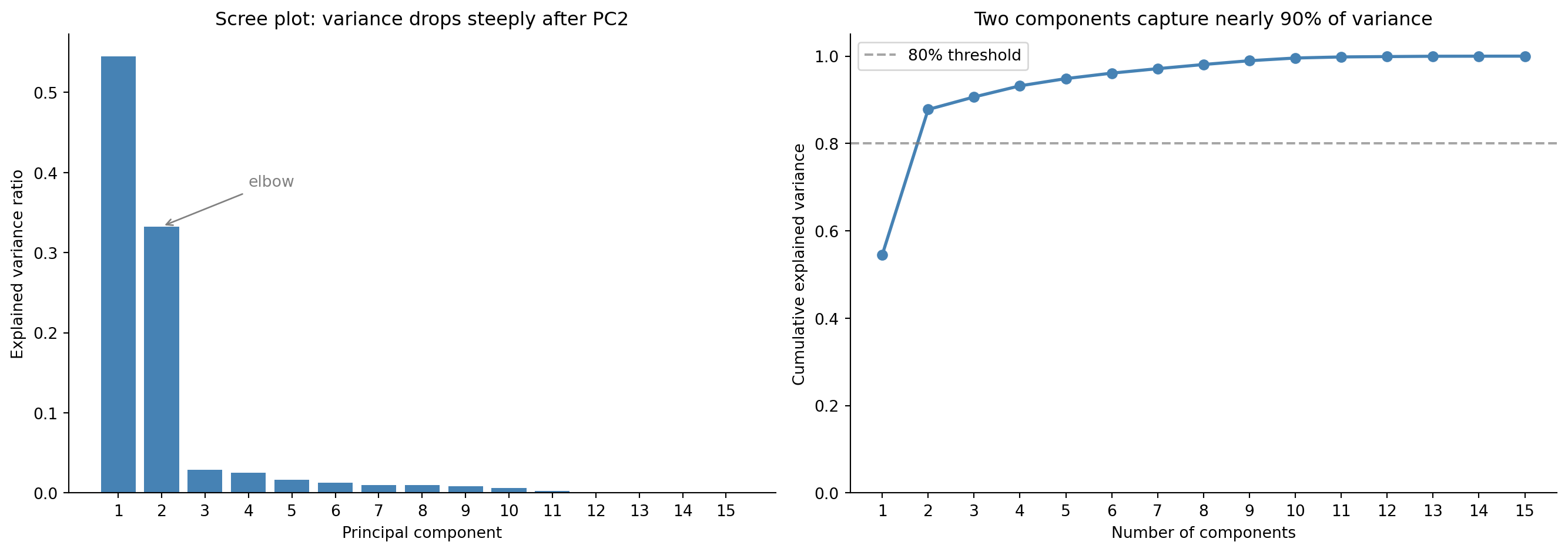
Since we standardise first, $\Sigma$ is the **correlation matrix**: PCA on standardised data decomposes correlations, not raw covariances. As @fig-scree-plot shows, the first two components capture about 88% of the total variance, so you can represent your 15-dimensional data in two dimensions and lose only around 12% of the discriminating information.
```{python}
#| label: pca-fit
#| echo: true
from sklearn.preprocessing import StandardScaler
from sklearn.decomposition import PCA

scaler = StandardScaler()
X_scaled = scaler.fit_transform(telemetry[feature_names])

pca = PCA()
X_pca = pca.fit_transform(X_scaled)

print('Explained variance ratio (first 5 components):')
for i, ratio in enumerate(pca.explained_variance_ratio_[:5]):
    print(f"  PC{i+1}: {ratio:.1%}")
print(f"\nCumulative (first 3): {pca.explained_variance_ratio_[:3].sum():.1%}")
print(f"Cumulative (first 5): {pca.explained_variance_ratio_[:5].sum():.1%}")
```
::: {.callout-note}
## Engineering Bridge
PCA is the "Extract Interface" refactoring applied to data. You have a class with 15 public fields, many of which are correlated (they expose the same underlying state through different accessors). The refactored interface has 3–4 composite properties that capture the essential variation. Callers get the same discriminating power with a simpler API.
Where the analogy breaks down: a refactored interface has meaningful names (`health_score`, `resource_pressure`). Principal components are linear combinations with mathematically optimal but semantically opaque definitions: PC1 might be "0.35 × cpu_mean + 0.33 × cpu_p99 + 0.28 × thread_util + ...". You gain dimensionality reduction but lose human-readable labels. Naming components is a post-hoc interpretive act, not something the algorithm provides.
:::
## How many components? {#sec-choosing-components}
PCA gives you as many components as you had features. The question is how many to *keep*. Two visual tools help.
The **scree plot** shows eigenvalues (variance captured) in descending order. You look for an "elbow," the point where the curve flattens and additional components add little. The **cumulative explained variance** plot shows the running total; you read off where it crosses a threshold like 80% or 90%.
These are heuristics, not hard rules. The right number of components depends on your goal. For visualisation, 2–3 components are all you can plot. For a downstream model, keep enough to preserve the signal without re-introducing the noise that dimensionality reduction was meant to discard (the same bias-variance logic from @sec-bias-variance). Too few components and you lose genuine structure (underfitting); too many and you keep noise dimensions that hurt generalisation.
```{python}
#| label: fig-scree-plot
#| echo: true
#| fig-cap: "Scree plot (first panel) and cumulative explained variance (second panel). The steep drop after PC2 suggests that just two components capture most of the information."
#| fig-alt: "Two-panel figure. First panel: bar chart of explained variance ratio for 15 principal components. PC1 is tallest at roughly 55%, PC2 at roughly 33%, and all remaining components under 5%, showing a steep elbow after PC2. Second panel: line chart of cumulative explained variance rising sharply to about 88% at two components and approaching 100% gradually. A horizontal dashed line marks the 80% threshold."
fig, (ax1, ax2) = plt.subplots(1, 2, figsize=(14, 5))
fig.patch.set_alpha(0)
ax1.patch.set_alpha(0)
ax2.patch.set_alpha(0)

components = range(1, len(pca.explained_variance_ratio_) + 1)

# Scree plot
ax1.bar(components, pca.explained_variance_ratio_, color='#0072B2',
        edgecolor='none')
ax1.annotate('Elbow (PC2→PC3 break)', xy=(2.5, pca.explained_variance_ratio_[2]),
             xytext=(5, pca.explained_variance_ratio_[2] + 0.10),
             arrowprops=dict(arrowstyle='->', color='grey'),
             fontsize=10, color='grey')
ax1.set_xlabel('Principal component')
ax1.set_ylabel('Explained variance ratio')
ax1.set_title('Scree plot: variance drops steeply after PC2')
ax1.set_xticks(list(components))
ax1.spines[['top', 'right']].set_visible(False)

# Cumulative variance
cumvar = np.cumsum(pca.explained_variance_ratio_)
ax2.plot(list(components), cumvar, 'o-', color='#0072B2', linewidth=2)
ax2.axhline(0.80, color='grey', linestyle='--', alpha=0.7, label='80% threshold')
ax2.set_xlabel('Number of components')
ax2.set_ylabel('Cumulative explained variance')
ax2.set_title('Two components capture most of the variance')
ax2.set_xticks(list(components))
ax2.set_ylim(0, 1.05)
ax2.legend()
ax2.spines[['top', 'right']].set_visible(False)

plt.tight_layout()
plt.show()
```
## Interpreting components: the loadings {#sec-pca-loadings}
Each principal component is a weighted combination of the original features. These weights — the **loadings** — tell you what each component *means* in terms of the original measurements.
```{python}
#| label: fig-loadings-heatmap
#| echo: true
#| fig-cap: "Loadings for the first four principal components. PC1 loads on latency, CPU, and GC metrics (overall resource pressure), while PC2 contrasts memory/disk metrics against network metrics — separating storage-bound from network-bound services."
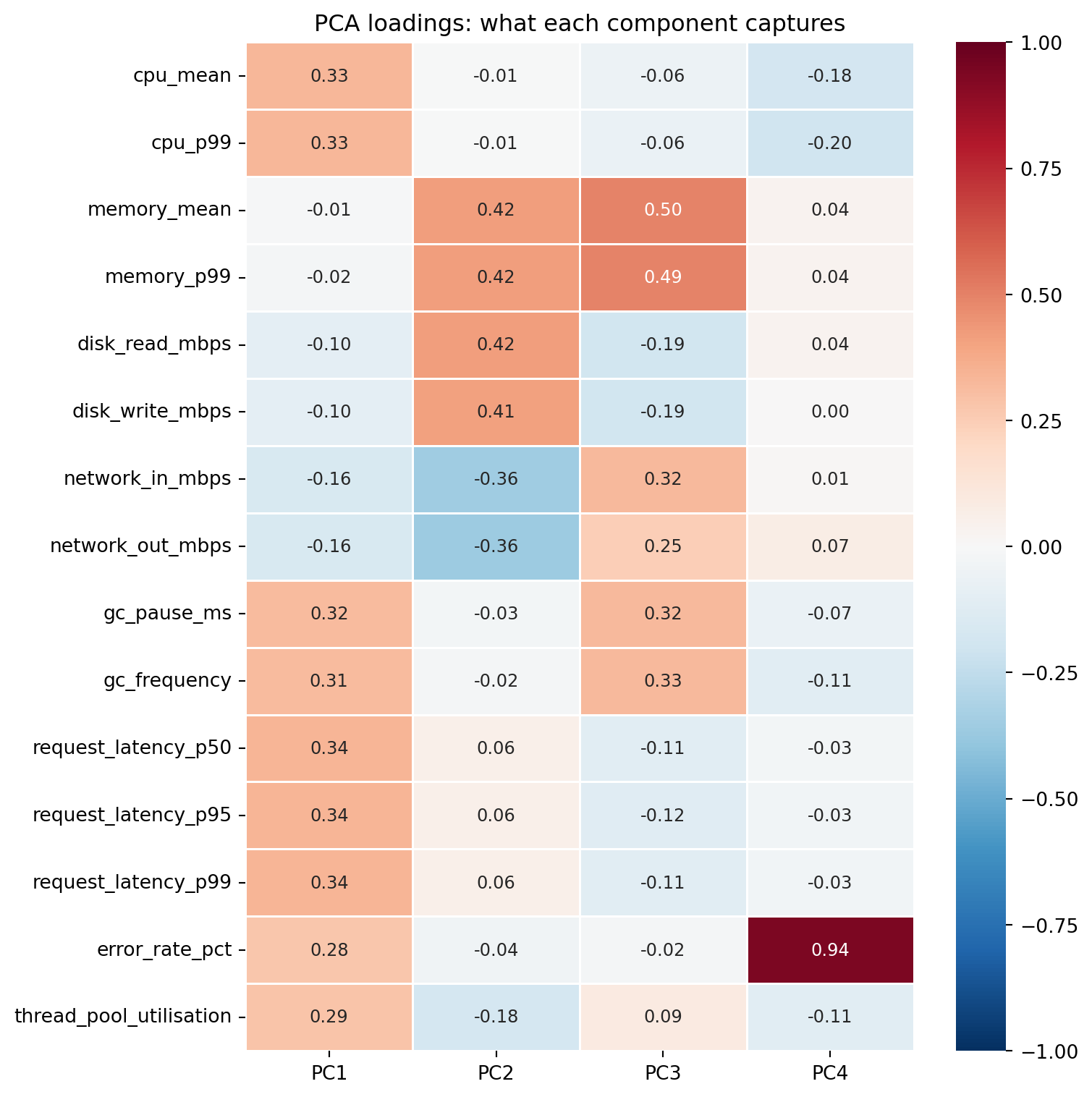
#| fig-alt: "Heatmap showing loading values for the first four principal components across 15 features. PC1 has moderate positive loadings on latency, CPU, and GC metrics. PC2 contrasts memory and disk metrics (positive loadings around 0.4) against network metrics (negative loadings around -0.4), with latency near zero. PC3 separates memory and GC from disk and latency. PC4 is dominated by error rate (loading 0.94)."
loadings = pd.DataFrame(
    pca.components_[:4].T,
    columns=['PC1', 'PC2', 'PC3', 'PC4'],
    index=feature_names
)

fig, ax = plt.subplots(figsize=(8, 8))
fig.patch.set_alpha(0)
ax.patch.set_alpha(0)
sns.heatmap(loadings, annot=True, fmt='.2f', cmap='RdBu_r', center=0,
            vmin=-1, vmax=1, linewidths=0.5, ax=ax, annot_kws={'size': 9})
ax.set_title('PCA loadings: what each component captures')
plt.tight_layout()
plt.show()
```
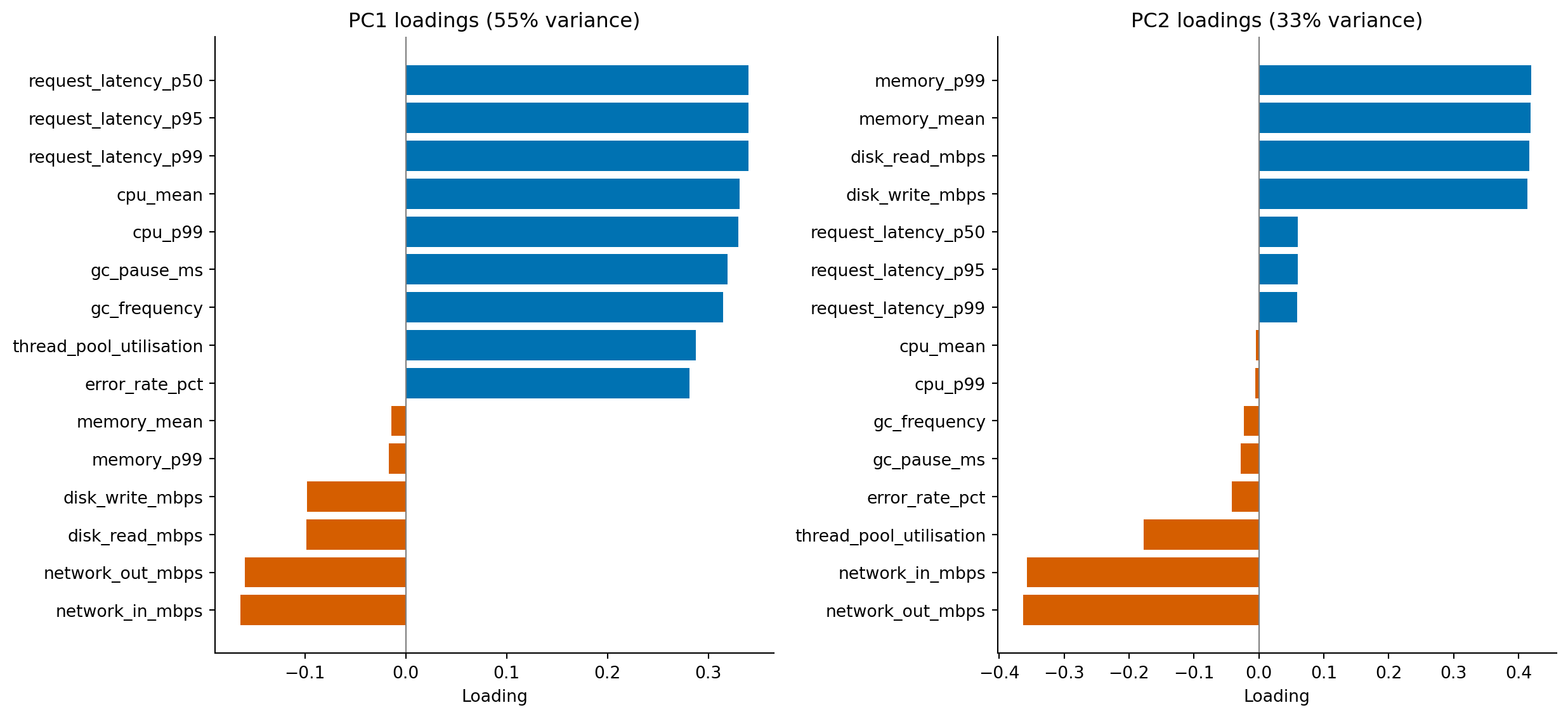
The heatmap is a useful overview, but for the components you actually plan to interpret it pays to look at the loadings on their own. A horizontal bar chart, sorted by magnitude, makes the structure inside each component much easier to read than a column of small numbers.
```{python}
#| label: fig-loadings-bars
#| echo: true
#| fig-cap: "Loadings for PC1 (left) and PC2 (right), sorted by magnitude. PC1 is dominated by positive loadings on latency, CPU, GC, and thread utilisation — the metrics that move together when a service is under load. PC2 contrasts memory and disk metrics (positive) against network metrics (negative)."
#| fig-alt: "Two horizontal bar charts side by side, one for PC1 and one for PC2. PC1's bars are overwhelmingly positive, with the longest bars belonging to the three latency percentiles, CPU mean and p99, and GC pause; error rate has a smaller positive loading and the network metrics are weakly negative. PC2's bars are split: memory mean and p99 and disk read and write are positive (around 0.4), while network out and network in are strongly negative (around -0.36); CPU and latency loadings are small."
fig, (ax_pc1, ax_pc2) = plt.subplots(1, 2, figsize=(13, 6))
fig.patch.set_alpha(0)
ax_pc1.patch.set_alpha(0)
ax_pc2.patch.set_alpha(0)

for ax, pc, idx in zip((ax_pc1, ax_pc2), ('PC1', 'PC2'), (0, 1)):
    ordered = loadings[pc].sort_values()
    colours = ['#0072B2' if v > 0 else '#D55E00' for v in ordered]
    ax.barh(ordered.index, ordered.values, color=colours, edgecolor='none')
    ax.axvline(0, color='grey', linewidth=0.8)
    ax.set_title(f'{pc} loadings ({pca.explained_variance_ratio_[idx]:.0%} variance)')
    ax.set_xlabel('Loading')
    ax.spines[['top', 'right']].set_visible(False)

plt.tight_layout()
plt.show()
```
Now walk through the components in order. PC1 is dominated by positive loadings: the load-driven metrics all point the same way, and the largest contributors — the latency percentiles, CPU mean and p99, and GC pause — are precisely the metrics that climb together when a service is under load. The natural interpretation is "general resource pressure": a service with a high PC1 score is busy across the board. Error rate loads positively too, but more weakly than the load-driven metrics, which fits the data-generating process: although each service type has a different baseline error rate, the within-type noise is large relative to that between-type signal, so much of error rate's variance is idiosyncratic and does not align cleanly with the dominant load-driven direction.
PC2 is more interesting because it has *signed* contrasts. Memory and disk metrics load positively, network metrics load negatively, and the load-driven metrics from PC1 are now near zero. PC2 separates services along an axis that PC1 ignored: storage-bound versus network-bound. A database with high memory and disk activity will land at one end of PC2; a web server pushing bytes over the network will land at the other. Crucially, two services can sit at the same point on PC1 (similar overall load) but at opposite ends of PC2 (different *kind* of work).
PC3 (which we'd inspect the same way) typically captures whatever variance is left after the dominant load-versus-IO contrast is removed — in this dataset, that turns out to be a memory-pressure signal driven by GC frequency. The methodology generalises: walk down the components in order, name each one by reading its dominant loadings, and stop when the loadings start looking like noise rather than coherent stories. That's roughly where the scree plot's elbow sits.
One caveat before you over-read the signs: a principal component is only defined up to an arbitrary sign flip, since negating an eigenvector leaves the variance it captures unchanged. scikit-learn fixes the sign deterministically (it orients each component so its largest-magnitude entry is positive), which is why the directions described here are stable across reruns — but on a different dataset, or a different library, "positive" and "negative" could swap wholesale. What survives a flip is the *contrast*: memory and disk loading opposite to network on PC2 is real, regardless of which side carries the plus sign.
These labels are *your* interpretation, not something the algorithm declares. Two analysts looking at the same loadings might name the components differently, and both could be right. Principal components are mathematical artefacts; the semantic labels are human additions, and the discipline is to test those labels by checking whether services with extreme component scores actually behave the way the label implies.
## Visualising in two dimensions {#sec-pca-visualisation}
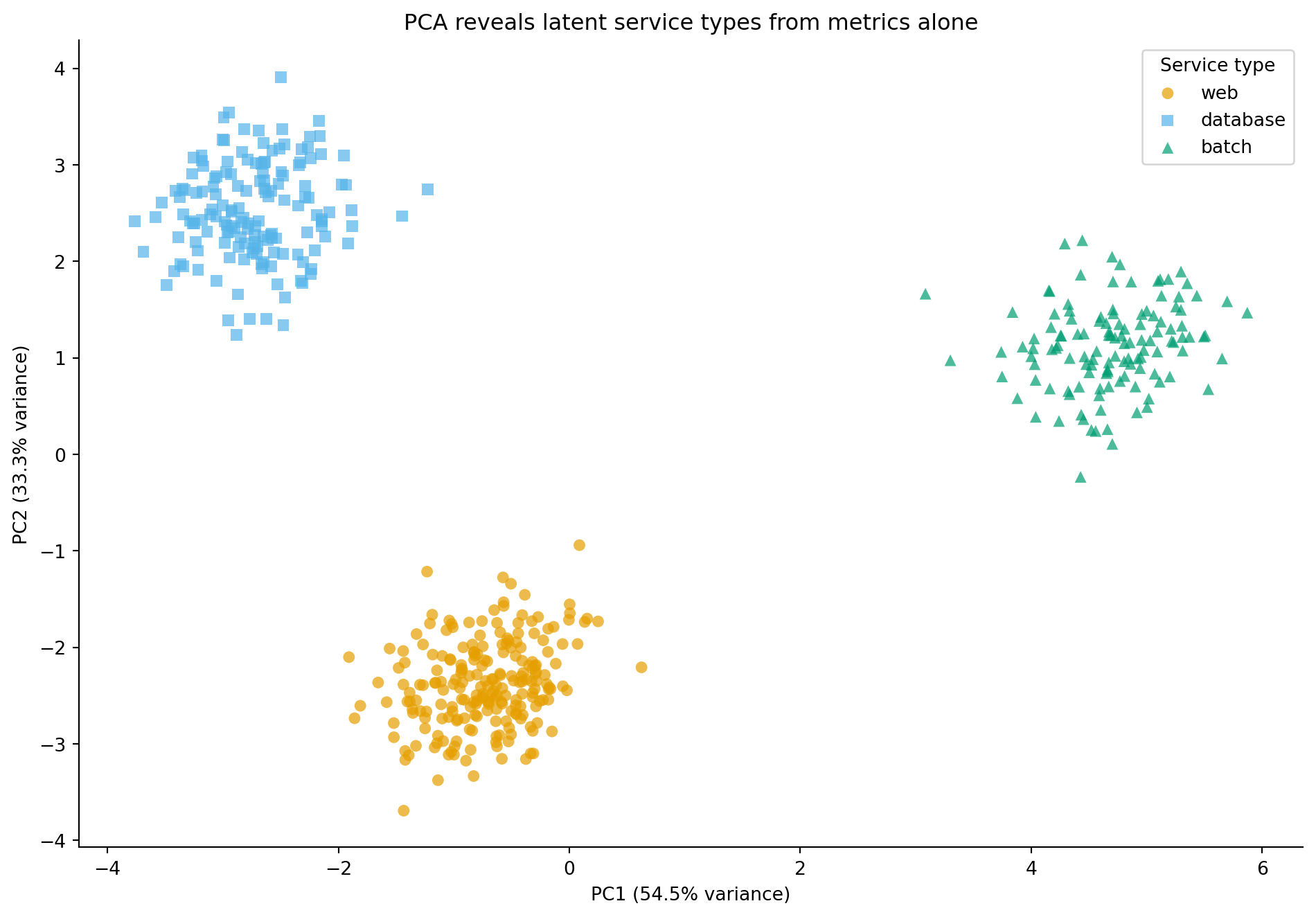
The whole point of reducing 15 dimensions to 2 is that you can now *see* the data. When we plot PC1 against PC2, coloured by service type, the latent structure becomes visible.
```{python}
#| label: fig-pca-scatter
#| echo: true
#| fig-cap: "Services projected onto their first two principal components. The three service types — web servers, databases, and batch processors — form distinct clusters, even though PCA had no access to the labels."
#| fig-alt: "Scatter plot with PC1 on the horizontal axis and PC2 on the vertical axis. Web servers (orange circles), databases (blue squares), and batch processors (green triangles) each occupy a distinct region of the plane, with only partial overlap between groups. Batch processors spread out along the high-PC1 end (highest overall load), while web servers and databases sit at lower PC1 and are separated from each other along PC2. The clear separation demonstrates that PCA has discovered the latent service type structure from the metrics alone."
# Colour-blind safe palette (Okabe-Ito) with distinct markers
type_styles = {
    'web':      {'color': '#E69F00', 'marker': 'o'},
    'database': {'color': '#56B4E9', 'marker': 's'},
    'batch':    {'color': '#009E73', 'marker': '^'},
}

fig, ax = plt.subplots(figsize=(10, 7))
fig.patch.set_alpha(0)
ax.patch.set_alpha(0)
for stype, style in type_styles.items():
    mask = telemetry['service_type'] == stype
    ax.scatter(X_pca[mask, 0], X_pca[mask, 1],
               c=style['color'], marker=style['marker'],
               label=stype, alpha=0.7, edgecolor='none', s=40)

ax.set_xlabel(f'PC1 ({pca.explained_variance_ratio_[0]:.1%} variance)')
ax.set_ylabel(f'PC2 ({pca.explained_variance_ratio_[1]:.1%} variance)')
ax.set_title('PCA reveals latent service types from metrics alone')
ax.legend(title='Service type')
ax.spines[['top', 'right']].set_visible(False)
plt.tight_layout()
plt.show()
```
PCA had no access to the service type labels. It found these clusters purely by identifying the directions of maximum variance in the 15-dimensional metric space. The fact that these directions align with meaningful service categories isn't a coincidence: the service types have distinct resource profiles, and PCA has recovered that structure.
In *Clustering: unsupervised pattern discovery*, we'll explore how to discover these groups algorithmically when you don't have labels at all.
## t-SNE: non-linear dimensionality reduction {#sec-tsne}
PCA finds linear structure: it rotates axes to align with directions of maximum variance. But sometimes the interesting relationships between observations aren't well captured by straight lines in high-dimensional space. **t-SNE** (t-distributed Stochastic Neighbor Embedding) takes a different approach: instead of preserving global variance, it preserves *local neighbourhoods*.
The intuition is this: t-SNE computes pairwise similarities between observations in the original high-dimensional space (how close are these two services, considering all 15 metrics?), then finds a 2D layout where those local similarities are preserved as well as possible. Points that were close neighbours in 15 dimensions end up close in 2D; points that were distant stay distant. It does this by converting pairwise distances into probability distributions and minimising the divergence between the high-dimensional and low-dimensional distributions.
The key parameter is **perplexity**, which loosely controls the effective number of neighbours each point considers. Low perplexity (5–10) focuses on very local structure — tight, small clusters. High perplexity (50–100) incorporates more global information. The scikit-learn default of 30 is a reasonable starting point.
Several caveats are essential. Distances *between* clusters in a t-SNE plot are not meaningful: two clusters that appear far apart aren't necessarily more different than two that appear close. Cluster *sizes* are not meaningful either; t-SNE tends to expand dense clusters and compress sparse ones. And the algorithm is stochastic: different random initialisations produce different layouts. Always run t-SNE multiple times or set a random seed, and never over-interpret the geometry of the result.
::: {.callout-note}
## Engineering Bridge
Think of t-SNE's perplexity parameter as the neighbourhood radius in a service mesh topology. A small perplexity means each node only considers its immediate neighbours when positioning itself, so you get detailed local structure but lose the global picture. A large perplexity means each node considers a wider neighbourhood, and the layout reflects broader patterns but washes out fine-grained detail. It's the same resolution trade-off you face when choosing aggregation windows for monitoring: 1-second windows show request-level spikes; 5-minute windows show trends. Neither is "correct"; they answer different questions.
:::
```{python}
#| label: fig-pca-vs-tsne
#| echo: true
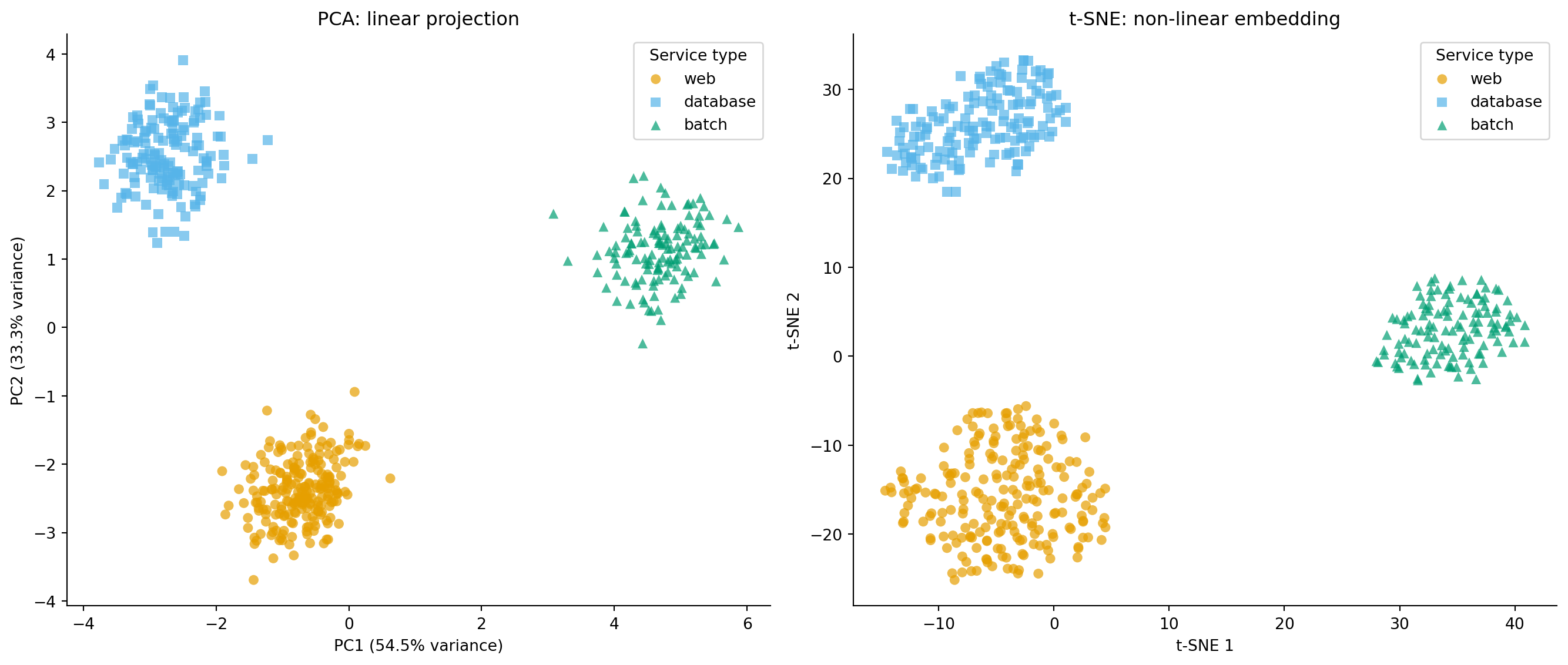
#| fig-cap: "PCA versus t-SNE projections of the service telemetry data. Both reveal the three service types, but t-SNE produces tighter, more separated clusters by preserving local neighbourhood structure."
#| fig-alt: "Two-panel scatter plot. First panel shows PCA projection with three well-separated clusters distinguished by colour and marker shape: web (orange circles), database (blue squares), batch (green triangles). Second panel shows t-SNE projection of the same data with the same markers, where the three clusters are more compact and better separated, though axis scales are not directly interpretable."
from sklearn.manifold import TSNE

tsne = TSNE(n_components=2, perplexity=30, random_state=42)
X_tsne = tsne.fit_transform(X_scaled)

fig, (ax1, ax2) = plt.subplots(1, 2, figsize=(14, 6))
fig.patch.set_alpha(0)
ax1.patch.set_alpha(0)
ax2.patch.set_alpha(0)

for stype, style in type_styles.items():
    mask = telemetry['service_type'] == stype

    ax1.scatter(X_pca[mask, 0], X_pca[mask, 1],
                c=style['color'], marker=style['marker'],
                label=stype, alpha=0.7, edgecolor='none', s=40)
    ax2.scatter(X_tsne[mask, 0], X_tsne[mask, 1],
                c=style['color'], marker=style['marker'],
                label=stype, alpha=0.7, edgecolor='none', s=40)

ax1.set_xlabel(f'PC1 ({pca.explained_variance_ratio_[0]:.1%} variance)')
ax1.set_ylabel(f'PC2 ({pca.explained_variance_ratio_[1]:.1%} variance)')
ax1.set_title('PCA: linear projection')
ax1.legend(title='Service type')
ax1.spines[['top', 'right']].set_visible(False)

ax2.set_xlabel('t-SNE 1')
ax2.set_ylabel('t-SNE 2')
ax2.set_title('t-SNE: non-linear embedding')
ax2.legend(title='Service type')
ax2.spines[['top', 'right']].set_visible(False)

plt.tight_layout()
plt.show()
```
Both methods reveal the three service types, but notice the difference in emphasis. PCA preserves global structure: the relative positions of clusters reflect real differences in the data. t-SNE produces tighter, more visually satisfying clusters but at the cost of interpretable axes. PCA is better for quantitative downstream use (the components are linear combinations you can reason about); t-SNE is better for visual exploration when you want to see whether natural groupings exist.
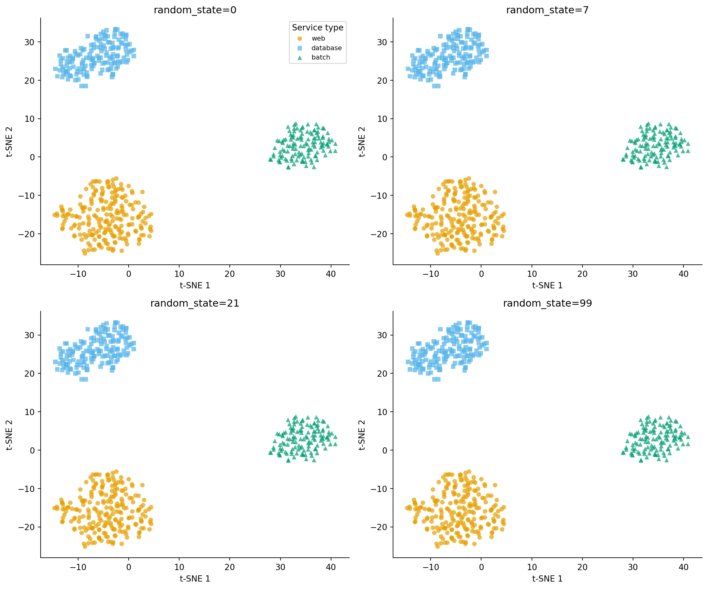
To make the stochasticity caveat concrete, here is the same data run through t-SNE four times with four different random seeds. Same algorithm, same parameters, same input — only the seed changes.
```{python}
#| label: fig-tsne-seeds
#| echo: true
#| fig-cap: "Four t-SNE embeddings of the same telemetry data, differing only in `random_state`. The three service types remain cleanly separated in every panel, but the *layout* — which cluster ends up top-left, which is rotated, which is flipped — varies arbitrarily from seed to seed. Read t-SNE plots for *what is grouped*, not for *where things sit*."
#| fig-alt: "Two-by-two grid of t-SNE scatter plots. Each panel shows the three service types (web, database, batch) as orange circles, blue squares, and green triangles, with axes labelled t-SNE 1 and t-SNE 2. In every panel the three clusters are distinct and well-separated, but their positions and orientations differ: in one panel the database cluster is in the upper-right, in another it is at the bottom; one panel has clusters arranged roughly vertically, another horizontally. The clusters themselves are stable; the global layout is not."
fig, axes = plt.subplots(2, 2, figsize=(12, 10))
fig.patch.set_alpha(0)

for ax, seed in zip(axes.ravel(), [0, 7, 21, 99]):
    ax.patch.set_alpha(0)
    tsne_seed = TSNE(n_components=2, perplexity=30, random_state=seed)
    X_tsne_seed = tsne_seed.fit_transform(X_scaled)
    for stype, style in type_styles.items():
        mask = telemetry['service_type'] == stype
        ax.scatter(X_tsne_seed[mask, 0], X_tsne_seed[mask, 1],
                   c=style['color'], marker=style['marker'],
                   label=stype, alpha=0.7, edgecolor='none', s=30)
    ax.set_title(f'random_state={seed}')
    ax.set_xlabel('t-SNE 1')
    ax.set_ylabel('t-SNE 2')
    ax.spines[['top', 'right']].set_visible(False)

axes[0, 0].legend(title='Service type', loc='best', fontsize=8)
plt.tight_layout()
plt.show()
```
The clusters are *robust*: the same three groups appear, with similar membership, in every panel. The *layout* is not: which cluster lands where, whether the picture is rotated or mirrored, which clusters look "close" to which — none of that is stable. If you screenshot one of these panels and write a story about the geometry ("databases sit between web and batch, suggesting they share characteristics with both"), you've written fiction. Re-run with a different seed and the geometry changes; only the partitioning is real. PCA, by contrast, is deterministic up to sign flips: rerun it with any seed and you get the same projection.
A popular alternative is **UMAP** (Uniform Manifold Approximation and Projection), which tends to better preserve global structure than t-SNE while being significantly faster on large datasets. We won't cover it here (it requires an additional dependency), but if you're working with datasets of tens of thousands of observations or more, it's worth investigating.
## Summary {#sec-dimreduction-summary}
1. **High-dimensional, correlated features carry redundant information.** Dimensionality reduction finds a smaller set of composite variables that capture most of the variation, making data easier to visualise, model, and interpret.
2. **PCA finds linear combinations of features that maximise variance**, producing orthogonal components ordered by importance. It requires standardisation so that scale differences don't dominate.
3. **The number of components is a bias-variance decision.** Too few and you lose signal (underfitting); too many and you keep noise. Scree plots and cumulative explained variance guide the choice.
4. **Component loadings reveal what each composite variable captures**, but the interpretation is post-hoc and subjective — the algorithm optimises mathematics, not semantics.
5. **t-SNE preserves local neighbourhood structure non-linearly**, producing visually compelling 2D embeddings. But distances between clusters and cluster sizes are not interpretable — it's a visualisation tool, not a general-purpose dimensionality reducer.
## Exercises {#sec-dimreduction-exercises}
1. Fit PCA to the telemetry data *without* standardising first (skip the `StandardScaler` step). Which component dominates, and why? Compare the explained variance ratios to the standardised version.
2. Plot the cumulative explained variance for all 15 components. How many components are needed to reach 80%? 90%? 95%? If you were building a downstream model, which threshold would you choose and why?
3. Run t-SNE on the standardised telemetry data with perplexity values of 5, 30, and 100. Plot the three embeddings side by side. How does perplexity affect the visual separation of service types?
4. **Conceptual:** After applying PCA to reduce your feature space from 15 to 4 components, you fit a linear regression using the components as input features. Can you interpret the regression coefficients the same way you would interpret coefficients on the original features? Why or why not?
5. **Conceptual:** When is dimensionality reduction harmful rather than helpful? Describe a scenario where all 15 features carry unique, uncorrelated information, and reducing dimensions would discard signal rather than noise.
6. **Conceptual:** PCA is often described as refactoring your feature space. Refactoring, by definition, changes internal structure while preserving external behaviour exactly. In what specific ways does PCA violate that guarantee? Consider information preservation, the interpretability of what you are left with, reversibility, and whether "preserving the most variance" is the same as "preserving what a downstream model needs."