---
# Content: CC BY-NC-SA 4.0 | Code: MIT - see /LICENSE.md
title: "Exercise answers"
---
{{< include /_common-imports.qmd >}}
These are suggested answers and discussion points for the exercises at the end of each chapter. For coding exercises, the code shown here is one reasonable approach; yours may differ and still be perfectly correct.
## Chapter 1: From deterministic to probabilistic thinking
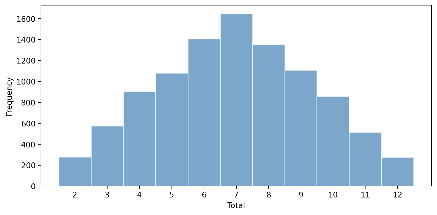
**Exercise 1.** Simulating two-dice totals.
```{python}
#| label: ex-ch1-q1
#| echo: true
#| fig-cap: "Distribution of totals from rolling two dice 10,000 times."
#| fig-alt: "Histogram of the totals from 10,000 rolls of two dice, with totals from 2 to 12 on the horizontal axis and frequency on the vertical axis. The bars form a symmetric triangular shape peaking at 7 and tapering to the rare extremes of 2 and 12, illustrating that more combinations produce a total of 7 than any other value."
rng = np.random.default_rng(42)

rolls = rng.integers(1, 7, size=(10_000, 2))
totals = rolls.sum(axis=1)

fig, ax = plt.subplots(figsize=(8, 4))
ax.hist(totals, bins=np.arange(1.5, 13.5, 1), edgecolor='white', color='#0072B2', alpha=0.7)
ax.set_xlabel('Total')
ax.set_ylabel('Frequency')
ax.set_xticks(range(2, 13))
plt.tight_layout()
```
The distribution is triangular, peaking at 7. This is because there are more combinations that produce a total of 7 (1+6, 2+5, 3+4, 4+3, 5+2, 6+1 — six combinations) than any other total. The extremes (2 and 12) each have only one combination. This is an early example of how the *sum* of random variables tends towards a characteristic shape, a theme that becomes central when we meet the Central Limit Theorem.
**Exercise 2.** API response time distribution.
The key properties the distribution needs are: strictly positive support (latencies can't be negative), right-skewed shape (most requests are fast, a long tail of slow ones), and continuous values. Several distributions fit this description.
The **log-normal** is often the best fit in practice, because it captures the multiplicative nature of latency: each layer of the stack multiplies the total time rather than adding to it. The **exponential** is simpler but assumes memorylessness, which doesn't always hold for real systems where slow requests tend to stay slow (e.g. due to cache misses or lock contention). The **gamma** and **Weibull** distributions are also reasonable choices. The point of the exercise is not to guess the "right" answer but to recognise that the constraints of the problem (positive, skewed, continuous) narrow the field considerably.
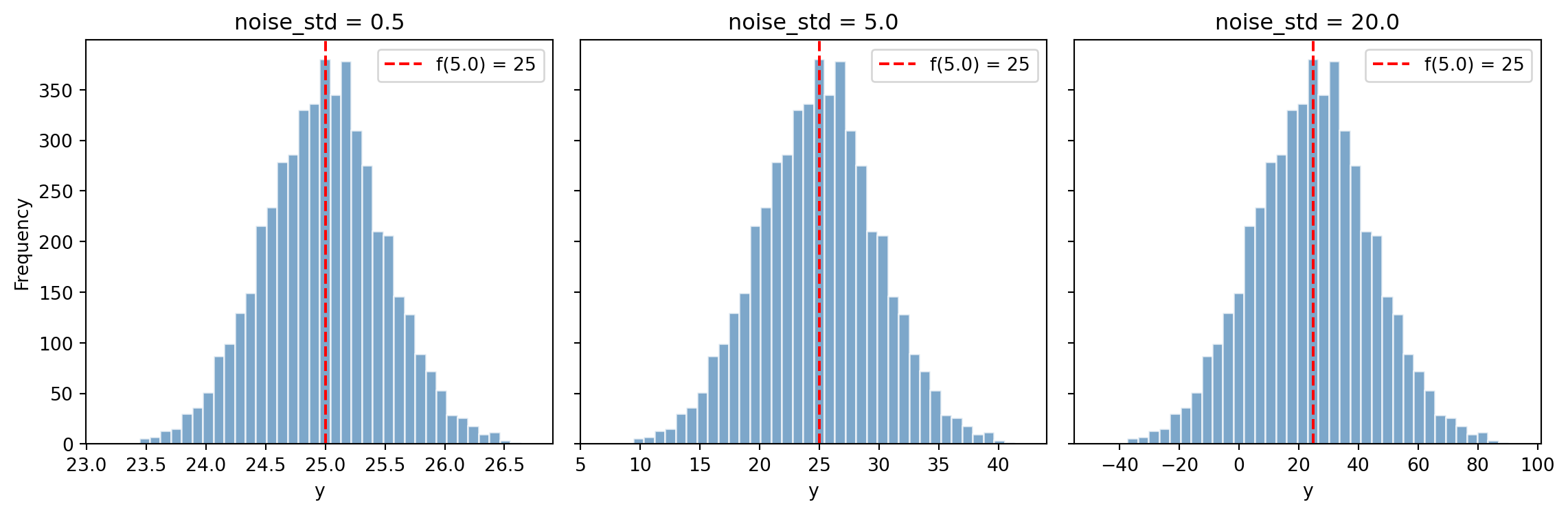
**Exercise 3.** Simulating a data-generating process.
```{python}
#| label: ex-ch1-q3
#| echo: true
#| fig-cap: "As noise increases, the spread of outcomes grows while the central tendency remains at f(x)."
#| fig-alt: "Three-panel figure of histograms of simulated outcomes for noise standard deviations of 0.5, 5.0, and 20.0, with a dashed vertical line marking f(5) = 25 in each. All three histograms stay centred on 25, but the spread widens markedly from left to right, illustrating that the noise term governs the spread while the signal fixes the centre."
def simulate_dgp(f, noise_std, x, n_simulations):
    """Simulate y = f(x) + epsilon for a given noise level."""
    rng = np.random.default_rng(42)
    return f(x) + rng.normal(0, noise_std, size=n_simulations)

# A simple deterministic function
f = lambda x: 3 * x + 10
x = 5.0

fig, axes = plt.subplots(1, 3, figsize=(12, 4), sharey=True)
for ax, noise in zip(axes, [0.5, 5.0, 20.0]):
    outcomes = simulate_dgp(f, noise, x, 5_000)
    ax.hist(outcomes, bins=40, edgecolor='white', color='#0072B2', alpha=0.7)
    ax.axvline(f(x), color='red', linestyle='--', label=f'f({x}) = {f(x):.0f}')
    ax.set_title(f'noise_std = {noise}')
    ax.set_xlabel('y')
    ax.legend()

axes[0].set_ylabel('Frequency')
plt.tight_layout()
```
All three panels centre on $f(5) = 25$. As `noise_std` increases, the histogram spreads out but stays centred. This illustrates the $y = f(x) + \varepsilon$ model: the signal ($f(x)$) determines the centre, while the noise ($\varepsilon$) determines the spread. The function hasn't changed — only our ability to observe it precisely.
**Exercise 4.** DGP-as-API analogy — where it breaks down.
Two properties of a real API that a data-generating process lacks:
1. **Documentation and contracts.** A real API has a schema, a changelog, and often a support team. A data-generating process has none of these: you cannot look up the "specification" of how customer churn works. This makes statistical modelling harder because you have to infer the structure entirely from observed data, with no ground truth to validate against beyond out-of-sample performance.
2. **Versioning and stability guarantees.** A well-maintained API has semantic versioning: you know when breaking changes are introduced. A data-generating process can shift without warning (a phenomenon called *distribution shift* or *concept drift*). Customer behaviour changes, market conditions evolve, and the model you fitted last quarter may no longer describe the process generating today's data. Unlike an API migration, there is no deprecation notice.
Other valid answers include: APIs are deterministic (same request, same response) while DGPs are stochastic; APIs have well-defined error codes while DGPs have irreducible noise that looks identical to signal; APIs can be tested with known inputs while DGPs cannot be "called" with controlled experiments in many real-world settings.
**Exercise 5.** Floating-point arithmetic and the deterministic/stochastic boundary.
```{python}
#| label: ex-ch1-q5
#| echo: true
# This is deterministic but surprising
print(f"sum([0.1] * 3) == 0.3 → {sum([0.1] * 3) == 0.3}")
print(f"sum([0.1] * 3) = {sum([0.1] * 3)!r}")
```
This is *not* nondeterminism. The result is fully deterministic — the same code will produce the same result on any IEEE 754-compliant machine. It's a representation error: 0.1 cannot be represented exactly in binary floating point, so the accumulated rounding produces a result (`0.30000000000000004`) that differs from 0.3 by a tiny amount.
This differs from the stochastic variation in the chapter in a fundamental way: the "noise" in floating-point arithmetic is *predictable and reproducible* given the same inputs, platform, and compiler. Stochastic variation, by contrast, is inherently unpredictable even with identical inputs. A flaky test caused by floating-point issues can be fixed (use `math.isclose`, avoid exact equality on floats); a test on a genuinely stochastic quantity cannot be "fixed" in the same sense — you can only reason about it probabilistically.
The broader lesson: the chapter's clean split between deterministic and stochastic is a pedagogical simplification. Real systems sit on a spectrum. Floating-point arithmetic is deterministic but surprising. Hash table iteration order (in older Python versions) is deterministic but practically unpredictable. And flaky tests are often deterministic in principle but stochastic in practice because the hidden inputs (timing, resource state) are effectively random. Recognising where you sit on this spectrum tells you whether you need debugging tools or statistical tools.
## Chapter 2: Distributions: the type system of uncertainty
**Exercise 1.** Poisson requests — analytical vs simulated.
```{python}
#| label: ex-ch2-q1
#| echo: true
from scipy import stats

rng = np.random.default_rng(42)

poisson = stats.poisson(mu=100)

# Analytical
p_analytical = 1 - poisson.cdf(120)
print(f"P(X > 120) analytical: {p_analytical:.4f}")

# Simulated
simulated_minutes = rng.poisson(lam=100, size=10_000)
p_simulated = np.mean(simulated_minutes > 120)
print(f"P(X > 120) simulated:  {p_simulated:.4f}")
print(f"Difference:            {abs(p_analytical - p_simulated):.4f}")
```
The two values should be very close. With 10,000 simulations, you'd typically expect agreement to within about 1 percentage point. This demonstrates a key principle: analytical solutions and simulation should converge, and when they don't, it's a sign that one of your assumptions is wrong.
**Exercise 2.** Binomial pipeline stages.
```{python}
#| label: ex-ch2-q2
#| echo: true
from scipy import stats

pipeline = stats.binom(n=8, p=0.98)

p_all_pass = pipeline.pmf(8)
p_at_least_6 = 1 - pipeline.cdf(5)

print(f"P(all 8 pass)      = {p_all_pass:.6f}")
print(f"P(all 8 pass) naive = {0.98 ** 8:.6f}  (identical)")
print(f"P(at least 6 pass) = {p_at_least_6:.6f}")
```
For the "all pass" case, the binomial PMF simplifies to $p^n = 0.98^8$, so naive multiplication works. But "at least 6 pass" requires summing over multiple outcomes, $P(X = 6) + P(X = 7) + P(X = 8)$, each involving a different number of ways to arrange the successes and failures. This is where the binomial distribution earns its keep: $\binom{8}{6}$, $\binom{8}{7}$, and $\binom{8}{8}$ weight each term correctly. Naive multiplication cannot account for these combinatorial possibilities.
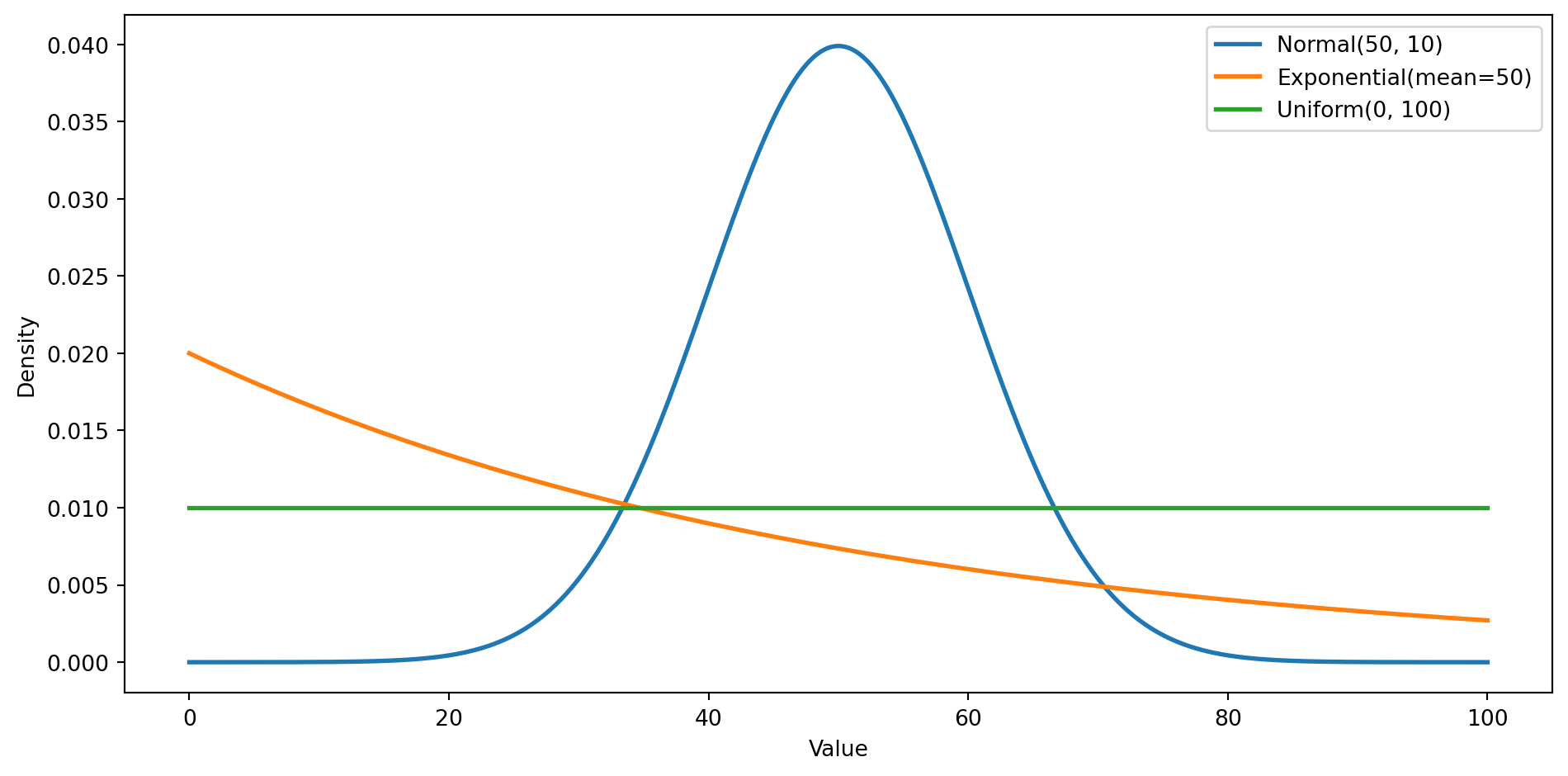
**Exercise 3.** Three distributions with the same mean.
```{python}
#| label: ex-ch2-q3
#| echo: true
#| fig-cap: "Three distributions with mean 50. Same centre, very different shapes of uncertainty."
#| fig-alt: "Line chart of three probability density curves over values from 0 to 100, all sharing a mean of 50. The Normal(50, 10) curve is a symmetric bell concentrated near 50; the Exponential curve is highest at zero and decays with a long right tail; the Uniform(0, 100) curve is a flat horizontal line. Together they show that the same mean can correspond to very different shapes of uncertainty."
from scipy import stats

x = np.linspace(0, 100, 500)
fig, ax = plt.subplots(figsize=(10, 5))

ax.plot(x, stats.norm(50, 10).pdf(x), linewidth=2, label='Normal(50, 10)')
ax.plot(x, stats.expon(scale=50).pdf(x), linewidth=2, label='Exponential(mean=50)')
ax.plot(x, stats.uniform(0, 100).pdf(x), linewidth=2, label='Uniform(0, 100)')

ax.set_xlabel('Value')
ax.set_ylabel('Density')
ax.legend()
plt.tight_layout()
```
All three have a mean of 50, but they represent fundamentally different kinds of uncertainty. The **normal** says "values near 50 are most likely, and extreme values are rare": symmetric, concentrated uncertainty. The **exponential** says "small values are most likely, but occasionally you'll see very large ones": asymmetric, heavy-tailed uncertainty. The **uniform** says "I have no idea; anything between 0 and 100 is equally plausible": maximum ignorance. The mean alone tells you almost nothing about the shape of uncertainty. This is why distributions matter.
**Exercise 4.** Where the type system analogy breaks down.
The analogy breaks down in several interesting ways:
*Multiple membership.* In a type system, a value has one type (or a well-defined place in a type hierarchy). A data point of 7 is equally consistent with Normal(7, 1), Poisson(7), Uniform(0, 14), and infinitely many other distributions. Values don't "belong to" distributions; distributions are models we impose on data.
*Subtyping.* There are relationships between distributions that resemble subtyping. A Bernoulli distribution is a Binomial with $n=1$. A Normal with $\mu=0$ and $\sigma=1$ is a special case of the general Normal. The exponential is a special case of the Gamma distribution. But these are parameter specialisations, not subtype polymorphism: you can't substitute a Poisson where a Normal is expected and have things "just work."
*Type errors.* The closest analogue to a type error is a **model misspecification**: using a normal distribution for data that's actually count-based, or assuming independence when observations are correlated. But unlike a type error, which is caught at compile time (or runtime), model misspecification is subtle and can go undetected unless you actively check for it with diagnostic tools. There's no compiler for statistical models.
## Chapter 3: Descriptive statistics: profiling your data
**Exercise 1.** Robustness to outliers.
```{python}
#| label: ex-ch3-q1
#| echo: true
rng = np.random.default_rng(42)
data = rng.normal(0, 1, 1000)

def summary(arr):
    q1, q3 = np.percentile(arr, [25, 75])
    return {
        'mean': np.mean(arr),
        'median': np.median(arr),
        'std': np.std(arr, ddof=1),
        'IQR': q3 - q1,
    }

before = summary(data)
after = summary(np.append(data, 100))  # Add single outlier

print(f"{'Measure':<10} {'Before':>10} {'After':>10} {'Change':>10}")
print('-' * 42)
for key in before:
    b, a = before[key], after[key]
    print(f"{key:<10} {b:>10.4f} {a:>10.4f} {a - b:>+10.4f}")
```
The mean and standard deviation are dramatically affected by the single outlier. The median barely moves, and the IQR is essentially unchanged. This is why the median and IQR are called **robust** (or resistant) measures: they're based on ranks rather than values, so extreme observations don't distort them. When exploring unfamiliar data, robust measures are safer defaults.
**Exercise 2.** Pearson vs Spearman with outliers.
```{python}
#| label: ex-ch3-q2
#| echo: true
from scipy import stats

rng = np.random.default_rng(42)

# Generate base data: payload size vs response time with a linear relationship
payload_kb = rng.lognormal(mean=3, sigma=1, size=500)
response_ms = 10 + 0.5 * payload_kb + rng.normal(0, 15, size=500)

# Compute correlations before outliers
r_pearson, _ = stats.pearsonr(payload_kb, response_ms)
r_spearman, _ = stats.spearmanr(payload_kb, response_ms)
print('Before outliers:')
print(f"  Pearson:  {r_pearson:.4f}")
print(f"  Spearman: {r_spearman:.4f}")

# Add 5 outlier points: very large payloads with fast responses (cached)
outlier_payload = rng.lognormal(mean=6, sigma=0.3, size=5)
outlier_response = rng.normal(5, 2, size=5)  # Fast cached responses

payload_with_outliers = np.concatenate([payload_kb, outlier_payload])
response_with_outliers = np.concatenate([response_ms, outlier_response])

r_pearson_out, _ = stats.pearsonr(payload_with_outliers, response_with_outliers)
r_spearman_out, _ = stats.spearmanr(payload_with_outliers, response_with_outliers)
print('\nAfter adding 5 cached-response outliers:')
print(f"  Pearson:  {r_pearson_out:.4f}")
print(f"  Spearman: {r_spearman_out:.4f}")
```
Pearson correlation is heavily influenced by the outliers because it works with the raw values: extreme points exert disproportionate leverage on the linear fit. Spearman correlation, which works on ranks, is much more robust: converting values to ranks reduces the influence of extreme points. For data with potential outliers or nonlinear relationships, Spearman is generally the safer choice. In this case, the outliers represent a real phenomenon (cached responses), which suggests the "true" relationship is more complex than a single correlation can capture, another reminder that visualisation matters.
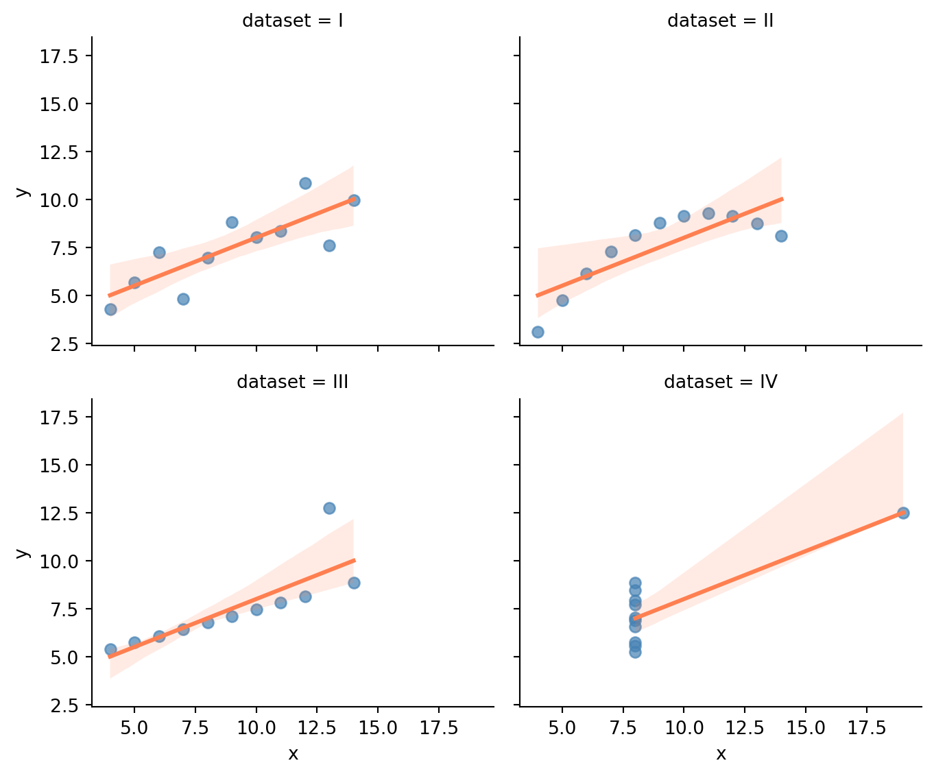
**Exercise 3.** Anscombe's quartet.
```{python}
#| label: ex-ch3-q3
#| echo: true
#| fig-cap: "Anscombe's quartet: four datasets with nearly identical summary statistics and completely different shapes."
#| fig-alt: "Four scatter plots arranged in a two-by-two grid, each showing one dataset of Anscombe's quartet with the same fitted regression line. The patterns differ sharply: a roughly linear scatter, a smooth curve, a tight line with one high outlier, and a vertical column of points with one outlier far to the right. Despite identical means, standard deviations, and correlations, the shapes are completely different, showing that summary statistics alone cannot characterise a dataset."
import seaborn as sns

anscombe = sns.load_dataset('anscombe')

g = sns.lmplot(data=anscombe, x='x', y='y', col='dataset',
               col_wrap=2, height=3, aspect=1.2,
               scatter_kws={'alpha': 0.7, 'color': '#0072B2'},
               line_kws={'color': '#E69F00'})
plt.tight_layout()
```
```{python}
#| label: ex-ch3-q3-stats
#| echo: true
for name, group in anscombe.groupby('dataset'):
    r = np.corrcoef(group['x'], group['y'])[0, 1]
    print(f"Dataset {name}: mean_x={group['x'].mean():.1f}, "
          f"mean_y={group['y'].mean():.2f}, "
          f"std_y={group['y'].std():.2f}, r={r:.3f}")
```
The four datasets have nearly identical means, standard deviations, and correlations — yet they include a linear relationship, a perfect curve, a perfect line with one outlier, and a vertical line with one outlier. The point is stark: **summary statistics alone cannot characterise a dataset**. You must visualise. This is the single most important lesson in descriptive statistics.
**Exercise 4.** Where the observability analogy breaks down.
Two key differences (others are valid):
1. **No ground truth during exploration.** When profiling a running service, you have SLOs and expected behaviour: you *know* what normal looks like and can immediately spot deviations. When profiling a dataset for modelling, you often don't know what "normal" looks like. The entire point of descriptive statistics is to *discover* the distribution's shape, not to check it against a known spec. This makes the exercise more open-ended and more prone to confirmation bias.
2. **No live feedback loop.** Observability tools update in real time: you change a configuration, and the dashboard reflects the effect within seconds. With a static dataset, there's no equivalent of "deploy a fix and watch the p99 drop." You're working with a fixed snapshot, and the only way to learn more is to collect new data or look at the existing data from a different angle. This means your initial profiling choices (which variables to examine, which plots to draw) matter more, because there's no iterative tightening of the feedback loop.
## Chapter 4: Probability: from error handling to inference
**Exercise 1.** Notification system — at least one channel delivers.
```{python}
#| label: ex-ch4-q1
#| echo: true
# Channel delivery rates
p_email = 0.98
p_sms = 0.95
p_push = 0.90

# Analytical: P(at least one) = 1 - P(none deliver)
# Channels are independent, so P(none) = P(no email) * P(no sms) * P(no push)
p_none = (1 - p_email) * (1 - p_sms) * (1 - p_push)
p_at_least_one = 1 - p_none
print(f"P(at least one delivers) = 1 - {p_none:.6f} = {p_at_least_one:.6f}")

# Simulation
rng = np.random.default_rng(42)
n_sim = 100_000

email_delivers = rng.random(n_sim) < p_email
sms_delivers = rng.random(n_sim) < p_sms
push_delivers = rng.random(n_sim) < p_push

received = email_delivers | sms_delivers | push_delivers
p_simulated = received.mean()

print(f"P(at least one) simulated: {p_simulated:.6f}")
print(f"Difference:                {abs(p_at_least_one - p_simulated):.6f}")
```
The complement rule makes this clean: rather than computing the probability of all the ways at least one channel could deliver (email only, SMS only, push only, email and SMS, ...), compute the single way that *none* deliver and subtract from 1. The simulation confirms the analytical result. With 100,000 trials, the agreement is typically within a fraction of a percentage point.
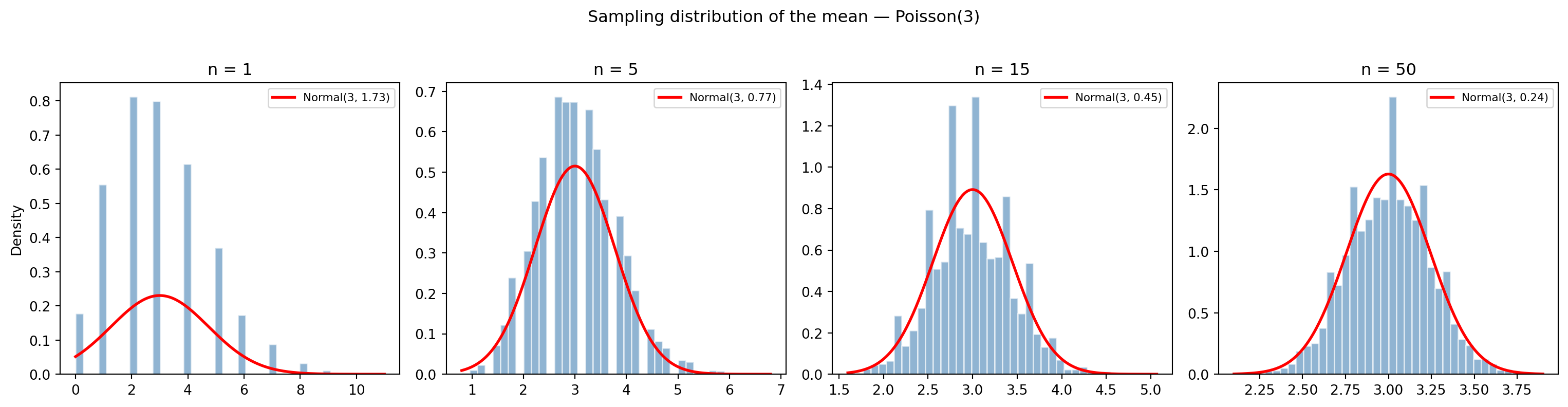
**Exercise 2.** CLT exploration with Poisson(3).
```{python}
#| label: ex-ch4-q2
#| echo: true
#| fig-cap: "Sampling distributions of the mean from Poisson(3) for increasing sample sizes, with the CLT-predicted Normal overlaid in red."
#| fig-alt: "Four-panel figure of histograms showing the sampling distribution of the mean for sample sizes n = 1, 5, 15, and 50, each with the Central-Limit-Theorem Normal density overlaid as a red curve. At n = 1 the histogram is discrete and right-skewed like the underlying Poisson; as n grows the histograms become narrower, smoother, and more symmetric, matching the Normal curve ever more closely and illustrating convergence to normality."
from scipy import stats

rng = np.random.default_rng(42)

mu = 3  # Poisson mean and variance are both lambda
sample_sizes = [1, 5, 15, 50]

fig, axes = plt.subplots(1, 4, figsize=(16, 4))

for ax, n in zip(axes, sample_sizes):
    # Draw 5,000 samples of size n; compute the mean of each
    means = [rng.poisson(lam=mu, size=n).mean() for _ in range(5_000)]

    ax.hist(means, bins=40, density=True, alpha=0.6, color='#0072B2',
            edgecolor='white')

    # CLT prediction: Normal(mu, sigma/sqrt(n))
    # For Poisson, sigma = sqrt(lambda)
    se = np.sqrt(mu / n)
    x = np.linspace(min(means), max(means), 200)
    ax.plot(x, stats.norm(mu, se).pdf(x), 'r-', linewidth=2,
            label=f'Normal({mu}, {se:.2f})')

    ax.set_title(f'n = {n}')
    ax.legend(fontsize=8)

axes[0].set_ylabel('Density')
fig.suptitle('Sampling distribution of the mean — Poisson(3)', y=1.02)
plt.tight_layout()
```
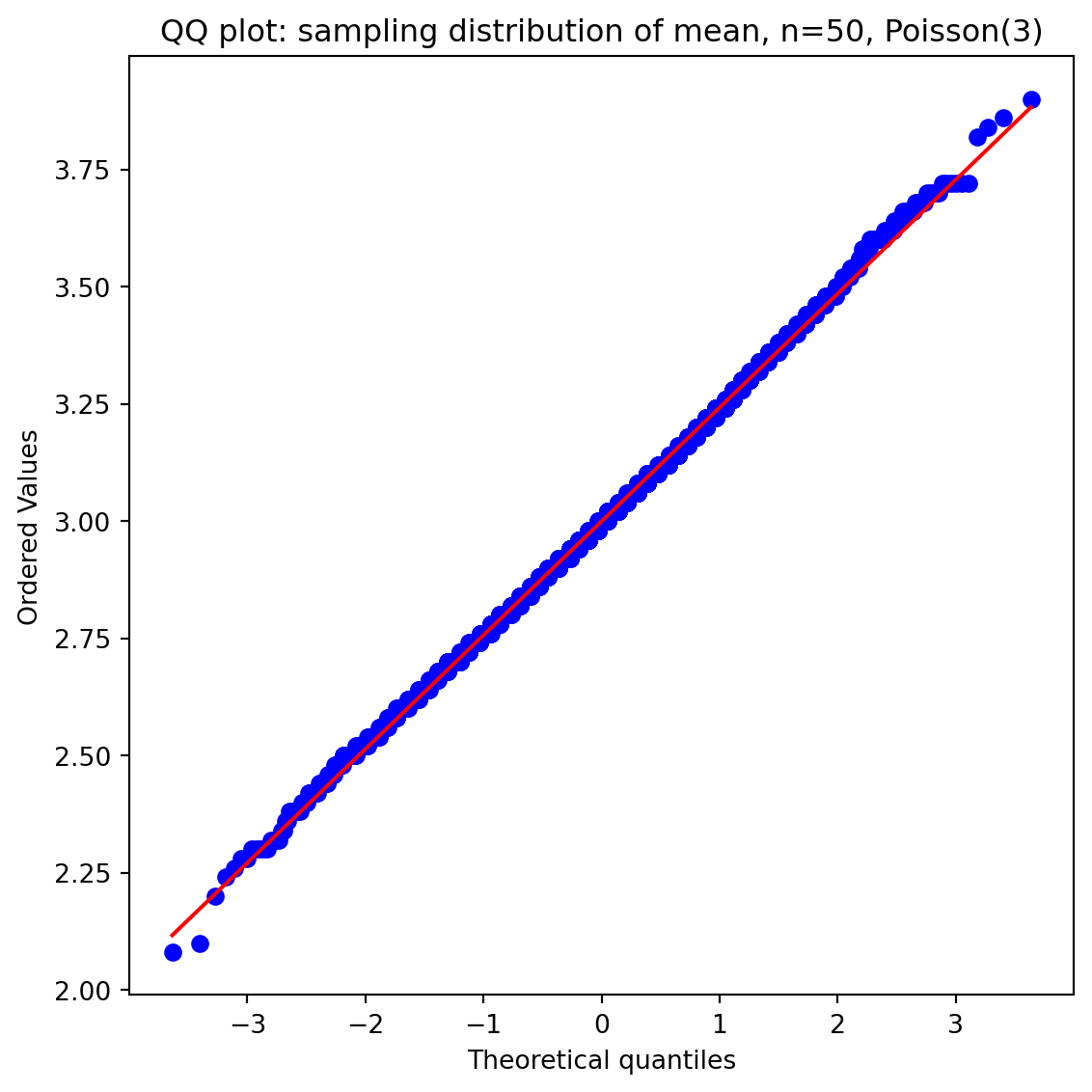
```{python}
#| label: ex-ch4-q2-qq
#| echo: true
#| fig-cap: "QQ plot for n=50: if the sampling distribution is truly Normal, points should fall close to the red line."
#| fig-alt: "Normal quantile-quantile plot of the sampling distribution of the mean for n = 50 from Poisson(3). The plotted points lie almost exactly along the straight red reference line, with only slight deviation at the extreme tails, confirming that the sampling distribution is close to Normal at this sample size."
from scipy import stats

rng = np.random.default_rng(42)
means_50 = [rng.poisson(lam=3, size=50).mean() for _ in range(5_000)]

fig, ax = plt.subplots(figsize=(6, 6))
stats.probplot(means_50, dist='norm', plot=ax)
ax.set_title('QQ plot: sampling distribution of mean, n=50, Poisson(3)')
plt.tight_layout()
```
At $n = 1$, the sampling distribution is just the Poisson itself, discrete and right-skewed. By $n = 5$, it is already becoming smoother. By $n = 15$, the Normal approximation is visually convincing. At $n = 50$, the QQ plot confirms close agreement with normality. The Poisson(3) is noticeably skewed, so the CLT takes a moderate sample size to kick in; a symmetric starting distribution would converge faster.
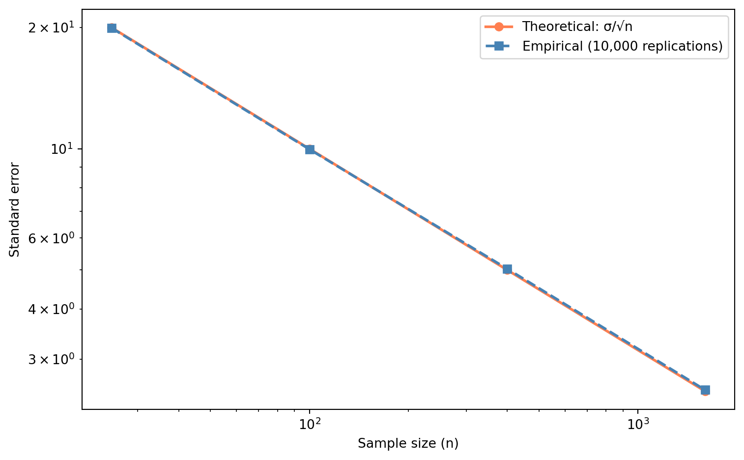
**Exercise 3.** Standard error vs sample size for Exponential data.
```{python}
#| label: ex-ch4-q3
#| echo: true
#| fig-cap: "Theoretical vs empirical standard error for increasing sample sizes. The 4× rule holds: quadruple the data, halve the SE."
#| fig-alt: "Log-log line chart of standard error against sample size for n = 25, 100, 400, and 1600. Two near-identical decreasing series are shown: the theoretical sigma over root-n curve (circles, solid) and the empirical standard error from simulation (squares, dashed). Both fall as a straight line on log-log axes, demonstrating the one-over-root-n relationship in which quadrupling the sample halves the standard error."
rng = np.random.default_rng(42)

mu = 100  # Exponential mean; for Exponential, sigma = mu
sigma = mu
sample_sizes = [25, 100, 400, 1600]

theoretical_se = [sigma / np.sqrt(n) for n in sample_sizes]
empirical_se = []

for n in sample_sizes:
    # Draw 10,000 samples of size n; compute mean of each
    sample_means = np.array([rng.exponential(scale=mu, size=n).mean()
                             for _ in range(10_000)])
    empirical_se.append(sample_means.std())

print(f"{'n':>6}  {'Theoretical SE':>15}  {'Empirical SE':>13}  {'Ratio':>6}")
print('-' * 55)
for i, n in enumerate(sample_sizes):
    ratio = theoretical_se[i] / empirical_se[i]
    print(f"{n:>6}  {theoretical_se[i]:>15.4f}  {empirical_se[i]:>13.4f}  {ratio:>6.3f}")

# Verify the 4x rule
print(f"\nSE at n=25 / SE at n=100   = {theoretical_se[0]/theoretical_se[1]:.1f}x "
      f"(expected 2.0x)")
print(f"SE at n=100 / SE at n=400  = {theoretical_se[1]/theoretical_se[2]:.1f}x "
      f"(expected 2.0x)")
print(f"SE at n=400 / SE at n=1600 = {theoretical_se[2]/theoretical_se[3]:.1f}x "
      f"(expected 2.0x)")

fig, ax = plt.subplots(figsize=(8, 5))
ax.plot(sample_sizes, theoretical_se, 'o-', color='#E69F00', linewidth=2,
        label='Theoretical: σ/√n')
ax.plot(sample_sizes, empirical_se, 's--', color='#0072B2', linewidth=2,
        label='Empirical (10,000 replications)')
ax.set_xlabel('Sample size (n)')
ax.set_ylabel('Standard error')
ax.set_xscale('log')
ax.set_yscale('log')
ax.legend()
plt.tight_layout()
```
The theoretical and empirical values agree closely. The $4\times$ rule holds exactly in theory ($\sqrt{4} = 2$) and approximately in simulation. On the log-log plot, the $1/\sqrt{n}$ relationship appears as a straight line with slope $-1/2$. The practical implication is stark: to halve your estimation error, you need four times as much data. This is the diminishing-returns law of statistical precision.
**Exercise 4.** Bayes' theorem with a code-coverage tool.
```{python}
#| label: ex-ch4-q4
#| echo: true
# P(flagged | bug) = 0.80  (sensitivity / true positive rate)
# P(flagged | no bug) = 0.10  (false positive rate)
# P(bug) varies

sensitivity = 0.80
fpr = 0.10

print(f"{'Base rate':>10}  {'P(bug|flagged)':>15}  {'Interpretation'}")
print('-' * 60)

for base_rate in [0.01, 0.03, 0.05, 0.20]:
    # Bayes' theorem:
    # P(bug|flagged) = P(flagged|bug) * P(bug) / P(flagged)
    # P(flagged) = P(flagged|bug)*P(bug) + P(flagged|no bug)*P(no bug)
    p_flagged = sensitivity * base_rate + fpr * (1 - base_rate)
    p_bug_given_flagged = (sensitivity * base_rate) / p_flagged

    if p_bug_given_flagged < 0.20:
        interp = 'Most flags are false positives'
    elif p_bug_given_flagged < 0.50:
        interp = 'More noise than signal'
    else:
        interp = 'Majority of flags are real bugs'

    print(f"{base_rate:>10.0%}  {p_bug_given_flagged:>15.1%}  {interp}")
```
At a 1% base rate, only about 7.5% of flagged functions actually contain a bug: the tool generates more than ten false positives for every true positive. At 3%, it rises to about 20%. Even at 5%, most flags are still false positives. Only at a 20% base rate does the tool become genuinely useful (about 67% precision).
This is the base-rate fallacy in action: a test's usefulness depends at least as much on the *prevalence* of the thing it's detecting as on the test's own accuracy. A tool with 80% sensitivity and 10% false positive rate sounds impressive until you realise that in a clean codebase, the false positives vastly outnumber the true positives. The same principle applies to monitoring alerts, security scanners, and medical tests.
**Exercise 5.** Where the error-handling analogy breaks down.
The probability-as-error-handling analogy breaks down in at least two important ways:
*Independence rarely holds.* The opening example multiplied independent failure probabilities: $P(A \cap B) = P(A) \times P(B)$. In real systems, failures are usually correlated. A network partition takes out multiple services simultaneously. A bad deploy affects all instances at once. A shared database becomes a single point of failure. When events are dependent, you need the full multiplication rule, $P(A \cap B) = P(A) \times P(B \mid A)$, and estimating the conditional probabilities is much harder than estimating the marginals. In practice, engineers reach for **fault tree analysis** or **Monte Carlo simulation** rather than analytic probability when dependencies are complex.
*Failure isn't binary.* The example treated each service as "up" or "down," but real failures exist on a spectrum: degraded performance, partial availability, increased error rates, higher latency. A service returning 200 OK with garbage data is simultaneously "up" and "failing." Modelling this requires moving from simple probability (binary events) to **distributions**: the service's error rate isn't 0 or 1, it's a continuous value that fluctuates. This is exactly where the distributional thinking from Chapters 2 and 3 becomes essential.
Other valid answers include: failure probabilities change over time (a system that just survived a load spike may be more fragile, not less, the opposite of the memorylessness assumption); the number of "events" isn't fixed (new services get added, old ones are deprecated); and the cost of failure varies enormously by context (a checkout failure costs far more than a recommendation failure), which probability rules alone don't capture.
## Chapter 5: Hypothesis testing: the unit test of data science
**Exercise 1.** One-sample t-test on API response times.
```{python}
#| label: ex-ch5-q1
#| echo: true
from scipy import stats

# Summary statistics
sample_mean = 127.0
hypothesised_mean = 120.0
sample_std = 45.0
n = 200

# Manual calculation
se = sample_std / np.sqrt(n)
t_stat = (sample_mean - hypothesised_mean) / se
p_value = 2 * stats.t.sf(abs(t_stat), df=n - 1)

print(f"Standard error: {se:.2f}")
print(f"t-statistic:    {t_stat:.2f}")
print(f"p-value:        {p_value:.4f}")

if p_value < 0.05:
    print('Reject H₀: evidence that response times have changed.')
else:
    print('Fail to reject H₀: insufficient evidence that response times have changed.')

# Verify with scipy
rng = np.random.default_rng(42)
sample_data = rng.normal(127, 45, 200)
t_scipy, p_scipy = stats.ttest_1samp(sample_data, popmean=120.0)
print(f"\nscipy verification: t = {t_scipy:.2f}, p = {p_scipy:.4f}")
```
The t-statistic of about 2.20 with a p-value around 0.029 falls below $\alpha = 0.05$, so we reject $H_0$. There is statistically significant evidence that the mean response time has changed from the historical 120ms. Note, though, that a 7ms difference may or may not be *practically* significant; that depends on your SLO and user expectations. The `scipy` result from generated data will differ slightly because the sample's mean and standard deviation won't exactly match the summary statistics.
**Exercise 2.** Two-sample t-test on search algorithm speed + Cohen's $d$.
```{python}
#| label: ex-ch5-q2
#| echo: true
from scipy import stats

rng = np.random.default_rng(42)

# Generate sample data consistent with the summary statistics
a = rng.normal(340, 80, 150)
b = rng.normal(315, 75, 150)

# Two-sample t-test
t_stat, p_value = stats.ttest_ind(a, b)
print(f"t-statistic: {t_stat:.2f}")
print(f"p-value:     {p_value:.4f}")

# Cohen's d (equal sample sizes, so simplified formula works)
s1, s2 = 80, 75
s_pooled = np.sqrt((s1**2 + s2**2) / 2)
cohens_d = abs(340 - 315) / s_pooled
print(f"\nCohen's d (from summary stats): {cohens_d:.2f}")
print(f"Pooled SD:  {s_pooled:.1f}")
```
The p-value should be well below 0.05, giving strong evidence that the algorithms differ in speed. Cohen's $d \approx 0.32$ is a small-to-medium effect by conventional benchmarks ($d = 0.2$ is "small," $d = 0.5$ is "medium"). A 25ms difference on a 340ms baseline is about a 7% improvement. Whether that justifies switching depends on factors the test can't answer: migration cost, maintenance burden, and whether the improvement matters to users. Statistical significance tells you the effect is real; practical significance tells you whether to act on it.
**Exercise 3.** Power analysis — sample size table.
```{python}
#| label: ex-ch5-q3
#| echo: true
from statsmodels.stats.power import NormalIndPower

power_analysis = NormalIndPower()
baseline = 0.10

print(f"{'Difference':>12}  {'Cohens h':>10}  {'n per group':>12}")
print('-' * 40)

for diff_pp in [0.5, 1.0, 2.0, 5.0]:
    diff = diff_pp / 100
    target = baseline + diff
    h = 2 * (np.arcsin(np.sqrt(target)) - np.arcsin(np.sqrt(baseline)))
    n = power_analysis.solve_power(effect_size=h, alpha=0.05,
                                    power=0.80, alternative='two-sided')
    print(f"{diff_pp:>10.1f}pp  {h:>10.4f}  {np.ceil(n):>12,.0f}")
```
The relationship is dramatic: detecting a 0.5 percentage point lift requires roughly 85 times more users than detecting a 5 percentage point lift (about 57,800 per group versus 680). This is the $1/\sqrt{n}$ law in action: halving the effect size quadruples the required sample size (approximately). The practical lesson for A/B testing is that you should decide in advance what the *smallest meaningful effect* is. If a 0.5pp lift isn't worth acting on, don't design a test to detect it; you'll need an impractically large sample. Focus your power analysis on the smallest effect that would change your decision.
**Exercise 4.** Multiple testing with Bonferroni correction.
```{python}
#| label: ex-ch5-q4
#| echo: true
from scipy import stats

rng = np.random.default_rng(42)

n_tests = 100
n_per_group = 500

# Run 100 tests where H0 is true for all
p_values = []
for _ in range(n_tests):
    a = rng.normal(0, 1, n_per_group)
    b = rng.normal(0, 1, n_per_group)
    _, p = stats.ttest_ind(a, b)
    p_values.append(p)

p_values = np.array(p_values)

# Count false positives at uncorrected alpha
uncorrected_fp = np.sum(p_values < 0.05)
print(f"Uncorrected (α = 0.05):    {uncorrected_fp} false positives out of {n_tests}")

# Bonferroni correction
bonferroni_alpha = 0.05 / n_tests
bonferroni_fp = np.sum(p_values < bonferroni_alpha)
print(f"Bonferroni  (α = {bonferroni_alpha:.4f}): {bonferroni_fp} false positives out of {n_tests}")
print(f"\nExpected false positives (uncorrected): {n_tests * 0.05:.0f}")
print(f"Expected false positives (Bonferroni):  ≤ {0.05:.2f} (family-wise)")
```
Without correction, you'll see roughly 5 false positives out of 100, exactly what $\alpha = 0.05$ predicts when every null hypothesis is true. The Bonferroni correction ($\alpha / 100 = 0.0005$) typically eliminates all of them.
The trade-off is power: the corrected threshold is so strict that real effects need to be much larger (or sample sizes much bigger) to reach significance. Bonferroni controls the **family-wise error rate**, the probability of *any* false positive across all tests, but it's conservative when tests are numerous or correlated. Less conservative alternatives like the Benjamini–Hochberg procedure control the **false discovery rate** instead, allowing more detections at the cost of a controlled proportion of false positives.
**Exercise 5.** Underpowered A/B test conclusion.
The colleague's conclusion, "there's no difference," commits the classic error of interpreting a failure to reject $H_0$ as evidence *for* $H_0$. With only 50 users per group, the test has extremely low power. A quick power analysis reveals the problem:
```{python}
#| label: ex-ch5-q5
#| echo: true
from statsmodels.stats.power import NormalIndPower

power_analysis = NormalIndPower()

# What power does n=50 per group give for a 3pp difference from 10% baseline?
baseline = 0.10
target = 0.13
h = 2 * (np.arcsin(np.sqrt(target)) - np.arcsin(np.sqrt(baseline)))

power = power_analysis.power(effect_size=h, nobs1=50,
                              alpha=0.05, alternative='two-sided')

print(f"Power to detect 3pp lift with n=50: {power:.1%}")
print(f"\nWith {power:.0%} power, there's a {1 - power:.0%} chance of missing a real")
print(f"3pp effect — the test is essentially a coin flip.")

# How many would they actually need?
n_needed = power_analysis.solve_power(effect_size=h, alpha=0.05,
                                       power=0.80, alternative='two-sided')
print(f"\nFor 80% power: n = {np.ceil(n_needed):.0f} per group")
```
With well under 10% power, the test had more than a 90% chance of missing a real 3 percentage point effect. A non-significant result at $p = 0.25$ tells you almost nothing: the test was never capable of answering the question. The advice: run a power analysis *before* the experiment to determine the required sample size, then collect enough data. Don't draw conclusions from underpowered tests.
**Exercise 6.** Where the unit-test analogy breaks down.
The analogy is genuinely useful — both are gatekeeping checks that formalise "is this behaving as expected?" — but it breaks down in at least three ways.
*Determinism.* A unit test is (ideally) deterministic: given the same code and inputs, it returns the same verdict every time. A hypothesis test is stochastic by construction. Even when $H_0$ is exactly true, the test rejects it $\alpha$ of the time — the false-positive rate is not a bug to be fixed but a designed-in property. Two analysts running the "same test" on two samples from the same population can reach opposite verdicts, and neither made a mistake.
*What a pass means.* A passing unit test is (weak) positive evidence that the code does what the assertion says. A non-significant hypothesis test is *not* evidence that $H_0$ is true — it is a failure to reject, which can equally mean "no effect" or "not enough data to detect the effect" (the power problem from exercise 5). Absence of evidence is not evidence of absence. A green test bar says "confirmed"; a non-significant p-value says only "not disproven."
*Re-running.* Re-running a unit test costs nothing and changes nothing. Re-running a hypothesis test as data accumulates — peeking — inflates the false-positive rate far beyond $\alpha$, because each look is another chance to cross the threshold by luck (the multiple-testing problem from exercise 4). The discipline a hypothesis test demands — pre-commit the sample size and the decision rule — has no real counterpart in unit testing.
The deeper point: a unit test asks a logical question with a definite answer; a hypothesis test manages uncertainty and can only ever control error rates, never eliminate them.
## Chapter 6: Confidence intervals: error bounds for estimates
**Exercise 1.** Load balancer response time CI.
```{python}
#| label: ex-ch6-q1
#| echo: true
from scipy import stats

data = np.array([23, 31, 45, 27, 33, 52, 38, 29, 41, 36, 48, 25, 30, 44, 35])

n = len(data)
x_bar = data.mean()
s = data.std(ddof=1)
se = s / np.sqrt(n)

# Manual calculation
t_crit = stats.t.ppf(0.975, df=n - 1)
ci_lower = x_bar - t_crit * se
ci_upper = x_bar + t_crit * se

print(f"n = {n}")
print(f"Sample mean: {x_bar:.2f} ms")
print(f"Sample std:  {s:.2f} ms")
print(f"Standard error: {se:.2f} ms")
print(f"t* (df={n-1}): {t_crit:.3f}")
print(f"95% CI (manual): ({ci_lower:.1f}, {ci_upper:.1f}) ms")

# Verify with scipy
ci_scipy = stats.t.interval(0.95, df=n - 1, loc=x_bar, scale=se)
print(f"95% CI (scipy):  ({ci_scipy[0]:.1f}, {ci_scipy[1]:.1f}) ms")
```
With only 15 observations, the t-critical value ($t^*_{14} \approx 2.145$) is noticeably larger than the Normal-based $z^* = 1.96$, reflecting the extra uncertainty from estimating $\sigma$ with such a small sample. The interval is fairly wide: the true mean response time could plausibly be anywhere in a range spanning roughly 20ms. If you need a narrower CI to make a deployment decision, you need more data.
**Exercise 2.** A/B test CIs with larger samples.
```{python}
#| label: ex-ch6-q2
#| echo: true
from scipy import stats

n_control, n_variant = 5000, 5000
p_control, p_variant = 0.082, 0.091

z_crit = stats.norm.ppf(0.975)

# CIs for each group
se_c = np.sqrt(p_control * (1 - p_control) / n_control)
se_v = np.sqrt(p_variant * (1 - p_variant) / n_variant)

ci_c = (p_control - z_crit * se_c, p_control + z_crit * se_c)
ci_v = (p_variant - z_crit * se_v, p_variant + z_crit * se_v)

print(f"Control: {p_control:.1%}  95% CI: ({ci_c[0]:.2%}, {ci_c[1]:.2%})")
print(f"Variant: {p_variant:.1%}  95% CI: ({ci_v[0]:.2%}, {ci_v[1]:.2%})")

# CI for the difference (unpooled)
diff = p_variant - p_control
se_diff = np.sqrt(se_c**2 + se_v**2)
ci_diff = (diff - z_crit * se_diff, diff + z_crit * se_diff)

print(f"\nDifference: {diff:.2%}")
print(f"95% CI for difference: ({ci_diff[0]:.2%}, {ci_diff[1]:.2%})")
print(f"Includes zero? {ci_diff[0] <= 0 <= ci_diff[1]}")
```
The CI for the difference includes zero (just barely), so the result is not statistically significant at the 95% level. The CI width is about 2 percentage points, which means the experiment can distinguish effects larger than roughly ±1pp from zero. A 0.9pp observed difference is on the edge of detectability. With $n = 5{,}000$ per group, this experiment was reasonably well-powered for effects of 2pp or more, but underpowered for the smaller lift that was actually observed. To reliably detect a 0.9pp effect, you'd need roughly 15,000–16,000 users per group.
**Exercise 3.** Bootstrap vs t-interval on skewed data.
```{python}
#| label: ex-ch6-q3
#| echo: true
from scipy import stats

rng = np.random.default_rng(42)

for n in [30, 200]:
    data = rng.lognormal(mean=3, sigma=1, size=n)
    x_bar = data.mean()
    se = data.std(ddof=1) / np.sqrt(n)
    t_crit = stats.t.ppf(0.975, df=n - 1)

    # t-interval
    ci_t = (x_bar - t_crit * se, x_bar + t_crit * se)

    # Bootstrap
    boot_means = np.array([
        rng.choice(data, size=n, replace=True).mean()
        for _ in range(10_000)
    ])
    ci_boot = np.percentile(boot_means, [2.5, 97.5])

    print(f"n = {n}")
    print(f"  Sample mean:    {x_bar:.1f}")
    print(f"  t-interval:     ({ci_t[0]:.1f}, {ci_t[1]:.1f})  "
          f"width = {ci_t[1] - ci_t[0]:.1f}")
    print(f"  Bootstrap:      ({ci_boot[0]:.1f}, {ci_boot[1]:.1f})  "
          f"width = {ci_boot[1] - ci_boot[0]:.1f}")
    print(f"  t-interval is symmetric around mean; "
          f"bootstrap skew = {ci_boot[1] - x_bar:.1f} vs {x_bar - ci_boot[0]:.1f}")
    print()
```
At $n = 30$ the two methods diverge noticeably. The t-interval is symmetric by construction, but the log-normal data is right-skewed, so the bootstrap CI is asymmetric, wider on the right side. The bootstrap better reflects the actual shape of the sampling distribution. At $n = 200$ the CLT has kicked in more strongly and the two intervals converge, though the bootstrap still captures a small amount of residual skew. As a rule of thumb, the t-interval becomes reliable when the sampling distribution of $\bar{x}$ (not the data itself) is approximately Normal, which depends on both $n$ and how skewed the population is.
**Exercise 4.** Coverage simulation.
```{python}
#| label: ex-ch6-q4
#| echo: true
from scipy import stats

rng = np.random.default_rng(42)

true_mean = 100
true_std = 15
n = 50
n_experiments = 1000

for conf_level in [0.90, 0.95, 0.99]:
    t_crit = stats.t.ppf((1 + conf_level) / 2, df=n - 1)
    captured = 0

    for _ in range(n_experiments):
        sample = rng.normal(true_mean, true_std, n)
        x_bar = sample.mean()
        se = sample.std(ddof=1) / np.sqrt(n)
        lower = x_bar - t_crit * se
        upper = x_bar + t_crit * se

        if lower <= true_mean <= upper:
            captured += 1

    print(f"{conf_level:.0%} CI: {captured}/{n_experiments} captured "
          f"({captured/n_experiments:.1%} actual coverage)")
```
The actual coverage rates should closely match the nominal confidence levels: about 90% of the 90% CIs contain the true mean, 95% of the 95% CIs, and 99% of the 99% CIs. With 1,000 experiments, you'll see some random variation (perhaps 94.3% instead of exactly 95%), but the agreement should be convincing. This is the defining property of a valid confidence interval procedure: the long-run coverage rate equals the stated confidence level.
**Exercise 5.** Correcting the CI interpretation.
The statement "there's a 95% probability that the true mean is between 42 and 58" treats the true mean as a random variable with a probability distribution. In frequentist statistics, the true mean is fixed (though unknown); it's the *interval* that's random. Before computing the CI, there was a 95% probability that the random interval would contain the true value. After computing it, the interval either contains the true value or it doesn't.
The correct interpretation: "We used a procedure that produces intervals containing the true mean 95% of the time. This interval is one result of that procedure." It's a statement about the method's reliability, not about the specific interval.
From a decision-making standpoint, the distinction *usually* doesn't matter in practice. If you're deciding whether to investigate a performance regression and the 95% CI is (42, 58), acting as if the true value is "probably in that range" leads to the same decision as the more careful frequentist interpretation. Where it leads you astray is when you're combining evidence across multiple experiments or making sequential decisions: treating each CI as a "95% probability statement" leads to overconfidence, because 95% of them contain the truth but you don't know *which* 95%. This is exactly the multiple testing problem from the previous chapter: 20 separate "95% probability" claims will include roughly one wrong one.
## Chapter 7: A/B testing: deploying experiments
**Exercise 1.** Sample size and runtime for a checkout A/B test.
```{python}
#| label: ex-ch7-q1
#| echo: true
from statsmodels.stats.power import NormalIndPower

power_analysis = NormalIndPower()

baseline = 0.08
target = 0.08 + 0.015  # 1.5pp MDE
h = 2 * (np.arcsin(np.sqrt(target)) - np.arcsin(np.sqrt(baseline)))

# 50/50 split
n_per_group = np.ceil(power_analysis.solve_power(
    effect_size=h, alpha=0.05, power=0.80, alternative='two-sided'
))
daily_users = 2000
users_per_group_per_day = daily_users / 2
days_50_50 = int(np.ceil(n_per_group / users_per_group_per_day))
# Round up to full weeks
weeks = int(np.ceil(days_50_50 / 7))
days_50_50 = weeks * 7

print(f"Cohen's h: {h:.4f}")
print(f"Required n per group: {n_per_group:,.0f}")
print(f"\n50/50 split (1,000 per group per day):")
print(f"  Days needed: {days_50_50} ({weeks} weeks)")

# 80/20 split — unequal groups reduce power; use ratio parameter
n_variant_80_20 = np.ceil(power_analysis.solve_power(
    effect_size=h, alpha=0.05, power=0.80,
    alternative='two-sided', ratio=4  # control is 4× variant
))
n_control_80_20 = 4 * n_variant_80_20

daily_variant_users = daily_users * 0.20
days_80_20 = int(np.ceil(n_variant_80_20 / daily_variant_users))
weeks_80 = int(np.ceil(days_80_20 / 7))
days_80_20 = weeks_80 * 7

print(f"\n80/20 split (ratio=4, variant is smaller group):")
print(f"  Required n (variant): {n_variant_80_20:,.0f}")
print(f"  Required n (control): {n_control_80_20:,.0f}")
print(f"  Variant users/day: {daily_variant_users:,.0f}")
print(f"  Days needed: {days_80_20} ({weeks_80} weeks)")
print(f"\nThe 80/20 split takes roughly {days_80_20 / days_50_50:.1f}x longer.")
```
The 50/50 split is the most efficient design for statistical power. An 80/20 split protects more users from a potentially worse variant, but that safety comes at a cost: the variant group needs *more* users than in the equal-split case (because power depends on the harmonic mean of the two group sizes), and each day contributes fewer variant users. Together these effects roughly double the runtime. This is a real trade-off in practice: if the feature is risky, the slower experiment may be worth it. If the feature is low-risk, the 50/50 split gets you an answer faster.
**Exercise 2.** Simulating the peeking problem.
```{python}
#| label: ex-ch7-q2
#| echo: true
from scipy import stats

rng = np.random.default_rng(42)

n_simulations = 1000
users_per_day = 200  # per group
max_days = 30
true_rate = 0.10  # Same for both groups — no real effect

ever_significant = 0
significant_at_end = 0

for _ in range(n_simulations):
    # Accumulate data day by day
    control_conversions = 0
    variant_conversions = 0
    control_n = 0
    variant_n = 0
    found_sig = False

    for day in range(1, max_days + 1):
        control_conversions += rng.binomial(users_per_day, true_rate)
        variant_conversions += rng.binomial(users_per_day, true_rate)
        control_n += users_per_day
        variant_n += users_per_day

        # Two-proportion z-test
        p_c = control_conversions / control_n
        p_v = variant_conversions / variant_n
        p_pool = (control_conversions + variant_conversions) / (control_n + variant_n)
        se = np.sqrt(p_pool * (1 - p_pool) * (1/control_n + 1/variant_n))

        if se > 0:
            z = (p_v - p_c) / se
            p_value = 2 * stats.norm.sf(abs(z))
        else:
            p_value = 1.0

        if p_value < 0.05 and not found_sig:
            found_sig = True
            ever_significant += 1

        if day == max_days and p_value < 0.05:
            significant_at_end += 1

print(f"Ever significant (peeking daily):  {ever_significant}/{n_simulations} "
      f"= {ever_significant/n_simulations:.1%}")
print(f"Significant at day {max_days} only:       {significant_at_end}/{n_simulations} "
      f"= {significant_at_end/n_simulations:.1%}")
print(f"\nNominal α = 5%")
print(f"Inflation from peeking: ~{ever_significant/n_simulations:.0%} vs 5%")
```
With daily peeking over 30 days, roughly 25–30% of null experiments reach significance at some point, five to six times the nominal 5% rate. At the planned endpoint alone, the rate stays close to 5%. This is the peeking problem in action: the more times you check, the more chances randomness has to produce a spurious result. The fix is either to commit to a fixed analysis time or to use sequential testing methods that account for repeated looks.
**Exercise 3.** SRM check function.
```{python}
#| label: ex-ch7-q3
#| echo: true
from scipy import stats

def srm_check(n_control, n_variant, expected_ratio=0.5):
    """Test whether observed group sizes match the expected allocation ratio."""
    total = n_control + n_variant
    expected_control = total * expected_ratio
    expected_variant = total * (1 - expected_ratio)
    chi2, p_value = stats.chisquare(
        [n_control, n_variant],
        f_exp=[expected_control, expected_variant]
    )
    return p_value

# Test on the three splits
splits = [(5050, 4950), (5200, 4800), (5500, 4500)]

for n_c, n_v in splits:
    p = srm_check(n_c, n_v)
    total = n_c + n_v
    pct = n_c / total * 100
    flag = 'WARNING: Investigate' if p < 0.01 else 'OK'
    print(f"({n_c:,}, {n_v:,}) — {pct:.1f}/{100-pct:.1f}% split — "
          f"p = {p:.4f} — {flag}")
```
A 50.5/49.5 split (5050 vs 4950) is well within normal variation for 10,000 users: the p-value is high and there's no cause for concern. A 52/48 split is already suspicious ($p < 0.01$ with 10,000 users), and a 55/45 split is a definitive SRM that demands investigation before you trust the results. The standard threshold is $p < 0.01$, more conservative than the typical 0.05, because an SRM invalidates the entire experiment and you want to be quite sure before discarding results.
**Exercise 4.** Experiment design for session duration.
```{python}
#| label: ex-ch7-q4
#| echo: true
from statsmodels.stats.power import TTestIndPower

power_analysis = TTestIndPower()

baseline_mean = 4.5  # minutes
baseline_std = 3.2   # minutes
mde = 0.3            # minutes

# Cohen's d
d = mde / baseline_std

n_per_group = np.ceil(power_analysis.solve_power(
    effect_size=d, alpha=0.05, power=0.80, alternative='two-sided'
))

daily_users = 10_000
users_per_group_per_day = daily_users / 2
days_needed = int(np.ceil(n_per_group / users_per_group_per_day))
weeks = int(np.ceil(days_needed / 7))
days_needed = weeks * 7

print('=== Experiment plan: recommendation algorithm ===\n')
print(f"Hypotheses:")
print(f"  H₀: μ_new = μ_old  (no difference in session duration)")
print(f"  H₁: μ_new ≠ μ_old  (session duration differs)\n")
print(f"Primary metric: mean session duration (minutes)")
print(f"Guardrails:")
print(f"  1. Bounce rate (must not increase by >1pp)")
print(f"  2. Pages per session (must not decrease by >5%)\n")
print(f"Parameters:")
print(f"  Baseline: {baseline_mean} min (σ = {baseline_std} min)")
print(f"  MDE: {mde} min ({mde/baseline_mean:.1%} relative)")
print(f"  Cohen's d: {d:.3f} (small effect)")
print(f"  α = 0.05, power = 0.80\n")
print(f"Sample size: {n_per_group:,.0f} per group")
print(f"Runtime: {days_needed} days ({weeks} weeks) at {daily_users:,} DAU")
print(f"\nBiggest validity threats:")
print(f"  - Novelty/fatigue effects (users initially engage more/less)")
print(f"  - Day-of-week seasonality (run for full weeks)")
print(f"  - Session duration is right-skewed — monitor median alongside mean")
```
Session duration is typically right-skewed and has high variance, which is why the required sample size is large despite a seemingly reasonable 0.3-minute MDE. The biggest practical threats are novelty effects (users may explore a new recommendation system more initially, inflating session duration) and the skewed distribution (a few very long sessions can dominate the mean). Running for full weeks guards against day-of-week effects. The guardrails ensure the new algorithm doesn't increase engagement by showing clickbait that ultimately frustrates users (reflected in higher bounce rate or fewer pages per session).
**Exercise 5.** Before/after comparison problems.
A before/after comparison (this week vs last week) fails as a causal inference method for at least three reasons:
*Confounding from time-varying factors.* Anything that changed between last week and this week (a marketing campaign, a seasonal shift, a competing product launch, a public holiday, a site outage) is confounded with the treatment. You can't tell whether the conversion change came from your feature or from the calendar. An A/B test solves this by running both variants *simultaneously*, so external factors affect both groups equally.
*Regression to the mean.* If you launched the feature because last week's numbers were unusually bad, this week's numbers would likely improve *regardless* of the feature, just by reverting to the average. The impulse to "try something" is strongest when metrics are at their worst, which is exactly when regression to the mean is most likely to create the illusion of improvement.
*No variance estimate.* With one data point per condition (one week of treatment, one week of control), you have no way to estimate the natural week-to-week variability. Was a 0.5pp lift meaningful or within normal fluctuation? You can't compute a p-value or confidence interval without some measure of noise, and a single before/after pair doesn't provide one.
A before/after comparison might be acceptable when (a) the effect is so large and immediate that confounding is implausible (e.g. a feature that doubles conversion overnight), (b) you have a long historical baseline to estimate natural variability (interrupted time series analysis), or (c) you literally cannot randomise (e.g. a pricing change that must apply to everyone simultaneously, or a physical infrastructure change). Even then, it's weaker evidence than a proper experiment.
**Exercise 6.** Where the canary-deployment analogy breaks down.
A canary rollout and an A/B test share a shape — expose a subset to the new thing, watch what happens — but they answer different questions and rest on different assumptions.
*What they establish.* A canary is a safety check: it asks "does the new version break anything?" and watches operational signals (error rates, latency, crashes) that move sharply and obviously when something is wrong. An A/B test asks "is the new version *better* on a behavioural metric?" — conversion, session length, revenue — where the effect is small relative to natural user-to-user variation, so you need randomisation and statistics to separate signal from noise. A canary can pass while an A/B test would show the change to be a net negative for users.
*How they respond to a bad result.* A canary is built to be rolled back instantly and cheaply the moment a metric goes red; watching continuously and reacting immediately is the whole point. An A/B test must do the opposite: pre-commit a sample size and a stopping rule, because reacting to the first bad (or good) reading is the peeking problem that inflates the error rate.
*Independence.* Canary instances are assumed not to interfere with one another. A/B test *users* often do — through shared inventory, social features, or marketplace effects — which violates the independence assumption behind the statistics and can bias the estimated effect. Cluster randomisation exists precisely because this part of the analogy fails.
## Chapter 8: Bayesian inference: updating beliefs with evidence
**Exercise 1.** Bug rate estimation with two different priors.
```{python}
#| label: ex-ch8-q1
#| echo: true
from scipy import stats

# Data: 3 bugs in 500 sessions
k, n = 3, 500

# Prior 1: Beta(1, 1) — uniform, "no prior knowledge"
a1, b1 = 1 + k, 1 + (n - k)
post1 = stats.beta(a1, b1)

# Prior 2: Beta(2, 198) — centred at 1%, "colleague's experience"
a2, b2 = 2 + k, 198 + (n - k)
post2 = stats.beta(a2, b2)

print('Uniform prior: Beta(1, 1)')
print(f"  Posterior: Beta({a1}, {b1})")
print(f"  Mean: {post1.mean():.4f} ({post1.mean()*100:.2f}%)")
print(f"  95% CrI: ({post1.ppf(0.025):.4f}, {post1.ppf(0.975):.4f})")

print(f"\nInformative prior: Beta(2, 198)")
print(f"  Posterior: Beta({a2}, {b2})")
print(f"  Mean: {post2.mean():.4f} ({post2.mean()*100:.2f}%)")
print(f"  95% CrI: ({post2.ppf(0.025):.4f}, {post2.ppf(0.975):.4f})")

print(f"\nMLE: {k/n:.4f} ({k/n*100:.2f}%)")
```
With the uniform Beta(1, 1) prior the posterior is Beta(4, 498): the posterior mean is about 0.8% with a 95% credible interval spanning roughly 0.2% to 1.7%. (The MLE is 0.6% = 3/500; the Beta(1, 1) pseudo-counts nudge the posterior mean slightly above it.) The informative Beta(2, 198) prior is centred at 1%, but being worth about 200 pseudo-observations it actually pulls the posterior (Beta(5, 695)) the other way: the mean falls to about 0.7% and the interval narrows and shifts downward, with the upper bound dropping from about 1.7% to about 1.5%. The intuition that a prior centred at 1% must raise the estimate fails because the prior is concentrated below the data's upper credible bound and is worth almost half as much as the 500 real sessions, so its mass outweighs the sparse evidence. With many more sessions, the two posteriors would converge.
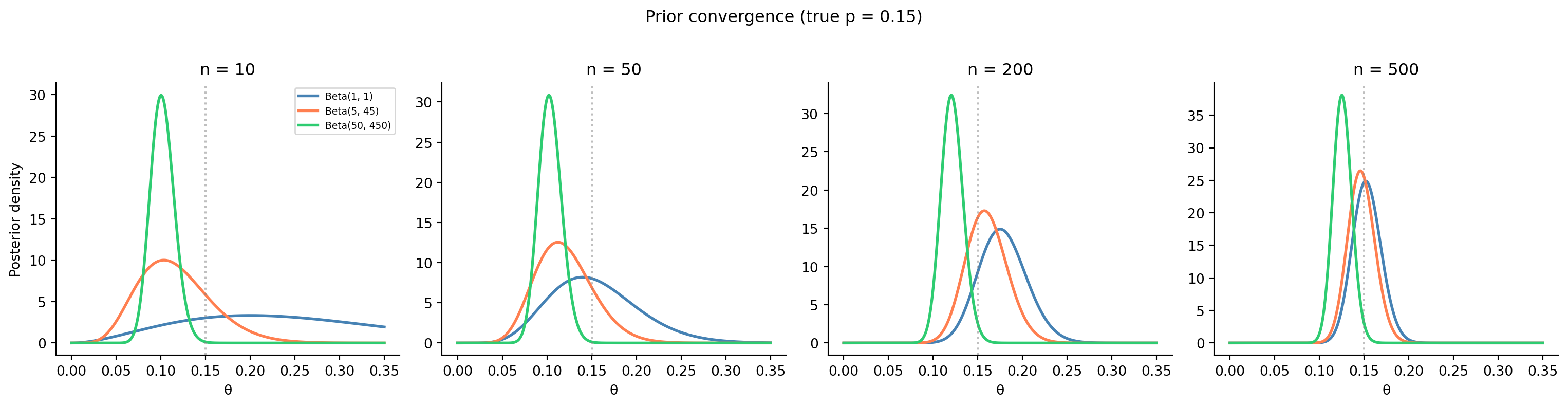
**Exercise 2.** Simulating the prior's influence.
```{python}
#| label: ex-ch8-q2
#| echo: true
#| fig-cap: "Three priors converge as sample size increases. With 50 observations, the strong prior still pulls noticeably; with 500, all three posteriors nearly overlap."
#| fig-alt: "Four-panel figure of posterior density curves for sample sizes n = 10, 50, 200, and 500, each panel showing three posteriors from a uniform, a weakly informative, and a strong prior, with a dotted vertical line at the true value. At n = 10 the three curves are widely separated and the strong prior sits near its prior mean; as n grows the curves narrow and converge, until at n = 500 all three nearly overlap, showing that data eventually overwhelms the prior."
from scipy import stats

rng = np.random.default_rng(42)

true_p = 0.15
priors = [
    ('Beta(1, 1)', 1, 1, '#0072B2'),
    ('Beta(5, 45)', 5, 45, '#E69F00'),
    ('Beta(50, 450)', 50, 450, '#009E73'),
]

sample_sizes = [10, 50, 200, 500]
fig, axes = plt.subplots(1, 4, figsize=(16, 4), sharey=False)

for ax, n_obs in zip(axes, sample_sizes):
    k = rng.binomial(n_obs, true_p)
    theta = np.linspace(0, 0.35, 500)

    for label, a, b, colour in priors:
        post = stats.beta(a + k, b + (n_obs - k))
        ax.plot(theta, post.pdf(theta), color=colour, linewidth=2, label=label)

    ax.axvline(true_p, color='grey', linestyle=':', alpha=0.5)
    ax.set_title(f'n = {n_obs}')
    ax.set_xlabel('θ')
    ax.spines[['top', 'right']].set_visible(False)

axes[0].set_ylabel('Posterior density')
axes[0].legend(fontsize=7)
fig.suptitle(f'Prior convergence (true p = {true_p})', y=1.02)
plt.tight_layout()
```
At $n = 10$, the three posteriors are noticeably different: the strong prior (Beta(50, 450), worth 500 pseudo-observations) barely moves from its prior mean of 0.10. At $n = 50$, the uniform and weakly informative priors have converged, but the strong prior still pulls towards 0.10. By $n = 200$, even the strong prior is being overwhelmed by the data, and at $n = 500$ all three posteriors are essentially identical. The rule of thumb: the prior stops mattering when the real sample size is much larger than the prior's pseudo-count. For Beta$(50, 450)$, that means you need substantially more than 500 observations to fully override it.
**Exercise 3.** Small-sample Bayesian vs frequentist A/B test.
```{python}
#| label: ex-ch8-q3
#| echo: true
from scipy import stats

rng = np.random.default_rng(42)

# Small sample: 40 per group
n_c, n_v = 40, 40
k_c, k_v = 5, 8

# Frequentist: Fisher's exact test
odds_ratio, p_fisher = stats.fisher_exact([[k_v, n_v - k_v], [k_c, n_c - k_c]])
print("Frequentist (Fisher's exact test):")
print(f"  p-value: {p_fisher:.4f}")
print(f"  Significant at α=0.05? {'Yes' if p_fisher < 0.05 else 'No'}")

# Bayesian: Beta(1,1) prior for both
posterior_c = stats.beta(1 + k_c, 1 + n_c - k_c)
posterior_v = stats.beta(1 + k_v, 1 + n_v - k_v)

samples_c = posterior_c.rvs(100_000, random_state=rng)
samples_v = posterior_v.rvs(100_000, random_state=rng)

p_better = np.mean(samples_v > samples_c)
lift = samples_v - samples_c

print(f"\nBayesian (Beta(1,1) prior):")
print(f"  P(variant > control) = {p_better:.4f}")
print(f"  Expected lift: {np.mean(lift):.4f} ({np.mean(lift)*100:.1f}pp)")
print(f"  95% CrI for lift: ({np.percentile(lift, 2.5)*100:.1f}, "
      f"{np.percentile(lift, 97.5)*100:.1f})pp")
```
Fisher's exact test returns a non-significant result: the sample is too small to detect a difference between 12.5% (5/40) and 20% (8/40). The frequentist answer is "we can't conclude anything." The Bayesian approach is more informative: it tells you there's roughly a 78–82% probability that the variant is better, with an expected lift of about 7 percentage points and a wide credible interval that includes negative values. Neither approach conjures significance from thin air, but the Bayesian answer gives the decision-maker something to work with: "there's about an 80% chance this is an improvement, but we're not sure of the magnitude." In a low-stakes decision (e.g. choosing a button colour), that might be enough to act on. In a high-stakes decision (e.g. a major infrastructure change), you'd want more data.
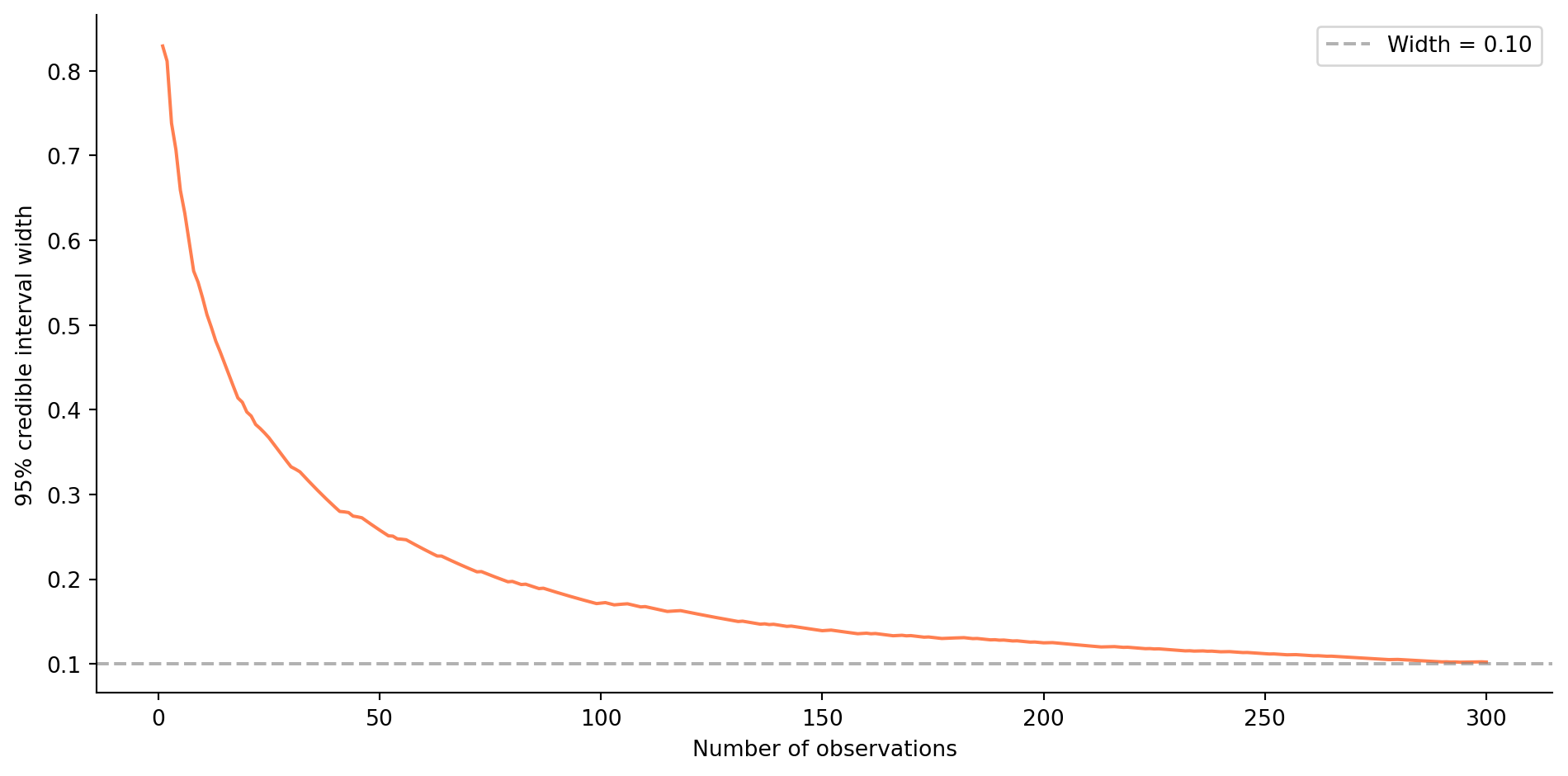
**Exercise 4.** Sequential updating and credible interval width.
```{python}
#| label: ex-ch8-q4
#| echo: true
#| fig-cap: "Credible interval width narrows as observations accumulate. The dashed line marks the 0.10 threshold."
#| fig-alt: "Line chart of the width of the 95% credible interval against the number of observations from 1 to 300. The width starts near 1.0 and falls steeply at first, then more gradually, crossing a dashed horizontal reference line at a width of 0.10 after a couple of hundred observations. The curve illustrates the diminishing-returns, one-over-root-n narrowing of the interval as data accumulates."
from scipy import stats

rng = np.random.default_rng(42)

true_p = 0.30
n_obs = 300
observations = rng.binomial(1, true_p, size=n_obs)

# Track posterior parameters and CI width after each observation
alpha, beta_param = 1, 1  # Beta(1,1) prior
widths = []

for i, obs in enumerate(observations):
    alpha += obs
    beta_param += (1 - obs)
    post = stats.beta(alpha, beta_param)
    ci_lo, ci_hi = post.ppf(0.025), post.ppf(0.975)
    widths.append(ci_hi - ci_lo)

fig, ax = plt.subplots(figsize=(10, 5))
ax.plot(range(1, n_obs + 1), widths, '#E69F00', linewidth=1.5)
ax.axhline(0.10, color='grey', linestyle='--', alpha=0.6, label='Width = 0.10')
ax.set_xlabel('Number of observations')
ax.set_ylabel('95% credible interval width')
ax.legend()
ax.spines[['top', 'right']].set_visible(False)
plt.tight_layout()

# Find when width first drops below 0.10
below = [i + 1 for i, w in enumerate(widths) if w < 0.10]
if below:
    print(f"CI width drops below 0.10 at observation {below[0]}")
else:
    print('CI width never drops below 0.10 in this run')
print(f"Final CI width: {widths[-1]:.4f}")
```
The credible interval starts very wide (nearly 1.0 with the uninformative prior) and narrows rapidly at first, then more slowly, the familiar $1/\sqrt{n}$ diminishing returns. For $p = 0.30$, the interval width typically drops below 0.10 around 200–300 observations. The exact number varies with the random seed because the posterior depends on the specific sequence of successes and failures, not just the total count (though the final posterior is the same either way; that's the beauty of conjugate updating).
**Exercise 5.** Frequentist vs Bayesian disagreement.
The frequentist and the Bayesian are answering different questions, which is why they can disagree without either being wrong.
The frequentist computes $P(\text{data} \mid H_0)$. With $p = 0.048$, the data is just barely surprising enough to reject $H_0$ at the 5% threshold. This calculation doesn't use any prior information; it treats every experiment in isolation. If you ran 100 A/B tests where $H_0$ was true, about 5 would produce $p < 0.05$ by chance. The result is "significant" but borderline.
The Bayesian computes $P(\text{variant better} \mid \text{data})$, incorporating a sceptical prior. This prior says "most A/B tests show small or no effects," a reasonable belief based on industry experience. The sceptical prior effectively raises the bar: even though the data mildly favours the variant, the prior belief that most effects are small pulls the posterior towards 50/50. The result, 82% probability, means "there's decent evidence, but I'm not convinced."
The frequentist result is more useful in a **high-volume, low-stakes context** where you're running many experiments and want a simple, well-calibrated decision rule: ship everything with $p < 0.05$, accept a known 5% false positive rate, and let the portfolio of experiments work out on average. The Bayesian result is more useful in a **low-volume, high-stakes context** where each decision matters individually: "is there an 82% chance this specific feature is an improvement?" lets you weigh the cost of a wrong decision more explicitly. A product team might ship at 82% confidence for a cheap-to-revert UI change, but demand 95%+ for an expensive infrastructure migration.
**Exercise 6.** Where the prior-as-default-config analogy breaks down.
Treating a prior as a default value that data overrides captures one true thing — with enough data, the likelihood dominates and the prior's influence fades — but it misleads in three ways.
*Data never fully overrides the prior.* A config default is gone the moment you set an explicit value. A prior is never fully replaced; it is *combined* with the likelihood every time, and its weight shrinks smoothly as data accumulates rather than switching off. With little data (exercise 2), the posterior sits close to the prior, and the answer you get reflects your assumptions as much as your evidence.
*A prior encodes uncertainty, not a point.* A default config value is a single value. A prior is a full probability distribution — it says not just "around 1%" but "and here is how sure I am." Beta$(2, 198)$ and Beta$(20, 1980)$ are both centred at 1% but express very different confidence, and they pull the posterior by very different amounts. There is no config-default equivalent of that spread.
*A bad prior is worse than a bad default.* Pick a poor default and the first real value overwrites it. Pick a poor prior — one that is overconfident and wrong — and it can bias your conclusions for a long time, especially in the small-sample regime where priors matter most. That is why the honest practice is a sensitivity analysis: try several reasonable priors and report whether the conclusion depends on the choice.
## Chapter 9: Linear regression: your first model
**Exercise 1.** Adding a second predictor to the pipeline model.
```{python}
#| label: ex-ch9-q1
#| echo: true
import statsmodels.api as sm

rng = np.random.default_rng(42)

n = 80
files_changed = rng.integers(1, 40, size=n)
pipeline_duration = 120 + 8.5 * files_changed + rng.normal(0, 25, size=n)

# Generate test_suites correlated with files_changed
test_suites = np.clip(files_changed // 7 + rng.integers(0, 3, size=n), 1, 8)

print(f"Correlation(files_changed, test_suites): "
      f"{np.corrcoef(files_changed, test_suites)[0, 1]:.3f}")

# Simple regression
X_simple = sm.add_constant(files_changed)
model_simple = sm.OLS(pipeline_duration, X_simple).fit()

# Multiple regression
X_multi = sm.add_constant(np.column_stack([files_changed, test_suites]))
model_multi = sm.OLS(pipeline_duration, X_multi).fit()

print(f"\nSimple regression:")
print(f"  R² = {model_simple.rsquared:.4f}, "
      f"Adj R² = {model_simple.rsquared_adj:.4f}")
print(f"  files_changed coef: {model_simple.params[1]:.3f} "
      f"(SE = {model_simple.bse[1]:.3f}, p = {model_simple.pvalues[1]:.4f})")

print(f"\nMultiple regression:")
print(f"  R² = {model_multi.rsquared:.4f}, "
      f"Adj R² = {model_multi.rsquared_adj:.4f}")
print(f"  files_changed coef: {model_multi.params[1]:.3f} "
      f"(SE = {model_multi.bse[1]:.3f}, p = {model_multi.pvalues[1]:.4f})")
print(f"  test_suites coef:   {model_multi.params[2]:.3f} "
      f"(SE = {model_multi.bse[2]:.3f}, p = {model_multi.pvalues[2]:.4f})")
```
The $R^2$ increases slightly when adding `test_suites`, but the adjusted $R^2$ stays the same or decreases: the second predictor isn't earning its place. Since the true data-generating process doesn't include `test_suites`, and the variable is correlated with `files_changed`, the regression splits the effect between them: the `files_changed` coefficient drops and `test_suites` picks up some of the association, but with a large standard error and a non-significant p-value. This is a mild form of multicollinearity in action: correlated predictors make individual coefficient estimates less precise, even when the overall model fit barely changes.
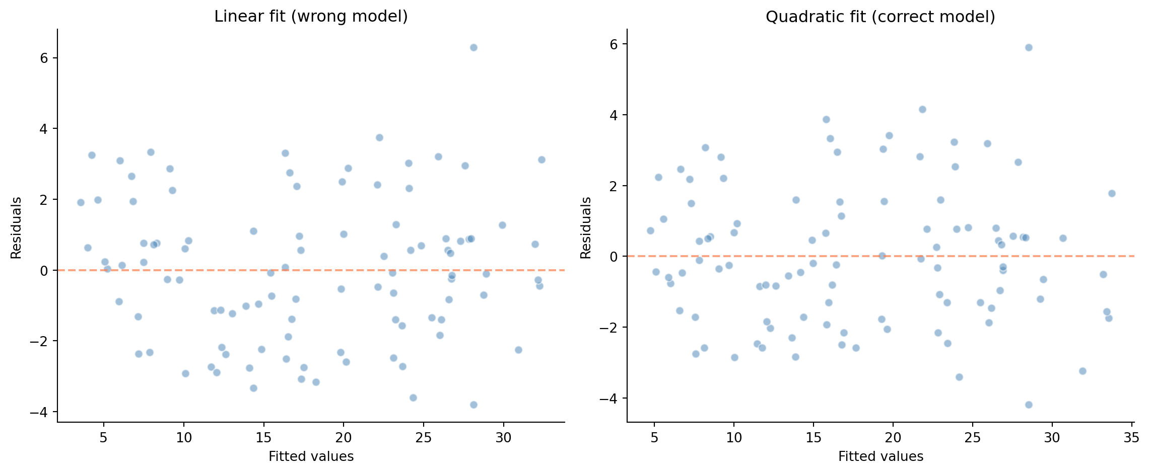
**Exercise 2.** Detecting model misspecification with residual plots.
```{python}
#| label: ex-ch9-q2
#| echo: true
#| fig-cap: "Left: residuals from a linear fit to quadratic data show a clear U-shaped pattern — the model is systematically wrong. Right: residuals from the correct quadratic fit show no pattern."
#| fig-alt: "Two side-by-side residual-versus-fitted scatter plots, each with a dashed horizontal line at zero. The left panel (linear fit to quadratic data) shows residuals forming a clear U-shaped curve, indicating a systematically misspecified model. The right panel (correct quadratic fit) shows residuals scattered randomly around zero with no pattern, the signature of a well-specified model."
import statsmodels.api as sm

rng = np.random.default_rng(42)

n = 100
x = rng.uniform(0, 10, n)
y = 5 + 2 * x + 0.1 * x**2 + rng.normal(0, 2, n)

# Linear fit (wrong model)
X_lin = sm.add_constant(x)
model_lin = sm.OLS(y, X_lin).fit()

# Quadratic fit (correct model)
X_quad = sm.add_constant(np.column_stack([x, x**2]))
model_quad = sm.OLS(y, X_quad).fit()

fig, (ax1, ax2) = plt.subplots(1, 2, figsize=(12, 5))

ax1.scatter(model_lin.fittedvalues, model_lin.resid, alpha=0.5,
            color='#0072B2', edgecolor='white')
ax1.axhline(0, color='#E69F00', linestyle='--', alpha=0.7)
ax1.set_xlabel('Fitted values')
ax1.set_ylabel('Residuals')
ax1.set_title('Linear fit (wrong model)')
ax1.spines[['top', 'right']].set_visible(False)

ax2.scatter(model_quad.fittedvalues, model_quad.resid, alpha=0.5,
            color='#0072B2', edgecolor='white')
ax2.axhline(0, color='#E69F00', linestyle='--', alpha=0.7)
ax2.set_xlabel('Fitted values')
ax2.set_ylabel('Residuals')
ax2.set_title('Quadratic fit (correct model)')
ax2.spines[['top', 'right']].set_visible(False)

plt.tight_layout()
plt.show()
```
The linear model's residuals show a clear U-shaped (or parabolic) pattern: the model over-predicts at low and high $x$ values and under-predicts in the middle. This is the signature of a missing quadratic term. The correct quadratic model produces residuals that scatter randomly around zero: no pattern, no systematic error. This is exactly what good residual diagnostics look like, and it demonstrates why you should always plot residuals rather than relying solely on $R^2$.
**Exercise 3.** Multicollinearity and variance inflation.
```{python}
#| label: ex-ch9-q3
#| echo: true
import statsmodels.api as sm
from statsmodels.stats.outliers_influence import variance_inflation_factor

rng = np.random.default_rng(42)

n = 100
x1 = rng.normal(50, 10, n)
x2 = x1 + rng.normal(0, 2, n)  # highly correlated with x1 (r ≈ 0.98)
y = 10 + 3 * x1 + 2 * x2 + rng.normal(0, 5, n)

print(f"Correlation(x1, x2): {np.corrcoef(x1, x2)[0, 1]:.3f}")

# Fit with both predictors
X_both = sm.add_constant(np.column_stack([x1, x2]))
model_both = sm.OLS(y, X_both).fit()

# Fit with x1 only
X_one = sm.add_constant(x1)
model_one = sm.OLS(y, X_one).fit()

print(f"\nWith both predictors:")
print(f"  x1 coef: {model_both.params[1]:.2f} "
      f"(SE = {model_both.bse[1]:.2f}, p = {model_both.pvalues[1]:.4f})")
print(f"  x2 coef: {model_both.params[2]:.2f} "
      f"(SE = {model_both.bse[2]:.2f}, p = {model_both.pvalues[2]:.4f})")

print(f"\nWith x1 only:")
print(f"  x1 coef: {model_one.params[1]:.2f} "
      f"(SE = {model_one.bse[1]:.2f}, p = {model_one.pvalues[1]:.8f})")

# VIF calculation
for i, name in enumerate(['const', 'x1', 'x2']):
    vif = variance_inflation_factor(X_both, i)
    if name != 'const':
        print(f"\nVIF({name}): {vif:.1f}")

print(f"\nVIF > 10 indicates severe multicollinearity")
```
With both predictors, the standard errors are dramatically inflated: the model can't reliably separate the effects of $x_1$ and $x_2$ because they carry almost the same information. One or both coefficients may be non-significant despite both genuinely affecting $y$. The VIF values are very high (well above 10), confirming severe multicollinearity. With only $x_1$ in the model, its standard error shrinks dramatically and its coefficient absorbs the combined effect of both variables. The prediction accuracy is similar either way: multicollinearity inflates coefficient uncertainty but doesn't necessarily harm overall fit.
**Exercise 4.** Confounding in the deployment failure regression.
The causal interpretation, "hiring more engineers reduces failures," is problematic because team size is almost certainly confounded with other variables that the regression doesn't (or can't) control for.
Several confounders could produce a negative coefficient for team size without any causal effect:
*Product maturity.* Larger teams tend to work on more mature, established products that have accumulated years of hardening, comprehensive test suites, and well-understood deployment processes. Smaller teams often work on newer, less stable products. The negative coefficient may reflect product maturity, not team size.
*Dedicated roles.* Larger teams are more likely to have dedicated DevOps engineers, SREs, or QA specialists who implement deployment safeguards. It's the specialised roles that reduce failures, not the headcount itself.
*Survivorship bias.* Teams that frequently suffer deployment failures might lose members (attrition, reassignment) or get deprioritised, leaving the remaining small teams in the data associated with higher failure rates.
*Code review practices.* Larger teams may have more rigorous review requirements: more reviewers per PR, stricter merge policies. It's the process that matters, not the team size.
To test whether team size *causally* reduces failures, you'd need an experiment (randomly assigning engineers to teams, which is rarely practical) or a quasi-experimental design that exploits exogenous variation in team size (e.g. a company reorganisation that shuffled team sizes independently of product quality).
**Exercise 5.** Full workflow on the scikit-learn diabetes dataset.
```{python}
#| label: ex-ch9-q5
#| echo: true
import statsmodels.api as sm
from sklearn.datasets import load_diabetes
from sklearn.model_selection import train_test_split
from sklearn.linear_model import LinearRegression
from sklearn.metrics import root_mean_squared_error

# Load data
diabetes = load_diabetes(as_frame=True)
X = diabetes.data
y = diabetes.target

print(f"Dataset: {X.shape[0]} observations, {X.shape[1]} features")
print(f"Features: {list(X.columns)}")
print(f"Target: disease progression (continuous)\n")

# Statsmodels for inference
X_sm = sm.add_constant(X)
model_sm = sm.OLS(y, X_sm).fit()

# Show significant predictors
print('Significant predictors (p < 0.05):')
for name in X.columns:
    p = model_sm.pvalues[name]
    coef = model_sm.params[name]
    if p < 0.05:
        print(f"  {name:6s}: coef = {coef:7.1f}, p = {p:.4f}")

print(f"\nR² (full data): {model_sm.rsquared:.4f}")
print(f"Adj R²:         {model_sm.rsquared_adj:.4f}")

# Sklearn for train/test evaluation
X_train, X_test, y_train, y_test = train_test_split(
    X, y, test_size=0.2, random_state=42
)

lr = LinearRegression()
lr.fit(X_train, y_train)

r2_train = lr.score(X_train, y_train)
r2_test = lr.score(X_test, y_test)
rmse_test = root_mean_squared_error(y_test, lr.predict(X_test))

print(f"\nTrain R²: {r2_train:.4f}")
print(f"Test R²:  {r2_test:.4f}")
print(f"Test RMSE: {rmse_test:.1f}")
print(f"\nGap (train - test R²): {r2_train - r2_test:.4f}")
```
```{python}
#| label: ex-ch9-q5-residuals
#| echo: true
#| fig-cap: "Residual diagnostics for the diabetes regression model."
#| fig-alt: "Two-panel residual diagnostic figure for the diabetes regression. The left panel plots residuals against fitted values with a dashed line at zero; the points scatter broadly around zero with a mild increase in spread at higher fitted values, hinting at slight heteroscedasticity. The right panel is a Normal quantile-quantile plot of the residuals; the points follow the reference line closely through the middle with mild departures in the tails."
from scipy import stats

y_pred_train = lr.predict(X_train)
resid_train = y_train - y_pred_train

fig, (ax1, ax2) = plt.subplots(1, 2, figsize=(12, 5))

ax1.scatter(y_pred_train, resid_train, alpha=0.5, color='#0072B2',
            edgecolor='white')
ax1.axhline(0, color='#E69F00', linestyle='--', alpha=0.7)
ax1.set_xlabel('Fitted values')
ax1.set_ylabel('Residuals')
ax1.set_title('Residuals vs fitted')
ax1.spines[['top', 'right']].set_visible(False)

stats.probplot(resid_train, plot=ax2)
ax2.set_title('Normal QQ plot')
ax2.get_lines()[0].set_color('#0072B2')
ax2.get_lines()[0].set_alpha(0.6)
ax2.get_lines()[1].set_color('#E69F00')

plt.tight_layout()
```
Typically only a few predictors are significant (BMI, blood pressure, and certain blood serum measurements), while others are not, despite all being included in the model. The training and test $R^2$ are moderate (around 0.50), with a small gap between them, suggesting modest overfitting. The residual plots may show slight heteroscedasticity (the spread of residuals is larger for higher fitted values) and mild departures from normality in the tails. An $R^2$ of 0.50 means the linear model explains about half the variance in disease progression, useful but far from complete, which is typical for biological data where many unmeasured factors contribute.
**Exercise 6.** Where the invoice / price-per-unit analogy breaks down.
Reading $\hat{y} = \beta_0 + \beta_1 x_1 + \cdots$ as a set of independent line items — "each extra file changed costs 2.5 seconds" — is exactly right when the predictors are uncorrelated and the true relationship is additive and linear. This chapter shows three ways it fails.
*Multicollinearity.* When predictors are correlated (exercise 3), the model cannot attribute a shared effect cleanly. The coefficients become unstable — large standard errors, signs that flip when you add or drop a related predictor — so a single "price per unit" is not a stable, well-identified quantity at all. The variance inflation factor quantifies how badly.
*Interactions and non-linearity.* An invoice assumes the price of one item does not depend on what else is on the bill. Regression coefficients assume the same additivity. When the true relationship is quadratic, or the effect of one predictor depends on another (exercise 2), a single linear coefficient is a misspecified summary — the residual plot reveals the structure the additive reading missed.
*Correlation is not causation.* A line item implies "buy one more and pay this much more." A regression coefficient is a statement about association *holding the other predictors fixed*, not a lever you can pull. The negative team-size coefficient (exercise 4) does not license "hire more engineers to cut failures"; a confounder can drive both. Reading coefficients as causal prices is the most common and most costly failure of the analogy.
The line-item picture is a good default and a bad master: it holds precisely when the assumptions behind OLS hold, and each way it breaks is one of those assumptions failing.
## Chapter 10: Logistic regression and classification
**Exercise 1.** Predicted probability curve.
```{python}
#| label: ex-ch10-q1
#| echo: true
#| fig-cap: "Predicted failure probability as a function of files changed, holding other predictors at their means. The S-shaped curve shows how logistic regression maps the linear predictor to a bounded probability."
#| fig-alt: "Line chart of predicted deployment-failure probability against the number of files changed, with other predictors held at their means. A solid S-shaped logistic curve rises from near zero, steepens through the middle, and flattens as it approaches its upper bound below one. A dashed straight line shows a linear fit for comparison, rising at a constant rate and exceeding the valid probability range, highlighting why the bounded sigmoid is preferable."
from scipy.special import expit
import statsmodels.api as sm

rng = np.random.default_rng(42)
n = 500

deploy_data = pd.DataFrame({
    'files_changed': rng.integers(1, 80, n),
    'hours_since_last_deploy': rng.exponential(24, n).round(1),
    'is_friday': rng.binomial(1, 1/5, n),
    'test_coverage_pct': np.clip(rng.normal(75, 15, n), 20, 100).round(1),
})

log_odds = (
    -1.0
    + 0.05 * deploy_data['files_changed']
    + 0.02 * deploy_data['hours_since_last_deploy']
    + 0.8 * deploy_data['is_friday']
    - 0.04 * deploy_data['test_coverage_pct']
)
deploy_data['failed'] = rng.binomial(1, expit(log_odds))

feature_names = ['files_changed', 'hours_since_last_deploy',
                 'is_friday', 'test_coverage_pct']
X = sm.add_constant(deploy_data[feature_names])
y = deploy_data['failed']
logit_model = sm.Logit(y, X).fit(disp=False)

# Create a range of files_changed, holding others at their means
files_range = np.linspace(1, 80, 200)
X_plot = pd.DataFrame({
    'const': 1,
    'files_changed': files_range,
    'hours_since_last_deploy': deploy_data['hours_since_last_deploy'].mean(),
    'is_friday': 0,
    'test_coverage_pct': deploy_data['test_coverage_pct'].mean(),
})

pred_probs = logit_model.predict(X_plot)

fig, ax = plt.subplots(figsize=(10, 5))
ax.plot(files_range, pred_probs, color='#0072B2', linewidth=2.5, label='Logistic')
ax.plot(files_range, np.polyval(np.polyfit(deploy_data['files_changed'],
        deploy_data['failed'], 1), files_range),
        color='#E69F00', linestyle='--', linewidth=2, label='Linear (for comparison)')
ax.set_xlabel('Files changed')
ax.set_ylabel('P(failure)')
ax.set_ylim(-0.05, 0.8)
ax.legend()
ax.spines[['top', 'right']].set_visible(False)
plt.tight_layout()
```
The logistic curve is S-shaped (sigmoid), bounded between 0 and 1. At low file counts, the curve is nearly flat; risk increases slowly. In the middle range, the curve steepens; each additional file has a larger marginal effect on the probability. At high file counts, the curve flattens again as the probability approaches its upper bound. The linear fit, by contrast, increases at a constant rate and extends beyond the valid probability range. The sigmoid's variable slope is the key difference: the same one-file increase has a different effect on probability depending on where you start. This is a direct consequence of the logit transformation: equal changes in log-odds translate to unequal changes in probability.
**Exercise 2.** Optimal F1 threshold and 90% recall threshold.
```{python}
#| label: ex-ch10-q2
#| echo: true
from scipy.special import expit
from sklearn.linear_model import LogisticRegression
from sklearn.model_selection import train_test_split
from sklearn.metrics import (precision_recall_curve, f1_score,
                              precision_score, recall_score)

rng = np.random.default_rng(42)
n = 500

deploy_data = pd.DataFrame({
    'files_changed': rng.integers(1, 80, n),
    'hours_since_last_deploy': rng.exponential(24, n).round(1),
    'is_friday': rng.binomial(1, 1/5, n),
    'test_coverage_pct': np.clip(rng.normal(75, 15, n), 20, 100).round(1),
})
log_odds = (
    -1.0
    + 0.05 * deploy_data['files_changed']
    + 0.02 * deploy_data['hours_since_last_deploy']
    + 0.8 * deploy_data['is_friday']
    - 0.04 * deploy_data['test_coverage_pct']
)
deploy_data['failed'] = rng.binomial(1, expit(log_odds))

feature_names = ['files_changed', 'hours_since_last_deploy',
                 'is_friday', 'test_coverage_pct']
X_train, X_test, y_train, y_test = train_test_split(
    deploy_data[feature_names], deploy_data['failed'],
    test_size=0.2, random_state=42
)

clf = LogisticRegression(max_iter=200, random_state=42)
clf.fit(X_train, y_train)
y_prob = clf.predict_proba(X_test)[:, 1]

# Find threshold that maximises F1
precision_vals, recall_vals, thresholds = precision_recall_curve(y_test, y_prob)
f1_scores = 2 * precision_vals[:-1] * recall_vals[:-1] / (
    precision_vals[:-1] + recall_vals[:-1] + 1e-10)
best_idx = np.argmax(f1_scores)
best_threshold = thresholds[best_idx]

y_best = (y_prob >= best_threshold).astype(int)
print(f"Best F1 threshold: {best_threshold:.3f}")
print(f"  F1:        {f1_score(y_test, y_best):.3f}")
print(f"  Precision: {precision_score(y_test, y_best):.3f}")
print(f"  Recall:    {recall_score(y_test, y_best):.3f}")

# Find threshold for ≥90% recall
recall_thresholds = []
for t in np.arange(0.01, 0.99, 0.01):
    y_t = (y_prob >= t).astype(int)
    r = recall_score(y_test, y_t, zero_division=0)
    p = precision_score(y_test, y_t, zero_division=0)
    recall_thresholds.append((t, r, p))

# Highest threshold that achieves ≥90% recall
high_recall = [(t, r, p) for t, r, p in recall_thresholds if r >= 0.90]
if high_recall:
    t_90, r_90, p_90 = high_recall[-1]  # highest threshold meeting criteria
    print(f"\n90% recall threshold: {t_90:.2f}")
    print(f"  Recall:    {r_90:.3f}")
    print(f"  Precision: {p_90:.3f}")
    print(f"\nPrecision sacrifice: {precision_score(y_test, y_best):.3f} → {p_90:.3f}")
```
The optimal F1 threshold may differ from 0.5 depending on the class balance and model calibration. To achieve 90% recall, you must lower the threshold, which causes precision to drop: you're catching most real failures but also flagging more false alarms. The exact trade-off depends on the random split, but the pattern is consistent: high recall comes at the cost of precision. Whether this is acceptable depends on the relative cost of missing a failure (outage, lost revenue) versus the cost of a false alarm (unnecessary review, delayed deployment).
**Exercise 3.** Class imbalance with artificial downsampling.
```{python}
#| label: ex-ch10-q3
#| echo: true
from scipy.special import expit
from sklearn.linear_model import LogisticRegression
from sklearn.model_selection import train_test_split
from sklearn.metrics import confusion_matrix, classification_report

rng = np.random.default_rng(42)
n = 500

deploy_data = pd.DataFrame({
    'files_changed': rng.integers(1, 80, n),
    'hours_since_last_deploy': rng.exponential(24, n).round(1),
    'is_friday': rng.binomial(1, 1/5, n),
    'test_coverage_pct': np.clip(rng.normal(75, 15, n), 20, 100).round(1),
})
log_odds = (
    -1.0
    + 0.05 * deploy_data['files_changed']
    + 0.02 * deploy_data['hours_since_last_deploy']
    + 0.8 * deploy_data['is_friday']
    - 0.04 * deploy_data['test_coverage_pct']
)
deploy_data['failed'] = rng.binomial(1, expit(log_odds))

# Downsample failures to ~5%
failures = deploy_data[deploy_data['failed'] == 1]
successes = deploy_data[deploy_data['failed'] == 0]
n_failures_target = int(0.05 * len(successes) / 0.95)
failures_downsampled = failures.sample(n=min(n_failures_target, len(failures)),
                                        random_state=42)
imbalanced = pd.concat([successes, failures_downsampled]).sample(
    frac=1, random_state=42)

print(f"Imbalanced dataset: {len(imbalanced)} observations, "
      f"{imbalanced['failed'].mean():.1%} failure rate\n")

feature_names = ['files_changed', 'hours_since_last_deploy',
                 'is_friday', 'test_coverage_pct']
X_train, X_test, y_train, y_test = train_test_split(
    imbalanced[feature_names], imbalanced['failed'],
    test_size=0.2, random_state=42, stratify=imbalanced['failed']
)

# Standard model
clf_std = LogisticRegression(max_iter=200, random_state=42)
clf_std.fit(X_train, y_train)

# Balanced model
clf_bal = LogisticRegression(class_weight='balanced', max_iter=200, random_state=42)
clf_bal.fit(X_train, y_train)

print('=== Standard model ===')
print(confusion_matrix(y_test, clf_std.predict(X_test)))
print(classification_report(y_test, clf_std.predict(X_test),
                             target_names=['Success', 'Failure'],
                             zero_division=0))

print('=== Balanced model ===')
print(confusion_matrix(y_test, clf_bal.predict(X_test)))
print(classification_report(y_test, clf_bal.predict(X_test),
                             target_names=['Success', 'Failure'],
                             zero_division=0))
```
The standard model tends to predict almost everything as "success," achieving high accuracy by ignoring the rare failure class. Its recall for failures is poor or even zero. The balanced model sacrifices some overall accuracy to detect more failures. For a deployment gating system, the balanced model is almost certainly preferable: missing a deployment failure (false negative) has far worse consequences than holding a safe deployment for review (false positive). The key lesson is that `class_weight='balanced'` doesn't change the model's structure; it changes the loss function to penalise minority-class errors more heavily, effectively lowering the decision boundary.
**Exercise 4.** Logistic regression: "just linear regression with a different output?"
The colleague is partially right: both models use a linear combination of predictors ($\beta_0 + \beta_1 x_1 + \cdots$), both produce coefficient estimates with standard errors and p-values, and both assume a linear relationship between the predictors and some quantity: in linear regression, the outcome itself; in logistic regression, the log-odds of the outcome.
Where the analogy breaks down:
*Loss function.* Linear regression minimises RSS (sum of squared residuals); logistic regression maximises the log-likelihood. These optimise fundamentally different things. RSS penalises large errors quadratically; log-likelihood penalises confident wrong predictions logarithmically (predicting $p = 0.01$ when the true outcome is 1 incurs a much larger penalty than predicting $p = 0.4$).
*Residuals.* In linear regression, the residual $e_i = y_i - \hat{y}_i$ is a continuous measure of how far off the prediction was, and residuals should be roughly normal with constant variance. In logistic regression, the raw residual is $y_i - \hat{p}_i$, which is bounded and heteroscedastic by construction (its variance depends on $\hat{p}_i$). Diagnostic tools exist (deviance residuals, Pearson residuals), but the "plot residuals and check for patterns" workflow from linear regression doesn't transfer directly.
*Assumptions.* Linear regression assumes normality and constant variance of errors (LINE). Logistic regression assumes the log-odds are a linear function of the predictors, that observations are independent, and that there are no extreme multicollinearity or perfect separation issues. It does *not* assume normality of any variable.
*Interpretation.* Linear regression coefficients are direct: "one more file adds 8.5 seconds." Logistic regression coefficients are one layer removed: "one more file increases the log-odds by 0.05," which requires exponentiation and context to translate into a probability change. The non-linear link function means the same change in $x$ has a different effect on $p$ depending on where you are on the sigmoid.
**Exercise 5.** Breast cancer classification.
```{python}
#| label: ex-ch10-q5
#| echo: true
from sklearn.datasets import load_breast_cancer
from sklearn.linear_model import LogisticRegression
from sklearn.model_selection import train_test_split
from sklearn.metrics import (confusion_matrix, classification_report,
                              roc_curve, roc_auc_score,
                              precision_recall_curve, ConfusionMatrixDisplay)

data = load_breast_cancer()
X_train, X_test, y_train, y_test = train_test_split(
    data.data, data.target, test_size=0.2, random_state=42
)

clf = LogisticRegression(max_iter=10000, random_state=42)
clf.fit(X_train, y_train)

y_pred = clf.predict(X_test)
y_prob = clf.predict_proba(X_test)[:, 1]

print('Confusion matrix:')
print(confusion_matrix(y_test, y_pred))
print(f"\n{classification_report(y_test, y_pred, target_names=data.target_names)}")
print(f"AUC: {roc_auc_score(y_test, y_prob):.4f}")
```
```{python}
#| label: ex-ch10-q5-curves
#| echo: true
#| fig-cap: "Left: ROC curve. Right: Precision-recall curve. Both show near-excellent performance on this well-separated dataset."
#| fig-alt: "Two side-by-side performance charts for the breast cancer model. The left panel is an ROC curve hugging the top-left corner with a dashed diagonal chance line and an AUC above 0.99. The right panel is a precision-recall curve that stays near the top of the plot across almost all recall values. Both indicate near-excellent classification on this well-separated dataset."
from sklearn.metrics import roc_curve, roc_auc_score, precision_recall_curve

fpr, tpr, _ = roc_curve(y_test, y_prob)
prec, rec, _ = precision_recall_curve(y_test, y_prob)

fig, (ax1, ax2) = plt.subplots(1, 2, figsize=(12, 5))

ax1.plot(fpr, tpr, color='#0072B2', linewidth=2)
ax1.plot([0, 1], [0, 1], 'grey', linestyle='--', alpha=0.6)
ax1.set_xlabel('False positive rate')
ax1.set_ylabel('True positive rate')
ax1.set_title(f'ROC curve (AUC = {roc_auc_score(y_test, y_prob):.3f})')
ax1.spines[['top', 'right']].set_visible(False)

ax2.plot(rec, prec, color='#E69F00', linewidth=2)
ax2.set_xlabel('Recall')
ax2.set_ylabel('Precision')
ax2.set_title('Precision-recall curve')
ax2.spines[['top', 'right']].set_visible(False)

plt.tight_layout()
```
The model performs very well on this dataset (AUC typically > 0.99), which is expected: the breast cancer dataset has well-separated features and a moderate class balance. For a clinician, **recall on the malignant class** (sensitivity) matters most. A false negative (telling a patient with cancer that they're healthy) has catastrophic consequences. A false positive (flagging a benign tumour for further testing) causes anxiety and additional cost, but the patient is ultimately fine. This is the same asymmetric-cost reasoning from the deployment example: when one type of error is much worse than the other, optimise for the metric that reflects that asymmetry. In clinical settings, this often means accepting lower specificity (more false positives) to achieve near-perfect sensitivity.
## Chapter 11: Regularisation: preventing overfitting
**Exercise 1.** Ridge-regularised degree-15 polynomial.
```{python}
#| label: ex-ch11-q1
#| echo: true
#| fig-cap: "Degree-15 polynomial with and without Ridge regularisation. Ridge tames the wild oscillations, producing a smooth curve closer to the true relationship."
#| fig-alt: "Two side-by-side scatter plots of p99 latency against concurrent users, each showing the 30 training points, the true square-root relationship as a dashed grey line, and a fitted curve. In the left panel the unregularised degree-15 polynomial oscillates wildly between points; in the right panel the Ridge-regularised degree-15 fit is smooth and closely tracks the true curve, showing that the penalty suppresses the wild oscillations."
from sklearn.preprocessing import PolynomialFeatures, StandardScaler
from sklearn.linear_model import RidgeCV
from sklearn.pipeline import make_pipeline

rng = np.random.default_rng(42)

x_train = np.sort(rng.uniform(10, 300, 30))
y_train = 20 + 8 * np.sqrt(x_train) + rng.normal(0, 10, 30)

x_smooth = np.linspace(10, 300, 500)
y_true = 20 + 8 * np.sqrt(x_smooth)

# Unregularised degree-15 polynomial
coeffs_unreg = np.polyfit(x_train, y_train, 15)
y_unreg = np.polyval(coeffs_unreg, x_smooth)

# Ridge-regularised degree-15 polynomial
poly = PolynomialFeatures(degree=15, include_bias=False)
X_train_poly = poly.fit_transform(x_train.reshape(-1, 1))
X_smooth_poly = poly.transform(x_smooth.reshape(-1, 1))

scaler = StandardScaler()
X_train_scaled = scaler.fit_transform(X_train_poly)
X_smooth_scaled = scaler.transform(X_smooth_poly)

ridge = RidgeCV(alphas=np.logspace(-2, 6, 100), cv=5)
ridge.fit(X_train_scaled, y_train)
y_ridge = ridge.predict(X_smooth_scaled)

fig, axes = plt.subplots(1, 2, figsize=(14, 5), sharey=True)

for ax, y_pred, title in zip(axes,
                              [y_unreg, y_ridge],
                              ['Degree 15 (no regularisation)', f'Degree 15 + Ridge (α={ridge.alpha_:.1f})']):
    ax.scatter(x_train, y_train, color='#0072B2', alpha=0.7, edgecolor='white', zorder=3)
    ax.plot(x_smooth, y_true, color='grey', linestyle='--', linewidth=1.5, label='True f(x)')
    ax.plot(x_smooth, y_pred, color='#E69F00', linewidth=2, label='Fitted')
    ax.set_xlabel('Concurrent users')
    ax.set_title(title)
    ax.legend(fontsize=8)
    ax.spines[['top', 'right']].set_visible(False)

axes[0].set_ylabel('p99 latency (ms)')
plt.tight_layout()
```
Yes, Ridge dramatically tames the oscillations. The unregularised degree-15 polynomial swings wildly between training points, fitting noise. The Ridge-regularised version produces a smooth curve that closely approximates the true square-root relationship, even though it still has 15 polynomial terms available. The penalty forces most higher-order coefficients towards zero, effectively recovering a simpler model from within the high-dimensional polynomial space.
**Exercise 2.** Feature selection comparison.
```{python}
#| label: ex-ch11-q2
#| echo: true
from sklearn.linear_model import LinearRegression, Ridge, LassoCV
from sklearn.preprocessing import StandardScaler
from sklearn.model_selection import train_test_split

rng = np.random.default_rng(42)
n, p_informative, p_noise = 150, 10, 40

X_info = rng.normal(0, 1, (n, p_informative))
X_noise = rng.normal(0, 1, (n, p_noise))
X = np.column_stack([X_info, X_noise])

true_coefs = rng.uniform(1, 5, p_informative)
y = X_info @ true_coefs + rng.normal(0, 5, n)

X_train, X_test, y_train, y_test = train_test_split(X, y, test_size=0.3, random_state=42)

scaler = StandardScaler()
X_train_s = scaler.fit_transform(X_train)
X_test_s = scaler.transform(X_test)

# OLS
ols = LinearRegression().fit(X_train_s, y_train)

# Ridge
ridge = Ridge(alpha=10.0).fit(X_train_s, y_train)

# Lasso with CV
lasso = LassoCV(cv=5, random_state=42, max_iter=10_000).fit(X_train_s, y_train)

threshold = 0.1
for name, model in [('OLS', ols), ('Ridge', ridge), ('Lasso', lasso)]:
    noise_coefs = np.abs(model.coef_[p_informative:])
    large_noise = (noise_coefs > threshold).sum()
    print(f"{name:6s}: {large_noise}/{p_noise} noise features with |coef| > {threshold}")
```
OLS will typically show many noise features with non-trivial coefficients because it fits whatever patterns happen to exist in the training data. Ridge reduces but doesn't eliminate these. Lasso is the clear winner for signal-noise separation: most noise features are driven exactly to zero, leaving only (or mostly) the genuinely informative ones with non-zero coefficients.
**Exercise 3.** Why standardise for regularisation but not OLS?
OLS minimises the sum of squared residuals without any penalty on coefficient size. Rescaling a feature by a constant simply rescales its coefficient by the inverse: the predictions and residuals are identical. The model is equivariant to scaling.
Regularisation adds a penalty on coefficient magnitude ($\sum \beta_j^2$ or $\sum |\beta_j|$). This penalty treats all coefficients equally: a coefficient of 5 is penalised the same regardless of which feature it belongs to. If one feature ranges from 0 to 1 (requiring a large coefficient to have any effect) and another ranges from 0 to 1,000,000 (needing only a tiny coefficient), the penalty will unfairly suppress the first feature. Standardising puts all features on the same scale so the penalty is applied equitably.
Without standardisation, Lasso applied to the scenario described would almost certainly zero out the 0-to-1 feature first, not because it's less informative, but because its coefficient needs to be larger to have the same predictive effect, and larger coefficients incur a larger penalty. The 0-to-1,000,000 feature would survive with a tiny coefficient that barely registers in the penalty term, regardless of whether it's actually useful.
**Exercise 4.** Regularisation strength for logistic regression.
```{python}
#| label: ex-ch11-q4
#| echo: true
#| fig-cap: "Test-set AUC across regularisation strengths. Performance plateaus once C is large enough to avoid over-constraining the model."
#| fig-alt: "Line chart with markers of test-set AUC against the base-10 logarithm of the regularisation parameter C. AUC is low at very small C (strong regularisation), rises sharply as C increases, then flattens into a broad plateau once C is large enough, showing that beyond a point further relaxation of the penalty yields little improvement."
from scipy.special import expit
from sklearn.linear_model import LogisticRegression
from sklearn.model_selection import train_test_split
from sklearn.metrics import roc_auc_score

rng = np.random.default_rng(42)
n = 500

deploy_data = pd.DataFrame({
    'files_changed': rng.integers(1, 80, n),
    'hours_since_last_deploy': rng.exponential(24, n).round(1),
    'is_friday': rng.binomial(1, 1/5, n),
    'test_coverage_pct': np.clip(rng.normal(75, 15, n), 20, 100).round(1),
})

log_odds = (
    -1.0
    + 0.05 * deploy_data['files_changed']
    + 0.02 * deploy_data['hours_since_last_deploy']
    + 0.8 * deploy_data['is_friday']
    - 0.04 * deploy_data['test_coverage_pct']
)
deploy_data['failed'] = rng.binomial(1, expit(log_odds))

feature_names = ['files_changed', 'hours_since_last_deploy',
                 'is_friday', 'test_coverage_pct']
X_train, X_test, y_train, y_test = train_test_split(
    deploy_data[feature_names], deploy_data['failed'],
    test_size=0.2, random_state=42
)

C_values = [0.001, 0.01, 0.1, 1.0, 10.0, 100.0]
aucs = []

for C in C_values:
    clf = LogisticRegression(C=C, max_iter=200, random_state=42)
    clf.fit(X_train, y_train)
    y_prob = clf.predict_proba(X_test)[:, 1]
    aucs.append(roc_auc_score(y_test, y_prob))
    print(f"C={C:>7.3f}  AUC={aucs[-1]:.4f}")

fig, ax = plt.subplots(figsize=(10, 5))
ax.plot(np.log10(C_values), aucs, 'o-', color='#0072B2', linewidth=2)
ax.set_xlabel('log₁₀(C)')
ax.set_ylabel('Test AUC')
ax.spines[['top', 'right']].set_visible(False)
plt.tight_layout()
```
At very low `C` (strong regularisation), the model is too constrained: all coefficients are shrunk so aggressively that it can barely distinguish risky deployments from safe ones. As `C` increases, performance improves as the model gains the freedom to use the features. Beyond a certain point (typically around `C=1` to `C=10` for this dataset), further relaxation provides diminishing returns: the model has enough freedom to capture the true relationships, and additional flexibility just risks fitting noise. With only four genuinely informative features and no noise features, overfitting is mild here, so the plateau is broad.
**Exercise 5.** When Ridge beats Lasso.
**Scenario 1: Correlated features.** Suppose you're predicting server load from CPU usage, memory usage, and network I/O, features that are highly correlated because busy servers tend to be busy on all dimensions simultaneously. Lasso will arbitrarily select one feature from the correlated group and zero out the others, which is unstable (a different training sample might select a different feature) and loses information. Ridge spreads the coefficient across all correlated features, producing more stable predictions and more sensible coefficient values. If you retrain on new data, Ridge will give similar results; Lasso might select entirely different features.
**Scenario 2: Many small effects.** If the true data-generating process involves many features each contributing a small amount (as in genomics or NLP with many weak effects), Lasso's aggressive zeroing-out will eliminate features that are genuinely useful: they're each too small to survive individually, but collectively they matter. Ridge keeps them all with small coefficients, which often yields better prediction accuracy in this setting. "Better" here means lower test error, even if the model is less interpretable. When the goal is prediction rather than understanding, Ridge's inclusive approach often wins.
**Exercise 6.** Where the dependency-pruning analogy breaks down.
Lasso does resemble stripping unused dependencies — it zeroes out coefficients, leaving a smaller model that is cheaper to serve and easier to read. But the analogy breaks down on how the decision is made and how safe it is.
*How "unused" is decided.* An unused import is a static, deterministic fact: the dependency graph either contains an edge or it does not, and a linter can prove it. Lasso's "unused" is a data-dependent, continuous judgement — a coefficient is driven to zero because its marginal contribution does not beat the penalty on *this* sample. Change the sample, or the value of $\alpha$, and the set of survivors changes.
*Stability under correlation.* Given several correlated features that carry the same information, a dependency analysis keeps whichever ones are actually imported. Lasso tends to pick one more or less arbitrarily and zero the rest, and which one it keeps can flip between samples — exactly why Ridge or Elastic Net is often preferred when correlated predictors matter (exercise 5). Dependency pruning has no such instability.
*Consequences of dropping.* Removing a genuinely unused package changes nothing about behaviour. Dropping a feature Lasso deems unimportant can discard real signal, especially when the cross-validated $\alpha$ is tuned for prediction rather than sparsity, or when a small true effect sits below the penalty threshold. Pruning is behaviour-preserving by definition; Lasso's selection is a bias-variance trade, not a free cleanup.
## Chapter 12: Tree-based models: when straight lines aren't enough
**Exercise 1.** Decision trees at depths 2, 5, and 10.
```{python}
#| label: ex-ch12-q1
#| echo: true
#| fig-cap: "Decision trees at depths 2, 5, and 10. The depth-2 tree is highly interpretable; the depth-10 tree is too complex to visualise meaningfully."
#| fig-alt: "Three side-by-side decision-tree diagrams of the same regression at maximum depths 2, 5, and 10, each titled with its test RMSE. The depth-2 tree has just a handful of clearly readable split nodes; the depth-5 tree is busier; the depth-10 tree is a dense thicket of tiny nodes too complex to read, illustrating the trade-off between interpretability and the onset of overfitting as depth grows."
from sklearn.tree import DecisionTreeRegressor, plot_tree
from sklearn.model_selection import train_test_split
from sklearn.metrics import root_mean_squared_error

rng = np.random.default_rng(42)
n = 600

incident_data = pd.DataFrame({
    'cpu_pct': rng.uniform(20, 99, n),
    'memory_pct': rng.uniform(20, 99, n),
    'error_rate': rng.exponential(2, n).clip(0, 30),
    'request_volume_k': rng.uniform(1, 100, n),
    'services_affected': rng.integers(1, 12, n),
    'is_deploy_related': rng.binomial(1, 0.3, n),
    'hour_of_day': rng.integers(0, 24, n),
    'on_call_experience_yrs': rng.uniform(0.5, 15, n),
})

resolution_time = (
    30
    + 0.5 * incident_data['error_rate']
    + 3.0 * incident_data['services_affected']
    + 10 * incident_data['is_deploy_related']
    - 1.5 * incident_data['on_call_experience_yrs']
    + 40 * ((incident_data['cpu_pct'] > 70) & (incident_data['memory_pct'] > 70)).astype(float)
    + 0.8 * np.maximum(incident_data['request_volume_k'] - 60, 0)
    + 8 * ((incident_data['hour_of_day'] < 6) | (incident_data['hour_of_day'] > 22)).astype(float)
    + rng.normal(0, 8, n)
)
incident_data['resolution_min'] = resolution_time.clip(5)

feature_names = ['cpu_pct', 'memory_pct', 'error_rate', 'request_volume_k',
                 'services_affected', 'is_deploy_related', 'hour_of_day',
                 'on_call_experience_yrs']

X = incident_data[feature_names]
y = incident_data['resolution_min']
X_train, X_test, y_train, y_test = train_test_split(X, y, test_size=0.2, random_state=42)

fig, axes = plt.subplots(1, 3, figsize=(18, 6))
for ax, depth in zip(axes, [2, 5, 10]):
    dt = DecisionTreeRegressor(max_depth=depth, random_state=42)
    dt.fit(X_train, y_train)
    rmse = root_mean_squared_error(y_test, dt.predict(X_test))
    plot_tree(dt, feature_names=feature_names, filled=True, rounded=True,
              fontsize=6 if depth <= 5 else 4, ax=ax, impurity=False, precision=1)
    ax.set_title(f'Depth {depth}: Test RMSE = {rmse:.1f} min')

plt.tight_layout()
```
The depth-2 tree typically discovers the CPU-memory interaction or services-affected as its first splits, the dominant non-linear patterns. Test RMSE improves substantially from depth 2 to depth 5 as the tree captures finer structure. By depth 10, training RMSE drops further but test RMSE may plateau or worsen slightly: this is the onset of overfitting. The tree has enough depth to memorise training-set noise rather than learning generalisable patterns.
**Exercise 2.** Cost-complexity pruning with cross-validation.
```{python}
#| label: ex-ch12-q2
#| echo: true
#| fig-cap: "Cross-validated RMSE across cost-complexity pruning alphas. The vertical dashed line marks the optimal alpha."
#| fig-alt: "Line chart with markers of cross-validated RMSE in minutes against the cost-complexity pruning parameter ccp_alpha. The curve dips to a minimum at a moderate alpha, marked by a vertical dashed line, then rises again for larger alphas, showing that there is an optimal amount of pruning that balances tree complexity against generalisation error."
from sklearn.model_selection import cross_val_score

# Get the pruning path
dt_full = DecisionTreeRegressor(random_state=42)
path = dt_full.cost_complexity_pruning_path(X_train, y_train)
ccp_alphas = path.ccp_alphas

# Cross-validate each alpha (subsample for speed)
alpha_subset = ccp_alphas[::max(1, len(ccp_alphas) // 50)]

cv_scores = []
for alpha in alpha_subset:
    dt = DecisionTreeRegressor(ccp_alpha=alpha, random_state=42)
    scores = cross_val_score(dt, X_train, y_train, cv=5,
                             scoring='neg_root_mean_squared_error')
    cv_scores.append(-scores.mean())

best_idx = np.argmin(cv_scores)
best_alpha = alpha_subset[best_idx]

# Fit the pruned tree
dt_pruned = DecisionTreeRegressor(ccp_alpha=best_alpha, random_state=42)
dt_pruned.fit(X_train, y_train)
pruned_rmse = root_mean_squared_error(y_test, dt_pruned.predict(X_test))

fig, ax = plt.subplots(figsize=(10, 5))
ax.plot(alpha_subset, cv_scores, 'o-', color='#0072B2', markersize=3)
ax.axvline(best_alpha, color='#E69F00', linestyle='--', alpha=0.7,
           label=f'Best α = {best_alpha:.4f}')
ax.set_xlabel('ccp_alpha')
ax.set_ylabel('CV RMSE (minutes)')
ax.legend()
ax.spines[['top', 'right']].set_visible(False)
plt.tight_layout()

print(f"Optimal ccp_alpha: {best_alpha:.4f}")
print(f"Pruned tree leaves: {dt_pruned.get_n_leaves()}")
print(f"Pruned tree depth:  {dt_pruned.get_depth()}")
print(f"Pruned test RMSE:   {pruned_rmse:.1f} min")
```
The pruned tree typically has far fewer leaves than the unrestricted tree but similar or better test-set performance. Cost-complexity pruning is the tree-model analogue of regularisation: it trades a small amount of training-set fit for a simpler, more generalisable model. The CV-optimal alpha finds the balance automatically.
**Exercise 3.** OOB score vs number of trees.
```{python}
#| label: ex-ch12-q3
#| echo: true
#| fig-cap: "OOB R² as the number of trees increases. Performance improves rapidly at first, then plateaus."
#| fig-alt: "Line chart of out-of-bag R-squared against the number of trees in a random forest, from 10 to 500. The curve climbs steeply over the first 50 to 100 trees, then flattens into a plateau, showing that adding trees beyond a couple of hundred yields negligible improvement and that random forests do not overfit as the number of trees grows."
from sklearn.ensemble import RandomForestRegressor

n_tree_values = list(range(10, 501, 10))
oob_scores = []

for n_trees in n_tree_values:
    rf = RandomForestRegressor(
        n_estimators=n_trees, random_state=42, oob_score=True, n_jobs=-1
    )
    rf.fit(X_train, y_train)
    oob_scores.append(rf.oob_score_)

fig, ax = plt.subplots(figsize=(10, 5))
ax.plot(n_tree_values, oob_scores, color='#0072B2', linewidth=2)
ax.set_xlabel('Number of trees')
ax.set_ylabel('OOB R²')
ax.spines[['top', 'right']].set_visible(False)
plt.tight_layout()
```
The OOB score improves rapidly in the first 50–100 trees, then plateaus. Beyond roughly 150–200 trees, additional trees contribute negligible improvement. This is a common pattern: random forests are relatively insensitive to `n_estimators` once you have "enough" trees. The main cost of more trees is computation time, not overfitting: unlike single trees, random forests don't overfit as `n_estimators` increases (each new tree is an independent vote, and averaging more votes doesn't hurt).
**Exercise 4.** Where the if-else analogy breaks down.
The if-else analogy breaks down in one critical way: **extrapolation**. Hand-coded dispatch logic can include explicit handlers for extreme or novel inputs: you can write `if cpu > 100: raise InvalidMetricError()` or provide a catch-all default case that encodes domain knowledge about edge cases. You *design* the edge-case behaviour.
A decision tree has no such capability. Its predictions outside the range of the training data are simply the mean of the nearest leaf, whatever leaf the observation happens to land in when following the learned splits. If training incidents all had CPU between 20% and 99%, a tree predicting for 150% CPU (perhaps a misconfigured metric) will give the same answer as for some value in the 90s. It cannot express "this input is outside my experience" or extrapolate a trend beyond what it has seen.
This is fundamentally different from hand-coded logic, which can reason about *intent* and handle unknown inputs gracefully. A tree is a lookup table shaped by training data; it cannot reason about what *should* happen for inputs it has never encountered. Linear models, despite their other limitations, at least continue the trend line beyond the training range, which is a more principled (though not always correct) form of extrapolation.
**Exercise 5.** Averaging reduces variance; sequential fitting reduces bias.
**Why averaging reduces variance:** Each individual tree in a random forest is a noisy estimate: it overfits its particular bootstrap sample. But different trees overfit in different ways because of the random sampling and feature selection. When you average many noisy estimates whose errors are uncorrelated, the errors cancel out. Mathematically, the variance of the average of $n$ uncorrelated estimates with equal variance $\sigma^2$ is $\sigma^2/n$: it shrinks as you add more estimates. The engineering parallel is running multiple independent load tests and averaging the results: each test has measurement noise, but the average is more stable than any individual test.
**Why sequential fitting reduces bias:** A biased model systematically misses certain patterns: it's wrong in a predictable direction. Each new tree in gradient boosting is specifically trained on the *residuals*, the patterns the current ensemble gets wrong. This directly attacks the systematic error, reducing it step by step. The engineering parallel is iterative debugging: you deploy, identify what's still failing (the residuals), write a targeted fix (the next tree), and repeat. Each iteration reduces the systematic gap between intended and actual behaviour. Unlike averaging (which helps with random noise), sequential correction helps with *systematic* errors, the model's blind spots.
The key insight is that these are complementary strategies. Random forests address the problem of each tree being *unstable* (high variance). Gradient boosting addresses the problem of each tree being *wrong on average* (high bias, because individual trees are kept shallow). In practice, both methods are highly effective, and the best choice depends on whether your bigger problem is instability or systematic underperformance.
## Chapter 13: Dimensionality reduction: refactoring your feature space
**Exercise 1.** PCA without standardisation.
```{python}
#| label: ex-ch13-q1
#| echo: true
from sklearn.decomposition import PCA
from sklearn.preprocessing import StandardScaler

# Regenerate the telemetry data (same seed as the chapter)
rng = np.random.default_rng(42)
n = 500

service_type = rng.choice(['web', 'database', 'batch'], size=n, p=[0.45, 0.30, 0.25])

profiles = {
    'web':      {'cpu': 45, 'mem': 35, 'disk': 10, 'net': 60, 'gc': 20, 'latency': 50,  'error': 1.0, 'threads': 70},
    'database': {'cpu': 30, 'mem': 75, 'disk': 80, 'net': 30, 'gc': 10, 'latency': 20,  'error': 0.3, 'threads': 40},
    'batch':    {'cpu': 85, 'mem': 60, 'disk': 40, 'net': 15, 'gc': 40, 'latency': 200, 'error': 2.0, 'threads': 90},
}

def generate_metrics(stype, rng):
    p = profiles[stype]
    cpu_base = rng.normal(p['cpu'], 8)
    cpu_mean = cpu_base + rng.normal(0, 2)
    cpu_p99 = cpu_base + rng.normal(12, 3)
    mem_base = rng.normal(p['mem'], 10)
    memory_mean = mem_base + rng.normal(0, 2)
    memory_p99 = mem_base + rng.normal(8, 2)
    disk_read = max(0, rng.normal(p['disk'], 5))
    disk_write = max(0, rng.normal(p['disk'] * 0.6, 4))
    net_in = max(0, rng.normal(p['net'], 8))
    net_out = max(0, rng.normal(p['net'] * 0.8, 6))
    gc_pause = max(0, rng.normal(p['gc'], 5) + 0.2 * (mem_base - p['mem']))
    gc_freq = max(0, rng.normal(p['gc'] * 0.5, 3) + 0.1 * (mem_base - p['mem']))
    latency_base = rng.normal(p['latency'], 15)
    latency_p50 = max(1, latency_base + rng.normal(0, 3))
    latency_p95 = max(1, latency_base * 1.5 + rng.normal(0, 5))
    latency_p99 = max(1, latency_base * 2.2 + rng.normal(0, 8))
    error_rate = max(0, rng.normal(p['error'], 0.5))
    thread_util = np.clip(rng.normal(p['threads'], 10), 0, 100)
    return [cpu_mean, cpu_p99, memory_mean, memory_p99,
            disk_read, disk_write, net_in, net_out,
            gc_pause, gc_freq, latency_p50, latency_p95,
            latency_p99, error_rate, thread_util]

feature_names = ['cpu_mean', 'cpu_p99', 'memory_mean', 'memory_p99',
                 'disk_read_mbps', 'disk_write_mbps', 'network_in_mbps',
                 'network_out_mbps', 'gc_pause_ms', 'gc_frequency',
                 'request_latency_p50', 'request_latency_p95',
                 'request_latency_p99', 'error_rate_pct',
                 'thread_pool_utilisation']

rows = [generate_metrics(st, rng) for st in service_type]
telemetry = pd.DataFrame(rows, columns=feature_names)

# PCA without standardisation
pca_raw = PCA()
pca_raw.fit(telemetry[feature_names])

# PCA with standardisation
scaler = StandardScaler()
pca_std = PCA()
pca_std.fit(scaler.fit_transform(telemetry[feature_names]))

print('Without standardisation — explained variance ratios:')
for i in range(5):
    print(f"  PC{i+1}: {pca_raw.explained_variance_ratio_[i]:.1%}")

print('\nWith standardisation — explained variance ratios:')
for i in range(5):
    print(f"  PC{i+1}: {pca_std.explained_variance_ratio_[i]:.1%}")

# Which raw feature has the highest variance?
raw_vars = telemetry[feature_names].var()
print(f"\nHighest-variance raw feature: {raw_vars.idxmax()} "
      f"(variance = {raw_vars.max():.1f})")
```
Without standardisation, PC1 is dominated by whichever feature has the largest raw variance, likely the latency p99 metric, which has values in the hundreds while error rate is near 1.0. PCA on unstandardised data is essentially a ranking of which features have the biggest numbers, not which directions best separate the observations. This is why standardisation is a non-negotiable preprocessing step for PCA.
**Exercise 2.** Cumulative explained variance and choosing a threshold.
```{python}
#| label: ex-ch13-q2
#| echo: true
X_scaled = scaler.fit_transform(telemetry[feature_names])
pca_full = PCA()
pca_full.fit(X_scaled)

cumvar = np.cumsum(pca_full.explained_variance_ratio_)

for threshold in [0.80, 0.90, 0.95]:
    n_components = np.searchsorted(cumvar, threshold) + 1
    print(f"{threshold:.0%} variance: {n_components} components "
          f"(actual: {cumvar[n_components - 1]:.1%})")
```
For a downstream model, 90% is a sensible default: it preserves most of the signal while discarding noise dimensions. If your model is prone to overfitting (small dataset, many features), a lower threshold like 80% provides additional regularisation. If you're doing exploratory visualisation, 2–3 components are enough regardless of the variance threshold.
**Exercise 3.** t-SNE with different perplexity values.
```{python}
#| label: ex-ch13-q3-tsne-perplexity
#| echo: true
from sklearn.manifold import TSNE

type_styles = {
    'web':      {'color': '#E69F00', 'marker': 'o'},
    'database': {'color': '#56B4E9', 'marker': 's'},
    'batch':    {'color': '#009E73', 'marker': '^'},
}
type_labels = pd.Categorical(service_type, categories=['web', 'database', 'batch'])

fig, axes = plt.subplots(1, 3, figsize=(16, 5))

for ax, perp in zip(axes, [5, 30, 100]):
    tsne = TSNE(n_components=2, perplexity=perp, random_state=42)
    X_tsne = tsne.fit_transform(X_scaled)

    for stype, style in type_styles.items():
        mask = type_labels == stype
        ax.scatter(X_tsne[mask, 0], X_tsne[mask, 1],
                   c=style['color'], marker=style['marker'],
                   label=stype, alpha=0.7, edgecolor='none', s=30)

    ax.set_title(f'Perplexity = {perp}')
    ax.set_xlabel('t-SNE 1')
    ax.set_ylabel('t-SNE 2')
    ax.legend(title='Service type', fontsize=7)
    ax.spines[['top', 'right']].set_visible(False)

plt.tight_layout()
plt.show()
```
At perplexity 5, t-SNE focuses on very local structure: you may see fragmented sub-clusters within each service type, as the algorithm prioritises keeping the nearest handful of neighbours together. At perplexity 30 (the default), you get a balanced view with well-separated clusters. At perplexity 100, the embedding considers broader neighbourhoods and the clusters may become less tightly defined, sometimes merging partially. The "right" perplexity depends on your question: local fine structure vs. global patterns. Whichever value you pick, resist over-reading the picture: in a t-SNE embedding the *sizes* of clusters and the *distances between* them carry no reliable meaning — the algorithm expands dense regions and compresses sparse ones to fit everything on one plot. Read it as a map of which points are neighbours, not of how far apart or how large the groups are.
**Exercise 4.** Interpreting PCA regression coefficients.
No — you cannot interpret PCA regression coefficients the same way you would original feature coefficients. Each principal component is a linear combination of all 15 original features, so a coefficient on PC1 reflects a weighted mixture of effects from CPU, memory, latency, and every other metric simultaneously. You can't say "a one-unit increase in PC1 corresponds to an increase in CPU utilisation" because PC1 is not CPU utilisation; it's a composite of everything.
To recover the effect on original features, you'd need to multiply the regression coefficients by the loadings matrix, transforming back from component space to feature space. But even then, the resulting "feature-level" effects are constrained by the linear combinations PCA chose, which may not align with the causal structure of the data. If you need interpretable feature-level coefficients, fit the model on the original (standardised) features, possibly with regularisation, rather than on PCA components.
**Exercise 5.** When dimensionality reduction is harmful.
Dimensionality reduction is harmful when the features are genuinely independent, each carrying unique, uncorrelated information. Consider monitoring a system where your 15 metrics are: response time, deployment frequency, test coverage, code complexity, team size, sprint velocity, defect rate, uptime, customer satisfaction score, revenue per user, support ticket volume, page load time, database query count, cache hit rate, and API call volume. These measure fundamentally different aspects of the system; none is redundant.
In this scenario, PCA would still find "principal components," but dropping any of them discards information that no other component captures. If feature 7 (defect rate) has low variance, PCA might drop it, but defect rate could be the most important feature for your task, even if it doesn't vary much. Low variance doesn't mean low importance; it just means PCA can't tell the difference.
Dimensionality reduction is a compression technique. It works well when there's redundancy to exploit (correlated features). When there isn't, when each feature contributes unique signal, compression loses information with no offsetting benefit. You're better off keeping all features and using regularisation (as in @sec-ridge) to manage complexity.
**Exercise 6.** Where the refactoring analogy breaks down.
Refactoring is defined by a guarantee: change the internal structure, preserve the external behaviour *exactly*. PCA changes the structure of your feature space, but it violates that guarantee in every way that matters.
*It is lossy.* Refactoring preserves behaviour to the bit. Reducing 15 features to 4 components deliberately throws away variance — the discarded components are gone, and any information they carried goes with them. That is a feature, not a bug (it is how PCA denoises), but it is emphatically not behaviour-preserving.
*You lose interpretability.* After a refactor, `calculate_tax()` is still `calculate_tax()` — names and meanings survive. Principal components are linear combinations of every original feature; "component 1" has no inherent meaning, and a regression coefficient on it cannot be read back as an effect of any real-world variable (exercise 4). You have traded named, meaningful axes for anonymous ones.
*It is not cleanly reversible.* You can always undo a refactor from version control. Projecting onto fewer components is a lossy, one-way map: you can approximate the original data but not recover it exactly.
*Variance is not relevance.* Refactoring never changes which computations matter. PCA keeps the directions of greatest *variance*, which need not be the directions a downstream task cares about — a high-variance-but-irrelevant axis is kept while a low-variance-but-predictive one is discarded (exercise 5, and the reason Linear Discriminant Analysis exists). Preserving the most variance is not the same as preserving the signal.
## Chapter 14: Clustering: unsupervised pattern discovery
**Exercise 1.** K-means with K = 2, 4, 5, 6.
```{python}
#| label: ex-ch14-q1
#| echo: true
#| fig-cap: "K-means clustering with K = 2, 4, 5, 6. At K=2, two true types merge; at K=5 and K=6, the algorithm splits genuine groups into sub-clusters."
#| fig-alt: "Four side-by-side scatter plots of the telemetry data projected onto the first two principal components, showing K-means results for K = 2, 4, 5, and 6, with each cluster drawn in a distinct colour and marker shape and the silhouette score in each title. At K = 2 two of the three true service types are merged into one cluster; at K = 5 and K = 6 genuine groups are split into sub-clusters, illustrating how the wrong K distorts the natural three-group structure."
from sklearn.preprocessing import StandardScaler
from sklearn.decomposition import PCA
from sklearn.cluster import KMeans
from sklearn.metrics import silhouette_score

rng = np.random.default_rng(42)
n = 500

service_type = rng.choice(['web', 'database', 'batch'], size=n, p=[0.45, 0.30, 0.25])

profiles = {
    'web':      {'cpu': 45, 'mem': 35, 'disk': 10, 'net': 60, 'gc': 20, 'latency': 50,  'error': 1.0, 'threads': 70},
    'database': {'cpu': 30, 'mem': 75, 'disk': 80, 'net': 30, 'gc': 10, 'latency': 20,  'error': 0.3, 'threads': 40},
    'batch':    {'cpu': 85, 'mem': 60, 'disk': 40, 'net': 15, 'gc': 40, 'latency': 200, 'error': 2.0, 'threads': 90},
}

def generate_metrics(stype, rng):
    p = profiles[stype]
    cpu_base = rng.normal(p['cpu'], 8)
    cpu_mean = cpu_base + rng.normal(0, 2)
    cpu_p99 = cpu_base + rng.normal(12, 3)
    mem_base = rng.normal(p['mem'], 10)
    memory_mean = mem_base + rng.normal(0, 2)
    memory_p99 = mem_base + rng.normal(8, 2)
    disk_read = max(0, rng.normal(p['disk'], 5))
    disk_write = max(0, rng.normal(p['disk'] * 0.6, 4))
    net_in = max(0, rng.normal(p['net'], 8))
    net_out = max(0, rng.normal(p['net'] * 0.8, 6))
    gc_pause = max(0, rng.normal(p['gc'], 5) + 0.2 * (mem_base - p['mem']))
    gc_freq = max(0, rng.normal(p['gc'] * 0.5, 3) + 0.1 * (mem_base - p['mem']))
    latency_base = rng.normal(p['latency'], 15)
    latency_p50 = max(1, latency_base + rng.normal(0, 3))
    latency_p95 = max(1, latency_base * 1.5 + rng.normal(0, 5))
    latency_p99 = max(1, latency_base * 2.2 + rng.normal(0, 8))
    error_rate = max(0, rng.normal(p['error'], 0.5))
    thread_util = np.clip(rng.normal(p['threads'], 10), 0, 100)
    return [cpu_mean, cpu_p99, memory_mean, memory_p99,
            disk_read, disk_write, net_in, net_out,
            gc_pause, gc_freq, latency_p50, latency_p95,
            latency_p99, error_rate, thread_util]

feature_names = ['cpu_mean', 'cpu_p99', 'memory_mean', 'memory_p99',
                 'disk_read_mbps', 'disk_write_mbps', 'network_in_mbps',
                 'network_out_mbps', 'gc_pause_ms', 'gc_frequency',
                 'request_latency_p50', 'request_latency_p95',
                 'request_latency_p99', 'error_rate_pct',
                 'thread_pool_utilisation']

rows = [generate_metrics(st, rng) for st in service_type]
telemetry = pd.DataFrame(rows, columns=feature_names)
telemetry['service_type'] = pd.Categorical(service_type, categories=['web', 'database', 'batch'])

scaler = StandardScaler()
X_scaled = scaler.fit_transform(telemetry[feature_names])
pca = PCA(n_components=2)
X_pca = pca.fit_transform(X_scaled)

colours = ['#0072B2', '#E69F00', '#009E73', '#CC79A7', '#D55E00', '#56B4E9']
markers = ['o', 's', '^', 'D', 'v', 'P']
fig, axes = plt.subplots(1, 4, figsize=(18, 4))

for ax, K in zip(axes, [2, 4, 5, 6]):
    km = KMeans(n_clusters=K, random_state=42, n_init=10)
    labels = km.fit_predict(X_scaled)
    sil = silhouette_score(X_scaled, labels)
    for k in range(K):
        mask = labels == k
        ax.scatter(X_pca[mask, 0], X_pca[mask, 1],
                   c=colours[k % len(colours)], marker=markers[k % len(markers)],
                   alpha=0.6, edgecolor='none', s=25, label=f'C{k}')
    ax.set_title(f'K={K}, silhouette={sil:.3f}')
    ax.set_xlabel('PC1')
    ax.set_ylabel('PC2')
    ax.legend(fontsize=6, ncol=2)
    ax.spines[['top', 'right']].set_visible(False)

plt.tight_layout()
```
At $K = 2$, two of the three true types (typically web and database, which have more similar resource profiles) are merged into one cluster. The silhouette score may actually be *higher* than at $K = 3$ if the merged groups are relatively close; silhouette score doesn't know the "right" answer, it just measures separation. At $K = 5$ and $K = 6$, the algorithm subdivides the larger true groups. Batch processors might split into high-CPU and moderate-CPU sub-clusters, or web servers into high-network and moderate-network groups. These sub-clusters may have some internal logic but don't correspond to meaningful categories; they're artefacts of K-means trying to impose too many partitions on data that has three natural groups.
**Exercise 2.** DBSCAN with different `eps` values.
```{python}
#| label: ex-ch14-q2
#| echo: true
#| fig-cap: "DBSCAN with eps = 1.5, 2.8, and 5.0. A well-tuned eps (1.5) finds three clusters and flags a few noise points; a larger eps (2.8) still finds three clusters but flags no noise; an over-large eps (5.0) merges everything into one cluster."
#| fig-alt: "Three side-by-side scatter plots of the data on the first two principal components, showing DBSCAN results for eps = 1.5, 2.8, and 5.0, with clusters in distinct colours and markers and noise points drawn as grey crosses. At eps = 1.5 there are three clusters with a few noise points; at eps = 2.8 there are still three clusters but no noise; at eps = 5.0 everything merges into a single cluster, illustrating how the neighbourhood radius controls the balance between separating clusters and flagging outliers."
from sklearn.cluster import DBSCAN

fig, axes = plt.subplots(1, 3, figsize=(16, 5))

for ax, eps in zip(axes, [1.5, 2.8, 5.0]):
    db = DBSCAN(eps=eps, min_samples=10)
    labels = db.fit_predict(X_scaled)
    n_clusters = len(set(labels) - {-1})
    n_noise = (labels == -1).sum()

    noise_mask = labels == -1
    if noise_mask.any():
        ax.scatter(X_pca[noise_mask, 0], X_pca[noise_mask, 1],
                   c='grey', marker='x', alpha=0.4, s=20, label='Noise')

    for k in range(n_clusters):
        mask = labels == k
        ax.scatter(X_pca[mask, 0], X_pca[mask, 1],
                   c=colours[k % len(colours)], marker=markers[k % len(markers)],
                   alpha=0.6, edgecolor='none', s=25, label=f'C{k}')

    ax.set_title(f'ε={eps}: {n_clusters} clusters, {n_noise} noise')
    ax.set_xlabel('PC1')
    ax.set_ylabel('PC2')
    ax.legend(fontsize=6, ncol=2)
    ax.spines[['top', 'right']].set_visible(False)

plt.tight_layout()
```
At $\varepsilon = 1.5$, the radius is well-tuned: the algorithm finds three clusters and flags a small number of points (about ten on this seed) as noise between the groups. At $\varepsilon = 2.8$, the radius is large enough that every point reaches its tenth neighbour within the neighbourhood, so DBSCAN still finds three clusters but labels no points as noise — the radius is too generous to isolate any outliers. At $\varepsilon = 5.0$, the radius is so large that all three true groups become connected into a single cluster, because even the gaps between them are bridged. This mirrors the perplexity trade-off in t-SNE: a resolution parameter that controls the balance between local and global structure.
**Exercise 3.** PCA + K-means pipeline.
```{python}
#| label: ex-ch14-q3
#| echo: true
from sklearn.decomposition import PCA
from sklearn.cluster import KMeans
from sklearn.metrics import adjusted_rand_score

true_numeric = telemetry['service_type'].cat.codes

# K-means on full 15-dimensional data
km_full = KMeans(n_clusters=3, random_state=42, n_init=10)
labels_full = km_full.fit_predict(X_scaled)

# PCA to 3 components, then K-means
pca3 = PCA(n_components=3)
X_pca3 = pca3.fit_transform(X_scaled)
km_pca = KMeans(n_clusters=3, random_state=42, n_init=10)
labels_pca = km_pca.fit_predict(X_pca3)

print(f"ARI (full 15D):     {adjusted_rand_score(true_numeric, labels_full):.3f}")
print(f"ARI (PCA 3D):       {adjusted_rand_score(true_numeric, labels_pca):.3f}")
print(f"Variance retained:  {pca3.explained_variance_ratio_.sum():.1%}")
```
For this dataset, PCA + K-means performs as well as (or very close to) K-means on the full feature space, because the first three components capture over 90% of the variance and the cluster structure lies primarily in these dominant directions. The 12 discarded dimensions mostly contain noise that doesn't help separate the groups. In general, dimensionality reduction before clustering can *improve* results by removing noise dimensions that dilute the distance signal, the same curse-of-dimensionality logic from the chapter. However, if genuine cluster structure lives in a low-variance dimension that PCA discards, the pipeline will fail to recover it.
**Exercise 4.** Resolving the "right number of clusters" disagreement.
Neither colleague is definitively right — and that's the nature of clustering. The silhouette score measures geometric separation in feature space, which may not align with business-relevant categories. The product-category alignment measures business utility, which may not respect the data's natural geometry. Both are valid perspectives answering different questions.
To resolve the disagreement, you'd want to ask: *what is the clustering for?* If the goal is automated ticket routing, the number of clusters should match the number of routing destinations, and that's a business decision, not a statistical one. If the goal is discovering latent patterns that might reveal new product categories or common failure modes, the silhouette-optimal $K$ is a better starting point.
In practice, the most productive approach is to examine the clusters at multiple values of $K$. Are the seven clusters at $K = 7$ genuinely distinct, or do some pairs look nearly identical? Do the three clusters at $K = 3$ miss important distinctions? Clustering is a tool for generating insight, not a test with a right answer. The value lies in what the clusters teach you about your data, not in finding the single correct partition.
**Exercise 5.** Canary services and forced assignment.
K-means would assign each canary service to whichever existing cluster centroid it happens to be closest to, even though the canary services don't yet have a stable resource profile. This is problematic for two reasons. First, the canary services might land in an inappropriate cluster: a service that hasn't ramped up yet could look superficially like a low-resource web server when it's actually a database that hasn't started receiving traffic. Second, and more insidiously, the canary services will *distort the cluster centroids* of whichever group they join, pulling the centroid away from the true centre of the established services. If you have 150 database services and add 20 canary services with unstable profiles, the "database" centroid shifts, and some genuine database services near the boundary might flip to a different cluster.
You could detect this by checking cluster stability: run K-means with and without the canary services and compute the ARI between the two results. A significant drop in ARI indicates that the new services are disrupting the existing structure. You could also examine the silhouette scores of individual canary services; they would likely have low or negative silhouette values, indicating poor cluster fit.
DBSCAN would handle this more gracefully. Services with unstable, atypical metric profiles would lack enough similar neighbours to form core points, so DBSCAN would classify them as noise, explicitly flagging them as "not yet fitting any established pattern." This is the correct interpretation: canary services are, by definition, in a transitional state, and forcing them into existing categories is premature. Once a canary stabilises and its metrics converge to a recognisable profile, it will naturally acquire enough neighbours to join the appropriate cluster.
## Chapter 15: Time series: modelling sequential data
**Exercise 1.** Decomposition with `period=365`.
```{python}
#| label: ex-ch15-q1
#| echo: true
#| fig-cap: "Annual decomposition reveals a broad seasonal pattern — higher traffic in spring and autumn, lower in summer and around the end of year."
#| fig-alt: "Four stacked line charts sharing a date axis, decomposing the daily request series into observed, trend, seasonal, and residual components. The observed panel is noisy and rising; the trend panel rises smoothly; the seasonal panel (period 365) shows a broad annual cycle; and the residual panel retains the higher-frequency weekly pattern, illustrating that single-period decomposition captures only the annual cycle and leaves other periodic structure in the residuals."
from statsmodels.tsa.seasonal import seasonal_decompose

rng = np.random.default_rng(42)
n_days = 1095
dates = pd.date_range('2022-01-01', periods=n_days, freq='D')
day_of_year = np.arange(n_days) % 365.25

trend = 100 + 150 * (np.arange(n_days) / n_days) ** 0.8
weekly = -12 * np.isin(dates.dayofweek, [5, 6]).astype(float)
annual = -15 * np.cos(2 * np.pi * day_of_year / 365.25) + 8 * np.sin(4 * np.pi * day_of_year / 365.25)
noise = np.zeros(n_days)
for t in range(1, n_days):
    noise[t] = 0.4 * noise[t - 1] + rng.normal(0, 8)
requests = np.maximum(trend + weekly + annual + noise, 10)
ts = pd.Series(requests, index=dates, name='requests_k')
ts = ts.asfreq('D')

decomp_annual = seasonal_decompose(ts, model='additive', period=365)

fig, axes = plt.subplots(4, 1, figsize=(14, 10), sharex=True)
for ax, (data, label) in zip(axes, [
    (decomp_annual.observed, 'Observed'),
    (decomp_annual.trend, 'Trend'),
    (decomp_annual.seasonal, 'Seasonal (period=365)'),
    (decomp_annual.resid, 'Residual'),
]):
    ax.plot(data, linewidth=0.7, color='#0072B2')
    ax.set_ylabel(label)
    ax.spines[['top', 'right']].set_visible(False)

axes[-1].set_xlabel('Date')
plt.tight_layout()
```
With `period=365`, the seasonal component captures the annual cycle, the broad cosine-like pattern of higher traffic in certain months and lower traffic in others. The weekly pattern gets absorbed into the residuals rather than the seasonal component, because `seasonal_decompose` can handle only one period at a time.
This is precisely why basic `seasonal_decompose` is insufficient for data with multiple seasonal patterns. It extracts a single repeating cycle of length `period`, and any other periodic structure remains in the residuals. **STL decomposition** (Seasonal and Trend decomposition using Loess) handles this better: it iterates between estimating trend and seasonal components using local regression (loess), and can be applied sequentially to extract multiple seasonal patterns. In `statsmodels`, the `STL` class can decompose the weekly pattern first, then apply a second pass to the remainder for the annual pattern.
**Exercise 2.** Comparing SARIMA models.
```{python}
#| label: ex-ch15-q2
#| echo: true
from statsmodels.tsa.statespace.sarimax import SARIMAX
from sklearn.metrics import mean_absolute_error, root_mean_squared_error

train = ts[:-90]
test = ts[-90:]

configs = [
    ((1, 1, 1), (1, 1, 1, 7)),
    ((2, 1, 1), (1, 1, 1, 7)),
    ((1, 1, 2), (1, 1, 1, 7)),
]

for order, seasonal in configs:
    model = SARIMAX(train, order=order, seasonal_order=seasonal,
                    enforce_stationarity=False, enforce_invertibility=False)
    fit = model.fit(disp=False)
    forecast = fit.get_forecast(steps=90).predicted_mean
    mae = mean_absolute_error(test, forecast)
    rmse = root_mean_squared_error(test, forecast)
    label = f"ARIMA{order}{seasonal[:3]}_{seasonal[3]}"
    print(f"{label:40s}  AIC={fit.aic:8.1f}  MAE={mae:.1f}  RMSE={rmse:.1f}")
```
The model with the lowest AIC may or may not have the best out-of-sample performance. AIC estimates the expected prediction error on *new data from the same process*, but it's an approximation. When models are close in AIC (within 2–3 points), their out-of-sample performance often differs by less than the noise in the evaluation. When AIC differences are large, the lower-AIC model usually does win out-of-sample. The lesson: AIC is a useful guide for model selection, not a guarantee. Always verify with a genuine held-out evaluation.
**Exercise 3.** Expanding-window cross-validation.
```{python}
#| label: ex-ch15-q3
#| echo: true
import warnings
warnings.filterwarnings('ignore')

n_folds = 5
fold_test_size = 30
fold_gap = 90  # spacing between fold origins (must keep all folds within 1095 days)
maes = []

for i in range(n_folds):
    train_end = 600 + i * fold_gap
    test_end = train_end + fold_test_size

    fold_train = ts.iloc[:train_end]
    fold_test = ts.iloc[train_end:test_end]

    model = SARIMAX(fold_train, order=(1, 1, 1), seasonal_order=(1, 1, 1, 7),
                    enforce_stationarity=False, enforce_invertibility=False)
    fit = model.fit(disp=False)
    forecast = fit.get_forecast(steps=fold_test_size).predicted_mean

    fold_mae = mean_absolute_error(fold_test, forecast)
    maes.append(fold_mae)
    print(f"Fold {i+1}: train={train_end} days, MAE={fold_mae:.1f}k")

print(f"\nMean MAE: {np.mean(maes):.1f}k ± {np.std(maes):.1f}k")
```
If the MAE is relatively stable across folds, the model's performance is consistent, good news for deployment. If it varies widely, certain time periods may be harder to forecast than others (perhaps due to structural breaks, unusual events, or the series becoming more volatile as it grows). High variance across folds is a warning sign that a single held-out evaluation may be misleading, and the model's real-world performance is less predictable than a single error metric suggests.
**Exercise 4.** The 7-day moving average as a time series model.
A 7-day moving average forecast ($\hat{y}_{t+1} = \frac{1}{7}\sum_{i=0}^{6} y_{t-i}$) is a uniform finite filter that assigns equal weight to the most recent 7 observations and zero weight to everything else. In time series terminology, it's related to, but distinct from, two formal model families. It resembles a moving average (MA) model in that it averages past values, but ARIMA's MA terms model *error* dependencies, not level averages. It's also loosely related to simple exponential smoothing (SES), but SES assigns *exponentially decaying* weights to all past observations rather than equal weights to a fixed window. The 7-day average is best understood as a simple smoothing filter: model-free, parameter-free, and easy to implement.
This simple approach works well when the series is roughly stationary with no trend and the dominant pattern is a weekly cycle: the 7-day average naturally "smooths out" the weekly variation, giving you an estimate of the current level. It's robust and requires no parameter estimation, which matters when you have limited data.
It fails when there is a trend: the moving average always lags behind a rising or falling series because it averages over past values that were systematically lower (or higher). It also can't capture autocorrelation structure within the week: if Mondays are consistently 20% above the weekly average, the 7-day moving average ignores this and predicts the same value for every day. ARIMA with seasonal terms captures both the trend (through differencing) and the within-week pattern (through seasonal AR/MA terms), giving it a structural advantage for data with these features.
**Exercise 5.** Why `shuffle=True` breaks time series evaluation.
With `shuffle=True`, observations from 2024 can appear in the training set while observations from 2023 appear in the test set. The model effectively "sees the future" during training. For a series with a clear upward trend, this means the model learns the level of 2024 traffic from the training data and then is asked to "predict" 2023 traffic, which is lower by construction of the trend. It will appear to forecast accurately because it has already observed the answer.
The accuracy metrics are misleading in two specific ways. First, the MAE and RMSE will be *artificially low* because the model has access to data from the same time period it's being tested on: the temporal proximity means training and test observations share the same trend level, seasonal phase, and local noise structure. Second, and more subtly, the model's prediction intervals will appear well-calibrated because the residuals are estimated from data that spans the test period. In a genuine forecasting scenario, the model would never have seen data from the forecast horizon.
Comparing a shuffled evaluation against a proper temporal split typically reveals the problem clearly: the shuffled MAE might be 3–5k while the temporal MAE is 8–15k. The difference is the "information leak": the performance gap between interpolation (filling in gaps within known data) and extrapolation (predicting into an unknown future). Real forecasting is always extrapolation.
## Chapter 16: Reproducible data science
**Exercise 1.** Provenance record function.
```{python}
#| label: ex-ch16-q1
#| echo: true
import hashlib
import io
from datetime import datetime, timezone
from sklearn.model_selection import train_test_split
from sklearn.ensemble import RandomForestClassifier
from sklearn.metrics import accuracy_score, f1_score

def create_provenance_record(config: dict, data: pd.DataFrame,
                              model, X_test, y_test) -> dict:
    """Create a complete provenance record for a training run."""
    buf = io.BytesIO()
    data.to_parquet(buf, index=False)
    data_hash = hashlib.sha256(buf.getvalue()).hexdigest()[:16]

    y_pred = model.predict(X_test)
    return {
        'timestamp': datetime.now(timezone.utc).isoformat(),
        'config': config,
        'data_hash': data_hash,
        'data_shape': list(data.shape),
        'metrics': {
            'accuracy': round(accuracy_score(y_test, y_pred), 4),
            'f1': round(f1_score(y_test, y_pred, zero_division=0), 4),
        },
    }

# Generate synthetic data
rng = np.random.default_rng(42)
n = 500
df = pd.DataFrame({
    'feature_a': rng.normal(0, 1, n),
    'feature_b': rng.uniform(0, 10, n),
    'target': (rng.normal(0, 1, n) + rng.uniform(0, 10, n) > 5).astype(int),
})

X = df[['feature_a', 'feature_b']]
y = df['target']
X_train, X_test, y_train, y_test = train_test_split(
    X, y, test_size=0.2, random_state=42
)

# Model A: 50 trees
config_a = {'n_estimators': 50, 'random_state': 42}
model_a = RandomForestClassifier(**config_a).fit(X_train, y_train)
prov_a = create_provenance_record(config_a, df, model_a, X_test, y_test)

# Model B: 200 trees
config_b = {'n_estimators': 200, 'random_state': 42}
model_b = RandomForestClassifier(**config_b).fit(X_train, y_train)
prov_b = create_provenance_record(config_b, df, model_b, X_test, y_test)

# Verify: data hashes match (same data), configs differ, metrics may differ
assert prov_a['data_hash'] == prov_b['data_hash'], 'Data hashes should match'
assert prov_a['config'] != prov_b['config'], 'Configs should differ'
print(f"Model A — n_estimators: {prov_a['config']['n_estimators']}, "
      f"accuracy: {prov_a['metrics']['accuracy']}")
print(f"Model B — n_estimators: {prov_b['config']['n_estimators']}, "
      f"accuracy: {prov_b['metrics']['accuracy']}")
print(f"Data hashes match: {prov_a['data_hash'] == prov_b['data_hash']}")
```
The function captures enough information to answer "what data did this model see, with what configuration, and how well did it perform?" The data hash is the key addition: it lets you verify that two training runs used identical data without storing the data itself in the log.
**Exercise 2.** Parallel vs sequential determinism.
```{python}
#| label: ex-ch16-q2
#| echo: true
from sklearn.ensemble import RandomForestClassifier
from sklearn.model_selection import train_test_split

rng = np.random.default_rng(42)
X = rng.normal(0, 1, (500, 5))
y = (X[:, 0] + 0.5 * X[:, 1] + rng.normal(0, 0.3, 500) > 0).astype(int)

X_train, X_test, y_train, y_test = train_test_split(
    X, y, test_size=0.2, random_state=42
)

rf_seq = RandomForestClassifier(n_estimators=100, random_state=42, n_jobs=1)
rf_seq.fit(X_train, y_train)
preds_seq = rf_seq.predict(X_test)

rf_par = RandomForestClassifier(n_estimators=100, random_state=42, n_jobs=-1)
rf_par.fit(X_train, y_train)
preds_par = rf_par.predict(X_test)

print(f"Sequential accuracy: {rf_seq.score(X_test, y_test):.4f}")
print(f"Parallel accuracy:   {rf_par.score(X_test, y_test):.4f}")
print(f"Predictions identical: {np.array_equal(preds_seq, preds_par)}")
```
On a single machine, scikit-learn's random forest produces identical results regardless of `n_jobs` because each tree is assigned a deterministic seed derived from `random_state` before parallel dispatch. The individual trees are independent: there is no shared accumulation across threads, so the order they complete in doesn't affect the final prediction (which is a vote or average).
However, this is *not* guaranteed across machines because: (1) different BLAS/LAPACK implementations may produce slightly different floating-point results for the same operations, (2) the number of available cores can affect how joblib partitions work, and (3) different NumPy builds may use different internal algorithms. Nondeterminism from parallelism arises in algorithms where threads *combine* partial results, for example parallel gradient descent or feature-split evaluation in GPU-accelerated libraries such as XGBoost or LightGBM, where floating-point addition order varies between runs.
**Exercise 3.** Reproducibility smoke test.
```{python}
#| label: ex-ch16-q3
#| echo: true
from sklearn.linear_model import LogisticRegression
from sklearn.model_selection import train_test_split

def train_and_predict(seed=42):
    """Train a model and return predictions — should be deterministic."""
    rng = np.random.default_rng(seed)
    X = rng.normal(0, 1, (200, 3))
    y = (X @ [1.5, -0.5, 0.8] + rng.normal(0, 0.5, 200) > 0).astype(int)

    X_train, X_test, y_train, y_test = train_test_split(
        X, y, test_size=0.2, random_state=seed
    )

    model = LogisticRegression(random_state=seed, max_iter=200)
    model.fit(X_train, y_train)
    return model.predict_proba(X_test)

# Run twice and compare
preds_run1 = train_and_predict(seed=42)
preds_run2 = train_and_predict(seed=42)

assert np.array_equal(preds_run1, preds_run2), 'Predictions differ!'
print(f"Run 1 shape: {preds_run1.shape}")
print(f"Run 2 shape: {preds_run2.shape}")
print(f"Max absolute difference: {np.max(np.abs(preds_run1 - preds_run2)):.1e}")
print('Smoke test passed: predictions are identical across runs.')
```
To catch environment-level reproducibility failures, you would: (1) record the library versions (`pip freeze` output) alongside the expected predictions, (2) hash the predictions and check against a stored reference hash, and (3) run the smoke test in CI after any dependency update. If the test fails after a library bump, you know the new version changed numerical behaviour, which might be acceptable (patch-level fix) or might require investigation (different model coefficients).
**Exercise 4.** Fixed seeds vs averaged seeds.
Both perspectives are partially right, and they address different concerns.
**Fixing a seed helps reproducibility**: it ensures that you and your colleague get the same numbers, that a code review can verify exact results, and that a regression test can detect unexpected changes. The seed doesn't "optimise" the model in any meaningful sense; it simply selects one particular random split and initialisation from the space of all possible ones. Unless you deliberately tried hundreds of seeds and kept the best one (which would be a form of data leakage), the fixed seed is no more likely to produce a flattering result than any other.
**Averaging over seeds helps assess robustness**: it tells you how sensitive your conclusions are to the particular random split. If accuracy is 0.92 ± 0.01 across 10 seeds, the model is stable. If it's 0.92 ± 0.08, the result is fragile and depends heavily on which observations ended up in the test set. This is valuable information that a single seed hides.
The practical resolution is to do both. Use a fixed seed for the "official" result that appears in reports and deployments: this is your reproducible reference point. Then run a multi-seed sensitivity analysis as part of your evaluation to verify that the fixed-seed result is representative, not an outlier. If the multi-seed average differs substantially from the fixed-seed result, that's a red flag: your model may be unstable, your dataset may be too small, or your evaluation may be too sensitive to the particular train/test partition. Cross-validation (as we used in earlier chapters) is the systematic version of this idea.
**Exercise 5.** Sorted output and pipeline reproducibility.
Sorting by primary key makes the output *order-deterministic*: the rows will appear in the same sequence every time, which is important for operations sensitive to row order (like `train_test_split` without shuffling, or hash-based comparisons). But sorting alone is not sufficient for full reproducibility. Several things can still change between runs:
*The source data itself.* If the production database has new records, updated values, or soft-deleted rows, the query will return different data even if the sorting is identical. Sorting stabilises the order; it doesn't freeze the content.
*The transformation logic.* If the feature engineering code reads a lookup table, calls an external API, or uses the current timestamp, the output depends on state beyond the source data. A feature like "days since last purchase" changes every day by definition.
*Floating-point aggregation order.* Even with sorted output, if the transformation includes aggregations (e.g. `GROUP BY` in SQL, or pandas `groupby`), the order in which floating-point values are summed may differ between database engine versions or due to query plan changes. The final aggregated values can differ in the last significant digits.
*Schema changes.* A column renamed or retyped in the source table will silently change the output. A new column added to a `SELECT *` query changes the DataFrame structure.
To make the pipeline truly reproducible, you'd also need: (1) a snapshot or version identifier for the source data, (2) deterministic transformations with no external dependencies, (3) a content hash of the output to detect any drift, and (4) version control for the transformation code itself. Sorting is one useful step in a multi-step solution, not the solution itself.
## Chapter 17: Data pipelines: ETL and feature stores
**Exercise 1.** Distribution drift detection.
```{python}
#| label: ex-ch17-q1
#| echo: true
def validate_with_drift_check(
    df: pd.DataFrame,
    reference_stats: dict[str, dict[str, float]],
    threshold: float = 2.0,
) -> list[str]:
    """Validate features including distribution drift detection.

    reference_stats maps column names to {"mean": ..., "std": ...}.
    Flags columns where the current mean has shifted by more than
    `threshold` standard deviations from the reference mean.
    """
    errors = []

    # Schema checks
    required_cols = {'user_id', 'total_spend', 'transaction_count',
                     'unique_categories'}
    missing = required_cols - set(df.columns)
    if missing:
        errors.append(f"Missing columns: {missing}")

    # Null checks
    null_pct = df.isnull().mean()
    high_null_cols = null_pct[null_pct > 0.05].index.tolist()
    if high_null_cols:
        errors.append(f"Columns exceed 5% null threshold: {high_null_cols}")

    # Range checks
    if 'total_spend' in df.columns and (df['total_spend'] < 0).any():
        errors.append('Negative values in total_spend')

    # Distribution drift checks
    for col, ref in reference_stats.items():
        if col not in df.columns:
            continue
        current_mean = df[col].mean()
        ref_mean = ref['mean']
        ref_std = ref['std']
        if ref_std > 0:
            shift = abs(current_mean - ref_mean) / ref_std
            if shift > threshold:
                errors.append(
                    f"Drift in {col}: mean shifted {shift:.1f} SDs "
                    f"(ref={ref_mean:.1f}, current={current_mean:.1f})"
                )

    return errors

# Build reference statistics from a "known good" dataset
rng = np.random.default_rng(42)
reference_data = pd.DataFrame({
    'user_id': range(500),
    'total_spend': rng.exponential(200, 500),
    'transaction_count': rng.poisson(10, 500),
    'unique_categories': rng.integers(1, 6, 500),
})

reference_stats = {}
for col in ['total_spend', 'transaction_count', 'unique_categories']:
    reference_stats[col] = {
        'mean': reference_data[col].mean(),
        'std': reference_data[col].std(),
    }

# Test with clean data (should pass)
clean_data = pd.DataFrame({
    'user_id': range(500),
    'total_spend': rng.exponential(200, 500),
    'transaction_count': rng.poisson(10, 500),
    'unique_categories': rng.integers(1, 6, 500),
})
errors = validate_with_drift_check(clean_data, reference_stats)
print(f"Clean data: {'PASSED' if not errors else errors}")

# Test with drifted data (total_spend mean shifted dramatically)
drifted_data = clean_data.copy()
drifted_data['total_spend'] = rng.exponential(800, 500)  # 4x the reference mean
errors = validate_with_drift_check(drifted_data, reference_stats)
print(f"Drifted data: {errors}")
```
The drift check compares the current mean against a reference mean, measured in reference standard deviations. This is essentially a z-score for the column-level summary statistic. A threshold of 2 flags columns that have shifted significantly. In production, reference statistics would be computed from the initial training data and stored alongside the model metadata.
**Exercise 2.** Time-windowed features.
```{python}
#| label: ex-ch17-q2
#| echo: true
rng = np.random.default_rng(42)

# Simulated transaction data
n = 2000
transactions = pd.DataFrame({
    'user_id': rng.integers(1, 201, n),
    'timestamp': pd.date_range('2023-06-01', periods=n, freq='37min'),
    'amount': np.round(rng.lognormal(3, 1, n), 2),
})

def compute_windowed_features(
    txns: pd.DataFrame,
    reference_date: pd.Timestamp,
    windows_days: list[int] = [7, 30, 90],
) -> pd.DataFrame:
    """Compute per-user features over multiple time windows.

    Only uses transactions strictly before reference_date to avoid leakage.
    """
    # Filter to transactions before the reference date
    past = txns[txns['timestamp'] < reference_date].copy()

    records = []
    for user_id in past['user_id'].unique():
        user_txns = past[past['user_id'] == user_id]
        row = {'user_id': user_id}
        for w in windows_days:
            cutoff = reference_date - pd.Timedelta(days=w)
            window_txns = user_txns[user_txns['timestamp'] >= cutoff]
            row[f"spend_{w}d"] = window_txns['amount'].sum()
            row[f"txn_count_{w}d"] = len(window_txns)
        records.append(row)

    return pd.DataFrame(records)

# Compute features as of two different dates
features_july = compute_windowed_features(
    transactions, pd.Timestamp('2023-07-15')
)
features_aug = compute_windowed_features(
    transactions, pd.Timestamp('2023-08-15')
)

print(f"Features as of July 15: {features_july.shape[0]} users")
print(features_july[['user_id', 'spend_7d', 'spend_30d', 'spend_90d']].head())
print(f"\nFeatures as of Aug 15: {features_aug.shape[0]} users")
print(features_aug[['user_id', 'spend_7d', 'spend_30d', 'spend_90d']].head())
```
The reference date is critical for avoiding data leakage. When building training data, the reference date should be the date each label was observed, not today's date. Using today's date would give the model access to transactions that occurred *after* the prediction target was determined, making training performance artificially high and production performance worse. This is the same point-in-time correctness concept that feature stores enforce automatically.
**Exercise 3.** Train/serve skew demonstration.
```{python}
#| label: ex-ch17-q3
#| echo: true
from sklearn.preprocessing import StandardScaler
from sklearn.linear_model import LogisticRegression

rng = np.random.default_rng(42)

# Training
X_train = rng.normal(50, 15, (500, 3))
scaler = StandardScaler()
X_train_scaled = scaler.fit_transform(X_train)
y_train = (X_train_scaled[:, 0] + 0.5 * X_train_scaled[:, 1] > 0).astype(int)

model = LogisticRegression(random_state=42)
model.fit(X_train_scaled, y_train)

# Generate test observations
X_test = rng.normal(50, 15, (100, 3))

# Correct: use training scaler
X_test_correct = scaler.transform(X_test)
preds_correct = model.predict_proba(X_test_correct)[:, 1]

# Skewed: fit_transform each observation independently
import warnings
preds_skewed = []
for obs in X_test:
    with warnings.catch_warnings():
        warnings.simplefilter('ignore')  # single-row fit has zero variance — silence any warning
        x = StandardScaler().fit_transform(obs.reshape(1, -1))
    preds_skewed.append(model.predict_proba(x)[0, 1])
preds_skewed = np.array(preds_skewed)

# Measure the error
errors = np.abs(preds_correct - preds_skewed)
print(f"Mean prediction error:   {errors.mean():.4f}")
print(f"Max prediction error:    {errors.max():.4f}")
print(f"Median prediction error: {np.median(errors):.4f}")
print(f"Predictions that flip class (threshold=0.5): "
      f"{((preds_correct > 0.5) != (preds_skewed > 0.5)).sum()} / {len(X_test)}")
```
The skewed approach `fit_transform`s each test observation individually. With a single observation, the standard deviation is zero; rather than divide by zero, sklearn sets the scale factor to 1, so mean-centring maps every feature to exactly zero. Each observation is therefore transformed to the *same* all-zeros vector — the training mean in standardised space — so the model returns an identical prediction for every observation, destroying its ability to discriminate. This is an extreme case, but subtler versions of the same bug occur whenever the serving code recomputes statistics that should have been frozen at training time. The correct approach is to serialise the fitted scaler alongside the model and use its `transform` method at serving time.
**Exercise 4.** Feature store trade-offs.
**Benefits of a centralised feature store:**
- *Consistency.* All 15 models use the same CLV definition, eliminating silent discrepancies where one model treats refunds differently from another. This is the data equivalent of a shared library: fix a bug once and all consumers benefit.
- *Reduced duplication.* Eight teams no longer maintain eight separate CLV computation pipelines. This saves engineering time and reduces the surface area for bugs.
- *Train/serve parity.* The feature store serves the same features for training (historical lookup) and inference (latest values), eliminating a major source of train/serve skew.
- *Auditability.* You can answer "which models depend on CLV?" and "when did the CLV definition change?", critical for debugging and compliance.
**Risks of centralisation:**
- *Migration disruption.* Changing the CLV definition will change the feature values that existing models were trained on. Retraining all 8 models simultaneously is risky; not retraining them means they're consuming features they weren't calibrated for.
- *Single point of failure.* If the CLV pipeline breaks, 8 models are affected instead of one. The blast radius of an outage increases with centralisation.
- *Lowest-common-denominator features.* Different models may genuinely need different CLV definitions (different time windows, different revenue scopes). Forcing standardisation might degrade some models' performance.
**Transition strategy:** Run the feature store's CLV in parallel with existing implementations. Validate that the centralised version produces equivalent results for each model. Migrate models one at a time, retraining each against the new feature values and comparing performance before switching. Keep the old implementations available as a rollback path until all models have been validated.
**Exercise 5.** The case for data validation.
**Why the junior data scientist is wrong:** Models don't "learn to handle bad data"; they learn to fit whatever data they see. If 5% of your labels are wrong because of a date parsing bug, the model will learn a slightly wrong decision boundary and you'll never know. If a feature column goes to all zeros because of an upstream schema change, the model will learn to ignore that feature, silently losing predictive power without any error. The model optimises for the objective function on the data it receives; it has no concept of whether the data is "correct."
**The narrow sense in which they might have a point:** Some models, particularly tree-based ensembles, are genuinely robust to certain kinds of noise: outliers in features, small amounts of label noise, and missing values. A random forest won't crash on a few anomalous values the way a linear model might. But robustness to noise is not the same as robustness to systematic errors. A model can tolerate random measurement noise while being completely misled by a systematic data quality problem.
**The strongest argument for validation beyond model accuracy:** Data validation protects *people*, not just models. When a model makes a decision (deny a loan, flag a transaction as fraudulent, recommend a medical treatment), that decision affects a real person. If the decision was based on corrupted data, the person was harmed by a preventable engineering failure. Validation is a guardrail against harm, not just against poor metrics. This is why regulated industries (finance, healthcare) require data lineage and validation as a compliance obligation, independent of model performance.
## Chapter 18: Model deployment and MLOps
**Exercise 1.** Model validation function.
```{python}
#| label: ex-ch18-q1
#| echo: true
from sklearn.pipeline import Pipeline
from sklearn.preprocessing import StandardScaler
from sklearn.ensemble import GradientBoostingClassifier
from sklearn.dummy import DummyClassifier
from sklearn.model_selection import train_test_split
from sklearn.metrics import accuracy_score, f1_score

def validate_model(
    pipeline,
    X_test: np.ndarray,
    y_test: np.ndarray,
    thresholds: dict[str, float],
    directional_checks: list[dict] | None = None,
) -> dict:
    """Validate a model against performance thresholds and directional tests.

    directional_checks is a list of dicts with keys:
        "name", "low_input", "high_input" — the model should predict
        a higher probability for high_input than low_input.
    """
    y_pred = pipeline.predict(X_test)
    y_prob = pipeline.predict_proba(X_test)[:, 1]

    metric_fns = {'accuracy': accuracy_score, 'f1': f1_score}
    results = {'metrics': {}, 'directional': {}, 'all_passed': True}

    # Performance checks
    for metric_name, threshold in thresholds.items():
        fn = metric_fns.get(metric_name)
        if fn is None:
            continue
        value = round(fn(y_test, y_pred), 4)
        passed = value >= threshold
        results['metrics'][metric_name] = {
            'value': value, 'threshold': threshold, 'passed': passed
        }
        if not passed:
            results['all_passed'] = False

    # Non-degeneracy check
    unique_preds = len(np.unique(y_pred))
    results['metrics']['non_degenerate'] = {
        'value': unique_preds, 'threshold': 2, 'passed': unique_preds > 1
    }
    if unique_preds <= 1:
        results['all_passed'] = False

    # Directional checks
    if directional_checks:
        for check in directional_checks:
            p_low = pipeline.predict_proba(check['low_input'])[0, 1]
            p_high = pipeline.predict_proba(check['high_input'])[0, 1]
            passed = p_high > p_low
            results['directional'][check['name']] = {
                'p_low': round(p_low, 4),
                'p_high': round(p_high, 4),
                'passed': passed,
            }
            if not passed:
                results['all_passed'] = False

    return results


# Generate data
rng = np.random.default_rng(42)
n = 800
X = np.column_stack([
    rng.exponential(100, n),
    np.clip(rng.normal(2, 1.5, n), 0, None),
    rng.lognormal(4, 0.8, n),
    rng.integers(0, 24, n),
    rng.binomial(1, 2/7, n),
])
from scipy.special import expit
log_odds = -1.8 + 0.005 * X[:,0] + 0.8 * X[:,1] + 0.002 * X[:,2] + 0.3 * X[:,4]
y = rng.binomial(1, expit(log_odds))
X_train, X_test, y_train, y_test = train_test_split(
    X, y, test_size=0.2, random_state=42
)

thresholds = {'accuracy': 0.70, 'f1': 0.50}
directional = [{
    'name': 'error_pct_increases_risk',
    'low_input': np.array([[100, 0.5, 50, 12, 0]]),
    'high_input': np.array([[100, 5.0, 50, 12, 0]]),
}]

# Test with a real model
good_pipeline = Pipeline([
    ('scaler', StandardScaler()),
    ('model', GradientBoostingClassifier(
        n_estimators=150, max_depth=4, learning_rate=0.1, random_state=42
    )),
])
good_pipeline.fit(X_train, y_train)
good_result = validate_model(good_pipeline, X_test, y_test, thresholds, directional)
print(f"Good model passed: {good_result['all_passed']}")
for m, v in good_result['metrics'].items():
    print(f"  {m}: {v['value']} (threshold: {v['threshold']}, passed: {v['passed']})")

# Test with a dummy model (should fail)
dummy_pipeline = Pipeline([
    ('scaler', StandardScaler()),
    ('model', DummyClassifier(strategy='most_frequent')),
])
dummy_pipeline.fit(X_train, y_train)
dummy_result = validate_model(dummy_pipeline, X_test, y_test, thresholds, directional)
print(f"\nDummy model passed: {dummy_result['all_passed']}")
for m, v in dummy_result['metrics'].items():
    print(f"  {m}: {v['value']} (threshold: {v['threshold']}, passed: {v['passed']})")
```
The validation function checks three things: metric thresholds (accuracy, F1), non-degeneracy (the model predicts more than one class), and directional assertions (higher error rates should increase incident probability). The real model passes all checks; the dummy model fails on F1 and non-degeneracy because it predicts only the majority class. In CI, a failure here would block the deployment.
**Exercise 2.** Drift detection function.
```{python}
#| label: ex-ch18-q2
#| echo: true
from scipy import stats

def detect_drift(
    reference: np.ndarray,
    current: np.ndarray,
    feature_names: list[str],
    alpha: float = 0.01,
) -> pd.DataFrame:
    """Run KS tests on each feature and return a summary DataFrame."""
    results = []
    for i, name in enumerate(feature_names):
        ks_stat, p_value = stats.ks_2samp(reference[:, i], current[:, i])
        drifted = p_value < alpha
        results.append({
            'feature': name,
            'ks_statistic': round(ks_stat, 4),
            'p_value': round(p_value, 4),
            'drifted': drifted,
        })
        if drifted:
            print(f"  WARNING: drift detected in '{name}' "
                  f"(KS={ks_stat:.4f}, p={p_value:.4f})")

    return pd.DataFrame(results)

# Reference data (from training)
rng = np.random.default_rng(42)
reference = np.column_stack([
    rng.exponential(100, 1000),
    np.clip(rng.normal(2, 1.5, 1000), 0, None),
    rng.lognormal(4, 0.8, 1000),
])

# Current data — error_pct has drifted
current = np.column_stack([
    rng.exponential(102, 500),       # minor shift, within noise
    np.clip(rng.normal(5.0, 2.0, 500), 0, None),  # significant drift
    rng.lognormal(4.05, 0.8, 500),   # minor shift
])

feature_names = ['request_rate', 'error_pct', 'p99_latency_ms']
print('Drift detection results:')
drift_df = detect_drift(reference, current, feature_names)
print(drift_df.to_string(index=False))
```
The function runs a two-sample KS test per feature and flags any with a p-value below the significance threshold. The `error_pct` feature is correctly identified as drifted: its mean shifted from roughly 2.0 to 5.0, which is detectable even with a modest sample size. In production, this function would run as a pre-deployment check and as part of ongoing monitoring.
**Exercise 3.** Model serialisation round-trip.
```{python}
#| label: ex-ch18-q3
#| echo: true
import io
import time
import joblib
from sklearn.pipeline import Pipeline
from sklearn.preprocessing import StandardScaler
from sklearn.ensemble import GradientBoostingClassifier
from sklearn.model_selection import train_test_split

rng = np.random.default_rng(42)
X = rng.normal(0, 1, (1000, 10))
y = (X[:, 0] + 0.5 * X[:, 1] > 0).astype(int)
X_train, X_test, y_train, y_test = train_test_split(
    X, y, test_size=0.2, random_state=42
)

pipeline = Pipeline([
    ('scaler', StandardScaler()),
    ('model', GradientBoostingClassifier(
        n_estimators=150, max_depth=4, random_state=42
    )),
])
pipeline.fit(X_train, y_train)
original_preds = pipeline.predict(X_test)

# Serialise
buf = io.BytesIO()
start = time.perf_counter()
joblib.dump(pipeline, buf)
save_time = time.perf_counter() - start
size_kb = buf.tell() / 1024

# Deserialise
buf.seek(0)
start = time.perf_counter()
loaded = joblib.load(buf)
load_time = time.perf_counter() - start

# Verify
loaded_preds = loaded.predict(X_test)
assert np.array_equal(original_preds, loaded_preds), 'Predictions differ!'

print(f"Serialised size: {size_kb:.1f} KB")
print(f"Save time: {save_time*1000:.1f} ms")
print(f"Load time: {load_time*1000:.1f} ms")
print(f"Predictions match: True")
```
To reduce artefact size for resource-constrained environments, several strategies apply. First, reduce model complexity: fewer estimators or shallower trees produce smaller artefacts (a random forest with 100 trees is roughly 10× the size of one with 10 trees). Second, use `joblib.dump(pipeline, path, compress=3)`: joblib supports zlib compression, which can reduce artefact size by 50–80% at the cost of slower load times. Third, consider model distillation: train a smaller model (e.g., logistic regression) to mimic the predictions of the larger one, trading some accuracy for a much smaller deployment footprint. Finally, for tree-based models, pruning post-training (removing low-importance splits) reduces both size and inference latency.
**Exercise 4.** Canary deployment — more fraud flags.
A 30% increase in fraud flags is not automatically a problem; it depends on whether the additional flags are *correct*. Several pieces of information are needed:
- **Precision on the new flags.** Of the transactions the new model flags that the old model did not, how many are actually fraudulent? If the new model has discovered a genuine fraud pattern that the old model missed, this is an improvement. If the extra flags are all false positives, the model is more aggressive but not more accurate.
- **Recall comparison.** Has the new model's overall recall improved? If it catches more true fraud at the cost of some additional false positives, the trade-off might be acceptable depending on the business cost of fraud vs the cost of false positives.
- **The base rate of fraud.** If fraud has genuinely increased (perhaps due to a new attack vector), both models should be flagging more transactions. Compare the new model's flag rate not just against the old model, but against the actual fraud rate in the canary traffic.
- **Population differences.** Is the 5% of traffic routed to the canary representative? If the canary receives a biased sample (e.g., disproportionately from a high-risk geography), the higher flag rate might be an artefact of the traffic split rather than a property of the model.
- **False positive cost.** In fraud detection, the asymmetry matters: a missed fraud can cost thousands of pounds, while a false positive means a brief inconvenience for the customer. If the new model's precision is even slightly above the old model's, the 30% increase in flags may be acceptable.
The decision to continue or roll back should be based on precision and recall on the canary traffic, not on the flag rate alone.
**Exercise 5.** Is weekly retraining sufficient?
**When weekly retraining is sufficient:** If the data distribution and the relationship between features and outcomes change slowly (gradual drift), weekly retraining keeps the model reasonably current. For applications where prediction quality degrades gracefully (recommendation systems, content ranking, demand forecasting with stable seasonality), a one-week lag is unlikely to cause serious harm.
**When it is not sufficient:** Weekly retraining fails when drift is sudden rather than gradual. A new product launch changes user behaviour overnight. A regulatory change makes a feature irrelevant. A data pipeline bug corrupts a feature column. An adversarial attack (in fraud detection) shifts the attack pattern within hours. In all these cases, the model runs on stale assumptions for up to a week before retraining corrects it. For high-stakes applications (fraud detection, credit scoring, medical diagnosis), a week of degraded predictions can cause real harm.
**The cheapest monitoring check:** Monitor the distribution of *predictions* (not inputs). Specifically, track the mean predicted probability over a sliding window (e.g., hourly). If the mean prediction shifts significantly from its historical baseline, something has changed, either in the input data or in the relationship between inputs and outcomes. This is cheaper than monitoring every input feature individually, and it captures the net effect of any drift on the model's behaviour. A simple alert ("mean predicted probability has moved more than 2 standard deviations from its 30-day average") catches the most dangerous failures (data pipeline corruption, sudden concept drift) with minimal infrastructure.
**Where the DevOps CI/CD analogy breaks down:** In traditional software, a deployed service behaves the same way tomorrow as it does today: the code hasn't changed, so the behaviour hasn't changed. A deployed model can degrade *without any change to its code or artefact*, simply because the world it was trained on has moved. Data drift, concept drift, upstream pipeline changes, and adversarial behaviour can all silently erode model quality between deployments. Traditional CI/CD assumes that if the tests passed at deploy time, the service is good until the next deploy. ML CI/CD must account for the fact that a model that passed all tests last Tuesday may already be stale by Friday, not because anything in the codebase changed, but because the data-generating process shifted.
## Chapter 19: Working with data at scale
**Exercise 1.** Automatic dtype optimisation function.
```{python}
#| label: ex-ch19-q1
#| echo: true
def optimise_dtypes(df: pd.DataFrame) -> pd.DataFrame:
    """Automatically optimise DataFrame memory usage via dtype selection."""
    result = df.copy()
    before = df.memory_usage(deep=True).sum() / 1024**2

    for col in result.columns:
        series = result[col]

        if pd.api.types.is_object_dtype(series):
            n_unique = series.nunique()
            if n_unique < 50:
                result[col] = series.astype('category')
            else:
                result[col] = series.astype('string[pyarrow]')
        elif pd.api.types.is_bool_dtype(series):
            pass  # already optimal
        elif pd.api.types.is_integer_dtype(series):
            result[col] = pd.to_numeric(
                series,
                downcast='unsigned' if (series >= 0).all() else 'integer',
            )
        elif pd.api.types.is_float_dtype(series):
            result[col] = pd.to_numeric(series, downcast='float')

    after = result.memory_usage(deep=True).sum() / 1024**2
    print(f"Before: {before:.1f} MB → After: {after:.1f} MB "
          f"(saved {(1 - after / before) * 100:.0f}%)")
    return result


# Test it
rng = np.random.default_rng(42)
test_df = pd.DataFrame({
    'id': np.arange(100_000),
    'category': rng.choice(['A', 'B', 'C', 'D'], 100_000),
    'value': rng.normal(0, 1, 100_000),
    'name': [f"item-{i}" for i in range(100_000)],
    'flag': rng.choice([True, False], 100_000),
})

optimised = optimise_dtypes(test_df)
print(f"\nOptimised dtypes:\n{optimised.dtypes}")
```
The function inspects each column and applies the appropriate strategy: numeric downcasting for integers and floats, categoricals for low-cardinality strings, and Arrow strings for high-cardinality strings. The 50-unique threshold for categoricals is a reasonable heuristic: categories with thousands of unique values don't benefit much from the lookup-table encoding.
**Exercise 2.** Session-based aggregation without `apply`.
```{python}
#| label: ex-ch19-q2
#| echo: true
rng = np.random.default_rng(42)
n = 200_000

# Create analytics data with timestamps
analytics = pd.DataFrame({
    'user_id': [f"user-{i:06d}" for i in rng.integers(0, 50_000, n)],
    'page': rng.choice(
        ['/home', '/products', '/cart', '/checkout', '/account',
         '/search', '/help', '/about'],
        n,
    ),
    'timestamp': (
        pd.Timestamp('2024-01-01')
        + pd.to_timedelta(rng.uniform(0, 30 * 24 * 3600, n), unit='s')
    ),
    'response_ms': rng.exponential(150, n),
})

# Sort by user and time (required for session detection)
analytics = analytics.sort_values(['user_id', 'timestamp']).reset_index(drop=True)

# Detect session boundaries: gap > 30 minutes between consecutive events
analytics['time_gap'] = analytics.groupby('user_id')['timestamp'].diff()
analytics['new_session'] = (
    analytics['time_gap'].isna()  # first event per user
    | (analytics['time_gap'] > pd.Timedelta(minutes=30))
)
analytics['session_id'] = analytics.groupby('user_id')['new_session'].cumsum()

# Aggregate per user
user_stats = analytics.groupby('user_id').agg(
    n_sessions=('session_id', 'max'),
    total_pages=('page', 'count'),
    mean_response=('response_ms', 'mean'),
)

print(user_stats.describe().round(2))
```
The key insight is detecting session boundaries with vectorised time differences. `groupby(...).diff()` computes the time gap between consecutive events within each user, and a boolean comparison identifies gaps exceeding 30 minutes. The cumulative sum of these boundary markers creates session IDs, all without a single Python loop.
**Exercise 3.** Minimum sample size for ±0.5 percentage points.
```{python}
#| label: ex-ch19-q3
#| echo: true
# Analytical calculation
# ME = z * sqrt(p(1-p) / n) → n = (z / ME)^2 * p(1-p)
z = 1.96
target_me = 0.005  # 0.5 percentage points
p_worst = 0.5

n_required = int(np.ceil((z / target_me) ** 2 * p_worst * (1 - p_worst)))
print(f"Minimum sample size: {n_required:,}")

# Empirical verification
rng = np.random.default_rng(42)
true_p = 0.3
population = rng.binomial(1, true_p, 10_000_000)

n_trials = 1000
within_margin = 0

for _ in range(n_trials):
    sample = rng.choice(population, n_required, replace=False)
    sample_p = sample.mean()
    if abs(sample_p - true_p) <= target_me:
        within_margin += 1

coverage = within_margin / n_trials
print(f"Empirical coverage: {coverage:.1%} of samples within "
      f"±{target_me*100}pp of true p={true_p}")
print(f"Expected coverage:  ≥95%")
```
The required sample size is 38,416. The margin of error formula gives $n = (1.96 / 0.005)^2 \times 0.25 = 38{,}416$. The empirical verification confirms that roughly 95% of samples at this size produce estimates within 0.5 percentage points of the true proportion, matching the theoretical guarantee.
**Exercise 4.** Chunked median — why it's hard.
The naive approach to computing a median in chunks is to collect all values from every chunk into a single list, then compute the median at the end. This defeats the purpose of chunking because the accumulated list grows to the same size as the full column; you haven't saved any memory.
The fundamental problem is that the median is **not a decomposable aggregation**. Unlike sums and counts, you cannot compute partial medians and combine them. The median of chunk medians is not the median of the full dataset: a chunk with 10 values and a chunk with 10,000 values contribute equally to the median of medians, but the larger chunk should dominate.
**Approximate alternatives:**
1. **Histogram-based approximation.** Maintain a fixed-size histogram across chunks. For each chunk, update the bin counts. After processing all chunks, find the bin containing the 50th percentile. Accuracy depends on bin width: 1,000 bins covering the data range typically gives precision within 0.1% of the true median.
2. **The t-digest algorithm** maintains a compressed representation of the data distribution using a fixed memory budget. It provides accurate quantile estimates (within 0.01% for the median) regardless of dataset size. The `tdigest` Python library implements this.
3. **Two-pass approach.** In the first pass, compute the min, max, and approximate quartiles from a sample. In the second pass, count values in narrow bins around the estimated median to refine it. This uses minimal memory but requires reading the data twice.
The analogy to decomposable aggregations breaks down because order statistics (median, percentiles) depend on the *global* rank of values, not on any property that can be computed locally. A sum is a sufficient statistic: the sum of the sums equals the total sum. The median has no sufficient statistic of fixed size.
**Exercise 5.** Counter-argument to "always load everything."
Loading complete datasets by default wastes compute resources and engineering time for negligible analytical benefit. For aggregate statistics, the margin of error shrinks with $\sqrt{n}$: going from 10,000 to 10 million rows improves precision by a factor of roughly 30, from ±1% to ±0.03%, a difference that almost never changes a business decision. Meanwhile, loading 1,000× more data means 1,000× more memory, longer pipeline runtimes, and slower iteration during exploratory analysis. The engineering cost is linear in data size; the statistical benefit is sublinear.
**When the colleague is right:** They're correct when the analysis involves rare events (fraud detection, system failures), tail statistics (99th percentile response times), or subgroup analysis where small groups need adequate representation. They're also right during initial exploration when you don't yet know which subgroups or features matter: a sample might miss a pattern that only appears in a specific segment. And for training machine learning models, more data generally does improve performance (unlike aggregate statistics), particularly for complex models with many parameters that benefit from the additional signal.
## Chapter 20: Testing data science code
**Exercise 1.** Prediction output validation.
```{python}
#| label: ex-ch20-q1
#| echo: true
def validate_prediction_output(
    probabilities: np.ndarray,
    concentration_threshold: float = 0.99,
) -> list[str]:
    """Validate model prediction output before returning to consumers."""
    errors = []

    # (a) No null values
    if np.any(np.isnan(probabilities)):
        errors.append(
            f"Predictions contain {np.isnan(probabilities).sum()} NaN values"
        )

    # (b) All probabilities between 0 and 1
    if np.any(probabilities < 0) or np.any(probabilities > 1):
        n_out = np.sum((probabilities < 0) | (probabilities > 1))
        errors.append(f"{n_out} probability values outside [0, 1]")

    # (c) Rows sum to 1 (within tolerance)
    if probabilities.ndim == 2:
        row_sums = probabilities.sum(axis=1)
        bad_rows = ~np.isclose(row_sums, 1.0, atol=1e-6)
        if bad_rows.any():
            errors.append(
                f"{bad_rows.sum()} rows don't sum to 1.0 (max deviation: "
                f"{np.abs(row_sums - 1.0).max():.6f})"
            )

    # (d) Class distribution not suspiciously concentrated
    if probabilities.ndim == 2:
        predicted_classes = probabilities.argmax(axis=1)
    else:
        predicted_classes = (probabilities > 0.5).astype(int)

    if len(predicted_classes) > 0:
        _, counts = np.unique(predicted_classes, return_counts=True)
        max_fraction = counts.max() / len(predicted_classes)
        if max_fraction > concentration_threshold:
            errors.append(
                f"Prediction concentration: {max_fraction:.1%} of predictions "
                f"are the same class (threshold: {concentration_threshold:.0%})"
            )

    return errors


# --- Tests ---
# Valid predictions
valid_probs = np.array([[0.8, 0.2], [0.3, 0.7], [0.5, 0.5], [0.6, 0.4]])
assert validate_prediction_output(valid_probs) == []
print('Valid predictions pass')

# (a) NaN values
nan_probs = valid_probs.copy()
nan_probs[0, 0] = np.nan
errors = validate_prediction_output(nan_probs)
assert any('NaN' in e for e in errors)
print('NaN detection works')

# (b) Out-of-range probabilities
bad_range = np.array([[1.2, -0.2], [0.3, 0.7]])
errors = validate_prediction_output(bad_range)
assert any('outside [0, 1]' in e for e in errors)
print('Range check works')

# (c) Rows don't sum to 1
bad_sum = np.array([[0.6, 0.6], [0.3, 0.7]])
errors = validate_prediction_output(bad_sum)
assert any('sum to 1.0' in e for e in errors)
print('Row-sum check works')

# (d) Concentrated predictions
concentrated = np.array([[0.9, 0.1]] * 100)
errors = validate_prediction_output(concentrated)
assert any('concentration' in e.lower() for e in errors)
print('Concentration check works')
```
The function checks four independent conditions and returns all violations rather than failing on the first one. This is deliberate: when debugging a production issue, you want the full picture, not just the first symptom.
**Exercise 2.** Multi-seed robustness test.
```{python}
#| label: ex-ch20-q2
#| echo: true
from sklearn.ensemble import RandomForestClassifier
from sklearn.datasets import make_classification
from sklearn.model_selection import train_test_split

# Generate a fixed dataset (the data shouldn't change, only the model randomness)
X, y = make_classification(
    n_samples=500, n_features=10, n_informative=5,
    random_state=42,
)

threshold = 0.75
seeds = range(10)
accuracies = []

X_train, X_test, y_train, y_test = train_test_split(
    X, y, test_size=0.2, random_state=0  # Fixed split — same data every time
)

for seed in seeds:
    rf = RandomForestClassifier(n_estimators=100, random_state=seed)
    rf.fit(X_train, y_train)
    acc = rf.score(X_test, y_test)
    accuracies.append(acc)

accuracies = np.array(accuracies)
all_above = (accuracies >= threshold).all()
print(f"Accuracies across 10 seeds: {np.round(accuracies, 3)}")
print(f"Mean: {accuracies.mean():.3f}, Std: {accuracies.std():.3f}")
print(f"Min:  {accuracies.min():.3f}")
print(f"All above {threshold}? {all_above}")

assert all_above, (
    f"Model failed to achieve {threshold} accuracy on seed "
    f"{seeds[accuracies.argmin()]} (got {accuracies.min():.3f})"
)
```
This test tells you that the model's performance is robust to different random initialisations, not an artefact of a lucky seed. By fixing the data split and varying only the model seed, we isolate the question: "does this model's performance depend on its random initialisation?"
A single-seed test can pass because the particular initialisation happens to produce a good model. Multi-seed testing catches models that are fragile.
**Where this breaks down:** The test becomes expensive for slow-to-train models. Training 10 gradient boosting models with cross-validation takes 10× longer. For large models, 3–5 seeds is a pragmatic compromise. A stronger variant also varies the data split seed (using `random_state=seed` in `train_test_split`), which tests robustness to both split randomness and model randomness, at the cost of making failures harder to diagnose. Also, the threshold still requires judgement: you've traded "is this threshold arbitrary?" for "is this threshold robust?", which is better but not fully resolved.
**Exercise 3.** Directional test suite for churn prediction.
```{python}
#| label: ex-ch20-q3
#| echo: true
from sklearn.ensemble import GradientBoostingClassifier
from scipy.special import expit

# Train a churn model on synthetic data
rng = np.random.default_rng(42)
n = 1000
churn_data = pd.DataFrame({
    'tenure_months': rng.integers(1, 60, n),
    'monthly_spend': rng.exponential(50, n),
    'support_tickets_last_30d': rng.poisson(1.5, n),
    'days_since_last_login': rng.exponential(10, n),
})

log_odds = (
    0.5
    - 0.03 * churn_data['tenure_months']
    - 0.01 * churn_data['monthly_spend']
    + 0.3 * churn_data['support_tickets_last_30d']
    + 0.05 * churn_data['days_since_last_login']
)
churn_data['churned'] = rng.binomial(1, expit(log_odds))

feature_cols = ['tenure_months', 'monthly_spend',
                'support_tickets_last_30d', 'days_since_last_login']
model = GradientBoostingClassifier(
    n_estimators=100, max_depth=3, random_state=42
)
model.fit(churn_data[feature_cols], churn_data['churned'])

# Baseline observation
baseline = pd.DataFrame({
    'tenure_months': [24],
    'monthly_spend': [50.0],
    'support_tickets_last_30d': [1],
    'days_since_last_login': [5.0],
})
p_base = model.predict_proba(baseline)[0, 1]

# Test 1: Longer tenure → lower churn
longer_tenure = baseline.copy()
longer_tenure['tenure_months'] = 48
p_tenure = model.predict_proba(longer_tenure)[0, 1]
assert p_tenure < p_base, 'Longer tenure should reduce churn probability'
print(f"Tenure:    base={p_base:.3f}, longer={p_tenure:.3f}")

# Test 2: Higher spend → lower churn
higher_spend = baseline.copy()
higher_spend['monthly_spend'] = 150.0
p_spend = model.predict_proba(higher_spend)[0, 1]
assert p_spend < p_base, 'Higher spend should reduce churn probability'
print(f"Spend:     base={p_base:.3f}, higher={p_spend:.3f}")

# Test 3: More support tickets → higher churn
more_tickets = baseline.copy()
more_tickets['support_tickets_last_30d'] = 8
p_tickets = model.predict_proba(more_tickets)[0, 1]
assert p_tickets > p_base, 'More tickets should increase churn probability'
print(f"Tickets:   base={p_base:.3f}, more={p_tickets:.3f}")

# Test 4: Longer since last login → higher churn
longer_inactive = baseline.copy()
longer_inactive['days_since_last_login'] = 30.0
p_inactive = model.predict_proba(longer_inactive)[0, 1]
assert p_inactive > p_base, 'Longer inactivity should increase churn'
print(f"Inactivity: base={p_base:.3f}, longer={p_inactive:.3f}")
```
**Where the expected direction might be wrong:** The `monthly_spend` direction is not always reliable. A customer with very high spend might be on a plan that exceeds their needs: they're paying more than they want to and are actively looking for cheaper alternatives. In subscription businesses, customers who upgrade to the highest tier and then see declining usage often churn at *higher* rates than moderate-spend customers. The directional assumption "more spend = less churn" holds on average but fails for specific segments. This is why directional tests should be combined with domain expertise, not applied blindly.
**Exercise 4.** Retrofitting tests around an existing model.
**Tests you can add immediately (no baseline needed):**
- *Smoke tests:* Verify the model loads, accepts the expected input shape, and returns outputs of the right shape and type. This catches packaging and serialisation issues from day one.
- *Data validation tests:* Write schema and range checks for the model's input data based on the training data's statistics. These protect against upstream data changes regardless of whether you know the "correct" outputs.
- *Invariance tests:* Verify that features that shouldn't matter (IDs, timestamps used only for ordering, cosmetic fields) don't change predictions. You don't need to know the right answer to know that shuffling the user ID shouldn't change it.
- *Type and shape tests:* Assert that probabilities are between 0 and 1, sum to 1, and that class labels are within the expected set.
**Tests that require baseline measurements first:**
- *Regression tests:* Run the current model on a fixed set of representative inputs and save the outputs as your reference snapshot. Any future change that alters these outputs will be flagged. You're defining "correct" as "whatever the model currently does," imperfect but immediately useful.
- *Minimum performance tests:* Compute the model's current metrics (accuracy, F1, AUC) on a held-out set and use them as the baseline. Set the threshold slightly below the current performance (e.g., 2–3 percentage points) to allow for normal variation while catching genuine degradation.
- *Directional tests:* These require understanding which features should move the prediction in which direction. Consult with the team that built the model or inspect feature importances to identify the key relationships.
**Strategy:** Start with the immediate tests: they provide guardrails with zero risk. Then build a reference fixture from the current model's behaviour on a curated set of inputs. Gradually add directional and performance tests as you develop understanding of the model's expected behaviour.
**Exercise 5.** Rebuttal to "AUC is sufficient."
Good evaluation metrics tell you that the model fits the *evaluation data* well. They do not tell you that the code is correct in every other sense. A pipeline with a data leakage bug will produce *excellent* AUC: the model is essentially cheating by seeing test data during training, and the metric rewards the cheating. Only a leakage test (checking that the training data is properly separated from the test data) would catch this. Similarly, a data validation bug that silently fills null values with zeros instead of the column median will produce a model that trains without errors and achieves reasonable metrics, but makes systematically wrong predictions for the customer segment that triggers the nulls. A unit test on the imputation function would catch this immediately. Good metrics are necessary but not sufficient; they test the *outcome* but not the *process* that produced it.
## Chapter 21: Predicting customer churn
**Exercise 1.** Balanced vs unbalanced models.
```{python}
#| label: ex-ch21-q1
#| echo: true
#| fig-cap: "ROC and precision-recall curves for balanced and unbalanced gradient boosting models."
#| fig-alt: "Two side-by-side charts. Left: ROC curves for balanced and unbalanced models, nearly overlapping with AUC values annotated. Right: precision-recall curves showing the balanced model achieving higher recall at the cost of lower precision."
from scipy.special import expit
from sklearn.model_selection import train_test_split
from sklearn.linear_model import LogisticRegression
from sklearn.ensemble import GradientBoostingClassifier
from sklearn.metrics import roc_curve, roc_auc_score, precision_recall_curve
from sklearn.utils.class_weight import compute_sample_weight

rng = np.random.default_rng(42)
n = 2000

customers = pd.DataFrame({
    'tenure_months': rng.integers(1, 48, n),
    'monthly_spend_gbp': np.clip(rng.lognormal(3.5, 0.6, n), 10, 500).round(2),
    'logins_last_30d': rng.poisson(12, n),
    'support_tickets_last_90d': rng.poisson(1.2, n),
    'features_used_pct': np.clip(rng.beta(3, 2, n) * 100, 5, 100).round(1),
    'days_since_last_login': rng.exponential(8, n).round(1),
    'is_annual': rng.binomial(1, 0.4, n),
    'payment_failures_last_90d': rng.poisson(0.3, n),
    'login_trend': np.clip(rng.normal(0.85, 0.4, n), 0.1, 3.0).round(2),
})

log_odds = (
    0.8 - 0.04 * customers['tenure_months']
    - 0.005 * customers['monthly_spend_gbp']
    - 0.08 * customers['logins_last_30d']
    + 0.15 * customers['support_tickets_last_90d']
    - 0.02 * customers['features_used_pct']
    + 0.04 * customers['days_since_last_login']
    - 0.6 * customers['is_annual']
    + 0.4 * customers['payment_failures_last_90d']
)
customers['churned'] = rng.binomial(1, expit(log_odds))

feature_cols = list(customers.columns.drop('churned'))
X = customers[feature_cols]
y = customers['churned']
X_train, X_test, y_train, y_test = train_test_split(
    X, y, test_size=0.2, random_state=42, stratify=y
)

# Unbalanced
gb_unbal = GradientBoostingClassifier(
    n_estimators=200, learning_rate=0.1, max_depth=4, random_state=42
)
gb_unbal.fit(X_train, y_train)
prob_unbal = gb_unbal.predict_proba(X_test)[:, 1]

# Balanced via sample weights
weights = compute_sample_weight('balanced', y_train)
gb_bal = GradientBoostingClassifier(
    n_estimators=200, learning_rate=0.1, max_depth=4, random_state=42
)
gb_bal.fit(X_train, y_train, sample_weight=weights)
prob_bal = gb_bal.predict_proba(X_test)[:, 1]

fig, (ax1, ax2) = plt.subplots(1, 2, figsize=(14, 5))

for label, probs, colour in [('Unbalanced', prob_unbal, '#0072B2'),
                               ('Balanced', prob_bal, '#E69F00')]:
    fpr, tpr, _ = roc_curve(y_test, probs)
    auc = roc_auc_score(y_test, probs)
    ax1.plot(fpr, tpr, color=colour, linewidth=2, label=f'{label} (AUC={auc:.3f})')

    prec, rec, _ = precision_recall_curve(y_test, probs)
    ax2.plot(rec, prec, color=colour, linewidth=2, label=label)

ax1.plot([0, 1], [0, 1], 'k--', alpha=0.3)
ax1.set_xlabel('False positive rate')
ax1.set_ylabel('True positive rate')
ax1.set_title('ROC curves')
ax1.legend()
ax1.spines[['top', 'right']].set_visible(False)

ax2.set_xlabel('Recall')
ax2.set_ylabel('Precision')
ax2.set_title('Precision-recall curves')
ax2.legend()
ax2.spines[['top', 'right']].set_visible(False)

plt.tight_layout()
plt.show()
```
With a roughly 25-30% churn rate, balancing has a modest effect: the AUC values are similar. The balanced model tends to push predicted probabilities higher for the minority class, which shifts the precision-recall trade-off: at the same recall, the balanced model may have slightly lower precision, but at the same threshold it catches more churners. The balanced model is preferable when the cost of missing a churner is high relative to the cost of a false alarm (the typical scenario). The unbalanced model is better when false positives are expensive, for instance if the retention offer involves a large discount that significantly reduces margin.
**Exercise 2.** Adding trend features.
```{python}
#| label: ex-ch21-q2
#| echo: true
from sklearn.metrics import roc_auc_score
from sklearn.inspection import permutation_importance

# Add trend features
X_train_trends = X_train.copy()
X_test_trends = X_test.copy()

# Simulate trend features (in practice, computed from historical data)
rng2 = np.random.default_rng(99)
for df in [X_train_trends, X_test_trends]:
    df['spend_trend'] = np.clip(rng2.normal(1.0, 0.3, len(df)), 0.2, 2.5).round(2)
    df['ticket_trend'] = np.clip(rng2.normal(1.0, 0.5, len(df)), 0.0, 4.0).round(2)

gb_trends = GradientBoostingClassifier(
    n_estimators=200, learning_rate=0.1, max_depth=4, random_state=42
)
gb_trends.fit(X_train_trends, y_train)
prob_trends = gb_trends.predict_proba(X_test_trends)[:, 1]

auc_original = roc_auc_score(y_test, prob_unbal)
auc_trends = roc_auc_score(y_test, prob_trends)

print(f"AUC without trend features: {auc_original:.4f}")
print(f"AUC with trend features:    {auc_trends:.4f}")

perm = permutation_importance(
    gb_trends, X_test_trends, y_test,
    n_repeats=10, random_state=42, scoring='roc_auc'
)
trend_cols = list(X_train_trends.columns)
sorted_idx = np.argsort(perm.importances_mean)[::-1]
print('\nFeature importance (top 5):')
for i in sorted_idx[:5]:
    print(f"  {trend_cols[i]:30s}: {perm.importances_mean[i]:.4f}")
```
The simulated trend features have only a modest effect here because they're generated independently of the true churn mechanism. In practice, trend features, especially declining login frequency, are often among the strongest signals because they capture *intent to leave* rather than static customer characteristics.
**Exercise 3.** Cost-sensitive threshold optimisation.
Intervene on a customer only when the expected benefit exceeds the cost of the offer. For a customer with churn probability $p_{\text{churn}}$, a successful intervention is worth $p_{\text{save}} \times \text{CLV}$, so the rule is to intervene when
$$p_{\text{churn}} \times p_{\text{save}} \times \text{CLV} > c_{\text{offer}},$$
which rearranges to a threshold on the churn probability:
$$p^* = \frac{c_{\text{offer}}}{p_{\text{save}} \times \text{CLV}}.$$
(This deliberately ignores the cost of intervening on customers who would not have churned; if that offer cost is incurred regardless, it tightens the threshold further.)
For each scenario:
- **(a)** CLV = £500: $p^* = 50 / (0.30 \times 500) = 0.333$; the threshold rises because each saved customer is worth less, so you need higher confidence before spending the offer cost.
- **(b)** Offer cost = £200: $p^* = 200 / (0.30 \times 1200) = 0.556$; the threshold rises above 0.5 because the offer is expensive enough that you only want to target customers very likely to churn.
- **(c)** Save probability = 10%: $p^* = 50 / (0.10 \times 1200) = 0.417$; the threshold rises because your intervention is less effective, so each targeted customer generates less expected value.
The general pattern: when the ratio of intervention cost to expected benefit is high, the threshold rises: you become more selective. When the retention offer is expensive relative to CLV, you may find that only customers with very high churn probability are worth targeting, which dramatically reduces the number of customers you intervene on.
**Exercise 4.** Small data challenges.
With 50 customers and 3 months of data, several problems arise:
- **Sample size.** At a 25% churn rate, you'd have roughly 12-13 churned customers. That's far too few to train a reliable model; any classifier would be dominated by noise. Even logistic regression with 4-5 features would be unstable.
- **Observation window.** Three months of history means you can only compute 30-day churn once (months 2-3 relative to month 1 features) or at most a few overlapping windows. You don't have enough independent observation periods to validate whether patterns are consistent.
- **Feature reliability.** Behavioural features like "average logins per month" computed from 1-2 months of data are highly variable. A customer who had a busy week looks like a power user; one who was on holiday looks disengaged. You need enough history that these short-term fluctuations average out.
- **Recommendation.** With 50 customers, start with simple heuristics based on domain knowledge (e.g., flag customers who haven't logged in for 14 days). Collect data deliberately for 6-12 months, aiming for at least 200-300 customers with known outcomes. Meanwhile, A/B test retention interventions to learn which ones actually work; that learning is as valuable as the predictive model.
**Exercise 5.** The intervention feedback loop.
This is the **counterfactual problem** in causal inference. When you intervene on high-risk customers, you can't observe what *would have* happened without the intervention. If the model predicts 80% churn probability and the customer receives a retention offer and stays, you don't know whether they stayed because of the offer or because the model was wrong.
This complicates evaluation in two ways. First, **model accuracy appears to degrade**: the model predicts churn for customers who don't churn, but that's precisely because your intervention worked. Second, **retraining on post-intervention data teaches the model the wrong lesson**: it learns that high-risk customers don't churn (because you saved them), which reduces predicted probabilities and may cause you to stop intervening.
Strategies to address this:
- **Randomised holdout.** Randomly withhold intervention from a small percentage of high-risk customers (say 10%). This is ethically justifiable if you frame it as "we can't reach everyone, so we randomly select who receives outreach first." The holdout group provides an unbiased estimate of model accuracy and intervention effectiveness.
- **Pre-intervention evaluation.** Evaluate the model's predictions *before* any intervention occurs, using the most recent period where no interventions were active.
- **Uplift modelling.** Instead of predicting *who will churn*, predict *who will respond to the intervention*. This requires historical data from randomised experiments and directly optimises the quantity you care about: the causal effect of the retention offer.
## Chapter 22: Building a recommendation system
**Exercise 1.** User-based collaborative filtering.
```{python}
#| label: ex-ch22-q1
#| echo: true
from scipy.sparse import csr_matrix
from sklearn.metrics.pairwise import cosine_similarity

rng = np.random.default_rng(42)

n_users, n_items, n_interactions = 500, 200, 8000
n_factors = 5
user_factors = rng.normal(0, 1, (n_users, n_factors))
item_factors = rng.normal(0, 1, (n_items, n_factors))
true_preferences = user_factors @ item_factors.T

observed_pairs = set()
while len(observed_pairs) < n_interactions:
    u = rng.integers(0, n_users)
    probs = np.exp(true_preferences[u]) / np.exp(true_preferences[u]).sum()
    i = rng.choice(n_items, p=probs)
    observed_pairs.add((u, i))

rows = []
for u, i in observed_pairs:
    rating = np.clip(np.round(true_preferences[u, i] + rng.normal(0, 0.5) + 3), 1, 5)
    rows.append({'user_id': u, 'item_id': i, 'rating': int(rating)})

ratings_df = pd.DataFrame(rows)

interaction_matrix = csr_matrix(
    (ratings_df['rating'].values,
     (ratings_df['user_id'].values, ratings_df['item_id'].values)),
    shape=(n_users, n_items)
)

# Item-based similarity (from the chapter)
item_similarity = cosine_similarity(interaction_matrix.T)
np.fill_diagonal(item_similarity, 0)

# User-based similarity
user_similarity = cosine_similarity(interaction_matrix)
np.fill_diagonal(user_similarity, 0)

def recommend_user_based(user_id, interaction_matrix, user_similarity, n=5):
    """Recommend items by finding similar users and suggesting their favourites."""
    user_ratings = interaction_matrix[user_id].toarray().flatten()
    rated_mask = user_ratings > 0

    # Weighted sum of similar users' ratings
    sim_weights = user_similarity[user_id]
    scores = sim_weights @ interaction_matrix.toarray()

    # Normalise by the sum of similarities of users who rated each item
    rated_by_others = (interaction_matrix.toarray() > 0).astype(float)
    norm = np.abs(sim_weights) @ rated_by_others
    norm[norm == 0] = 1
    scores = scores / norm

    scores[rated_mask] = -np.inf
    top_items = np.argsort(scores)[::-1][:n]
    return top_items, scores[top_items]

def recommend_item_based(user_id, interaction_matrix, item_similarity, n=5):
    """Recommend items using item-based collaborative filtering."""
    user_ratings = interaction_matrix[user_id].toarray().flatten()
    rated_mask = user_ratings > 0
    scores = item_similarity @ user_ratings
    sim_sums = np.abs(item_similarity[:, rated_mask]).sum(axis=1)
    sim_sums[sim_sums == 0] = 1
    scores = scores / sim_sums
    scores[rated_mask] = -np.inf
    top_items = np.argsort(scores)[::-1][:n]
    return top_items, scores[top_items]

user_recs, _ = recommend_user_based(0, interaction_matrix, user_similarity)
item_recs, _ = recommend_item_based(0, interaction_matrix, item_similarity)

print(f"User-based recs for user 0: {user_recs}")
print(f"Item-based recs for user 0: {item_recs}")
print(f"Overlap: {len(set(user_recs) & set(item_recs))} of 5")
```
User-based CF tends to outperform item-based when user preferences are more consistent than item characteristics, for instance, when users have strong, stable tastes and the item catalogue is heterogeneous. Item-based CF is generally preferred in practice because item-item similarities are more stable than user-user similarities (items don't change; user tastes drift), the item-item matrix is often smaller (fewer items than users), and it's easier to explain ("because you liked X" is more intuitive than "because you're similar to user #4,271").
**Exercise 2.** Tuning the hybrid blending weight.
```{python}
#| label: ex-ch22-q2
#| echo: true
#| fig-cap: "Precision@10 as a function of the hybrid blending weight w."
#| fig-alt: "Line chart showing precision at 10 on the vertical axis against the hybrid blending weight w on the horizontal axis from 0 to 1. The curve typically peaks at a moderate w value between 0.4 and 0.7, indicating that a blend of collaborative and content-based signals outperforms either alone."
from sklearn.model_selection import train_test_split

# Simulate item content features
n_genres = 8
item_genre_probs = rng.dirichlet(np.ones(n_genres) * 0.5, n_items)
item_price = rng.uniform(5, 100, n_items)
item_popularity = rng.exponential(1, n_items)
item_content = np.column_stack([
    item_genre_probs,
    (item_price - item_price.mean()) / item_price.std(),
    (item_popularity - item_popularity.mean()) / item_popularity.std(),
])

train_df, test_df = train_test_split(ratings_df, test_size=0.2, random_state=42)
train_matrix = csr_matrix(
    (train_df['rating'].values,
     (train_df['user_id'].values, train_df['item_id'].values)),
    shape=(n_users, n_items)
)
train_item_sim = cosine_similarity(train_matrix.T)
np.fill_diagonal(train_item_sim, 0)

def recommend_hybrid(user_id, train_matrix, item_sim, item_content, w, n=10):
    user_ratings = train_matrix[user_id].toarray().flatten()
    rated_mask = user_ratings > 0
    cf_scores = item_sim @ user_ratings
    sim_sums = np.abs(item_sim[:, rated_mask]).sum(axis=1)
    sim_sums[sim_sums == 0] = 1
    cf_scores = cf_scores / sim_sums
    if rated_mask.sum() > 0:
        weights = user_ratings[rated_mask]
        profile = (item_content[rated_mask].T @ weights) / weights.sum()
        cb_scores = cosine_similarity(profile.reshape(1, -1), item_content).flatten()
    else:
        cb_scores = np.zeros(n_items)
    def scale(x):
        finite = x[np.isfinite(x)]
        if finite.max() == finite.min():
            return np.zeros_like(x)
        return (x - finite.min()) / (finite.max() - finite.min())
    combined = w * scale(cf_scores) + (1 - w) * scale(cb_scores)
    combined[rated_mask] = -np.inf
    return np.argsort(combined)[::-1][:n]

def precision_at_k(test_df, train_matrix, item_sim, item_content, w, k=10):
    precisions = []
    for uid in test_df['user_id'].unique()[:100]:  # subsample for speed
        relevant = set(test_df[(test_df['user_id'] == uid) &
                               (test_df['rating'] >= 4)]['item_id'])
        if not relevant:
            continue
        recs = set(recommend_hybrid(uid, train_matrix, item_sim,
                                     item_content, w, n=k))
        precisions.append(len(relevant & recs) / k)
    return np.mean(precisions) if precisions else 0

ws = np.arange(0, 1.05, 0.1)
prec_scores = [precision_at_k(test_df, train_matrix, train_item_sim,
                                item_content, w) for w in ws]

best_w = ws[np.argmax(prec_scores)]
print(f"Best w: {best_w:.1f} (precision@10 = {max(prec_scores):.3f})")

fig, ax = plt.subplots(figsize=(8, 4))
ax.plot(ws, prec_scores, 'o-', color='#0072B2', linewidth=2)
ax.axvline(best_w, color='#E69F00', linestyle='--', alpha=0.7)
ax.set_xlabel('w (1 = pure CF, 0 = pure content-based)')
ax.set_ylabel('Precision@10')
ax.set_title('Tuning the hybrid blending weight w')
ax.spines[['top', 'right']].set_visible(False)
plt.tight_layout()
plt.show()
```
The result depends on the data, but typically the optimal $w$ is between 0.4 and 0.8: a blend outperforms either approach alone. Pure content-based ($w = 0$) tends to score lower because the simulated content features are only weakly correlated with the true latent factors that drive ratings.
**Exercise 3.** Intra-list diversity.
```{python}
#| label: ex-ch22-q3
#| echo: true
from sklearn.metrics.pairwise import cosine_similarity as cos_sim

def intra_list_diversity(recommended_items, item_content):
    """Average pairwise distance (1 - cosine similarity) among recommended items."""
    if len(recommended_items) < 2:
        return 0.0
    features = item_content[recommended_items]
    sim_matrix = cos_sim(features)
    # Upper triangle only (exclude diagonal and duplicates)
    n = len(recommended_items)
    total_dist = 0
    count = 0
    for i in range(n):
        for j in range(i + 1, n):
            total_dist += 1 - sim_matrix[i, j]
            count += 1
    return total_dist / count

# Generate recommendations for several users and average diversity
def avg_diversity(recommender_fn, n_sample=50, k=5):
    diversities = []
    for uid in range(n_sample):
        recs = recommender_fn(uid)
        if len(recs) > 0:
            diversities.append(intra_list_diversity(recs, item_content))
    return np.mean(diversities)

cf_div = avg_diversity(
    lambda uid: recommend_item_based(uid, interaction_matrix,
                                      item_similarity, n=5)[0]
)

def content_rec(uid):
    user_ratings = interaction_matrix[uid].toarray().flatten()
    rated_mask = user_ratings > 0
    if rated_mask.sum() == 0:
        return np.array([])
    weights = user_ratings[rated_mask]
    profile = (item_content[rated_mask].T @ weights) / weights.sum()
    scores = cos_sim(profile.reshape(1, -1), item_content).flatten()
    scores[rated_mask] = -np.inf
    return np.argsort(scores)[::-1][:5]

cb_div = avg_diversity(content_rec)

def hybrid_rec(uid):
    from scipy.sparse import issparse
    user_ratings = interaction_matrix[uid].toarray().flatten()
    rated_mask = user_ratings > 0
    cf_scores = item_similarity @ user_ratings
    ss = np.abs(item_similarity[:, rated_mask]).sum(axis=1)
    ss[ss == 0] = 1
    cf_scores = cf_scores / ss
    if rated_mask.sum() > 0:
        w = user_ratings[rated_mask]
        p = (item_content[rated_mask].T @ w) / w.sum()
        cb_scores = cos_sim(p.reshape(1, -1), item_content).flatten()
    else:
        cb_scores = np.zeros(n_items)
    def sc(x):
        v = x[np.isfinite(x)]
        return (x - v.min()) / (v.max() - v.min()) if v.max() != v.min() else np.zeros_like(x)
    combined = 0.6 * sc(cf_scores) + 0.4 * sc(cb_scores)
    combined[rated_mask] = -np.inf
    return np.argsort(combined)[::-1][:5]

hy_div = avg_diversity(hybrid_rec)

print(f"Collaborative filtering diversity: {cf_div:.3f}")
print(f"Content-based diversity:           {cb_div:.3f}")
print(f"Hybrid diversity:                  {hy_div:.3f}")
```
Content-based filtering typically produces the *least* diverse recommendations because it explicitly recommends items similar to what the user already liked; it optimises for similarity by design. Collaborative filtering tends to be more diverse because it discovers cross-category patterns (users who liked X also liked Y, even when X and Y are dissimilar in content features). The hybrid falls between the two. If diversity is a goal, you can explicitly re-rank the final list to maximise diversity while maintaining a minimum relevance threshold, a technique known as **maximal marginal relevance** (MMR).
**Exercise 4.** Purchase history vs browsing behaviour.
Purchase history is a strong signal of preference: if someone bought something, they likely wanted it. But it misses several important signals:
- **Intent without conversion.** A user who searches for "wireless headphones," reads five product pages, adds one to their basket, and then abandons the session has expressed clear interest that never became a purchase. Purchase-only data would miss this entirely.
- **Negative signals.** Browsing data reveals what the user *considered and rejected*: they viewed an item for two seconds and moved on. This implicit negative signal helps the model avoid recommending items the user has already seen and dismissed.
- **Exploration vs exploitation.** Browsing captures early-stage exploration (searching broadly, reading reviews), which reveals latent interests that haven't yet converted to purchases.
Risks of including browsing behaviour:
- **Noise.** Not every page view is intentional. Accidental clicks, bot traffic, and incidental views (scrolling past an item in a list) contaminate the signal. A model trained on noisy implicit data may overfit to accidental interactions.
- **Gift purchases.** A user buying a children's toy doesn't necessarily want more children's toys. Browsing data amplifies this problem: they may have compared dozens of options in a category they'll never return to.
- **Privacy concerns.** Detailed browsing data is more sensitive than purchase history, and using it extensively can feel intrusive to users.
The practical approach is to weight signals by strength: purchases > add-to-basket > product page views > search queries > list impressions. Each carries different information and different noise levels.
**Exercise 5.** Popularity bias and feedback loops.
Recommendation systems create a self-reinforcing cycle: popular items are recommended more → they receive more interactions → they appear even more popular → they dominate future recommendations. Over time, this concentrates attention on a shrinking set of items while the "long tail" of niche content becomes increasingly invisible.
This has several consequences:
- **Homogenisation.** All users receive increasingly similar recommendations, reducing the value of personalisation.
- **Unfairness to creators/sellers.** New items or niche products never gain enough visibility to accumulate ratings, creating a barrier to entry.
- **Filter bubbles.** Users are never exposed to items outside their observed preference pattern, which may narrow their tastes over time.
Mitigation strategies:
- **Exploration slots.** Reserve a percentage of recommendation positions (e.g., 10-20%) for items chosen by a different criterion: new items, random samples, or items from underrepresented categories. This guarantees exposure for the long tail.
- **Inverse propensity scoring.** Weight interactions inversely by the item's exposure frequency. An interaction with a rarely-shown item carries more signal than one with a constantly-promoted item, because the user sought it out rather than clicking because it was unavoidable.
- **Diversity constraints.** Enforce minimum diversity in each recommendation list (e.g., no more than 3 items from the same category in a top-10 list).
- **Temporal decay.** Reduce the influence of older interactions so that emerging items can compete with established ones.
To measure whether your intervention works, track: (a) the Gini coefficient of item exposure (lower = more equitable), (b) the percentage of the catalogue that receives at least one recommendation per week (catalogue coverage), and (c) the average novelty of recommendations (the inverse of item popularity among recommended items). Compare these metrics between treatment groups in an A/B test to verify that the diversity intervention doesn't significantly reduce click-through rates or revenue.
## Chapter 23: Demand forecasting
**Exercise 1.** SARIMAX with `is_promo` as an exogenous variable.
```{python}
#| label: ex-ch23-q1
#| echo: true
from statsmodels.tsa.statespace.sarimax import SARIMAX
from sklearn.metrics import mean_absolute_error

rng = np.random.default_rng(42)

n_days = 730
dates = pd.date_range('2023-01-01', periods=n_days, freq='D')
trend = 200 + 80 * (np.arange(n_days) / n_days)
weekly = np.where(dates.dayofweek >= 5, 25, -5)
day_of_year = dates.dayofyear
annual = (30 * np.cos(2 * np.pi * (day_of_year - 350) / 365.25)
          - 10 * np.cos(2 * np.pi * (day_of_year - 200) / 365.25))
is_promo = rng.binomial(1, 0.10, n_days)
promo_effect = is_promo * rng.uniform(40, 100, n_days)
noise = np.zeros(n_days)
for t in range(1, n_days):
    noise[t] = 0.35 * noise[t - 1] + rng.normal(0, 15)
sales = np.maximum(trend + weekly + annual + promo_effect + noise, 20).round(0)

demand = pd.DataFrame({'sales': sales, 'is_promo': is_promo}, index=dates)
demand.index.freq = 'D'

split_date = demand.index[-60]
train = demand.loc[:split_date].iloc[:-1]
test = demand.loc[split_date:]

# Plain SARIMA (no exogenous)
sarima = SARIMAX(train['sales'], order=(1, 1, 1), seasonal_order=(1, 1, 1, 7),
                 enforce_stationarity=False, enforce_invertibility=False)
sarima_fit = sarima.fit(disp=False)
sarima_pred = sarima_fit.get_forecast(steps=len(test)).predicted_mean

# SARIMAX with is_promo
sarimax = SARIMAX(train['sales'], exog=train[['is_promo']],
                  order=(1, 1, 1), seasonal_order=(1, 1, 1, 7),
                  enforce_stationarity=False, enforce_invertibility=False)
sarimax_fit = sarimax.fit(disp=False)
sarimax_pred = sarimax_fit.get_forecast(
    steps=len(test), exog=test[['is_promo']]).predicted_mean

print(f"SARIMA MAE:  {mean_absolute_error(test['sales'], sarima_pred):.1f}")
print(f"SARIMAX MAE: {mean_absolute_error(test['sales'], sarimax_pred):.1f}")
```
Adding `is_promo` as an exogenous variable typically improves the SARIMAX model's accuracy because the model can now account for the promotional lift rather than treating it as unexplained noise. The improvement is most visible on promotion days; non-promotion day forecasts should be similar between the two models. The key requirement is that you know the promotion schedule in advance: if promotions are decided at the last minute, the feature isn't available at prediction time.
**Exercise 2.** Feature selection via permutation importance.
The permutation importance plot in @sec-demand-drivers identifies which features contribute to forecast accuracy. A systematic approach: rank features by importance, remove those with importance below a threshold (e.g., below 1 unit MAE increase), and refit.
Generally, removing low-importance features (like `lag_14` or `day_of_year` if they rank near zero) has minimal effect on MAE. The model performs comparably with 8–10 strong features as with 25+. Performance starts to degrade noticeably when you remove core features (`lag_1`, `rolling_mean_7`, or `is_promo`) because these capture the primary dynamics (persistence, weekly rhythm, and external shocks respectively). The exercise demonstrates a general principle: a simpler model that retains the most informative features is often as accurate as the full model and is easier to maintain and debug in production.
**Exercise 3.** Quantile regression for inventory optimisation.
```{python}
#| label: ex-ch23-q3
#| echo: true
from sklearn.ensemble import GradientBoostingRegressor

def create_features(df):
    out = df.copy()
    for lag in [1, 2, 3, 7, 14, 28, 365]:
        out[f'lag_{lag}'] = out['sales'].shift(lag)
    for window in [7, 14, 28]:
        out[f'rolling_mean_{window}'] = out['sales'].shift(1).rolling(window).mean()
        out[f'rolling_std_{window}'] = out['sales'].shift(1).rolling(window).std()
    out['day_of_week'] = out.index.dayofweek
    out['is_weekend'] = (out.index.dayofweek >= 5).astype(int)
    out['month'] = out.index.month
    out['week_of_year'] = out.index.isocalendar().week.astype(int)
    out['day_of_year'] = out.index.dayofyear
    out['is_december'] = (out.index.month == 12).astype(int)
    return out

demand_feat = create_features(demand).dropna()
feature_cols = [c for c in demand_feat.columns
                if c not in ['sales', 'month', 'day_of_week']]

split_date = demand.index[-60]
train_mask = demand_feat.index < split_date
test_mask = demand_feat.index >= split_date
X_train = demand_feat.loc[train_mask, feature_cols]
y_train = demand_feat.loc[train_mask, 'sales']
X_test = demand_feat.loc[test_mask, feature_cols]
y_test = demand_feat.loc[test_mask, 'sales']

# Median forecast (standard)
gbr_median = GradientBoostingRegressor(
    n_estimators=300, learning_rate=0.05, max_depth=5,
    loss='quantile', alpha=0.5, random_state=42
)
gbr_median.fit(X_train, y_train)

# 75th percentile forecast (cost-optimal for 3:1 cost ratio)
gbr_q75 = GradientBoostingRegressor(
    n_estimators=300, learning_rate=0.05, max_depth=5,
    loss='quantile', alpha=0.75, random_state=42
)
gbr_q75.fit(X_train, y_train)

pred_median = gbr_median.predict(X_test)
pred_q75 = gbr_q75.predict(X_test)

# Compare underforecast rates
under_median = (y_test.values > pred_median).mean()
under_q75 = (y_test.values > pred_q75).mean()

print(f"Median forecast — underforecast rate: {under_median:.1%}")
print(f"Q75 forecast   — underforecast rate: {under_q75:.1%}")
print(f"Median forecast — MAE: {mean_absolute_error(y_test, pred_median):.1f}")
print(f"Q75 forecast   — MAE: {mean_absolute_error(y_test, pred_q75):.1f}")
```
The quantile regression approach directly targets the 75th percentile, producing forecasts that intentionally overestimate demand to reduce stockouts. The underforecast rate should drop from roughly 50% (median) to roughly 25% (Q75). The MAE is higher because the model is biased upward by design, but the *business cost* is lower when stockout costs dominate. The alternative approach (median forecast + a safety-stock buffer of about 0.67 standard deviations, the 75th-percentile z-score under a normal error assumption) can approximate the same effect but requires manually calibrating the buffer, whereas quantile regression learns the appropriate buffer from the data.
**Exercise 4.** Forecasting a new product with 21 days of data.
This scenario exposes several specific limitations:
(a) **Unavailable lag features.** `lag_28`, `lag_365`, and any rolling statistic with a window longer than ~14 days cannot be computed from 21 days of history. These features captured the monthly baseline and annual seasonality in our model; their absence removes a significant portion of the model's predictive power.
(b) **SARIMA seasonal estimation.** SARIMA(1,1,1)(1,1,1)$_7$ requires at least 2–3 full seasonal cycles to estimate seasonal parameters reliably. With 21 days (3 weeks), there are technically enough observations for a weekly seasonal model, but the estimates will be noisy and the prediction intervals will be very wide. Annual seasonality cannot be estimated at all: there isn't a single complete annual cycle.
(c) **Alternative approaches.** For new products, the most practical strategies are: (i) use analogous products: forecast based on the launch trajectory of similar products that have longer histories; (ii) Bayesian approaches with informative priors: encode domain knowledge about expected demand levels and seasonal patterns, then update as data accumulates; (iii) simple models with few parameters: an exponential smoothing model or even a 7-day moving average may outperform SARIMA when data is scarce because it has fewer parameters to estimate from limited observations.
**Exercise 5.** Model failure during novel promotional events.
The model underforecast because the 40% site-wide discount was **out of distribution**: nothing in the training data resembled a week-long, 40% discount event. The model's `is_promo` feature encoded a binary flag, and training promotions produced typical lifts of 20–50%. A qualitatively different event produces a quantitatively different response that the model never learned.
Redesign strategies:
- **Richer promotion features.** Replace the binary `is_promo` flag with continuous features: discount percentage, promotion duration, promotion scope (single product vs category vs site-wide). This gives the model a chance to extrapolate from smaller discounts to larger ones, though extrapolation beyond the training range is always risky.
- **Scenario modelling.** For novel campaigns, use domain expertise to estimate a demand multiplier (e.g., "we expect 2–3× normal demand") and adjust the forecast manually or via an override layer. This is the equivalent of capacity planning for a product launch: you don't trust the autoscaler when the load pattern is unprecedented.
- **Rapid feedback loops.** Monitor actual demand in near-real-time during the campaign and re-forecast daily. If day 1 demand is 2.5× normal, adjust the remaining days immediately rather than waiting for the full week to pass.
The capacity planning analogy holds well for the detection and response pattern: you monitor, detect the anomaly, and react. Where it breaks down is in the *cost structure*: over-provisioning servers is expensive but instantly reversible (scale down the next hour); over-ordering physical inventory is expensive and not reversible (you're stuck with the excess stock). The asymmetry of the physical-world cost function makes pre-campaign planning more critical for retail demand than for infrastructure capacity.
## Chapter 24: Fraud detection
**Exercise 1.** Logistic regression vs gradient boosting.
```{python}
#| label: ex-ch24-q1
#| echo: true
#| fig-cap: "Precision-recall curves for logistic regression and gradient boosting on the fraud detection task."
#| fig-alt: "Line chart of precision against recall showing two precision-recall curves for the fraud detection task, one for logistic regression and one for gradient boosting, with each model's average precision in the legend. The gradient boosting curve sits above the logistic regression curve across most of the recall range, indicating it achieves higher precision at a given recall on this highly imbalanced problem."
from sklearn.model_selection import train_test_split
from sklearn.linear_model import LogisticRegression
from sklearn.ensemble import GradientBoostingClassifier
from sklearn.metrics import precision_recall_curve, average_precision_score
from sklearn.preprocessing import StandardScaler

rng = np.random.default_rng(42)

n_legit = 9700
n_fraud = 300

legit_hour_weights = np.array([
    1, 1, 1, 1, 1, 2, 3, 5, 7, 8, 8, 7, 7, 6, 6, 5, 5, 5, 4, 4, 3, 3, 2, 1
], dtype=float)
legit_hour_probs = legit_hour_weights / legit_hour_weights.sum()

fraud_hour_weights = np.array([
    6, 7, 7, 7, 6, 4, 3, 2, 2, 2, 2, 3, 3, 3, 3, 3, 4, 4, 4, 5, 5, 5, 5, 5
], dtype=float)
fraud_hour_probs = fraud_hour_weights / fraud_hour_weights.sum()

legit = pd.DataFrame({
    'amount_gbp': np.clip(rng.lognormal(3.2, 1.0, n_legit), 1, 5000).round(2),
    'hour_of_day': rng.choice(24, n_legit, p=legit_hour_probs),
    'distance_from_home_km': np.clip(rng.exponential(15, n_legit), 0, 500).round(1),
    'transactions_last_24h': rng.poisson(2.5, n_legit),
    'days_since_last_txn': np.clip(rng.exponential(1.5, n_legit), 0, 30).round(1),
    'is_online': rng.binomial(1, 0.45, n_legit),
    'is_foreign_currency': rng.binomial(1, 0.08, n_legit),
    'merchant_risk_score': np.clip(rng.beta(2, 8, n_legit), 0, 1).round(3),
    'is_fraud': 0,
})
fraud = pd.DataFrame({
    'amount_gbp': np.clip(rng.lognormal(4.5, 1.2, n_fraud), 5, 10000).round(2),
    'hour_of_day': rng.choice(24, n_fraud, p=fraud_hour_probs),
    'distance_from_home_km': np.clip(rng.exponential(80, n_fraud), 0, 2000).round(1),
    'transactions_last_24h': rng.poisson(6, n_fraud),
    'days_since_last_txn': np.clip(rng.exponential(0.4, n_fraud), 0, 10).round(1),
    'is_online': rng.binomial(1, 0.75, n_fraud),
    'is_foreign_currency': rng.binomial(1, 0.35, n_fraud),
    'merchant_risk_score': np.clip(rng.beta(5, 3, n_fraud), 0, 1).round(3),
    'is_fraud': 1,
})

txn = pd.concat([legit, fraud], ignore_index=True).sample(frac=1, random_state=42).reset_index(drop=True)
txn['is_night'] = ((txn['hour_of_day'] >= 23) | (txn['hour_of_day'] <= 4)).astype(int)
txn['amount_log'] = np.log1p(txn['amount_gbp'])
txn['txn_velocity_ratio'] = txn['transactions_last_24h'] / (txn['days_since_last_txn'] + 0.1)

feature_cols = ['amount_log', 'hour_of_day', 'distance_from_home_km',
                'transactions_last_24h', 'days_since_last_txn', 'is_online',
                'is_foreign_currency', 'merchant_risk_score', 'is_night',
                'txn_velocity_ratio']

X = txn[feature_cols]
y = txn['is_fraud']
X_train, X_test, y_train, y_test = train_test_split(X, y, test_size=0.3,
                                                      random_state=42, stratify=y)

neg_count = (y_train == 0).sum()
pos_count = (y_train == 1).sum()
weights = np.where(y_train == 1, neg_count / pos_count, 1.0)

# Logistic regression (needs scaling)
scaler = StandardScaler()
X_train_sc = scaler.fit_transform(X_train)
X_test_sc = scaler.transform(X_test)

lr = LogisticRegression(class_weight={0: 1, 1: n_legit / n_fraud},
                        max_iter=1000, random_state=42)
lr.fit(X_train_sc, y_train)

gbm = GradientBoostingClassifier(n_estimators=200, learning_rate=0.1,
                                  max_depth=4, random_state=42)
gbm.fit(X_train, y_train, sample_weight=weights)

lr_scores = lr.predict_proba(X_test_sc)[:, 1]
gbm_scores = gbm.predict_proba(X_test)[:, 1]

lr_prec, lr_rec, _ = precision_recall_curve(y_test, lr_scores)
gbm_prec, gbm_rec, _ = precision_recall_curve(y_test, gbm_scores)

fig, ax = plt.subplots(figsize=(10, 6))
ax.plot(lr_rec, lr_prec, linewidth=2, color='#E69F00',
        label=f'Logistic regression (AP={average_precision_score(y_test, lr_scores):.3f})')
ax.plot(gbm_rec, gbm_prec, linewidth=2, color='#0072B2',
        label=f'Gradient boosting (AP={average_precision_score(y_test, gbm_scores):.3f})')
ax.set_xlabel('Recall')
ax.set_ylabel('Precision')
ax.set_title('Precision-recall comparison')
ax.legend()
ax.spines[['top', 'right']].set_visible(False)
plt.tight_layout()
plt.show()
```
Gradient boosting typically achieves a higher AP because it captures non-linear interactions between features, for instance, a high amount *combined with* a nighttime transaction is more suspicious than either alone, and a tree model learns this interaction naturally. Logistic regression treats each feature independently (unless you manually add interaction terms).
However, logistic regression has practical advantages: it's faster to train and score, its coefficients are directly interpretable as log-odds ratios, and it's easier to explain to regulators and auditors. In production, a simpler model might be preferred when (a) the performance gap is small, (b) explainability is a regulatory requirement, or (c) the model needs to score millions of transactions per second and the latency budget is tight.
**Exercise 2.** Tiered decision system.
```{python}
#| label: ex-ch24-q2
#| echo: true
scores = gbm_scores
actuals = y_test.values

# Define tiers
auto_approve = scores < 0.15
challenge = (scores >= 0.15) & (scores < 0.50)
manual_review = scores >= 0.50

print('Tier distribution:')
print(f"  Auto-approve:  {auto_approve.mean():.1%} of transactions")
print(f"  Challenge:     {challenge.mean():.1%} of transactions")
print(f"  Manual review: {manual_review.mean():.1%} of transactions")

print('\nFraud catch rate by tier:')
n_fraud_total = actuals.sum()
for name, mask in [('Auto-approve', auto_approve),
                    ('Challenge', challenge),
                    ('Manual review', manual_review)]:
    fraud_in_tier = actuals[mask].sum()
    print(f"  {name:15s}: {fraud_in_tier:3.0f} fraud "
          f"({fraud_in_tier/n_fraud_total:.1%} of all fraud)")
```
To limit manual review to 1% of transactions, raise the manual review threshold until only 1% of transactions exceed it. This reduces the fraud caught in the review tier but increases the importance of the automated challenge tier. You'd compute the 99th percentile of the score distribution and use that as the manual review threshold, then adjust the challenge tier thresholds to compensate.
**Exercise 3.** Additional feature engineering.
The two proposed features capture different signals. The amount ratio (`amount_gbp / dataset_mean_amount`) measures how unusual a transaction amount is relative to the population average, a simple proxy that works without per-customer history. The velocity flag (whether `txn_velocity_ratio` exceeds its training-set 95th percentile) captures unusually rapid transaction sequences.
In practice, global averages are a weak proxy for what you'd really want: per-customer baselines. A £500 transaction is suspicious for a customer who usually spends £30 but normal for one who regularly buys electronics. Per-customer features would require: (a) a per-customer state store with historical aggregates (average amount, transaction frequency percentiles), (b) real-time updates as each transaction arrives, and (c) a cold-start strategy for new customers who lack sufficient history. This is where the feature store architecture from @sec-model-serving becomes critical: the model's performance depends on the freshness and availability of these per-customer aggregates.
**Exercise 4.** Monitoring strategy for adversarial drift.
The monitoring challenge is that true labels arrive late: chargebacks take 30–90 days. A strategy that accounts for this:
**Fast signals (daily):** Track the *score distribution* itself. If the model's average score suddenly drops (fewer high-confidence fraud flags) or the distribution shape changes (the bimodal separation between fraud and legitimate scores narrows), something has changed. Also track the *false positive rate*: if analysts reviewing flagged transactions find fewer genuine fraud cases, the model may be flagging stale patterns while missing new ones.
**Medium signals (weekly):** Compare the feature distributions of flagged vs approved transactions. If flagged transactions start looking more like approved ones (the distance in feature space narrows), the model may be losing discriminative power. Compute the AP on the most recent week of labelled data (from completed investigations) and trend it over time.
**Slow signals (monthly):** Compute recall and precision on fully labelled cohorts (where all chargebacks have arrived). This is the ground-truth assessment, but it's 1–3 months delayed, so it's an audit tool rather than a real-time trigger.
**Retraining triggers:** (a) Fast-signal alert: score distribution KL divergence exceeds a threshold, or analyst-reported false positive rate rises above the baseline by more than 20%. (b) Weekly AP on labelled data drops below a minimum threshold. (c) Scheduled retraining (weekly as a baseline) regardless of drift signals, because adversarial drift can be gradual enough to evade threshold-based detection.
**Exercise 5.** Training window trade-offs.
The **6-month window** captures the most recent fraud patterns, which are the ones most likely to resemble current fraud tactics. It discards older patterns that fraudsters have already abandoned, keeping the model focused on current threats. The risk: the model has fewer total fraud examples to learn from, so rare fraud types that occur infrequently may be underrepresented.
The **2-year window** provides more training examples and greater variety of fraud patterns, which may help the model generalise. The risk: older fraud patterns may be obsolete (fraudsters have moved on), and including them pollutes the model's decision boundary with patterns that are no longer relevant. The model may waste capacity learning to detect fraud tactics that no longer exist.
The adversarial nature of fraud makes this different from churn prediction. In churn, older data is merely *stale*: customer behaviour evolves gradually, and two-year-old patterns are usually still partially relevant. In fraud, older data may be *actively misleading*: a fraud pattern from 18 months ago may have been a deliberate response to the model version running at that time, and preserving that pattern teaches the model to defend against an attack that no longer occurs while potentially ignoring the current threat.
The practical compromise: use a moderate window (3–6 months) for the primary training data, but maintain a separate "rare fraud" dataset of unusual fraud types observed over a longer period. Weight recent examples more heavily (exponential decay or explicit sample weighting). Retrain frequently and evaluate on the most recent labelled data to verify that the model's performance is current.
## Chapter 25: Natural language processing for business
**Exercise 1.** Multinomial Naive Bayes vs logistic regression.
```{python}
#| label: ex-ch25-q1
#| echo: true
#| code-fold: true
#| code-summary: "Expand to see data generation (same as chapter)"
from sklearn.feature_extraction.text import TfidfVectorizer
from sklearn.naive_bayes import MultinomialNB
from sklearn.linear_model import LogisticRegression
from sklearn.model_selection import train_test_split
from sklearn.metrics import classification_report
from sklearn.pipeline import Pipeline

rng = np.random.default_rng(42)

core_phrases = {
    'billing': [
        'charged twice', 'unexpected charge', 'need a refund',
        'overcharged on my invoice', 'billing discrepancy',
        'auto-renewal charged me', 'receipt for expenses',
        'charged more than the quote', 'payment failed',
        "discount code didn't work", 'credit card was billed',
        'invoice is higher than usual', 'double charge',
        "refund still hasn't arrived", "pricing doesn't match",
    ],
    'technical': [
        '500 error on export', 'API returns a timeout',
        "dashboard won't load", 'getting a loading spinner',
        'search returns no results', 'webhook not receiving events',
        'CSV export missing columns', 'SSO integration broke',
        'mobile app crashes', 'data sync is broken',
        "can't upload files", 'performance has degraded',
        'scheduled reports are blank', 'form throws an error',
    ],
    'account': [
        'add new users to our team', 'transfer account ownership',
        'reset two-factor authentication', 'merge two accounts',
        'update the company name', 'change my email address',
        'set up role-based permissions', 'remove a former employee',
        'forgot my password', 'change the primary admin',
        'audit log of account access', 'enable single sign-on',
        "can't see the shared workspace", 'set up separate workspaces',
    ],
    'feature_request': [
        'would be great to have dark mode', 'schedule reports for delivery',
        'need a Slack integration', 'add bulk editing',
        'want a kanban view', 'custom branding on the login page',
        'support importing from spreadsheets', 'mobile app for iOS',
        'granular notification preferences', 'changelog page',
        'export as PDF not just CSV', 'automated alerts for metrics',
        'hardware key authentication', 'API endpoint for user management',
    ],
}
shared_openers = [
    'I need help with', 'Can someone look into', 'Quick question about',
    'Following up on', 'Having trouble with', 'Is there a way to',
    "I'd like to", 'We need to', 'Please help with',
    'Our team is struggling with', 'Urgent issue regarding',
    'Could you assist with', 'Not sure who to ask about',
]
shared_context = [
    'my account', 'our team account', 'the enterprise plan',
    'the dashboard', 'the settings page', 'the upgrade we did',
    'the new update', 'our organisation', 'my profile',
    'the notification settings', 'our billing portal',
    'the export feature', 'our integration', 'the API',
    'the login page', 'the admin panel',
]
shared_closings = [
    'This is affecting our whole team.',
    "I've been a customer for two years.",
    'This is urgent for our quarterly deadline.',
    "I've already tried the troubleshooting guide.",
    'Other people on my team have the same issue.',
    'Please escalate this if needed.',
    'Is there a workaround in the meantime?',
    'Happy to jump on a call to discuss.',
    'I contacted support before about this.',
    'We really like the product but this is frustrating.',
    'Thanks in advance for your help.',
    'Appreciate any guidance on this.',
]
confusion_neighbours = {
    'billing': ['account'],
    'technical': ['feature_request'],
    'account': ['billing', 'technical'],
    'feature_request': ['technical'],
}
rows = []
for category, phrases in core_phrases.items():
    n_tickets = rng.integers(200, 280)
    for _ in range(n_tickets):
        parts = []
        if rng.random() < 0.30:
            parts.append(rng.choice(shared_openers))
        if rng.random() < 0.12:
            neighbour = rng.choice(confusion_neighbours[category])
            parts.append(rng.choice(core_phrases[neighbour]))
        else:
            parts.append(rng.choice(phrases))
        if rng.random() < 0.25:
            parts.append('on ' + rng.choice(shared_context))
        if rng.random() < 0.30:
            parts.append(rng.choice(shared_closings))
        text = ' '.join(parts)
        if rng.random() < 0.15:
            words = text.split()
            if len(words) > 6:
                for _ in range(rng.integers(1, 3)):
                    idx = rng.integers(1, len(words) - 1)
                    words.pop(idx)
                text = ' '.join(words)
        rows.append({'text': text, 'category': category})

tickets = pd.DataFrame(rows).sample(frac=1, random_state=42).reset_index(drop=True)
```
```{python}
#| label: ex-ch25-q1-compare
#| echo: true
X_train_text, X_test_text, y_train, y_test = train_test_split(
    tickets['text'], tickets['category'],
    test_size=0.2, random_state=42, stratify=tickets['category']
)

vectoriser = TfidfVectorizer(ngram_range=(1, 2), stop_words='english')
X_train = vectoriser.fit_transform(X_train_text)
X_test = vectoriser.transform(X_test_text)

nb = MultinomialNB()
nb.fit(X_train, y_train)

lr = LogisticRegression(max_iter=1000, random_state=42)
lr.fit(X_train, y_train)

print('Multinomial Naive Bayes:')
print(classification_report(y_test, nb.predict(X_test)))

print('\nLogistic Regression:')
print(classification_report(y_test, lr.predict(X_test)))
```
The conditional independence assumption, that the presence of one word doesn't affect the probability of another word given the class, is actually *more* reasonable for bag-of-words features than for structured data. In structured data, features like "monthly spend" and "tenure" are genuinely correlated: high-spending customers tend to have longer tenures. But in a bag of words, the presence of "invoice" in a billing ticket doesn't strongly predict the presence of "refund": the ticket might be about an invoice query, a refund request, or both. The words are drawn somewhat independently from the category's vocabulary. This doesn't mean independence holds perfectly (collocations like "credit card" violate it), but the violation is milder than in structured data, which is why Naive Bayes is a surprisingly strong baseline for text classification.
**Exercise 2.** Vocabulary size vs accuracy.
```{python}
#| label: ex-ch25-q2
#| echo: true
#| fig-cap: "Classification accuracy as a function of vocabulary size. Performance plateaus early, suggesting that a relatively small set of words captures most of the discriminative signal."
#| fig-alt: "Line chart with markers of cross-validated classification accuracy against maximum vocabulary size for sizes 100, 250, 500, 1000, and 2000. Accuracy rises quickly from the smallest vocabulary and then flattens into a plateau, showing that a few hundred discriminative words capture most of the signal and that adding more vocabulary yields little further gain."
from sklearn.model_selection import cross_val_score

vocab_sizes = [100, 250, 500, 1000, 2000]
accuracies = []

for max_feat in vocab_sizes:
    pipe = Pipeline([
        ('tfidf', TfidfVectorizer(ngram_range=(1, 2), stop_words='english',
                                   max_features=max_feat)),
        ('clf', LogisticRegression(max_iter=1000, random_state=42)),
    ])
    scores = cross_val_score(pipe, tickets['text'], tickets['category'],
                              cv=5, scoring='accuracy')
    accuracies.append(scores.mean())

fig, ax = plt.subplots(figsize=(8, 5))
ax.plot(vocab_sizes, accuracies, 'o-', color='#0072B2', linewidth=2, markersize=8)
ax.set_xlabel('Maximum vocabulary size')
ax.set_ylabel('Cross-validated accuracy')
ax.set_title('Accuracy plateaus with a modest vocabulary')
ax.set_ylim(0.7, 1.0)
ax.spines[['top', 'right']].set_visible(False)
plt.tight_layout()
plt.show()
```
The plateau confirms that the effective dimensionality of this classification problem is much lower than the full vocabulary. A few hundred distinctive words per category are sufficient to separate the classes. The remaining thousands of words are either shared across categories (and thus non-discriminative) or too rare to contribute reliably. This is consistent with the observation that regularised linear models work well for text: the L2 penalty automatically down-weights the uninformative features.
**Exercise 3.** Choosing the number of topics.
```{python}
#| label: ex-ch25-q3
#| echo: true
from sklearn.decomposition import NMF

tfidf_full = TfidfVectorizer(ngram_range=(1, 2), stop_words='english',
                              max_features=2000)
X_topics = tfidf_full.fit_transform(tickets['text'])
topic_feature_names = tfidf_full.get_feature_names_out()

for n_topics in [3, 5, 6, 8]:
    nmf = NMF(n_components=n_topics, random_state=42, max_iter=500)
    nmf.fit_transform(X_topics)

    print(f"\n--- {n_topics} topics ---")
    for i, topic in enumerate(nmf.components_):
        top_words = topic_feature_names[np.argsort(topic)[-6:][::-1]]
        print(f"  Topic {i}: {', '.join(top_words)}")
```
With 3 topics, two categories get merged, typically billing and account (both involve customer management) or technical and feature request (both involve the product). With 5–6 topics, the original themes remain and additional topics capture sub-themes (e.g., separating mobile issues from API issues within "technical"). With 8 topics, noise topics emerge (collections of common words without a coherent theme) and meaningful topics start to split into arbitrary fragments.
Without labels, choosing the number of topics relies on **coherence metrics** (do the top words in each topic make sense together?) and human judgement (can a domain expert name each topic?). Automated coherence measures like `c_v` or `u_mass` provide a quantitative signal, but the final choice is inherently subjective: it depends on the granularity at which the business wants to understand its text data.
**Exercise 4.** Combining text and metadata features.
The standard approach is to vectorise the text with TF-IDF, then concatenate the resulting sparse matrix with the dense metadata features using `scipy.sparse.hstack`. The combined matrix feeds into the classifier as a single feature set.
The preprocessing challenge is **scale mismatch**. TF-IDF features are normalised (typically L2-normalised per document) and range from 0 to roughly 1. Metadata features like "customer tenure in months" range from 1 to 120. Without scaling the metadata features, a linear model will assign them disproportionate weight simply because of their magnitude. The solution: standardise the metadata features before concatenation, or use `ColumnTransformer` from scikit-learn to apply different preprocessing to different feature groups.
A deeper issue is **feature dominance**. The TF-IDF matrix might have 3,000 columns while the metadata has 4. The model has far more text features to learn from, which can either help (if text is more informative) or hurt (if the metadata features carry strong signal that gets diluted). Some practitioners address this by training separate models on text and metadata and combining their predictions (a simple ensemble), which avoids the scale and dimensionality mismatch entirely.
**Exercise 5.** Negation handling in bag-of-words.
The negation problem is serious in contexts where sentiment or polarity matters: product reviews ("great product" vs "not a great product"), status updates ("service is working" vs "service is not working"), and any task where the distinction between positive and negative language is the signal the model needs to learn.
For ticket routing (our chapter's task), negation is less problematic because the category depends on the *topic* (billing, technical, account) rather than the polarity. "The API is working" and "the API is not working" are both technical issues.
Mitigations within the bag-of-words framework include: (a) **bigrams**: "not working" becomes a single feature, distinct from "working" alone. We already used bigrams in our configuration, which partially addresses this. (b) **Negation tagging**: a preprocessing step that appends "NOT_" to every word following a negation word until the next punctuation mark, turning "not working properly" into "NOT_working NOT_properly." This is a simple heuristic but surprisingly effective. (c) **Character n-grams**: using subword features (3–5 character sequences) rather than full words, which captures morphological patterns but not syntactic negation. None of these fully solve the problem; for tasks where negation is critical, contextual models (such as pre-trained language models) provide substantially better handling.
## Chapter 26: Computer vision fundamentals
**Exercise 1.** Gradient boosting on raw pixels.
```{python}
#| label: ex-ch26-q1
#| echo: true
from sklearn.datasets import load_digits
from sklearn.model_selection import train_test_split
from sklearn.linear_model import LogisticRegression
from sklearn.ensemble import GradientBoostingClassifier

digits = load_digits()
X_train, X_test, y_train, y_test = train_test_split(
    digits.data, digits.target,
    test_size=0.3, random_state=42, stratify=digits.target
)

lr = LogisticRegression(max_iter=5000, random_state=42)
lr.fit(X_train, y_train)
print(f"Logistic regression accuracy: {lr.score(X_test, y_test):.3f}")

gbm = GradientBoostingClassifier(n_estimators=200, max_depth=4, random_state=42)
gbm.fit(X_train, y_train)
print(f"Gradient boosting accuracy:   {gbm.score(X_test, y_test):.3f}")
```
Gradient boosting achieves comparable or slightly lower accuracy than logistic regression on this dataset. This is partly because the digit classes are well-separated enough that linear boundaries suffice, and partly because gradient boosting with 200 trees on only ~1,250 training samples risks overfitting. The non-linear capacity of gradient boosting isn't needed when the features (pixel intensities) already support linear separability. On larger, more complex image datasets, the non-linear model would likely gain an advantage, but at 8×8 pixels with well-centred digits, the problem is simple enough for a linear classifier to handle.
**Exercise 2.** t-SNE visualisation.
```{python}
#| label: ex-ch26-q2
#| echo: true
#| fig-cap: "t-SNE projection of the digits dataset. Compared to PCA, t-SNE produces tighter, more separated clusters — digits that overlap in PCA space (3, 5, 8) are better resolved."
#| fig-alt: "Scatter plot of the handwritten-digits dataset projected to two dimensions by t-SNE, with the ten digit classes drawn in different colours and each class centroid labelled with its digit. The points form ten largely distinct, tightly packed clusters, with digits that tend to overlap in PCA space, such as 3, 5, and 8, resolved into separate groupings, illustrating how t-SNE preserves local neighbourhood structure."
from sklearn.manifold import TSNE

X_train_ex2, _, y_train_ex2, _ = train_test_split(
    digits.data, digits.target,
    test_size=0.3, random_state=42, stratify=digits.target
)

tsne = TSNE(n_components=2, random_state=42, perplexity=30)
X_tsne = tsne.fit_transform(X_train_ex2)

fig, ax = plt.subplots(figsize=(10, 8))
for digit in range(10):
    mask = y_train_ex2 == digit
    ax.scatter(X_tsne[mask, 0], X_tsne[mask, 1],
               alpha=0.5, s=30, edgecolors='none', label=str(digit))

# Annotate centroids for readability
for digit in range(10):
    mask = y_train_ex2 == digit
    cx, cy = X_tsne[mask, 0].mean(), X_tsne[mask, 1].mean()
    ax.annotate(str(digit), xy=(cx, cy), fontsize=11, fontweight='bold',
                ha='center', va='center',
                bbox=dict(boxstyle='round,pad=0.2', fc='white', alpha=0.7))

ax.legend(title='Digit', bbox_to_anchor=(1.01, 1), loc='upper left',
          ncol=1, fontsize=9)
ax.set_xlabel('t-SNE component 1')
ax.set_ylabel('t-SNE component 2')
ax.set_title('t-SNE projection of digit images')
ax.spines[['top', 'right']].set_visible(False)
plt.tight_layout()
plt.show()
```
t-SNE reveals local neighbourhood structure that PCA's linear projection misses. Digit classes that overlap heavily in PCA space, particularly 3, 5, and 8, form distinct (though sometimes nearby) clusters in t-SNE space. This is because t-SNE optimises for preserving local distances: points that are close in the original 64-dimensional space should be close in the 2D embedding. PCA optimises for preserving global variance, which means it can conflate locally distinct clusters that happen to lie along the same directions of maximum spread.
The trade-off is that t-SNE is non-parametric (you can't transform new data without refitting) and the axes have no interpretable meaning. PCA gives you a coordinate system you can reason about; t-SNE gives you a picture.
**Exercise 3.** Additional hand-crafted features.
```{python}
#| label: ex-ch26-q3
#| echo: true
from sklearn.preprocessing import StandardScaler
from sklearn.pipeline import Pipeline

X_train_img, X_test_img, y_train_ex, y_test_ex = train_test_split(
    digits.images, digits.target,
    test_size=0.3, random_state=42, stratify=digits.target
)

def extract_extended_features(images):
    """Original 25 features plus transitions and diagonal projections."""
    feature_rows = []

    for img in images:
        # Original features (25) — same as chapter function
        quadrant_means = [
            img[:4, :4].mean(), img[:4, 4:].mean(),
            img[4:, :4].mean(), img[4:, 4:].mean(),
        ]
        row_projections = img.sum(axis=1).tolist()
        col_projections = img.sum(axis=0).tolist()

        gy, gx = np.gradient(img)
        grad_mag = np.sqrt(gx**2 + gy**2)
        gradient_stats = [grad_mag.mean(), grad_mag.std()]

        left = img[:, :4].ravel()
        right_flipped = img[:, 4:][:, ::-1].ravel()
        symmetry = (
            np.corrcoef(left, right_flipped)[0, 1]
            if np.std(left) > 0 and np.std(right_flipped) > 0
            else 0.0
        )

        ink_density = (img > 4).mean()

        centre = img[2:6, 2:6]
        border_mean = (img.sum() - centre.sum()) / (img.size - centre.size)
        centre_ratio = centre.mean() / (border_mean + 1e-6)

        # New: light-to-dark transitions per row (1 feature — avg across rows)
        threshold = img.mean()
        binary = (img > threshold).astype(int)
        transitions_row = np.abs(np.diff(binary, axis=1)).sum(axis=1).mean()

        # New: light-to-dark transitions per column (1 feature)
        transitions_col = np.abs(np.diff(binary, axis=0)).sum(axis=0).mean()

        # New: main diagonal projection (1 feature)
        diag_main = np.diag(img).sum()

        # New: anti-diagonal projection (1 feature)
        diag_anti = np.diag(np.fliplr(img)).sum()

        feature_rows.append(
            quadrant_means + row_projections + col_projections
            + gradient_stats + [symmetry, ink_density, centre_ratio,
                                transitions_row, transitions_col,
                                diag_main, diag_anti]
        )

    return np.array(feature_rows)

X_ext_train = extract_extended_features(X_train_img)
X_ext_test = extract_extended_features(X_test_img)

# Compare original 25 vs extended 29
X_orig_train = X_ext_train[:, :25]
X_orig_test = X_ext_test[:, :25]

for name, Xtr, Xte in [('Original (25)', X_orig_train, X_orig_test),
                         ('Extended (29)', X_ext_train, X_ext_test)]:
    pipe = Pipeline([
        ('scaler', StandardScaler()),
        ('clf', LogisticRegression(max_iter=5000, random_state=42)),
    ])
    pipe.fit(Xtr, y_train_ex)
    acc = pipe.score(Xte, y_test_ex)
    print(f"{name}: accuracy = {acc:.3f}")
```
The additional features provide marginal improvement at best. This is consistent with the observation from the chapter: on 8×8 images, the original 25 features already capture most of the discriminative geometric structure. The transition counts add edge-frequency information, and the diagonal projections capture oblique strokes, but for well-centred single-digit images these provide little signal beyond what row/column projections and gradient features already encode. The marginal value of additional hand-crafted features diminishes quickly once the core geometric properties are covered.
**Exercise 4.** Scaling to high-resolution images.
**Raw pixels** face the most severe challenge. Flattening a 4032×3024 RGB image produces a feature vector of over 36 million dimensions. No standard classifier can handle this: the feature matrix for even 1,000 images would consume hundreds of gigabytes, and the model would massively overfit with more features than training examples.
**PCA** can in principle reduce the dimensionality, but fitting PCA on 36-million-dimensional vectors is itself computationally expensive. The covariance matrix would be intractable to compute in full. Randomised PCA (which scikit-learn uses by default for large datasets) helps, but the linear subspace assumption becomes less appropriate for natural images where the meaningful variation is non-linear (a face rotated 10 degrees is a small perceptual change but a large linear change in pixel space).
**Hand-crafted features** scale best. The number of features you extract doesn't depend on image resolution: quadrant means, gradient statistics, and symmetry measures can be computed on any image size, producing a fixed-length feature vector. The computation cost grows linearly with the number of pixels, but the feature vector stays compact. The trade-off is that these features may not capture the complexity of natural images; features designed for digit classification wouldn't work for face recognition or medical imaging.
**Exercise 5.** Linear vs tree-based models on dense vs sparse features.
Tree-based models should perform relatively better on dense image features than on sparse text features. The reason is structural: decision trees split on individual features, and each split partitions the data based on a threshold on one feature's value. In sparse text data, most features are zero for most documents, so any individual split carries little information: the tree needs many splits to accumulate enough signal, and the resulting model is deep and prone to overfitting. In dense image data, every feature (pixel) has a non-zero value for every image, so each split is more informative.
Additionally, tree-based models can capture non-linear interactions between features (e.g., "pixel (3,4) is dark AND pixel (5,2) is light"), which is useful for images where spatial relationships between pixels matter. Logistic regression computes a single weighted sum and can't capture these interactions without explicit feature engineering.
That said, logistic regression uses all features simultaneously in a single weighted sum, which is efficient for high-dimensional sparse data, and that advantage also applies to image data when the dimensionality is manageable and the classes are linearly separable. The 8×8 digits dataset falls in this sweet spot: linear models work well because the problem is simple enough. For more complex image tasks with larger, higher-dimensional images, tree-based and non-linear models would gain a clearer advantage.