---
# Content: CC BY-NC-SA 4.0 | Code: MIT - see /LICENSE.md
title: "Demand forecasting"
---
{{< include /_common-imports.qmd >}}
## Every system has a capacity plan {#sec-demand-intro}
You've provisioned infrastructure before. Whether it's setting autoscaling thresholds for a Kubernetes cluster, sizing a database connection pool, or estimating the storage your logging pipeline will consume next quarter, you've faced the same fundamental question: *how much will we need, and when?*
Demand forecasting is that question applied to business operations. How many units of product will customers buy next week? How many orders will the warehouse need to fulfil on Black Friday? How much raw material should manufacturing purchase in March? The difference is that infrastructure overprovisioning is expensive but instantly reversible: scale down the next hour. Inventory overprovisioning ties up capital in goods that may never sell, while underprovisioning means lost sales you can never recover. The costs are asymmetric, the decisions are often irreversible, and the uncertainty is irreducible.
This chapter applies the time series foundations from @sec-order-matters to a realistic retail demand problem. Where that chapter taught the grammar (decomposition, stationarity, ARIMA), this chapter puts it to work on a business problem with real-world complications: multiple seasonal patterns, promotional effects, asymmetric costs, and the question of whether a machine learning model can outperform a statistical one.
## The data: daily retail sales {#sec-demand-data}
We'll simulate two years of daily sales for a retail product, realistic enough to exhibit the patterns that make demand forecasting hard, simple enough to keep the focus on methodology. The data-generating process includes a growth trend, weekly seasonality (higher sales on weekends), annual seasonality (a December peak and a summer lull), occasional promotions, and autocorrelated noise.
```{python}
#| label: demand-data-setup
#| echo: true
#| code-fold: true
#| code-summary: "Expand to see demand simulation code"
rng = np.random.default_rng(42)

n_days = 730  # 2 years
dates = pd.date_range('2023-01-01', periods=n_days, freq='D')

# Trend component grows from ~200 to ~280 units/day; observed sales vary
# around this once seasonality, promotions, and noise are added
trend = 200 + 80 * (np.arange(n_days) / n_days)

# Weekly seasonality: weekends sell ~12% more
day_of_week = dates.dayofweek.values
weekly = np.where(day_of_week >= 5, 25, -5)

# Annual seasonality: December peak, summer lull
day_of_year = dates.dayofyear.values
annual = (
    30 * np.cos(2 * np.pi * (day_of_year - 350) / 365.25)  # December peak
    - 10 * np.cos(2 * np.pi * (day_of_year - 200) / 365.25)  # summer lull
)

# Promotions: ~10% of days have a promotion, boosting sales by 40–100 units
is_promo = rng.binomial(1, 0.10, n_days)
promo_effect = is_promo * rng.uniform(40, 100, n_days)

# Autocorrelated noise (yesterday's surprise partly carries forward)
noise = np.zeros(n_days)
for t in range(1, n_days):
    noise[t] = 0.35 * noise[t - 1] + rng.normal(0, 15)

sales = trend + weekly + annual + promo_effect + noise
sales = np.maximum(sales, 20).round(0)  # can't sell negative units

demand = pd.DataFrame({
    'date': dates,
    'sales': sales,
    'is_promo': is_promo,
    'day_of_week': day_of_week,
    'month': dates.month.values,
})
demand = demand.set_index('date')

print(f"Period: {dates[0].strftime('%d %B %Y')} – {dates[-1].strftime('%d %B %Y')}")
print(f"Total days: {n_days:,}")
print(f"Mean daily sales: {sales.mean():.0f}")
print(f"Promotion days: {is_promo.sum()} ({is_promo.mean():.1%})")
```
```{python}
#| label: fig-demand-overview
#| echo: true
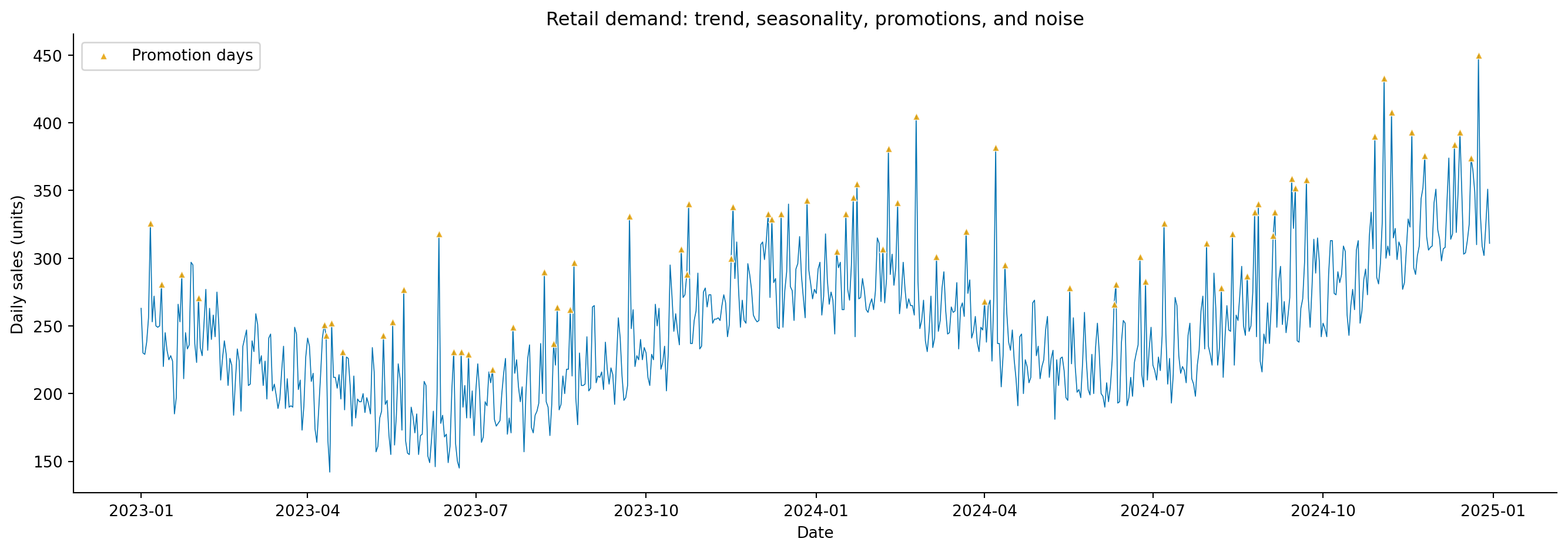
#| fig-cap: "Two years of daily retail sales. The series shows an upward trend, regular weekend peaks, a pronounced December surge, and scattered promotional spikes."
#| fig-alt: "Line chart of daily retail sales in blue from January 2023 to December 2024. The series rises from roughly 200 to 280 units per day. Weekend peaks create a regular sawtooth pattern, December shows a notable annual spike, and occasional upward-pointing triangle markers in orange indicate promotional events that spike above the surrounding pattern."
fig, ax = plt.subplots(figsize=(14, 5))
fig.patch.set_alpha(0)
ax.patch.set_alpha(0)
ax.plot(demand.index, demand['sales'], linewidth=0.6, color='#0072B2')
promo_days = demand[demand['is_promo'] == 1]
ax.scatter(promo_days.index, promo_days['sales'], color='#E69F00', marker='^',
           s=20, zorder=5, alpha=0.85, edgecolors='white', linewidths=0.5,
           label='Promotion days')
ax.set_xlabel('Date')
ax.set_ylabel('Daily sales (units)')
ax.set_title('Retail demand: trend, seasonality, promotions, and noise')
ax.legend(loc='upper left')
ax.spines[['top', 'right']].set_visible(False)
plt.tight_layout()
plt.show()
```
The orange triangles in @fig-demand-overview mark promotion days — sudden spikes that don't follow any seasonal pattern. These are the kind of external interventions that pure time series models struggle with, because they aren't functions of the calendar or the series' own history. We'll return to how different modelling approaches handle them.
## Exploratory analysis {#sec-demand-exploration}
Before modelling, we need to understand the patterns. The decomposition techniques from @sec-decomposition apply directly. Let's also look at the weekly profile and monthly aggregates to confirm the seasonal patterns.
```{python}
#| label: fig-demand-weekly-monthly
#| echo: true
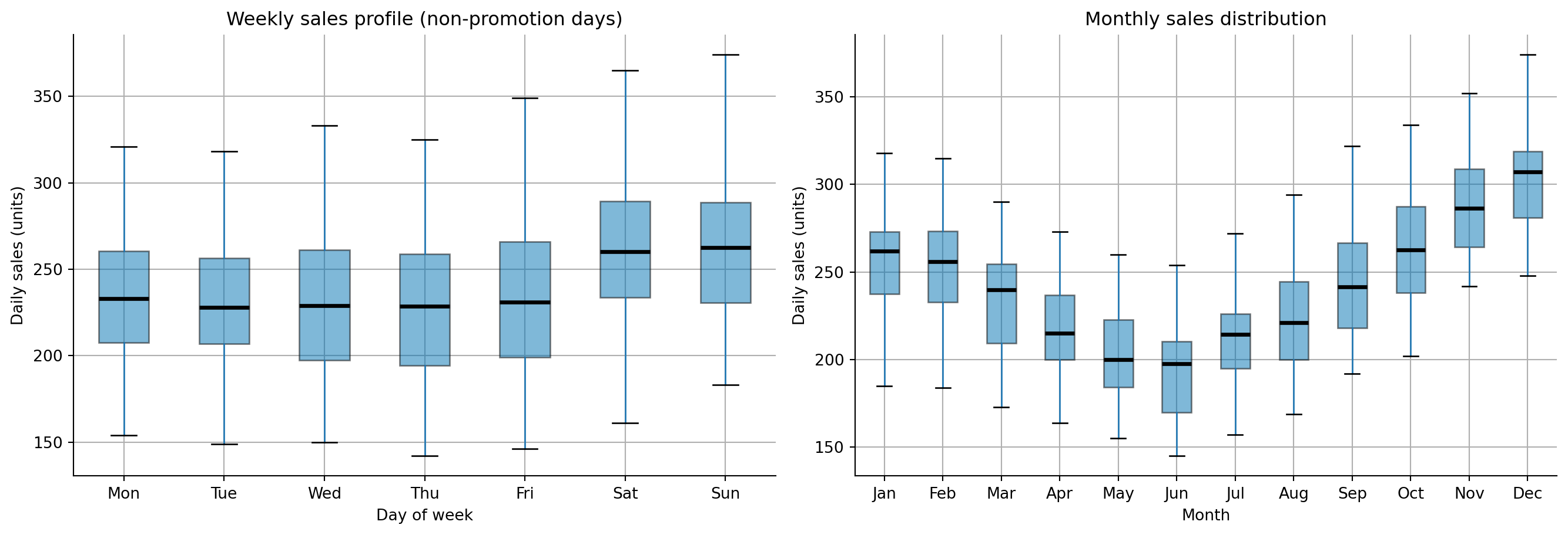
#| fig-cap: "Weekly sales profile (left) and monthly sales distribution (right). Weekends show higher demand, and December dominates the annual cycle."
#| fig-alt: "Two panels side by side. First panel: box plot of daily sales by day of week, with Saturday and Sunday showing higher medians and wider boxes than weekdays. Second panel: box plot of daily sales by month, with December showing the highest median and widest box, and summer months showing slightly lower medians."
fig, (ax1, ax2) = plt.subplots(1, 2, figsize=(14, 5))
fig.patch.set_alpha(0)
ax1.patch.set_alpha(0)
ax2.patch.set_alpha(0)

# Weekly profile
day_names = ['Mon', 'Tue', 'Wed', 'Thu', 'Fri', 'Sat', 'Sun']
demand_no_promo = demand[demand['is_promo'] == 0]  # exclude promo days for cleaner view
demand_no_promo.boxplot(column='sales', by='day_of_week', ax=ax1,
                        patch_artist=True, showfliers=False,
                        boxprops=dict(facecolor='#0072B2', alpha=0.5),
                        medianprops=dict(color='#000000', linewidth=2.5))
ax1.set_xticklabels(day_names)
ax1.set_xlabel('Day of week')
ax1.set_ylabel('Daily sales (units)')
ax1.set_title('Weekly sales profile (non-promotion days)')
ax1.get_figure().suptitle('')  # remove pandas auto-title
ax1.spines[['top', 'right']].set_visible(False)

# Monthly profile
month_names = ['Jan', 'Feb', 'Mar', 'Apr', 'May', 'Jun',
               'Jul', 'Aug', 'Sep', 'Oct', 'Nov', 'Dec']
demand_no_promo.boxplot(column='sales', by='month', ax=ax2,
                        patch_artist=True, showfliers=False,
                        boxprops=dict(facecolor='#0072B2', alpha=0.5),
                        medianprops=dict(color='#000000', linewidth=2.5))
ax2.set_xticklabels(month_names)
ax2.set_xlabel('Month')
ax2.set_ylabel('Daily sales (units)')
ax2.set_title('Monthly sales distribution')
ax2.get_figure().suptitle('')
ax2.spines[['top', 'right']].set_visible(False)

plt.tight_layout()
plt.show()
```
@fig-demand-weekly-monthly confirms what we embedded in the simulation: weekends sell more (Saturday and Sunday medians are visibly higher), and December is the peak month. With simulated data, exploratory data analysis (EDA) confirms the patterns are present as designed. With real data, EDA often reveals surprises: an unexpected day-of-month effect from paydays, a product cannibalisation pattern, or a trend break you hadn't anticipated. That's precisely its value: gauge the magnitude of expected patterns and surface unexpected ones before the model encodes your assumptions.
::: {.callout-note}
## Engineering Bridge
Exploratory analysis for demand forecasting maps to the **observability** practice of understanding your system's baseline behaviour before setting alerts. You wouldn't configure a CPU alert without first understanding the normal daily pattern: the load spike at 09:00, the quiet period overnight, the elevated baseline on batch-processing days. The box plots above serve the same purpose: establish what "normal" looks like so that the model (and the humans who use it) can recognise when something departs from the pattern. The difference is that in systems monitoring, baselines inform alert *thresholds*, discrete decision rules. In forecasting, baselines inform the *model itself*, shaping a continuous prediction. You're not just deciding when to fire a PagerDuty alert; you're estimating how much to order.
:::
## Feature engineering for forecasting {#sec-demand-features}
The time series chapter approached forecasting purely through the lens of the series' own history (the autoregressive terms, moving average terms, and seasonal differencing of ARIMA; @sec-arima). This works well when the only signal is the series itself. But demand forecasting often has **exogenous features**, external variables that influence demand but aren't part of the series' own dynamics. Promotions, holidays, marketing spend, competitor pricing, and weather can all shift demand in ways that the series' history alone can't predict.
The machine learning approach to time series treats forecasting as a supervised learning problem: engineer features from the series' history and external variables, then train a regression model to predict the next value. This lets us bring the full toolkit from Part 3 — gradient boosting, regularisation, feature importance — to bear on a time series problem.
The features fall into four categories. **Lag features** capture what happened recently: yesterday's sales, last week's sales, last year's same-day sales. **Rolling statistics** smooth out day-to-day noise by summarising recent history: the 7-day moving average captures the weekly baseline, while the 28-day moving standard deviation flags periods of unusual volatility. **Calendar features** encode temporal patterns that repeat on a fixed schedule: day of week, month, week of year, and an is-weekend flag. Finally, **external features** encode known future events (promotions, holidays, paydays) that influence demand through mechanisms outside the series' own dynamics.
```{python}
#| label: demand-feature-engineering
#| echo: true
#| code-fold: true
#| code-summary: "Feature engineering function"
def create_features(df):
    """Engineer features for demand forecasting."""
    out = df.copy()

    # Lag features: how much did we sell recently?
    for lag in [1, 2, 3, 7, 14, 28, 365]:
        out[f'lag_{lag}'] = out['sales'].shift(lag)

    # Rolling statistics: what's the recent trend?
    for window in [7, 14, 28]:
        out[f'rolling_mean_{window}'] = out['sales'].shift(1).rolling(window).mean()
        out[f'rolling_std_{window}'] = out['sales'].shift(1).rolling(window).std()

    # Calendar features
    out['day_of_week'] = out.index.dayofweek
    out['is_weekend'] = (out.index.dayofweek >= 5).astype(int)
    out['month'] = out.index.month
    out['week_of_year'] = out.index.isocalendar().week.astype(int)
    out['day_of_year'] = out.index.dayofyear
    out['is_december'] = (out.index.month == 12).astype(int)

    # is_promo is already present as an external feature

    return out

demand_feat = create_features(demand)

# Drop rows with NaN from lag/rolling features (first 365 days lost to lag_365)
demand_feat = demand_feat.dropna()

print(f"Features: {demand_feat.shape[1]} columns, {demand_feat.shape[0]} rows")
print(f"Period after feature creation: {demand_feat.index[0].strftime('%d %B %Y')} – "
      f"{demand_feat.index[-1].strftime('%d %B %Y')}")
```
One key detail: every lag and rolling feature uses `.shift(1)` or higher, and we never include the current day's value or any future information. In production, you're predicting tomorrow's demand using only what's available today. This constraint is easy to violate accidentally, and the resulting data leakage produces models that look excellent in backtesting and fail immediately in deployment. The same principle applies to external features: `is_promo` is usable only because promotions are *planned in advance*; you know tomorrow's promotion schedule today. If a feature requires information you won't have at prediction time, it cannot be used.
::: {.callout-note}
## Engineering Bridge
Time-series feature engineering has the same correctness constraint as **read-your-writes consistency** in distributed systems: a feature computed at time $t$ may only use information available at $t - 1$ and earlier. Violating this is silent: the training pipeline runs to completion, the metrics look excellent, and the failure surfaces only in production when the future information isn't available. You can't detect the bug by inspecting model outputs; you have to audit the feature construction code. Lag features also encode **data dependencies** in the production pipeline: `lag_1` (yesterday's sales) means the forecasting job cannot run until the sales ingestion job completes. What looks like a column in a DataFrame becomes an explicit job dependency in a scheduler like Airflow or Prefect.
:::
::: {.callout-tip}
## Author's Note
The ML framing of time series as feature engineering does something conceptually useful: it makes the modelling assumptions explicit. ARIMA's parameter notation — ARIMA(1,1,1)(1,1,1)$_7$ — encodes assumptions about which lags matter and how, but those assumptions live inside a parameter tuple that doesn't tell you which days or windows the model is relying on. With gradient boosting, the same assumptions become column names in a DataFrame: include `lag_7` and you're telling the model "last week's same day matters"; include `rolling_mean_28` and you're saying "the recent month's trend matters." The statistical and ML approaches are answering the same question ("which aspects of the past predict the future?"), but the ML approach exposes the answer in a form that's easy to audit, modify, and explain to a product team.
:::
## The statistical approach: SARIMA {#sec-demand-sarima}
Before reaching for machine learning, we fit a SARIMA model using the framework from @sec-arima. This gives us a principled benchmark and, importantly, well-calibrated prediction intervals.
```{python}
#| label: demand-sarima
#| echo: true
from statsmodels.tsa.statespace.sarimax import SARIMAX

# Temporal split: train on all but last 60 days, test on the last 60
split_date = demand.index[-60]
train_series = demand.loc[:split_date, 'sales'][:-1]
test_series = demand.loc[split_date:, 'sales']

# SARIMA(1,1,1)(1,1,1)_7 — the weekly specification from the time series chapter
sarima = SARIMAX(train_series, order=(1, 1, 1), seasonal_order=(1, 1, 1, 7),
                 enforce_stationarity=False, enforce_invertibility=False)
sarima_fit = sarima.fit(disp=False)

sarima_forecast = sarima_fit.get_forecast(steps=len(test_series))
sarima_pred = sarima_forecast.predicted_mean
sarima_ci = sarima_forecast.conf_int(alpha=0.05)

print(f"SARIMA AIC: {sarima_fit.aic:.1f}")
print(f"Training period: {train_series.index[0].strftime('%d %B %Y')} – "
      f"{train_series.index[-1].strftime('%d %B %Y')}")
print(f"Test period: {test_series.index[0].strftime('%d %B %Y')} – "
      f"{test_series.index[-1].strftime('%d %B %Y')}")
```
Note that SARIMA models the series' own dynamics: it doesn't know about promotions. Any promotional spike in the test period will appear as a forecast miss, because the model has no mechanism to anticipate an external intervention. This is where the ML approach has a structural advantage.
The 95% prediction intervals produced by `get_forecast` assume that the model's errors are normally distributed, an assumption that holds reasonably for series with symmetric noise but may understate uncertainty when errors are skewed (for instance, during promotional periods where demand can only spike upward). If you're using these intervals for stock-level decisions, it's worth checking the residual distribution from `sarima_fit.plot_diagnostics()`.
## The ML approach: gradient boosting {#sec-demand-ml}
Gradient boosting (@sec-gradient-boosting) remains a strong default for applied ML forecasting; it often outperforms more complex approaches on structured tabular data. It handles non-linear relationships, mixed feature types, and interactions between features naturally, properties that matter when demand depends on combinations like "Saturday in December during a promotion." (Neural forecasting architectures like N-BEATS and Temporal Fusion Transformers are increasingly competitive at scale, but gradient boosting is the right starting point for the majority of tabular demand problems.)
```{python}
#| label: demand-gbr
#| echo: true
from sklearn.ensemble import GradientBoostingRegressor
from sklearn.metrics import mean_absolute_error, root_mean_squared_error

# Prepare feature matrix — exclude 'sales' (target) and 'month'/'day_of_week'
# (we use finer-grained calendar features instead: is_weekend, is_december, etc.)
feature_cols = [c for c in demand_feat.columns
                if c not in ['sales', 'month', 'day_of_week']]

# Temporal split aligned with the SARIMA split
train_mask = demand_feat.index < split_date
test_mask = demand_feat.index >= split_date

X_train = demand_feat.loc[train_mask, feature_cols]
y_train = demand_feat.loc[train_mask, 'sales']
X_test = demand_feat.loc[test_mask, feature_cols]
y_test = demand_feat.loc[test_mask, 'sales']

gbr = GradientBoostingRegressor(
    n_estimators=300, learning_rate=0.05, max_depth=5,
    subsample=0.8, random_state=42
)
gbr.fit(X_train, y_train)

gbr_pred = gbr.predict(X_test)

print(f"Training samples: {len(X_train):,}")
print(f"Test samples:     {len(X_test):,}")
print(f"Features:         {len(feature_cols)}")
print(f"Note: GBR trains on ~{len(X_train)} rows (after dropping NaNs from lag_365),")
print(f"      while SARIMA uses all {len(train_series)} training days.")
```
## Comparing approaches {#sec-demand-comparison}
With both models fitted, let's compare them on the held-out 60 days. One important caveat: the comparison is not quite apples-to-apples. SARIMA produces a genuine 60-day-ahead multi-step forecast from the last training observation; it sees no actual values during the test period. The gradient boosting model, by contrast, uses `lag_1` (yesterday's actual sales) at each test point, making it effectively a one-step-ahead forecast refreshed daily. In production with daily retraining, the GBR setup is realistic; for a true $k$-day-ahead projection, GBR would need recursive prediction (feeding its own forecasts back as lag features), which degrades accuracy substantially. We note this asymmetry and compare both as they would run in their natural deployment modes.
```{python}
#| label: tbl-demand-comparison
#| echo: true
#| tbl-cap: "Held-out 60-day forecast accuracy for the seasonal-naive baseline, SARIMA, and gradient boosting (MAE, RMSE, MAPE)."
from sklearn.metrics import mean_absolute_percentage_error

# Align indices — SARIMA and GBR test periods may differ slightly
common_idx = test_series.index.intersection(X_test.index)
y_common = test_series.loc[common_idx]
sarima_common = sarima_pred.loc[common_idx]
gbr_common = pd.Series(gbr_pred, index=X_test.index).loc[common_idx]

# Seasonal-naive baseline: repeat the last observed training week forward — a
# multi-step forecast (like SARIMA) that sees no test-period actuals. This matches
# the baseline to SARIMA's forecasting mode; GBR, as noted above, remains a
# one-step-ahead forecast, so the comparison is not fully apples-to-apples.
naive = np.tile(train_series.values[-7:], 10)[:len(common_idx)]

results = pd.DataFrame({
    'Model': ['Seasonal naive', 'SARIMA', 'Gradient boosting'],
    'MAE': [
        mean_absolute_error(y_common, naive),
        mean_absolute_error(y_common, sarima_common),
        mean_absolute_error(y_common, gbr_common),
    ],
    'RMSE': [
        root_mean_squared_error(y_common, naive),
        root_mean_squared_error(y_common, sarima_common),
        root_mean_squared_error(y_common, gbr_common),
    ],
    'MAPE': [
        mean_absolute_percentage_error(y_common, naive) * 100,
        mean_absolute_percentage_error(y_common, sarima_common) * 100,
        mean_absolute_percentage_error(y_common, gbr_common) * 100,
    ],
})

results.round(1).set_index('Model')
```
@tbl-demand-comparison reports the three error metrics side by side. **MAPE** (Mean Absolute Percentage Error) expresses the average forecast error as a percentage of actual sales, a metric that operations teams often prefer because "8% error" is more intuitive than "18 units MAE" when comparing across products with different sales volumes. The downside is that MAPE is undefined when actual values are zero and penalises overforecasts more heavily than underforecasts. Because MAPE divides the absolute error by the actual value, an overforecast of $k$ units produces an error of $k / y_t$, which is unbounded when $\hat{y}_t \gg y_t$, while an underforecast is capped at 100% once $\hat{y}_t$ reaches zero. A model trained to minimise this quantity responds by nudging its predictions downward, trading symmetric accuracy for the asymmetric loss, systematically underforecasting as a result. That bias is worth knowing about before relying on MAPE for inventory decisions.
```{python}
#| label: fig-demand-forecast-comparison
#| echo: true
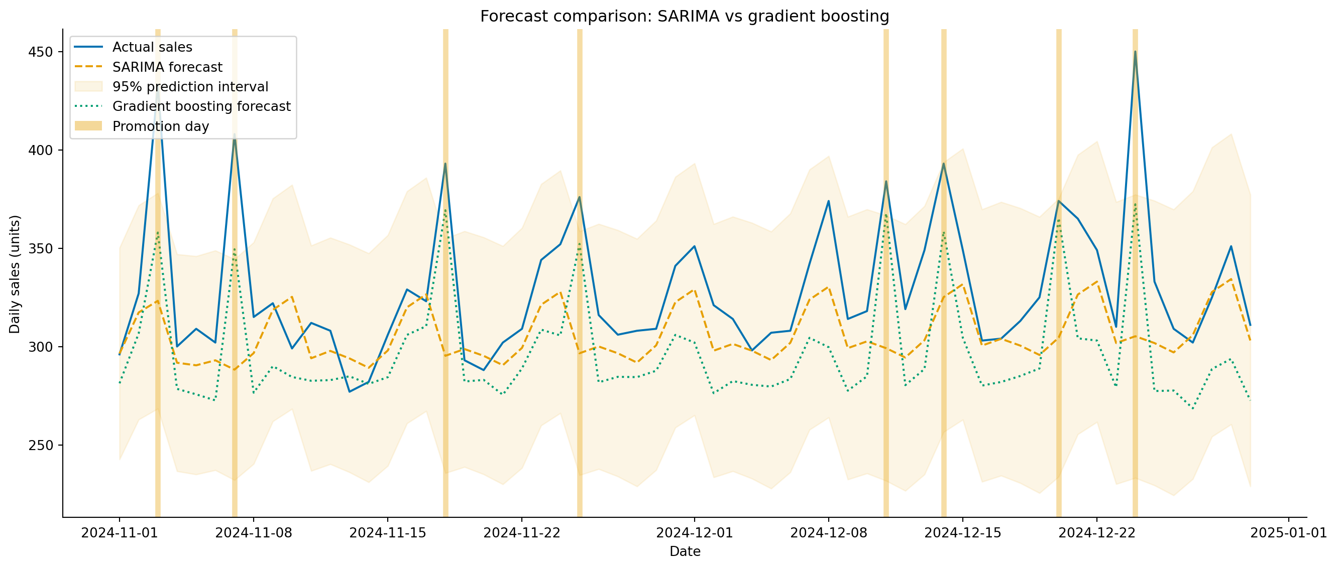
#| fig-cap: "60-day demand forecasts from SARIMA and gradient boosting against actual sales. Gradient boosting tracks promotional spikes more closely because it uses the `is_promo` feature; SARIMA treats them as unforecastable noise."
#| fig-alt: "Line chart showing 60 days of actual daily sales as a solid blue line with weekend peaks and occasional promotional spikes. A dashed amber line shows the SARIMA forecast tracking the trend and weekly pattern but missing promotional spikes. A dotted green line shows the gradient boosting forecast following the same weekly rhythm and partially capturing the promotional spikes. The SARIMA 95 percent prediction interval is shown as a light amber shaded region. Vertical semi-transparent grey bands mark promotion days in the test period."
from matplotlib.patches import Patch

fig, ax = plt.subplots(figsize=(14, 6))
fig.patch.set_alpha(0)
ax.patch.set_alpha(0)

ax.plot(common_idx, y_common, color='#0072B2', linewidth=1.5,
        label='Actual sales')
ax.plot(common_idx, sarima_common, color='#E69F00', linewidth=1.5,
        linestyle='--', label='SARIMA forecast')
ax.fill_between(sarima_ci.loc[common_idx].index,
                sarima_ci.loc[common_idx].iloc[:, 0],
                sarima_ci.loc[common_idx].iloc[:, 1],
                color='#E69F00', alpha=0.18, label='95% prediction interval')
ax.plot(common_idx, gbr_common, color='#009E73', linewidth=1.5,
        linestyle=':', label='Gradient boosting forecast')

# Mark promotion days in the test set (neutral grey so they don't clash
# with the orange SARIMA series/interval)
test_promos = demand.loc[common_idx]
test_promos = test_promos[test_promos['is_promo'] == 1]
for d in test_promos.index:
    ax.axvline(d, color='#999999', alpha=0.45, linewidth=4)

promo_patch = Patch(facecolor='#999999', alpha=0.45, label='Promotion day')
handles, labels_leg = ax.get_legend_handles_labels()
ax.set_xlabel('Date')
ax.set_ylabel('Daily sales (units)')
ax.set_title('Forecast comparison: SARIMA vs gradient boosting')
ax.legend(handles=handles + [promo_patch], loc='upper left')
ax.spines[['top', 'right']].set_visible(False)
plt.tight_layout()
plt.show()
```
The grey bands in @fig-demand-forecast-comparison mark promotion days. SARIMA can't anticipate them, because they're not encoded in the series' history, so every promotion is a miss. Gradient boosting, with access to `is_promo`, can at least partially capture the effect, provided the model has seen enough promotional days during training to learn their typical magnitude. This is the practical advantage of the ML approach: it naturally incorporates exogenous features that statistical models handle awkwardly or not at all.
But SARIMA has its own advantage: it produces **calibrated prediction intervals** from its likelihood model. Gradient boosting gives you point forecasts only. You *can* construct intervals for gradient boosting (using quantile regression, conformal prediction, or bootstrap methods), but they require additional machinery and assumptions. For capacity planning where you need to provision for the plausible worst case, those intervals matter.
## What drives demand? {#sec-demand-drivers}
As with churn prediction (@sec-churn-interpretation), understanding *why* the model forecasts what it does is as valuable as the forecast itself. Permutation importance tells us which features the gradient boosting model relies on most.
```{python}
#| label: fig-demand-importance
#| echo: true
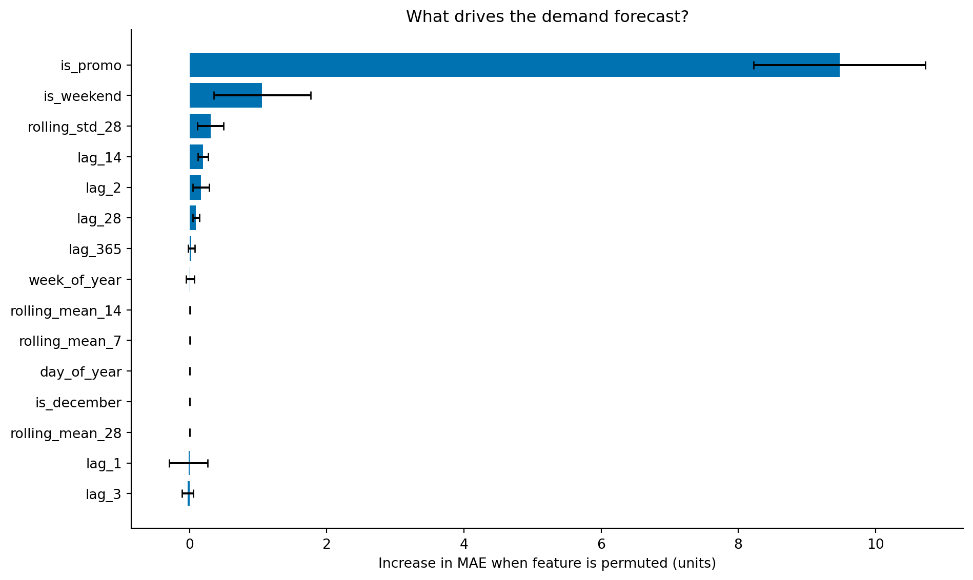
#| fig-cap: "Permutation importance for the demand forecasting model. The promotion flag (`is_promo`) dominates by a wide margin; the many correlated lag and rolling-average features each rank far lower, because permutation importance splits the credit for a shared signal among them."
#| fig-alt: "Horizontal bar chart showing permutation importance for the top 15 features of the gradient boosting demand model. One bar dominates: is_promo, the promotion flag, with an importance roughly nine times that of the next feature. The remaining bars are short and similar in length — is_weekend, rolling std 28, and lag features such as lag 14 and lag 2 — while the recent lag and rolling-mean features individually sit close to zero. Error bars show standard deviation across ten repeats."
from sklearn.inspection import permutation_importance

perm = permutation_importance(gbr, X_test, y_test, n_repeats=10,
                              random_state=42, scoring='neg_mean_absolute_error')

sorted_idx = np.argsort(perm.importances_mean)[-15:]  # top 15
labels = np.array(feature_cols)[sorted_idx]

fig, ax = plt.subplots(figsize=(10, 6))
fig.patch.set_alpha(0)
ax.patch.set_alpha(0)
ax.barh(range(len(sorted_idx)), perm.importances_mean[sorted_idx],
        xerr=perm.importances_std[sorted_idx],
        color='#0072B2', edgecolor='none', capsize=3)
ax.set_yticks(range(len(sorted_idx)))
ax.set_yticklabels(labels)
ax.set_xlabel('Increase in MAE when feature is permuted (units)')
ax.set_title('What drives the demand forecast?')
ax.spines[['top', 'right']].set_visible(False)
plt.tight_layout()
plt.show()
```
At first glance this ranking is surprising. The promotion flag (`is_promo`) dominates, with an importance roughly nine times that of any other feature, while `lag_1` (yesterday's sales) and `rolling_mean_7` — the features we'd expect to anchor a demand forecast — sit close to zero. That does *not* mean the model ignores recent sales. It means permutation importance behaves counterintuitively when features are correlated, and a demand series is full of correlated features: `lag_1`, `lag_2`, `rolling_mean_7`, and `rolling_mean_14` all encode roughly the same thing — the recent sales level.
Permutation importance works by shuffling a single feature, breaking its relationship with the target while leaving every other feature intact, and measuring how much the model's error grows. That last part is the catch. When you permute `lag_1`, the model simply leans on `lag_2`, `rolling_mean_7`, and the other recent-sales features, which are still intact and carry almost the same information; its predictions barely suffer, so `lag_1` scores as unimportant. Permute `rolling_mean_7` and the same thing happens in reverse. Each correlated feature looks dispensable *individually* because its neighbours can stand in for it, so the group's shared importance is diluted across all of them and each ends up near zero. `is_promo`, by contrast, is the only feature carrying the promotion signal — nothing else can substitute for it — so its full importance shows up undivided. The lesson is not that recent sales don't matter; it's that permutation importance attributes a shared signal poorly. When features are correlated, read individual importances as a lower bound, group related features before permuting, or reach for a method like conditional permutation importance or SHAP that accounts for the correlation structure. The `lag_365` feature (same day last year) ranks low for a related reason: the explicit calendar features already encode similar seasonal information.
::: {.callout-note}
## Engineering Bridge
Feature importance for a demand model serves the same role as a **dependency graph** in system architecture. When you need to understand why your service is slow, you trace the critical path through its dependencies: which calls contribute most to latency? When you need to understand why your forecast missed, you trace through the feature importances: which inputs contributed most to the prediction? Both exercises identify where to invest: improve the most impactful dependency, or invest in better data for the most important feature. And both have the same caveat: correlated dependencies (or correlated features) make attribution approximate rather than exact.
:::
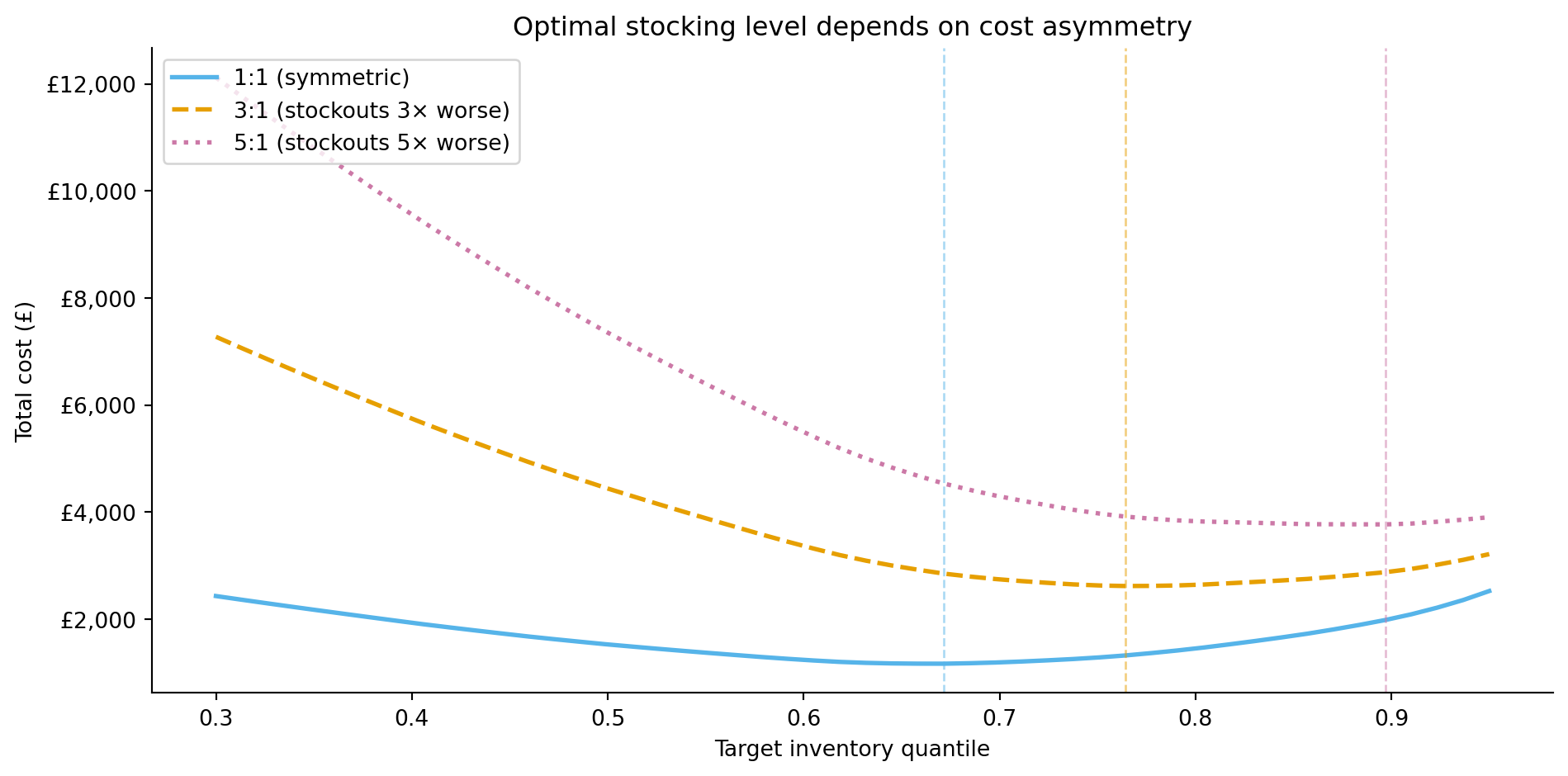
## The cost of getting it wrong {#sec-demand-costs}
Forecast errors are rarely symmetric in their business impact. Overforecasting by 50 units means excess inventory: storage costs, spoilage for perishable goods, tied-up capital. Underforecasting by 50 units means stockouts: lost sales, disappointed customers, potential long-term damage to loyalty. For most retailers, stockouts are worse than overstock.
This asymmetry means that the optimal forecast isn't the one that minimises MAE or RMSE. Instead, you want a forecast that balances the costs on each side. If stockout costs are three times overstock costs, you should plan inventory against a quantile of the forecast distribution higher than the median, the 75th percentile rather than the 50th, for instance. (This is different from simply biasing the point forecast upward, which discards the distributional information; the quantile approach uses the full predictive distribution to set the right inventory level.)
The total inventory cost across all forecast periods is the sum of the per-unit overage and underage costs:
$$
\text{Total cost} = c_{\text{over}} \sum_{t} \max(0, \hat{y}_t - y_t) + c_{\text{under}} \sum_{t} \max(0, y_t - \hat{y}_t)
$$
In words: for each day, count how many units you over-ordered (and multiply by the per-unit overstocking cost $c_{\text{over}}$) plus how many units you were short (and multiply by the per-unit stockout cost $c_{\text{under}}$). When $c_{\text{under}} > c_{\text{over}}$, the cost-minimising forecast targets a quantile above the median. The **critical ratio** from the newsvendor model determines which quantile:
$$
q^* = \frac{c_{\text{under}}}{c_{\text{under}} + c_{\text{over}}}
$$
With $c_{\text{under}} = \text{£}3$ and $c_{\text{over}} = \text{£}1$, the optimal quantile is $q^* = 3 / (3 + 1) = 0.75$: you should stock to the 75th percentile of the forecast distribution, not the median. This result assumes single-period decisions, deterministic unit costs, and a known demand distribution, simplifications that hold approximately for daily replenishment of a stable product but break down for multi-period inventory planning with quantity discounts or uncertain lead times.
```{python}
#| label: fig-demand-cost-asymmetry
#| echo: true
#| fig-cap: "Total cost as a function of the inventory quantile for different cost ratios. When stockouts are more expensive than overstock, the cost-minimising quantile shifts upward — you need to carry more safety stock. This curve treats the predictive distribution as Gaussian (recovered from the forecast's symmetric interval); when demand errors are skewed, as they often are around promotions, the implied optimal quantile is approximate."
#| fig-alt: "Line chart with three curves showing total inventory cost on the vertical axis against the target quantile (0.3 to 0.95) on the horizontal axis. The solid blue curve for equal costs (ratio 1 to 1) reaches its minimum at the lowest quantile. As the cost ratio rises, the cost-minimising quantile shifts rightward: the dashed amber curve for the 3 to 1 ratio bottoms out at a higher quantile, and the dotted pink curve for 5 to 1 higher still, tracking the critical-ratio values of roughly 0.5, 0.75, and 0.83. Vertical dashed lines in matching colours mark each empirical minimum."
# Use SARIMA's prediction intervals to derive the forecast distribution —
# GBR produces point forecasts only, so we need the statistical model's
# likelihood-based intervals for quantile-based stocking decisions.
forecast_mean_vals = sarima_common.values
forecast_std = (sarima_ci.loc[common_idx].iloc[:, 1].values
                - sarima_ci.loc[common_idx].iloc[:, 0].values) / (2 * 1.96)

from scipy import stats
import matplotlib.ticker as mticker

quantiles = np.linspace(0.30, 0.95, 50)

fig, ax = plt.subplots(figsize=(10, 5))
fig.patch.set_alpha(0)
ax.patch.set_alpha(0)
actuals = y_common.values

for c_under, c_over, label, colour, ls in [
    (1, 1, '1:1 (symmetric)',          '#56B4E9', '-'),
    (3, 1, '3:1 (stockouts 3× worse)', '#E69F00', '--'),
    (5, 1, '5:1 (stockouts 5× worse)', '#CC79A7', ':'),
]:
    costs = []
    for q in quantiles:
        stock_level = stats.norm.ppf(q, loc=forecast_mean_vals,
                                      scale=np.maximum(forecast_std, 1))
        over = np.maximum(stock_level - actuals, 0).sum()
        under = np.maximum(actuals - stock_level, 0).sum()
        costs.append(c_over * over + c_under * under)

    costs = np.array(costs)
    best_q = quantiles[np.argmin(costs)]
    ax.plot(quantiles, costs, linewidth=2, label=label, color=colour,
            linestyle=ls)
    ax.axvline(best_q, color=colour, linestyle='--', alpha=0.5, linewidth=1)

ax.set_xlabel('Target inventory quantile')
ax.set_ylabel('Total cost (£)')
ax.yaxis.set_major_formatter(mticker.FuncFormatter(lambda x, _: f'£{x:,.0f}'))
ax.set_title('Optimal stocking level depends on cost asymmetry')
ax.legend(loc='upper left')
ax.spines[['top', 'right']].set_visible(False)
plt.tight_layout()
plt.show()
```
This is the demand forecasting analogue of the threshold economics in @sec-churn-business-decisions. The model's statistical accuracy (MAE, RMSE) tells you how good the forecast is; the cost function tells you how to *use* it. A slightly less accurate forecast paired with the right stocking quantile can be worth more than a more accurate forecast applied naively at the median.
::: {.callout-tip}
## Author's Note
The asymmetric cost framing shifts forecasting from a statistical problem to a decision problem. The engineering instinct is to minimise error: make the forecast as close to the actual as possible, full stop. But in demand forecasting, the right amount of bias depends on which mistake costs more. What makes this different from the threshold decision in churn prediction (@sec-churn-business-decisions) is that the asymmetry *compounds* across time and across the product portfolio. A churn threshold is a per-customer decision; a stocking quantile is applied to every product, every day, for months. A systematic 5% overforecast across 10,000 stock-keeping units (SKUs) for a quarter accumulates into a warehouse full of excess inventory. The compounding effect means the quantile choice isn't just a tuning parameter — it's an operational strategy that shapes the entire supply chain.
:::
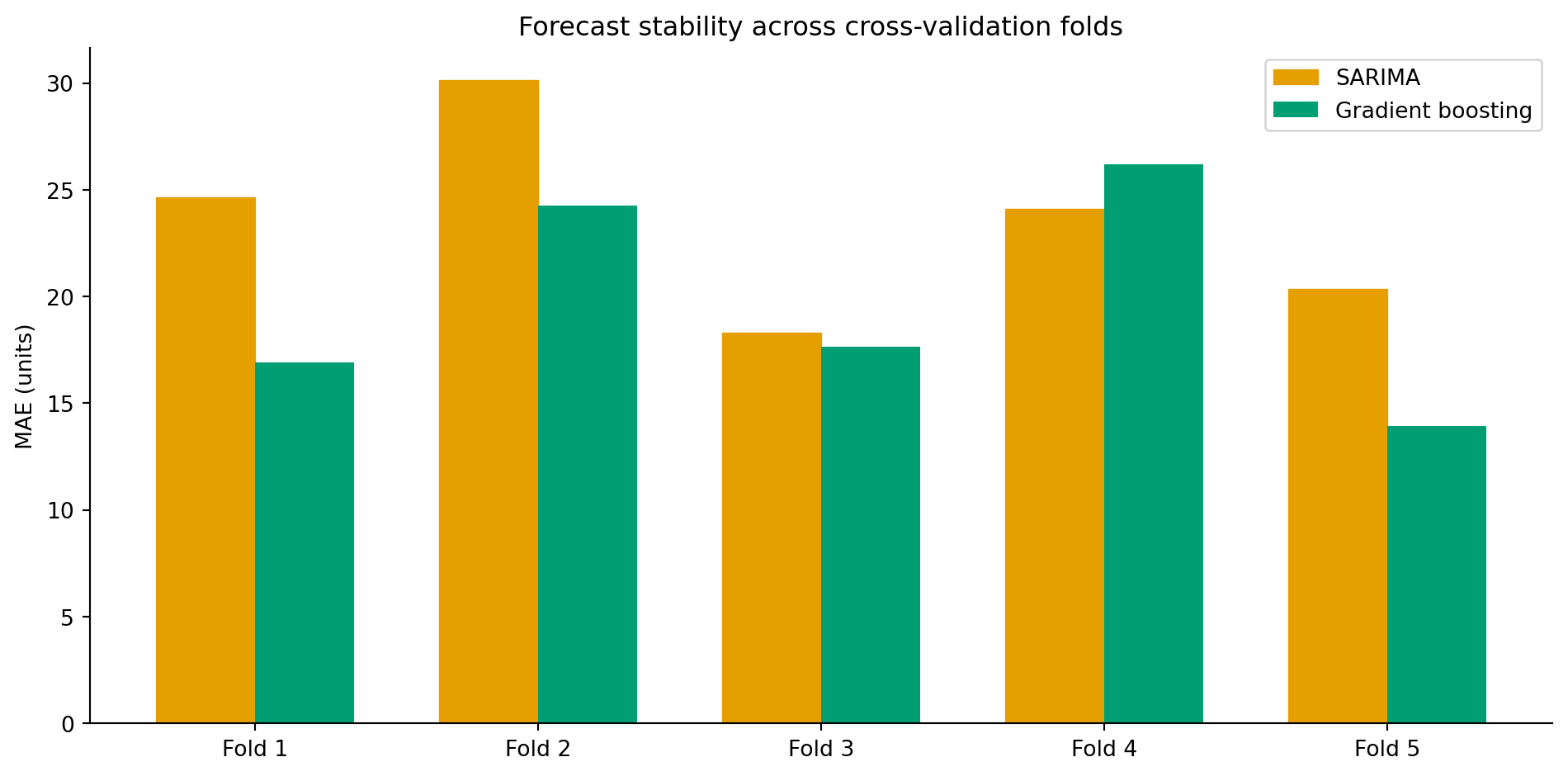
## Expanding-window evaluation: is the model stable? {#sec-demand-rolling}
A single 60-day test window can be misleading: the model might perform well in November but poorly in March when the patterns differ. Expanding-window cross-validation (@sec-ts-validation) gives a more honest assessment of forecast stability across different periods.
```{python}
#| label: tbl-demand-folds
#| echo: true
#| tbl-cap: "Per-fold MAE for SARIMA and gradient boosting across five expanding-window cross-validation folds."
#| code-fold: true
#| code-summary: "Expanding-window cross-validation loop"
n_folds = 5
fold_test_size = 30
results_folds = []

for fold in range(n_folds):
    test_start = len(demand) - (n_folds - fold) * fold_test_size
    test_end = test_start + fold_test_size

    fold_train = demand['sales'].iloc[:test_start]
    fold_test = demand['sales'].iloc[test_start:test_end]

    # SARIMA
    fold_sarima = SARIMAX(fold_train, order=(1, 1, 1),
                          seasonal_order=(1, 1, 1, 7),
                          enforce_stationarity=False,
                          enforce_invertibility=False)
    fold_sarima_fit = fold_sarima.fit(disp=False)
    fold_sarima_pred = fold_sarima_fit.get_forecast(steps=fold_test_size).predicted_mean

    # GBR — need features
    fold_feat = create_features(demand.iloc[:test_end])
    fold_feat = fold_feat.dropna()
    fold_train_mask = fold_feat.index < demand.index[test_start]
    fold_test_mask = (fold_feat.index >= demand.index[test_start]) & (
        fold_feat.index <= demand.index[min(test_end - 1, len(demand) - 1)])

    if fold_train_mask.sum() > 0 and fold_test_mask.sum() > 0:
        fold_gbr = GradientBoostingRegressor(
            n_estimators=300, learning_rate=0.05, max_depth=5,
            subsample=0.8, random_state=42
        )
        fold_gbr.fit(fold_feat.loc[fold_train_mask, feature_cols],
                      fold_feat.loc[fold_train_mask, 'sales'])
        gbr_fold_pred = fold_gbr.predict(
            fold_feat.loc[fold_test_mask, feature_cols])
        gbr_fold_actual = fold_feat.loc[fold_test_mask, 'sales']
        gbr_mae = mean_absolute_error(gbr_fold_actual, gbr_fold_pred)
    else:
        gbr_mae = np.nan

    sarima_mae = mean_absolute_error(fold_test.values,
                                     fold_sarima_pred.values[:len(fold_test)])
    results_folds.append({
        'fold': fold + 1,
        'SARIMA MAE': sarima_mae,
        'GBR MAE': gbr_mae,
    })

folds_df = pd.DataFrame(results_folds)
folds_df.round(1).set_index('fold')
```
```{python}
#| label: fig-demand-rolling-eval
#| echo: true
#| fig-cap: "MAE across five expanding-window cross-validation folds for SARIMA and gradient boosting. Fold-to-fold variation reveals how stable each model's performance is across different time periods."
#| fig-alt: "Grouped bar chart with five fold pairs. Each fold has two bars side by side: an amber bar with diagonal hatching for SARIMA and a solid green bar for gradient boosting. Gradient boosting generally has lower MAE across folds, but the gap varies — it is narrowest in the earlier folds where the gradient boosting training set is smallest."
fig, ax = plt.subplots(figsize=(10, 5))
fig.patch.set_alpha(0)
ax.patch.set_alpha(0)
x = np.arange(n_folds)
width = 0.35
ax.bar(x - width/2, folds_df['SARIMA MAE'], width, color='#E69F00',
       label='SARIMA', edgecolor='#E69F00', hatch='///', linewidth=0.5)
ax.bar(x + width/2, folds_df['GBR MAE'], width, color='#009E73',
       label='Gradient boosting', edgecolor='none')
ax.set_xticks(x)
ax.set_xticklabels([f'Fold {i+1}' for i in range(n_folds)])
ax.set_ylabel('MAE (units)')
ax.set_title('Forecast stability across cross-validation folds')
ax.legend()
ax.spines[['top', 'right']].set_visible(False)
plt.tight_layout()
plt.show()
```
@tbl-demand-folds lists the per-fold MAE for both models, and @fig-demand-rolling-eval plots the same figures. Fold-to-fold variation tells you something MAE alone cannot: how much the model's performance depends on *when* you evaluate it. Large variation across folds is a warning that the model may have learned patterns specific to certain periods (e.g., it performs well in steady periods but poorly during holidays). Consistent performance across folds gives more confidence that the model will generalise to future periods.
## From single products to portfolios {#sec-demand-hierarchy}
Real retail operations don't forecast a single product in isolation. A supermarket might stock 30,000 SKUs across 200 stores — that's 6 million individual time series. Forecasting at this scale introduces challenges that don't exist in the single-product case.
**Hierarchical forecasting** recognises that individual product series are part of a structure: SKU → category → department → store → region → total. Forecasts should be **coherent**: the sum of individual SKU forecasts should equal the category forecast, which should equal the department forecast, and so on up the hierarchy. Naive bottom-up forecasting (forecast each SKU independently, then sum) produces coherent totals but ignores the stronger signal available at aggregate levels. Top-down forecasting (forecast the total, then allocate proportionally) captures the aggregate trend but can't model product-level patterns.
**Reconciliation** methods combine forecasts from multiple levels of the hierarchy and adjust them to be coherent while minimising overall forecast error. The most established approach, MinT (Minimum Trace), estimates the covariance structure between levels and finds the adjustment that minimises total variance, though in practice simpler reconciliation methods often perform nearly as well and are easier to maintain in production. The intuition is similar to ensemble methods in classification: individual forecasters each have strengths at different levels of aggregation, and the reconciliation step blends them.
::: {.callout-note}
## Engineering Bridge
Hierarchical reconciliation maps directly to a familiar distributed systems pattern: **local decisions that must respect global constraints**. Per-server autoscaling is bottom-up: each node scales based on local load, but the total must stay within the cluster budget. Global quota allocation is top-down: divide the budget across services, but miss local spikes. The reconciliation approach is what systems like Kubernetes actually do: combine bottom-up resource requests with top-down limits, adjusting both to maintain cluster-wide feasibility. Each level of the hierarchy provides useful signal, and the art is combining them without violating the consistency requirements.
:::
## Summary {#sec-demand-summary}
1. **Demand forecasting combines time series modelling with business context.** The statistical foundations from @sec-order-matters provide the tools; the applied context determines how to use them — which features to engineer, which errors to penalise, and how to translate forecasts into decisions.
2. **Feature engineering transforms time series into supervised learning.** Lag features, rolling statistics, calendar variables, and exogenous inputs (promotions, holidays) let tree-based models compete with — and often outperform — traditional statistical methods, especially when external drivers are important.
3. **Statistical and ML approaches complement each other.** SARIMA provides principled prediction intervals from a likelihood model. Gradient boosting handles exogenous features and non-linear interactions. The best production systems often use both: ML for point forecasts and statistical models (or conformal prediction) for uncertainty quantification.
4. **Forecast error is not the right objective in isolation.** The cost of overforecasting versus underforecasting determines the optimal stocking quantile. A slightly less accurate forecast with the right inventory policy can be worth more than a more accurate forecast applied at the median.
5. **Production forecasting is an engineering problem as much as a modelling one.** Thousands of products, multiple stores, hierarchical coherence constraints, and daily retraining schedules demand the pipeline and deployment practices from @sec-pipelines-intro and @sec-mlops-intro — the model is only as good as the infrastructure that delivers its predictions on time.
## Exercises {#sec-demand-exercises}
1. The SARIMA model in this chapter doesn't use the `is_promo` feature. Refit using `SARIMAX` with `is_promo` as an exogenous variable (the `exog` parameter). Compare the MAE against the plain SARIMA baseline. Does knowing about promotions improve the statistical model's accuracy?
2. The gradient boosting model uses a large feature set. Use the permutation importance results from @sec-demand-drivers to identify features with near-zero importance, remove them, and refit the model. Does the simpler model perform comparably? At what point does removing features degrade performance?
3. **Quantile regression.** Fit a `GradientBoostingRegressor` with `loss='quantile'` and `alpha=0.75` to produce a 75th-percentile forecast (the cost-optimal quantile from @sec-demand-costs when stockouts cost 3× overstock). Compare this directly against using the median forecast plus a safety stock buffer. Which approach better controls the underforecast rate?
4. **Conceptual:** A product manager asks you to forecast demand for a product that launched three weeks ago. You have 21 days of sales data. What are the specific limitations of applying the methods from this chapter? Consider: (a) which lag features are unavailable, (b) whether SARIMA can estimate seasonal parameters, and (c) what alternative approaches might work for new products with minimal history.
5. **Conceptual:** Your demand forecasting model has been running in production for six months and performing well. Then your company runs a major promotional campaign unlike anything in the training data — a 40% site-wide discount for a full week. The model significantly underforecasts demand during the campaign. What went wrong, and how would you redesign the system to handle novel promotional events? Where does the analogy to capacity planning for a new product launch apply, and where does it break down?