---
# Content: CC BY-NC-SA 4.0 | Code: MIT - see /LICENSE.md
title: "Predicting customer churn"
---
{{< include /_common-imports.qmd >}}
## When users leave silently {#sec-churn-intro}
You've built alerting for service outages. When a server goes down, a metric spikes, or an error rate crosses a threshold, your on-call engineer gets paged. The system fails loudly, and you respond immediately.
Users don't fail loudly. A customer who's about to cancel doesn't throw an exception. They log in less often, they stop using the features that used to keep them engaged, they let their support tickets go unanswered — and then one day they're gone. No stack trace, no error log. Just a cancelled subscription and a gap in next month's revenue.
**Customer churn** (the loss of existing customers over a given period) is one of the most common prediction problems in industry. It sits at the intersection of everything we've built so far: classification models from @sec-from-numbers-to-decisions and @sec-decision-trees, the evaluation framework from @sec-classification-metrics, and the engineering practices from Part 4. This chapter puts those pieces together on a realistic problem from end to end: defining the target, engineering features, training and evaluating models, and turning predictions into business decisions.
## Defining the target {#sec-defining-churn}
The first decision, and one of the hardest, is defining what "churned" means. For a subscription service, it might seem obvious: the customer cancelled. But even this simple case has subtleties. Does a customer who downgrades from a paid plan to a free tier count as churned? What about someone who cancels and resubscribes a week later? What observation window do you use: did they churn this month, this quarter, this year?
These aren't statistical questions. They're business decisions that shape the entire modelling problem. A 30-day churn window catches customers who are leaving *right now* but gives you little time to intervene. A 90-day window gives more time to act but dilutes the signal: features measured today may be stale by the time the churn event occurs three months later.
For this chapter, we'll simulate a SaaS platform with monthly subscriptions. A customer is "churned" if they cancel within the next 30 days. This is concrete enough to build a model and general enough that the approach transfers to other contexts.
```{python}
#| label: churn-data-generation
#| echo: true
from scipy.special import expit  # logistic sigmoid: maps log-odds to probability

rng = np.random.default_rng(42)
n = 2000

# Simulate a SaaS customer base with realistic feature distributions
customers = pd.DataFrame({
    'tenure_months': rng.integers(1, 49, n),  # tenure from 1 to 48 months inclusive
    'monthly_spend_gbp': np.clip(rng.lognormal(3.5, 0.6, n), 10, 500).round(2),
    'logins_last_30d': rng.poisson(12, n),
    'support_tickets_last_90d': rng.poisson(1.2, n),
    'features_used_pct': np.clip(rng.beta(3, 2, n) * 100, 5, 100).round(1),
    'days_since_last_login': rng.exponential(8, n).round(1),
    'contract_type': rng.choice(['monthly', 'annual'], n, p=[0.6, 0.4]),
    'payment_failures_last_90d': rng.poisson(0.3, n),
})

# Encode contract type for modelling
customers['is_annual'] = (customers['contract_type'] == 'annual').astype(int)

# Data-generating process: churn probability depends on engagement and tenure
log_odds = (
    0.8
    - 0.04 * customers['tenure_months']
    - 0.005 * customers['monthly_spend_gbp']
    - 0.08 * customers['logins_last_30d']
    + 0.15 * customers['support_tickets_last_90d']
    - 0.02 * customers['features_used_pct']
    + 0.04 * customers['days_since_last_login']
    - 0.6 * customers['is_annual']
    + 0.4 * customers['payment_failures_last_90d']
)
customers['churned'] = rng.binomial(1, expit(log_odds))

print(f"Customers: {n:,}")
print(f"Churn rate: {customers['churned'].mean():.1%}")
print(f"\nFeature summary:")
print(customers.drop(columns=['churned', 'contract_type']).describe()
      .T[['mean', 'std', 'min', 'max']].round(1).to_string())
```
The churn rate of around 14–15% is somewhat higher than typical monthly SaaS churn (which ranges from 3–8%); we've elevated it here so both classes have enough observations for reliable evaluation. We'll revisit what happens when churn is rarer in the exercises.
::: {.callout-note}
## Engineering Bridge
Defining churn is analogous to defining an SLO violation. "Is the service down?" seems like a binary question until you start asking: does a 503 on a health check count if it recovers within 5 seconds? Does a 200 response with a 3-second latency count as "up"? Does a partial outage affecting 2% of users count? Just as SLO definitions shape how you measure reliability, churn definitions shape how you measure retention, and both require explicit decisions about edge cases before you can start building.
:::
## Feature engineering: from raw events to model inputs {#sec-churn-features}
The raw data we simulated already looks like features, but in practice you'd derive them from event logs, billing records, and product analytics. The transformation from raw events to model-ready features is where domain knowledge has the most impact, often more than the choice of algorithm.
Several patterns recur in churn feature engineering. **Recency** features capture how recently the customer did something: `days_since_last_login` is the canonical example. **Frequency** features count events over a window: `logins_last_30d` and `support_tickets_last_90d`. **Monetary** features capture spend: `monthly_spend_gbp`. This is sometimes called the **RFM framework** (Recency, Frequency, Monetary), and it's a useful starting checklist even if your features go beyond it.
One feature we haven't included but often matters enormously is **trend**: not the current value but the *change* in a value over time. A customer who logged in 20 times last month and 5 times this month is more at risk than one who consistently logs in 5 times per month. Let's add a trend feature.
```{python}
#| label: trend-feature
#| echo: true
# Simulation technique: we shift the trend downward for churners to create
# a realistic correlation. In production, NEVER use the label to construct
# features — that is data leakage. Compute trends from event timestamps.
customers['login_trend'] = np.clip(
    rng.normal(1.0, 0.4, n) - 0.3 * customers['churned'],
    0.1, 3.0
).round(2)

# A trend below 1.0 means declining engagement
print('Login trend by churn status:')
print(customers.groupby('churned')['login_trend'].describe()
      .round(2)[['mean', 'std', '25%', '75%']].to_string())
```
::: {.callout-tip}
## Author's Note
Feature engineering for churn prediction reinforces something that took me a while to internalise: the model is only as good as the features you give it. In software engineering, you can often improve a system's performance by choosing a better algorithm: swap a nested loop for a hash lookup and the problem disappears. In data science, a more powerful algorithm on poor features rarely beats a simple model on well-crafted features. The analogue isn't optimising the algorithm; it's redesigning the API to expose the right data in the first place.
:::
## Building the model {#sec-churn-modelling}
With our features defined, we can build and compare models. We'll follow the workflow established in earlier chapters: split the data, fit a baseline, then compare logistic regression and gradient boosting.
```{python}
#| label: churn-train-test-split
#| echo: true
from sklearn.model_selection import train_test_split

feature_cols = [
    'tenure_months', 'monthly_spend_gbp', 'logins_last_30d',
    'support_tickets_last_90d', 'features_used_pct',
    'days_since_last_login', 'is_annual', 'payment_failures_last_90d',
    'login_trend',
]

# Cast to float: several features (tenure, login counts, ticket counts) are
# integer-typed, and scikit-learn's partial-dependence machinery rejects
# integer columns to avoid implicit rounding when it builds the value grid.
X = customers[feature_cols].astype(float)
y = customers['churned']

X_train, X_test, y_train, y_test = train_test_split(
    X, y, test_size=0.2, random_state=42, stratify=y
)

print(f"Train: {len(X_train):,} ({y_train.mean():.1%} churn)")
print(f"Test:  {len(X_test):,} ({y_test.mean():.1%} churn)")
```
The `stratify=y` parameter ensures the churn rate is preserved in both splits, which matters when the classes aren't perfectly balanced, as we discussed in @sec-class-imbalance.
We're using a random train/test split here because our data is a single cross-sectional snapshot. In production, where you have time-stamped customer cohorts, a random split would leak future information into training. The standard practice is a **temporal split** (train on data from months 1–9, evaluate on months 10–12) so the model only sees data that would have been available at the time of prediction. Ignoring temporal ordering is one of the most common mistakes in real churn modelling.
```{python}
#| label: churn-model-comparison
#| echo: true
from sklearn.linear_model import LogisticRegression
from sklearn.ensemble import GradientBoostingClassifier
from sklearn.dummy import DummyClassifier
from sklearn.pipeline import Pipeline
from sklearn.preprocessing import StandardScaler
from sklearn.metrics import roc_auc_score, classification_report

models = {
    'Baseline (majority class)': DummyClassifier(strategy='most_frequent'),
    # Logistic regression needs scaled features — its L2 penalty is
    # sensitive to feature magnitudes
    'Logistic regression': Pipeline([
        ('scaler', StandardScaler()),
        ('clf', LogisticRegression(max_iter=200, random_state=42)),
    ]),
    # Tree-based models are scale-invariant — no scaling needed
    'Gradient boosting': GradientBoostingClassifier(
        n_estimators=200, learning_rate=0.1, max_depth=4, random_state=42
    ),
}

results = {}
for name, model in models.items():
    model.fit(X_train, y_train)
    y_pred = model.predict(X_test)

    y_prob = model.predict_proba(X_test)[:, 1]
    # DummyClassifier(strategy='most_frequent') predicts a constant class,
    # so it has no discriminative power — AUC will be 0.5 by definition
    auc = roc_auc_score(y_test, y_prob)

    results[name] = {'AUC': auc}

print(pd.DataFrame(results).T.round(3).to_string())
```
Both real models comfortably beat the majority-class baseline — but notice the ordering in the table: on this data, logistic regression actually edges out gradient boosting on AUC (0.767 versus 0.707). That is worth pausing on. A well-regularised linear model is a genuine competitor, not a warm-up act, and running it as a baseline before reaching for something fancier is a habit that repeatedly saves teams from shipping complexity that buys nothing.
So why does the rest of this chapter build on gradient boosting? Two reasons. First, the gap is modest and estimated on only 400 held-out customers, well within the range where a different split could reverse it; when models are this close, the tie-breaker is rarely the third decimal of AUC. Second, this chapter is as much about *interrogating* a model — permutation importance, partial dependence, threshold economics — as about squeezing out the last fraction of a point, and gradient boosting gives us the non-linear structure that makes those tools interesting to demonstrate. In a real project the decision would turn on calibration, latency, maintainability, and how each model ranks customers near the decision threshold — not on AUC alone. (We return to calibration explicitly in @sec-churn-business-decisions, where it matters most.)
With that caveat on the record, let's look at the detailed classification report for the gradient boosting model.
```{python}
#| label: churn-classification-report
#| echo: true
gb = models['Gradient boosting']
y_pred_gb = gb.predict(X_test)
y_prob_gb = gb.predict_proba(X_test)[:, 1]

print(classification_report(y_test, y_pred_gb,
                            target_names=['Retained', 'Churned']))
```
## Evaluation: choosing the right lens {#sec-churn-evaluation}
The classification report gives us a snapshot at the default threshold of 0.5. But as we saw in @sec-precision-recall-tradeoff, the threshold is a separate choice from the model. For churn prediction, the costs are asymmetric: missing a customer who's about to churn (false negative) means losing their revenue and the cost of acquiring a replacement. Flagging a happy customer as at-risk (false positive) means sending them a retention offer they didn't need — annoying but far cheaper.
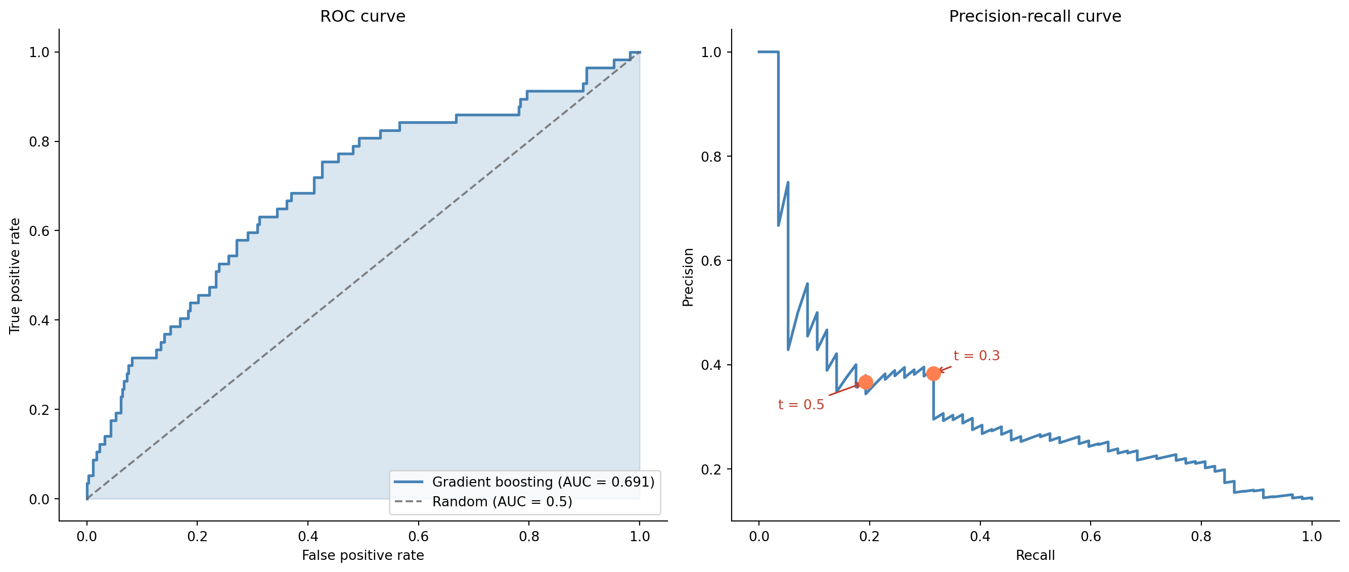
This asymmetry means we should examine the full ROC and precision-recall curves, not just the default threshold.
```{python}
#| label: fig-churn-roc-pr
#| echo: true
#| fig-cap: "ROC curve (left) and precision-recall curve (right) for the gradient boosting churn model. The ROC curve shows strong overall discrimination; the precision-recall curve reveals the trade-off at different operating points — each point on the curve corresponds to a specific threshold at which the model would operate."
#| fig-alt: "Two side-by-side charts. Left panel: ROC curve plotting true positive rate against false positive rate, with the curve well above the diagonal random-classifier line and a shaded area representing the AUC. Right panel: precision-recall curve showing precision decreasing as recall increases, with two marked operating points: threshold 0.3 achieves higher recall with moderate precision, while threshold 0.5 achieves lower recall with higher precision. The curves are drawn in blue."
from sklearn.metrics import roc_curve, precision_recall_curve

fpr, tpr, _ = roc_curve(y_test, y_prob_gb)
auc_gb = roc_auc_score(y_test, y_prob_gb)

prec, rec, pr_thresholds = precision_recall_curve(y_test, y_prob_gb)

fig, (ax1, ax2) = plt.subplots(1, 2, figsize=(14, 6))
fig.patch.set_alpha(0)

# ROC curve
ax1.patch.set_alpha(0)
ax1.fill_between(fpr, tpr, alpha=0.2, color='#0072B2')
ax1.plot(fpr, tpr, color='#0072B2', linewidth=2,
         label=f'Gradient boosting (AUC = {auc_gb:.3f})')
ax1.plot([0, 1], [0, 1], color='#666666', linestyle='--', alpha=0.8,
         label='Random (AUC = 0.5)')
ax1.set_xlabel('False positive rate')
ax1.set_ylabel('True positive rate')
ax1.set_title('ROC curve')
ax1.legend(loc='lower right')
ax1.spines[['top', 'right']].set_visible(False)

# Precision-recall curve with operating points
ax2.patch.set_alpha(0)
ax2.plot(rec, prec, color='#0072B2', linewidth=2)
offsets = [(15, 10), (-65, -20)]
for (t, (dx, dy)) in zip([0.3, 0.5], offsets):
    idx = np.argmin(np.abs(pr_thresholds - t))
    ax2.plot(rec[idx], prec[idx], 'o', color='#E69F00', markersize=10, zorder=5)
    ax2.annotate(f't = {t}', xy=(rec[idx], prec[idx]),
                 xytext=(dx, dy), textcoords='offset points',
                 fontsize=10, color='#c0392b',
                 arrowprops=dict(arrowstyle='->', color='#c0392b', lw=1.2))
ax2.set_xlabel('Recall')
ax2.set_ylabel('Precision')
ax2.set_title('Precision-recall curve')
ax2.spines[['top', 'right']].set_visible(False)

plt.tight_layout()
plt.show()
```
## Understanding what drives churn {#sec-churn-interpretation}
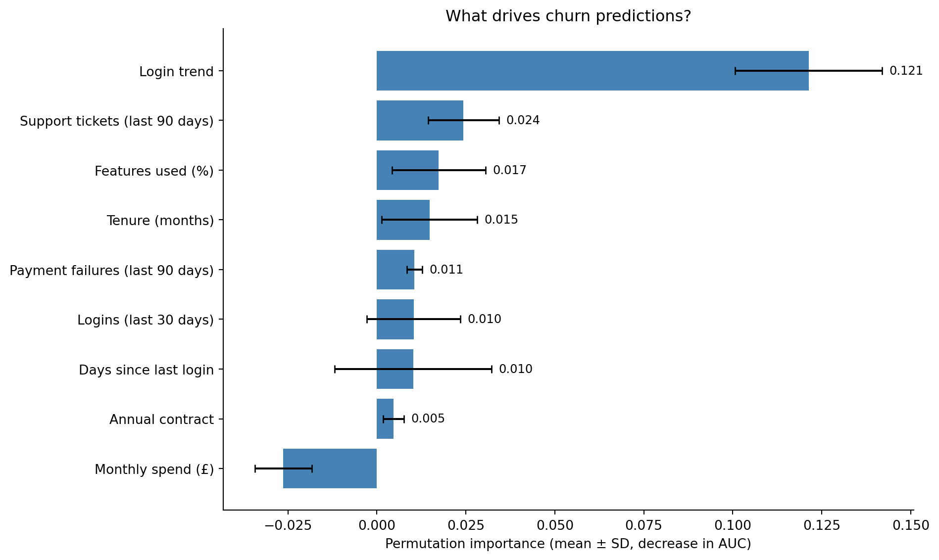
A model that predicts churn accurately but can't explain *why* customers churn is only half useful. Feature importance tells us which levers the business can pull. We'll use permutation importance (the more reliable approach discussed in @sec-random-forests) rather than the default impurity-based measure.
```{python}
#| label: fig-churn-feature-importance
#| echo: true
#| fig-cap: "Permutation importance for the churn model. Error bars show variability across ten permutation repeats. The login-trend feature dominates here — but note that in this simulation it was deliberately correlated with the label (see the leakage warning above), so its dominance is illustrative rather than a genuine ranking. The remaining ordering — feature usage, support-ticket volume, tenure, and login count — does align with what domain knowledge would suggest."
#| fig-alt: "Horizontal bar chart showing permutation importance for nine features, ordered from most to least important. The login trend feature has by far the largest bar, followed by percentage of features used, support tickets in the past 90 days, customer tenure in months, and logins in the last 30 days. The remaining features — payment failures in the past 90 days, annual contract status, days since last login, and monthly spend — have small bars near zero. Each bar is blue with error bars showing the standard deviation across ten permutation repeats, and the numeric importance value is labelled at the right end of each bar."
from sklearn.inspection import permutation_importance

perm_imp = permutation_importance(
    gb, X_test, y_test, n_repeats=10, random_state=42, scoring='roc_auc'
)

sorted_idx = np.argsort(perm_imp.importances_mean)

display_names = {
    'tenure_months': 'Tenure (months)',
    'monthly_spend_gbp': 'Monthly spend (£)',
    'logins_last_30d': 'Logins (last 30 days)',
    'support_tickets_last_90d': 'Support tickets (last 90 days)',
    'features_used_pct': 'Features used (%)',
    'days_since_last_login': 'Days since last login',
    'is_annual': 'Annual contract',
    'payment_failures_last_90d': 'Payment failures (last 90 days)',
    'login_trend': 'Login trend',
}

sorted_labels = [display_names.get(f, f) for f in np.array(feature_cols)[sorted_idx]]

fig, ax = plt.subplots(figsize=(10, 6))
fig.patch.set_alpha(0)
ax.patch.set_alpha(0)
ax.barh(range(len(feature_cols)), perm_imp.importances_mean[sorted_idx],
        xerr=perm_imp.importances_std[sorted_idx],
        color='#0072B2', edgecolor='none', capsize=3)
ax.set_yticks(range(len(feature_cols)))
ax.set_yticklabels(sorted_labels)
ax.set_xlabel('Permutation importance (mean ± SD, decrease in AUC)')
ax.set_title('What drives churn predictions?')
ax.spines[['top', 'right']].set_visible(False)

for i, v in enumerate(perm_imp.importances_mean[sorted_idx]):
    if v > 0.001:
        ax.text(v + perm_imp.importances_std[sorted_idx][i] + 0.002,
                i, f'{v:.3f}', va='center', fontsize=9)

plt.tight_layout()
plt.show()
```
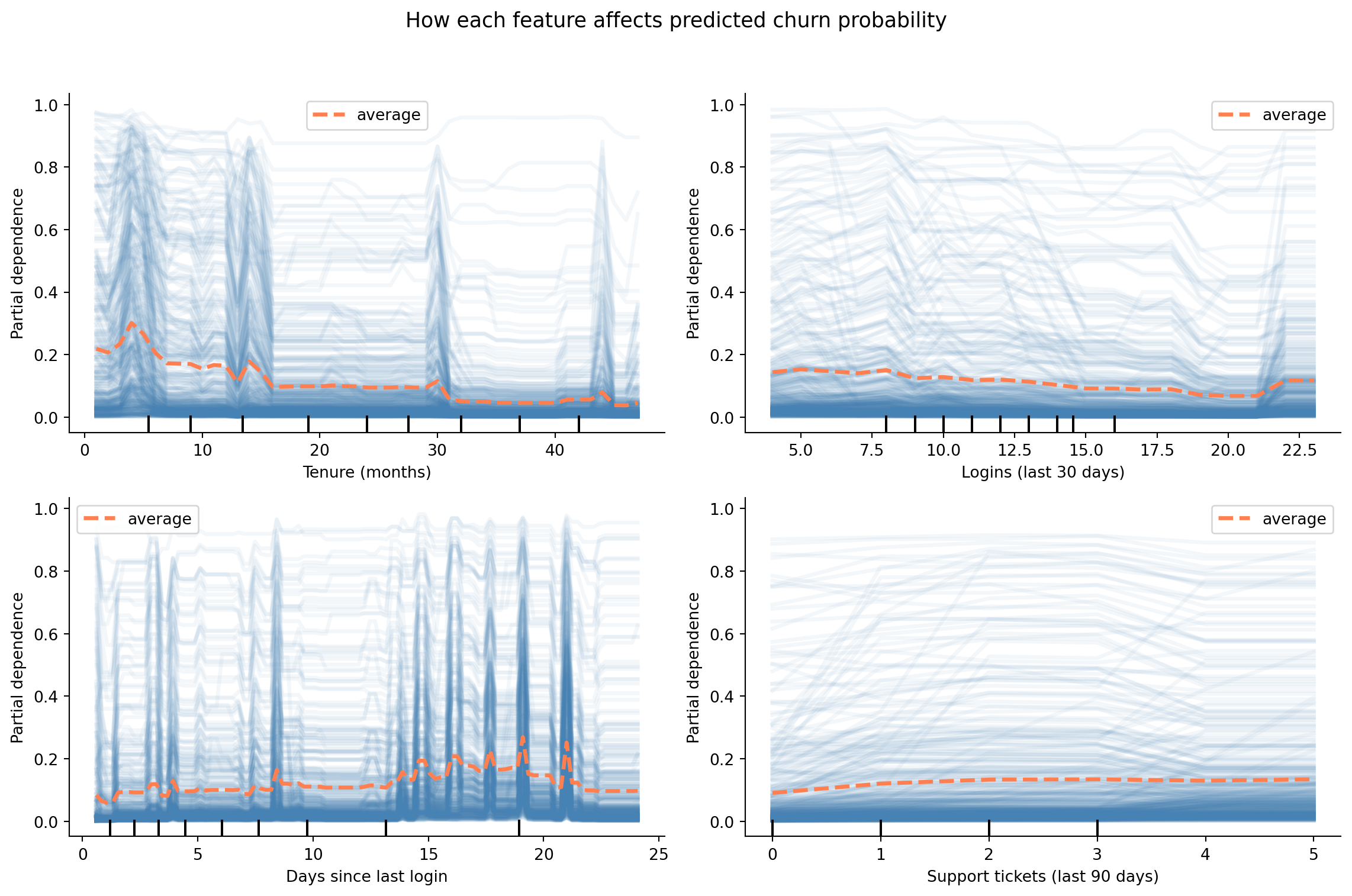
Feature importance tells you *what matters*; **partial dependence** tells you *how*. A partial dependence plot shows the marginal effect of a single feature on the predicted churn probability, averaging over the values of all other features. We'll also overlay individual conditional expectation (ICE) lines to show how the effect varies across customers.
```{python}
#| label: fig-partial-dependence
#| echo: true
#| fig-cap: "Partial dependence plots for four features chosen to illustrate the recency, frequency, and support signal shapes — not because they are the highest-importance features. Churn probability decreases with tenure and login frequency, and increases with days since last login and support ticket volume."
#| fig-alt: "Four partial dependence plots. Panel 1 (tenure in months): churn probability decreases steadily as tenure increases from 0 to 48 months, with the steepest decline in the first 12 months. Panel 2 (logins in last 30 days): churn probability decreases as login frequency increases from 0 to 30. Panel 3 (days since last login): churn probability increases as inactivity grows from 0 to 40 days. Panel 4 (support tickets in last 90 days): churn probability increases with ticket volume from 0 to 8 tickets. Each plot shows a thick orange line representing the average partial dependence (PDP), with many thin, semi-transparent blue lines behind it representing individual conditional expectation (ICE) traces for individual customers. The two line types are distinguished by both colour and line weight."
from sklearn.inspection import PartialDependenceDisplay

illustrative_features = ['tenure_months', 'logins_last_30d',
                         'days_since_last_login', 'support_tickets_last_90d']

pdp_display_names = {
    'tenure_months': 'Tenure (months)',
    'logins_last_30d': 'Logins (last 30 days)',
    'days_since_last_login': 'Days since last login',
    'support_tickets_last_90d': 'Support tickets (last 90 days)',
}

fig, axes = plt.subplots(2, 2, figsize=(12, 8))
fig.patch.set_alpha(0)
display = PartialDependenceDisplay.from_estimator(
    gb, X_test, illustrative_features, ax=axes.ravel(),
    line_kw={'color': '#E69F00', 'linewidth': 2.5},
    ice_lines_kw={'color': '#0072B2', 'alpha': 0.15},
    kind='both',
)

for ax, feat in zip(axes.ravel(), illustrative_features):
    ax.patch.set_alpha(0)
    ax.set_xlabel(pdp_display_names.get(feat, feat))
    ax.spines[['top', 'right']].set_visible(False)

fig.suptitle('How each feature affects predicted churn probability', fontsize=13)
plt.tight_layout(rect=[0, 0, 1, 0.95])
plt.show()
```
The ICE lines (the faint blue traces behind the orange average) show how the effect varies across customers. If the ICE lines are roughly parallel, the feature's effect is consistent. If they diverge, there are interaction effects: the feature matters more for some customer segments than others.
::: {.callout-note}
## Engineering Bridge
Partial dependence plots serve a similar purpose to sensitivity analysis in capacity planning: vary one parameter while holding the rest fixed and observe how the output changes. This is useful directionally, but comes with a caveat: if features are correlated, holding one fixed while varying another can explore unrealistic combinations. A PDP gives you *model introspection*, not ground-truth measurement. A flame graph shows you exactly where time is spent; a PDP shows you what the *model believes* about the relationship. Treat the shapes as directional guidance rather than precise functional relationships.
:::
## From probability to profit {#sec-churn-business-decisions}
The model produces a probability for each customer. The business needs a decision: who gets a retention offer? This is the threshold problem from @sec-decision-threshold, but now with real money attached.
Suppose our SaaS product has the following economics:
- Average customer lifetime value (CLV) remaining: **£1,200**
- Cost of a retention offer (discount, personal outreach, etc.): **£50**
- Probability that the offer prevents churn (if the customer was actually going to churn): **30%**
Given these numbers, sending a retention offer to a customer who would have churned has an expected value of $0.30 \times \text{£}1{,}200 - \text{£}50 = \text{£}310$. Sending an offer to a customer who wouldn't have churned costs £50 for nothing. The break-even point (call it $p^*$) is the churn probability at which the expected value of intervening equals zero:
$$
p^* = \frac{c_{\text{offer}}}{p_{\text{save}} \times \text{CLV}} = \frac{50}{0.30 \times 1200} = 0.139
$$
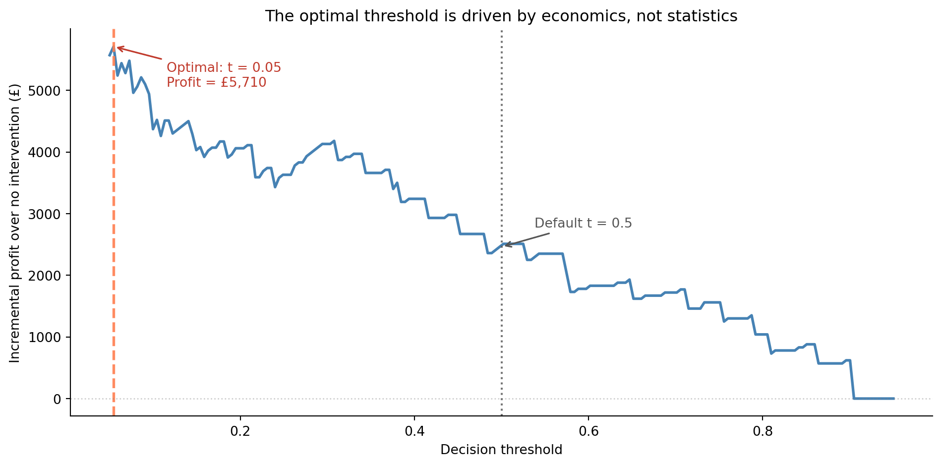
Any customer with a predicted churn probability above roughly 14% is worth targeting. This is far below the default 0.5 threshold, and it's derived from business logic, not statistical convention. Note that $p^* = 0.139$ is the *calibrated* expected-value break-even, whereas the peak of the profit curve below is an empirical optimum found by sweeping the model's **raw** scores. That empirical peak lands even lower — nearer 0.03 to 0.04 — both because the raw gradient-boosting scores are uncalibrated (see the caveat that follows) and because it's a noisy optimum from a single realisation of the test labels. The two agree in *direction* — intervene aggressively, far below 0.5 — but you shouldn't read the raw-score threshold as if it were a probability.
One important caveat: this calculation assumes the model's predicted probabilities are **calibrated**, meaning a predicted 14% genuinely corresponds to a 14% chance of churning. Gradient boosted trees tend to push predictions towards 0 and 1, making their raw probabilities unreliable for direct economic use. In production, you'd apply `CalibratedClassifierCV` from scikit-learn to improve calibration before plugging probabilities into the cost formula. For our purposes, the directional insight holds: the optimal threshold is determined by the economics, not by convention.
```{python}
#| label: fig-threshold-economics
#| echo: true
#| fig-cap: "Incremental profit over no intervention as a function of the decision threshold. The economically optimal threshold is much lower than the default 0.5 because the cost of missing a churning customer far exceeds the cost of an unnecessary retention offer. The curve uses the model's raw, uncalibrated scores, so the precise optimum is illustrative — calibrate the predicted probabilities (for example with `CalibratedClassifierCV`) before committing to a production threshold."
#| fig-alt: "Line chart with decision threshold on the horizontal axis from 0 to about 0.95 and incremental profit in pounds on the vertical axis. Starting from the left the blue line climbs steeply, peaks at a very low threshold (around 0.03 to 0.04), then declines unevenly towards zero at high thresholds. A dashed orange vertical line marks the optimal threshold near the left edge, and a dotted grey vertical line marks the default 0.5 threshold at a much lower profit. A horizontal grey dotted line marks the zero-profit baseline. Annotations label the optimal threshold with its profit value and the default threshold."
clv = 1200
cost_offer = 50
p_save = 0.30

# Sweep the full range down to 0: with costs this asymmetric the optimum sits
# very low, so a grid that started at 0.05 would clip it at the boundary.
thresholds = np.linspace(0.0, 0.95, 200)

# Vectorise across all thresholds simultaneously
y_true = y_test.values
targeted = y_prob_gb[np.newaxis, :] >= thresholds[:, np.newaxis]  # (200, 400)

tp = (targeted & (y_true == 1)).sum(axis=1)
fp = (targeted & (y_true == 0)).sum(axis=1)

# Incremental profit over doing nothing (no-intervention baseline)
profits = tp * (p_save * clv - cost_offer) - fp * cost_offer

best_idx = np.argmax(profits)
best_threshold = thresholds[best_idx]
best_profit = profits[best_idx]

fig, ax = plt.subplots(figsize=(10, 5))
fig.patch.set_alpha(0)
ax.patch.set_alpha(0)
ax.plot(thresholds, profits, color='#0072B2', linewidth=2)
ax.axvline(best_threshold, color='#E69F00', linestyle='--', alpha=0.9, linewidth=2)
ax.axvline(0.5, color='#555555', linestyle=':', alpha=0.8, linewidth=1.5)
ax.axhline(0, color='grey', linestyle=':', alpha=0.4, linewidth=1)

ax.annotate(f'Optimal: t = {best_threshold:.2f}\n'
            f'Profit = £{best_profit:,.0f}',
            xy=(best_threshold, best_profit),
            xytext=(40, -30), textcoords='offset points',
            fontsize=10, color='#c0392b',
            arrowprops=dict(arrowstyle='->', color='#c0392b', lw=1.2))

default_profit = profits[np.argmin(np.abs(thresholds - 0.5))]
ax.annotate('Default t = 0.5',
            xy=(0.5, default_profit),
            xytext=(25, 15), textcoords='offset points',
            fontsize=10, color='#555555',
            arrowprops=dict(arrowstyle='->', color='#555555', lw=1.2))

ax.set_xlabel('Decision threshold')
ax.set_ylabel('Incremental profit over no intervention (£)')
ax.set_title('The optimal threshold is driven by economics, not statistics')
ax.spines[['top', 'right']].set_visible(False)
plt.tight_layout()
plt.show()
```
The gap between the economically optimal threshold and the statistical default of 0.5 is substantial. Using the default threshold leaves money on the table by missing customers who are moderately likely to churn but still worth targeting. This is the practical payoff of the precision-recall framework from @sec-precision-recall-tradeoff: understanding the trade-off lets you make decisions that align with business value rather than statistical convention.
::: {.callout-tip}
## Author's Note
The economics calculation changed how I think about model evaluation entirely. As engineers, we're trained to optimise technical metrics: accuracy, latency, throughput. But a churn model that's 2 percentage points less precise but uses the economically optimal threshold can be worth tens of thousands of pounds more per quarter than a more accurate model deployed with the default 0.5 cutoff. The statistical metrics tell you how good the *model* is; the threshold tells you how well you're *using* it. Optimising the model while ignoring the threshold is like tuning your database queries while ignoring which queries your application actually runs.
:::
## The full pipeline {#sec-churn-pipeline}
In practice, you wouldn't train a model in a one-off script and declare victory. The churn pipeline needs to run regularly: retraining on fresh data, generating predictions for active customers, and feeding those predictions into your Customer Relationship Management (CRM) system or outreach tooling. The engineering patterns from @sec-pipelines-intro and @sec-mlops-intro apply directly.
A production churn pipeline starts with **data extraction**: pulling customer features from the data warehouse, event logs, and billing system. The hardest step is usually **feature computation**: computing rolling aggregates, trends, and derived features correctly across millions of rows without accidentally leaking future information into historical windows. The model **retrains** on a schedule (weekly or monthly) with the latest data, then **scores** the current customer base. Those predictions are **delivered** to a table that the CRM system reads from. And, crucially, the pipeline includes **monitoring** to track prediction distributions and model performance over time, as discussed in @sec-model-monitoring.
The monitoring step deserves emphasis. A churn model degrades silently, the same problem we opened with. If your product changes (a new pricing tier, a redesigned onboarding flow), the relationships the model learned may no longer hold. The model monitoring practices from @sec-model-monitoring (tracking prediction distributions, detecting data drift, and setting up periodic evaluation against fresh labels) are essential for keeping the model useful.
Churn is, however, a *near-stationary* problem: the data-generating process drifts on the timescale of product changes, not in response to the model's predictions. Compare that with @sec-fraud-drift, where fraudsters actively adapt to whichever signals the model has learned. Both pipelines share the same machinery — class imbalance, threshold selection, cost-aware decisions — but the monitoring and retraining cadence differ sharply: monthly retrains are usually adequate for churn, where weeks or even days may be too slow for fraud.
## Summary {#sec-churn-summary}
1. **Defining the target variable is a business decision, not a statistical one.** The choice of churn window, the treatment of edge cases, and the definition of "active" all shape the problem before any modelling begins.
2. **Feature engineering often matters more than algorithm choice.** Recency, frequency, monetary, and trend features capture the behavioural signals that predict churn. Domain knowledge guides which features to build.
3. **Evaluation should reflect business costs.** The default threshold of 0.5 is rarely optimal. Cost-sensitive threshold selection, grounded in the economics of retention offers and customer lifetime value, translates model quality into business value.
4. **Interpretation enables action.** Feature importance and partial dependence plots tell you *why* customers churn, not just *that* they will — turning a prediction into a strategy.
5. **A churn model is a system, not a script.** Production deployment requires regular retraining, prediction delivery, and monitoring for model degradation — the MLOps practices from @sec-mlops-intro.
## Exercises {#sec-churn-exercises}
1. Refit the logistic regression and gradient boosting models from this chapter using `class_weight='balanced'` (logistic regression) and `sample_weight` (gradient boosting, using class frequencies). Compare the ROC curves and precision-recall curves of the balanced and unbalanced models. Under what business scenarios would you prefer each?
2. The `login_trend` feature captures whether a customer's engagement is increasing or declining. Create two additional trend features: `spend_trend` (ratio of this month's spend to the three-month average) and `ticket_trend` (recent versus historical support ticket rate). Add them to the model and compare AUC and feature importance. Do the trend features improve the model? Which one matters most?
3. **Cost-sensitive threshold optimisation.** Modify the profit calculation from @sec-churn-business-decisions with different assumptions: (a) CLV = £500, (b) retention offer cost = £200, (c) save probability = 10%. How does the optimal threshold change in each case? What happens when the retention offer is expensive relative to CLV?
4. **Conceptual:** A product manager asks you to build a churn model but the company only has 3 months of historical data with 50 customers. What problems do you anticipate? Consider sample size, the length of the observation window, and the reliability of behavioural features computed from short histories. At what point would you advise waiting for more data rather than building a model now?
5. **Conceptual:** Churn prediction creates a potential feedback loop — you predict which customers will churn, intervene on the high-risk ones, and then measure churn in the next period. If your intervention works, the customers you targeted *don't* churn, which makes the model look wrong (it predicted churn but it didn't happen). How does this complicate model evaluation and retraining? How might you design an evaluation strategy that accounts for the intervention?