---
# Content: CC BY-NC-SA 4.0 | Code: MIT - see /LICENSE.md
title: "Logistic regression and classification"
---
{{< include /_common-imports.qmd >}}
## From numbers to decisions {#sec-from-numbers-to-decisions}
Linear regression predicts a number: pipeline duration, cloud cost, a continuous value on a smooth scale. But many of the most consequential questions in engineering aren't "how much?" questions. They're "which one?" questions. Will this deployment fail? Is this transaction fraudulent? Will this user churn? These are **classification** problems: the outcome isn't a number, it's a category.
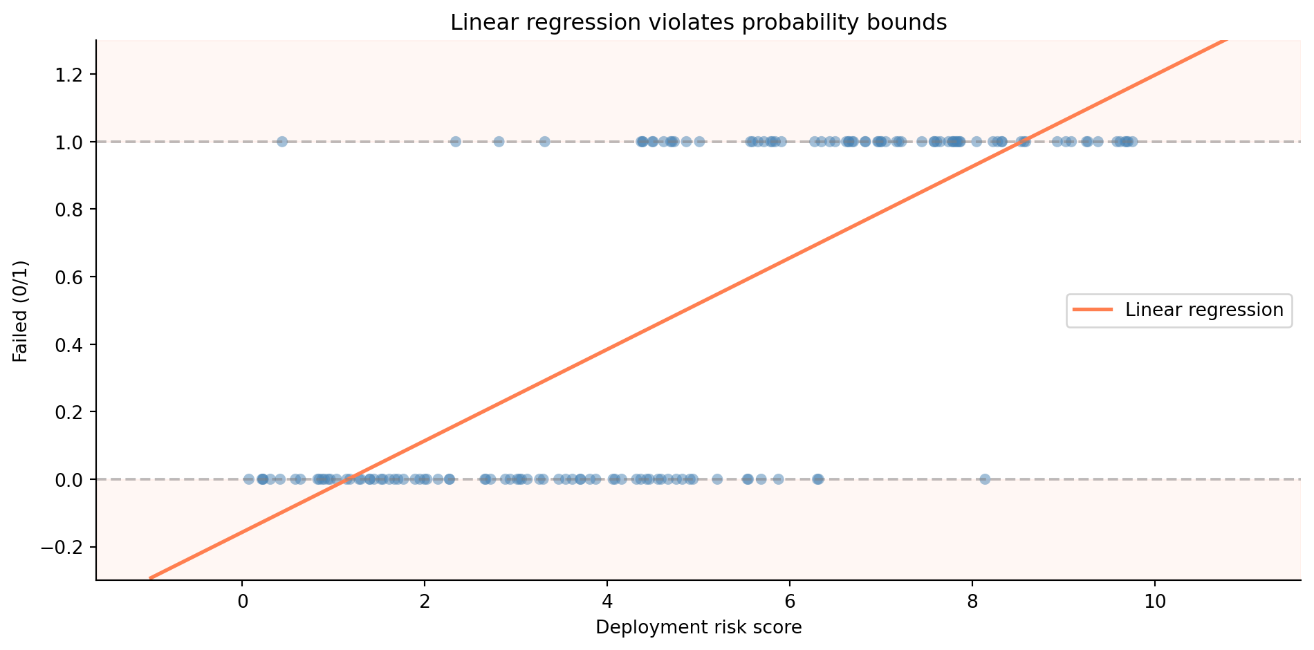
You might think the simplest approach is to take what worked in @sec-simple-regression and apply it directly. Assign 0 to "no failure" and 1 to "failure," then fit a linear regression. The prediction would be a number somewhere between 0 and 1, which you'd interpret as a probability. It sounds reasonable — until you try it.
```{python}
#| label: fig-linear-classification-problem
#| echo: true
#| fig-cap: "Linear regression applied to a classification problem. The model predicts values below 0 and above 1 — impossible as probabilities."
#| fig-alt: "Scatter plot showing binary outcomes (0 and 1) against deployment risk score on the horizontal axis. A straight regression line runs through the data, extending below zero on the left and above one on the right. Dashed horizontal lines mark the 0 and 1 probability boundaries that the line violates."
rng = np.random.default_rng(42)

n = 150
risk_score = rng.uniform(0, 10, n)
prob_fail = 1 / (1 + np.exp(-(risk_score - 5)))  # true sigmoid relationship
failed = rng.binomial(1, prob_fail)

fig, ax = plt.subplots(figsize=(10, 5))
fig.patch.set_alpha(0)
ax.patch.set_alpha(0)

# Shade impossible probability regions
ax.axhspan(-0.3, 0, color='#E69F00', alpha=0.15)
ax.axhspan(1, 1.3, color='#E69F00', alpha=0.15)

ax.scatter(risk_score, failed, alpha=0.5, color='#0072B2', edgecolor='none')

# Fit a linear regression (the wrong model)
slope, intercept = np.polyfit(risk_score, failed, 1)
x_line = np.linspace(-1, 11, 200)
ax.plot(x_line, intercept + slope * x_line, '#E69F00', linewidth=2,
        label='Linear regression')

ax.axhline(0, color='grey', linestyle='--', alpha=0.5)
ax.axhline(1, color='grey', linestyle='--', alpha=0.5)
ax.set_xlabel('Deployment risk score')
ax.set_ylabel('Failed (0/1)')
ax.set_ylim(-0.3, 1.3)
ax.set_title('Linear regression violates probability bounds')
ax.legend()
ax.spines[['top', 'right']].set_visible(False)
plt.tight_layout()
plt.show()
```
@fig-linear-classification-problem shows the problem. The linear model blithely predicts negative probabilities for low-risk deployments and probabilities above 1 for high-risk ones. Probabilities can't be negative or greater than 1. That's not a stylistic preference; it's a mathematical constraint. We need a model that produces outputs in the range $[0, 1]$ regardless of the inputs. We need **logistic regression**.
::: {.callout-note}
## Engineering Bridge
Classification is pattern matching: routing an input to one of several discrete outputs. If you've written an HTTP router, a message dispatcher, or a feature-flag evaluator, you've built classifiers. The difference is that your routers use deterministic rules you wrote by hand (`if path.startsWith("/api")...`), while a statistical classifier learns its rules from data. It's the same shift from @sec-determinism: from hand-coded logic to patterns inferred from observations.
:::
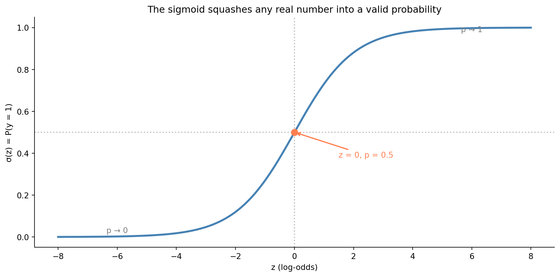
## The sigmoid function: squashing a line into a probability {#sec-sigmoid}
The core insight of logistic regression is elegant. Instead of predicting the outcome directly, we predict the *log-odds* of the outcome, then transform that prediction into a probability using a function that's bounded between 0 and 1.
Start with odds. If the probability of deployment failure is $p$, the **odds** of failure are $p / (1 - p)$. A probability of 0.75 corresponds to odds of 3:1; failure is three times more likely than success. The **log-odds** (or **logit**) is the natural logarithm of the odds:
$$
\text{logit}(p) = \ln\!\left(\frac{p}{1-p}\right)
$$
The logit maps probabilities in $(0, 1)$ to the entire real line $(-\infty, +\infty)$, exactly the range a linear model naturally produces. (@sec-logs-exps in Appendix A recaps logarithms and the logit–sigmoid pairing if either is rusty.) So we model the log-odds as a linear function of the predictors $x_1, \dots, x_d$ (we write $d$ for the number of predictors here, to keep $p$ free for the probability it denotes throughout this chapter):
$$
\ln\!\left(\frac{p}{1-p}\right) = \beta_0 + \beta_1 x_1 + \cdots + \beta_d x_d
$$
To recover the probability, we invert the logit. The result is the **sigmoid** (or logistic) function:
$$
p = \sigma(z) = \frac{1}{1 + e^{-z}} \quad \text{where } z = \beta_0 + \beta_1 x_1 + \cdots + \beta_d x_d
$$
The sigmoid takes any real number and squashes it into $(0, 1)$. Large positive $z$ gives $p$ close to 1; large negative $z$ gives $p$ close to 0; $z = 0$ gives $p = 0.5$.
```{python}
#| label: fig-sigmoid
#| echo: true
#| fig-cap: "The sigmoid squashes any real number into a valid probability. At z = 0 the probability is exactly 0.5; the curve flattens towards 0 and 1 at the extremes."
#| fig-alt: "S-shaped curve of the sigmoid function. The horizontal axis shows z values from negative 8 to positive 8; the vertical axis shows probability from 0 to 1. The curve transitions smoothly from near 0 on the left to near 1 on the right, crossing 0.5 at z equals 0. An orange dot marks the midpoint at z equals 0 and probability 0.5. Dotted reference lines mark z equals 0 on the horizontal axis and probability equals 0.5 on the vertical axis. Text annotations label the asymptotic regions as p approaches 0 and p approaches 1."
def sigmoid(z):
    return 1 / (1 + np.exp(-z))

z = np.linspace(-8, 8, 300)

fig, ax = plt.subplots(figsize=(10, 5))
fig.patch.set_alpha(0)
ax.patch.set_alpha(0)
ax.plot(z, sigmoid(z), color='#0072B2', linewidth=2.5)
ax.axhline(0.5, color='grey', linestyle=':', alpha=0.5)
ax.axvline(0, color='grey', linestyle=':', alpha=0.5)

# Mark the midpoint
ax.plot(0, 0.5, 'o', color='#E69F00', markersize=8, zorder=5)
ax.annotate('z = 0, p = 0.5', xy=(0, 0.5), xytext=(1.5, 0.38),
            fontsize=10, color='#E69F00',
            arrowprops=dict(arrowstyle='->', color='#E69F00', lw=1.5))

# Label asymptotic regions
ax.annotate('p → 1', xy=(6, 0.98), fontsize=10, color='grey', ha='center')
ax.annotate('p → 0', xy=(-6, 0.02), fontsize=10, color='grey', ha='center')

ax.set_xlabel('z (log-odds)')
ax.set_ylabel('σ(z) = P(y = 1)')
ax.set_title('The sigmoid squashes any real number into a valid probability')
ax.spines[['top', 'right']].set_visible(False)
plt.tight_layout()
plt.show()
```
The sigmoid is the link between the linear world you already understand and the probabilistic world of classification. Everything on the left side of $\sigma$ — the $\beta_0 + \beta_1 x_1 + \cdots$ — is just linear regression. The sigmoid wraps it so the output is always a valid probability.
## Maximum likelihood: a new way to fit {#sec-maximum-likelihood}
In linear regression, we minimised the sum of squared residuals, a perfectly reasonable goal when the outcome is continuous. But when the outcome is binary (0 or 1), squared residuals don't make sense. What does it mean to square the distance between a prediction of 0.7 and an outcome of 1?
Instead, logistic regression uses **maximum likelihood estimation** (MLE). The idea is to find the coefficients that make the observed data most probable. If the model predicts $\hat{p}_i$ for observation $i$, and that observation actually had outcome $y_i \in \{0, 1\}$, then the probability the model assigns to the observed outcome is:
$$
P(y_i \mid \hat{p}_i) = \hat{p}_i^{y_i} \cdot (1 - \hat{p}_i)^{1-y_i}
$$
When $y_i = 1$, this reduces to $\hat{p}_i$, the model's predicted probability of the event. When $y_i = 0$, it reduces to $1 - \hat{p}_i$, the predicted probability of the non-event. The **likelihood** of the full dataset is the product across all observations (assuming independence):
$$
\mathcal{L}(\boldsymbol{\beta}) = \prod_{i=1}^{n} \hat{p}_i^{y_i}(1 - \hat{p}_i)^{1-y_i}
$$
In practice, we maximise the **log-likelihood** (the sum of log-probabilities) to avoid numerical underflow from multiplying many small numbers:
$$
\ell(\boldsymbol{\beta}) = \sum_{i=1}^{n} \left[ y_i \ln(\hat{p}_i) + (1 - y_i)\ln(1 - \hat{p}_i) \right]
$$
This is the function that logistic regression's fitting algorithm optimises. Unlike ordinary least squares (OLS), there's no closed-form solution; you need an iterative algorithm that follows the gradient of the loss downhill (@sec-calculus in Appendix A recaps derivatives and gradients if that idea is rusty). Scikit-learn's default solver (L-BFGS, a quasi-Newton optimiser) takes repeated steps towards the optimum, approximating the curvature of the loss surface at each iteration. This is the luxury we lose, as foreshadowed in @sec-simple-regression.
::: {.callout-note}
## Engineering Bridge
If you've implemented gradient descent for anything — training a neural network, optimising a cost function, even tuning a PID controller — you know the pattern: evaluate the function, compute the gradient (the direction of steepest improvement), take a step, repeat. MLE for logistic regression works the same way. The loss function is the negative log-likelihood (also called **binary cross-entropy** or **log loss** in ML contexts), and the optimiser iterates until the gradients are close enough to zero. OLS was like solving an equation algebraically; MLE is like converging to the answer numerically.
:::
## A worked example: predicting deployment failures {#sec-deployment-failure-model}
Let's build a logistic regression to predict whether a deployment will fail based on observable characteristics. This is a realistic scenario: many platform teams build exactly this kind of model to gate or flag risky deployments.
```{python}
#| label: deployment-data
#| echo: true
from scipy.special import expit  # scipy's numerically stable sigmoid function

rng = np.random.default_rng(42)
n = 500

deploy_data = pd.DataFrame({
    'files_changed': rng.integers(1, 80, n),
    'hours_since_last_deploy': rng.exponential(24, n).round(1),
    'is_friday': rng.binomial(1, 1/5, n),
    'test_coverage_pct': np.clip(rng.normal(75, 15, n), 20, 100).round(1),
})

# True failure probability: logistic function of a linear combination
log_odds = (
    -1.0
    + 0.05 * deploy_data['files_changed']
    + 0.02 * deploy_data['hours_since_last_deploy']
    + 0.8 * deploy_data['is_friday']
    - 0.04 * deploy_data['test_coverage_pct']
)
deploy_data['failed'] = rng.binomial(1, expit(log_odds))

print(f"Dataset: {n} deployments")
print(f"Failure rate: {deploy_data['failed'].mean():.1%}")
print(f"\nFeature summary:")
print(deploy_data.drop(columns='failed').describe().T.round(1).to_string())
```
The failure rate is around 25–30%, realistic for a system where most deployments succeed, but failures are common enough to study. Let's fit a logistic regression using both `statsmodels` (for inference) and `scikit-learn` (for prediction), mirroring the dual workflow from @sec-regression-prediction.
```{python}
#| label: logistic-statsmodels
#| echo: true
import statsmodels.api as sm

feature_names = ['files_changed', 'hours_since_last_deploy',
                 'is_friday', 'test_coverage_pct']

X = sm.add_constant(deploy_data[feature_names])
y = deploy_data['failed']

logit_model = sm.Logit(y, X).fit(disp=False)  # suppress convergence output

# Display the key results rather than the full summary table
# (the full summary is wider than most screens)
results = pd.DataFrame({
    'coef': logit_model.params,
    'std err': logit_model.bse,
    'z': logit_model.tvalues,
    'P>|z|': logit_model.pvalues,
})
print(results.round(4).to_string())
print(f"\nLog-likelihood: {logit_model.llf:.1f}")
print(f"Pseudo R² (McFadden): {logit_model.prsquared:.4f}")
```
The output looks similar to the linear regression summary from @sec-statsmodels-ols, with some important differences.
**Coefficients are in log-odds.** Each coefficient represents the change in the log-odds of failure for a one-unit increase in that predictor, holding the others constant. The `files_changed` coefficient of roughly 0.05 means that each additional file increases the log-odds of failure by 0.05. That's hard to interpret directly; log-odds don't have an intuitive meaning for most people. We'll convert to more interpretable quantities shortly.
**The optimisation method is MLE, not OLS.** The summary shows `Method: MLE` and reports a log-likelihood rather than a residual sum of squares (RSS). The fitting algorithm converged iteratively to find the coefficients that maximise the probability of observing the data.
**Pseudo-$R^2$ replaces $R^2$.** Since there's no residual sum of squares in logistic regression, the familiar $R^2$ doesn't apply. McFadden's pseudo-$R^2$ [@mcfadden1974] serves a similar role: it compares the fitted model's log-likelihood to a null model (intercept only). Values between 0.2 and 0.4 are considered good for logistic regression. Don't compare this to the $R^2$ values you saw in @sec-statsmodels-ols; the scales aren't equivalent. @sec-metrics-index lists pseudo-$R^2$ alongside the other goodness-of-fit metrics in this book.
## Interpreting coefficients: odds ratios {#sec-odds-ratios}
Log-odds are mathematically convenient but not particularly intuitive. The standard trick is to exponentiate the coefficients to get **odds ratios**:
$$
\text{OR}_j = e^{\hat{\beta}_j}
$$
An odds ratio of 1.5 means "the odds of failure are multiplied by 1.5 for each one-unit increase in that predictor." An OR below 1 means the predictor *reduces* the odds.
```{python}
#| label: odds-ratios
#| echo: true
ci = np.exp(logit_model.conf_int())
or_table = pd.DataFrame({
    'Odds Ratio': np.exp(logit_model.params[feature_names]),
    'CI Lower': ci.loc[feature_names, 0],
    'CI Upper': ci.loc[feature_names, 1],
    'p-value': logit_model.pvalues[feature_names],
})
print(or_table.round(4).to_string())
```
The odds ratios tell a clear story. Each additional file changed multiplies the failure odds by about 1.05, a small per-file increase that compounds quickly: a 40-file PR has roughly $(1.05)^{39} \approx 6.7\times$ the odds of failure compared to a 1-file change (39 additional files). Higher test coverage is protective: each percentage point reduces the odds. Friday deployments show an elevated odds ratio, though the effect may not reach statistical significance with this sample size. The exact values vary a little with the sample, but the direction and rough magnitude of each effect are stable.
These interpretations come with the same "all else equal" caveat from @sec-multiple-regression. The Friday effect is the odds ratio *controlling for* files changed, time since last deploy, and test coverage. If Friday deploys also tend to be larger and less well-tested, the raw failure rate on Fridays would be even higher than the odds ratio alone suggests.
::: {.callout-tip}
## Author's Note
The odds ratio notation is a persistent source of confusion. "2× the odds" and "2× the probability" feel like they should be the same thing. They're not. If the baseline probability is 10% (odds 1:9), doubling the odds gives 2:9, which is a probability of 18%, not 20%. The gap between odds ratios and probability ratios grows as you move away from small probabilities. For rare events (< 5%), they're approximately equal, which is why medical research often uses odds ratios interchangeably with risk ratios for rare diseases. But for common outcomes, you need to be more careful. When communicating model results to non-technical stakeholders who want to know "how much more *likely*" something is, you need to convert from odds ratios back to probabilities or you'll mislead them without meaning to.
:::
## Prediction and the decision threshold {#sec-decision-threshold}
Understanding the coefficients tells you how predictors relate to the outcome. But in practice, you rarely stop at interpretation; you want the model to *make decisions*. A fitted logistic regression gives you *probabilities*, not decisions. To make a decision — deploy or hold, flag or pass — you need a **decision threshold**: a probability above which you classify the observation as positive (failure, in our case). The conventional default is 0.5, but there's nothing special about it.
```{python}
#| label: sklearn-logistic
#| echo: true
from sklearn.linear_model import LogisticRegression
from sklearn.model_selection import train_test_split

X_features = deploy_data[feature_names]
y_target = deploy_data['failed']

X_train, X_test, y_train, y_test = train_test_split(
    X_features, y_target, test_size=0.2, random_state=42
)

clf = LogisticRegression(max_iter=200, random_state=42)
clf.fit(X_train, y_train)

# Note: scikit-learn applies L2 regularisation by default (C=1.0) and is
# fitted only on the training split (80% of data), so coefficients will
# differ from the unregularised full-data fit in statsmodels above.

# Predicted probabilities for the test set
y_prob = clf.predict_proba(X_test)[:, 1]  # column 1 = P(failed = 1)

# Default predictions at threshold = 0.5
y_pred = clf.predict(X_test)

print(f"Training accuracy: {clf.score(X_train, y_train):.3f}")
print(f"Test accuracy:     {clf.score(X_test, y_test):.3f}")
print(f"\nFirst 10 predicted probabilities:")
print(np.round(y_prob[:10], 3))
print(f"Corresponding predictions (threshold=0.5): {y_pred[:10]}")
```
Accuracy, the fraction of correct predictions, is the most intuitive metric but often the least useful. If 70% of deployments succeed, a model that always predicts "no failure" achieves 70% accuracy while catching zero failures. We need metrics that account for the different types of errors.
## Evaluating classification: beyond accuracy {#sec-classification-metrics}
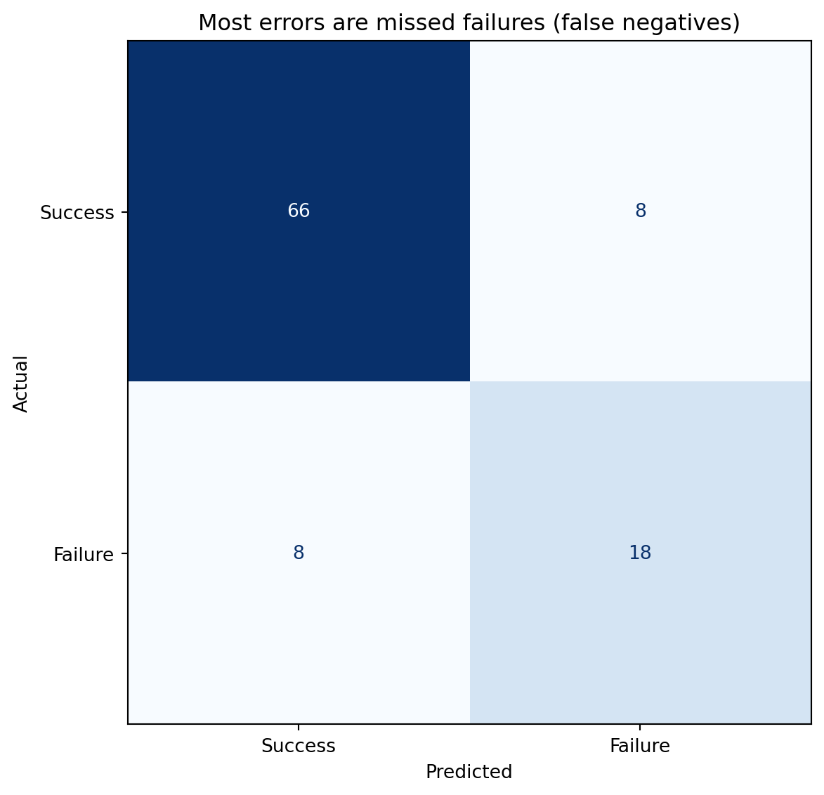
Classification errors come in two flavours. A **false positive** (Type I error) is predicting failure when the deployment would have succeeded, an unnecessary hold. A **false negative** (Type II error) is predicting success when the deployment will fail, a missed warning. The **confusion matrix** tabulates all four outcomes.
```{python}
#| label: fig-confusion-matrix
#| echo: true
#| fig-cap: "Confusion matrix at threshold 0.5. The off-diagonal cells show the two error types: false negatives (missed failures) and false positives (false alarms)."
#| fig-alt: "Two-by-two confusion matrix heatmap. Rows are actual labels (top: Success, bottom: Failure); columns are predicted labels (left: Success, right: Failure). The upper-left cell shows true negatives (correctly predicted successes), the lower-right shows true positives (correctly predicted failures). The lower-left cell holds false negatives (missed failures) and the upper-right cell holds false positives (false alarms)."
from sklearn.metrics import confusion_matrix, ConfusionMatrixDisplay

fig, ax = plt.subplots(figsize=(7, 6))
fig.patch.set_alpha(0)
ax.patch.set_alpha(0)
cm = confusion_matrix(y_test, y_pred)
disp = ConfusionMatrixDisplay(cm, display_labels=['Success', 'Failure'])
disp.plot(ax=ax, cmap='Blues', colorbar=False)
ax.set_xlabel('Predicted')
ax.set_ylabel('Actual')
ax.set_title('Off-diagonal cells reveal the two error types')
plt.tight_layout()
plt.show()
```
From the confusion matrix, we derive several metrics that each tell a different part of the story.
**Precision** answers: "of the deployments the model flagged as failures, how many actually failed?" It's the fraction of positive predictions that were correct: $\text{Precision} = \text{TP} / (\text{TP} + \text{FP})$. High precision means few false alarms.
**Recall** (also called **sensitivity**) answers: "of the deployments that actually failed, how many did the model catch?" It's the fraction of actual positives that were correctly identified: $\text{Recall} = \text{TP} / (\text{TP} + \text{FN})$. High recall means few missed failures.
**F1 score** is the harmonic mean of precision and recall, a single number that balances both:
$$
F_1 = 2 \cdot \frac{\text{Precision} \cdot \text{Recall}}{\text{Precision} + \text{Recall}}
$$
The harmonic mean punishes imbalance: if either precision or recall is low, the F1 score drops sharply, even if the other is high. F1 is one of the seven recurring evaluation metrics catalogued in @sec-metrics-index, where the comparison with AUC and the others — and the traps each one hides — sits in one place.
```{python}
#| label: classification-report
#| echo: true
from sklearn.metrics import classification_report

print(classification_report(y_test, y_pred, target_names=['Success', 'Failure']))
```
::: {.callout-note}
## Engineering Bridge
Precision and recall map directly to alerting systems. A monitoring alert with high precision but low recall catches real incidents when it fires, but misses many issues. An alert with high recall but low precision catches almost everything, but buries the team in false alarms. The trade-off is identical: raising the threshold reduces false positives (better precision) at the cost of more missed events (worse recall). If you've ever tuned the sensitivity of a PagerDuty alert, you've worked through exactly this trade-off — you just didn't call it an F1 score.
:::
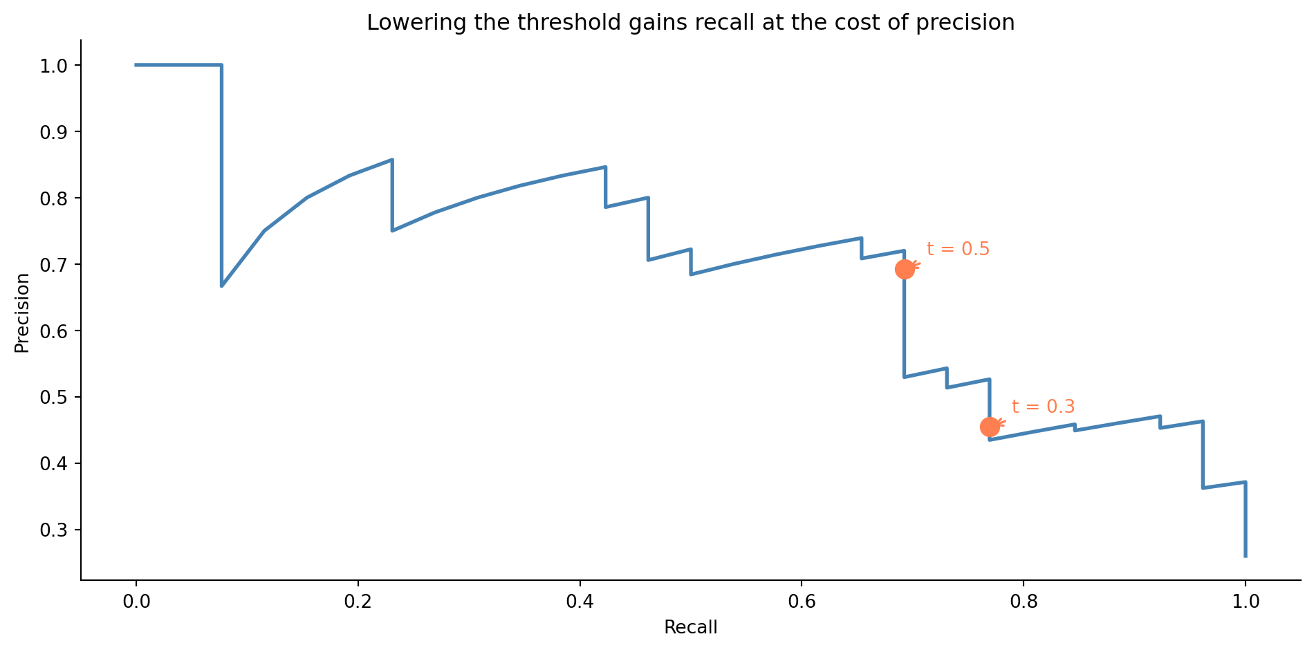
## The precision-recall trade-off {#sec-precision-recall-tradeoff}
Changing the decision threshold shifts the balance between precision and recall. A lower threshold catches more true failures (better recall) but also flags more false alarms (worse precision). A higher threshold does the reverse.
```{python}
#| label: fig-precision-recall-curve
#| echo: true
#| fig-cap: "Precision-recall curve for the deployment failure model. Lowering the threshold gains recall at the cost of precision. Two thresholds are marked to show the direction of the trade-off."
#| fig-alt: "Line chart with recall on the horizontal axis and precision on the vertical axis. The curve starts at high precision and low recall in the upper left, and as the threshold decreases, moves towards higher recall and lower precision. Two orange markers with annotations show the thresholds at 0.3 and 0.5, illustrating how lowering the threshold moves the operating point along the curve."
from sklearn.metrics import precision_recall_curve

precision_vals, recall_vals, thresholds = precision_recall_curve(y_test, y_prob)

fig, ax = plt.subplots(figsize=(10, 5))
fig.patch.set_alpha(0)
ax.patch.set_alpha(0)
ax.plot(recall_vals, precision_vals, color='#0072B2', linewidth=2)

# Mark two thresholds to show directionality
for t in [0.3, 0.5]:
    idx = np.argmin(np.abs(thresholds - t))
    ax.plot(recall_vals[idx], precision_vals[idx], 'o', color='#E69F00',
            markersize=10, zorder=5)
    ax.annotate(f't = {t}',
                xy=(recall_vals[idx], precision_vals[idx]),
                xytext=(12, 8), textcoords='offset points',
                fontsize=10, color='#E69F00',
                arrowprops=dict(arrowstyle='->', color='#E69F00', lw=1.2))

ax.set_xlabel('Recall')
ax.set_ylabel('Precision')
ax.set_title('Lowering the threshold gains recall at the cost of precision')
ax.spines[['top', 'right']].set_visible(False)
plt.tight_layout()
plt.show()
```
The right threshold depends on the costs. If a missed failure causes a production outage that costs £50,000 in lost revenue, but a false alarm only wastes 30 minutes of an engineer's time, you should err towards high recall. If the false alarm triggers a costly rollback process, you might favour precision. This is a *business* decision, not a statistical one; the model provides the probability, and your context determines the threshold.
```{python}
#| label: threshold-comparison
#| echo: true
from sklearn.metrics import precision_score, recall_score, f1_score

rows = []
for t in [0.2, 0.3, 0.4, 0.5, 0.6]:
    y_t = (y_prob >= t).astype(int)
    rows.append({
        'Threshold': t,
        'Precision': precision_score(y_test, y_t, zero_division=0),
        'Recall': recall_score(y_test, y_t, zero_division=0),
        'F1': f1_score(y_test, y_t, zero_division=0),
    })
print(pd.DataFrame(rows).set_index('Threshold').round(3).to_string())
```
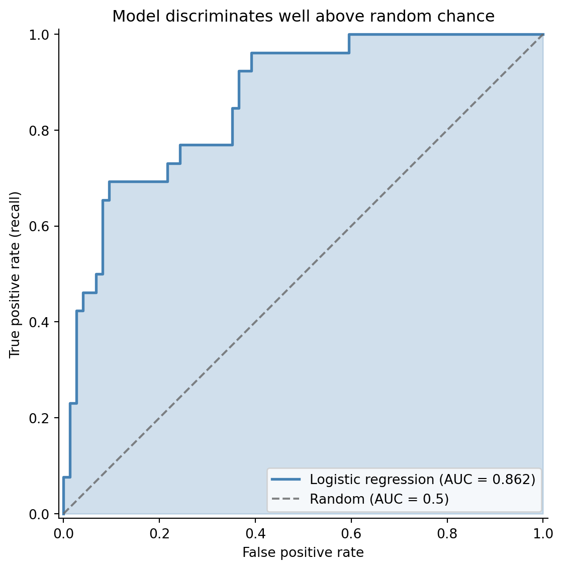
## The ROC curve and AUC {#sec-roc-auc}
While the precision-recall curve focuses on the positive class (failures), the **ROC curve** (Receiver Operating Characteristic) gives a broader view of model quality. It plots the **true positive rate** (recall) against the **false positive rate** ($\text{FPR} = \text{FP} / (\text{FP} + \text{TN})$) at every threshold.
The **area under the ROC curve** (AUC) is a single number summarising discriminative ability: how well the model separates the two classes across all possible thresholds. An AUC of 0.5 is no better than random guessing; 1.0 is perfect separation.
```{python}
#| label: fig-roc-curve
#| echo: true
#| fig-cap: "ROC curve for the deployment failure model. The curve bows well above the random-classifier diagonal, and the shaded area represents the AUC."
#| fig-alt: "Line chart with false positive rate on the horizontal axis and true positive rate on the vertical axis. The ROC curve curves above the dashed diagonal line of a random classifier. The area under the curve is shaded in blue. The legend reports the model's AUC score alongside the random-classifier baseline of 0.5."
from sklearn.metrics import roc_curve, roc_auc_score

fpr, tpr, roc_thresholds = roc_curve(y_test, y_prob)
auc = roc_auc_score(y_test, y_prob)

fig, ax = plt.subplots(figsize=(8, 6))
fig.patch.set_alpha(0)
ax.patch.set_alpha(0)
ax.fill_between(fpr, tpr, alpha=0.25, color='#0072B2')
ax.plot(fpr, tpr, color='#0072B2', linewidth=2,
        label=f'Logistic regression (AUC = {auc:.3f})')
ax.plot([0, 1], [0, 1], color='#666666', linestyle='--', alpha=0.8,
        label='Random (AUC = 0.5)')

ax.set_xlabel('False positive rate')
ax.set_ylabel('True positive rate (recall)')
ax.set_title('Model discriminates well above random chance')
ax.legend(loc='lower right')
ax.set_xlim([-0.01, 1.01])
ax.set_ylim([-0.01, 1.01])
ax.set_aspect('equal')
ax.spines[['top', 'right']].set_visible(False)
plt.tight_layout()
plt.show()
```
AUC has an elegant probabilistic interpretation: it's the probability that the model ranks a randomly chosen positive example higher than a randomly chosen negative example. An AUC of 0.75 means that if you pick one failed deployment and one successful deployment at random, the model assigns a higher failure probability to the actual failure 75% of the time. @sec-metrics-index summarises AUC alongside F1 and the other classification metrics.
When should you use ROC/AUC vs the precision-recall curve? ROC curves can be misleading when classes are heavily imbalanced. If only 1% of deployments fail, a model that rarely predicts failure can have a low FPR (few false positives relative to the large number of true negatives), making the ROC curve look impressive while the model's precision is terrible. The precision-recall curve, which ignores true negatives entirely, gives a more honest picture for imbalanced problems. For our roughly 70% success / 30% failure split, both are informative.
## Class imbalance: when failures are rare {#sec-class-imbalance}
Many real classification problems are severely imbalanced. Fraud might affect 0.1% of transactions. Critical bugs might appear in 2% of deployments. When the positive class is rare, two problems compound.
First, accuracy becomes meaningless: a model that always predicts "no fraud" is 99.9% accurate and utterly useless. This is why the metrics from @sec-classification-metrics exist: precision and recall measure performance on the class you actually care about.
Second, the model may struggle to learn the minority class at all. With 500 observations and a 1% positive rate, you'd have only 5 positive examples, not enough to learn any meaningful pattern.
Three strategies are commonly used to handle imbalance. The cheapest to try first is threshold adjustment: rather than defaulting to 0.5, choose a threshold that reflects the asymmetric costs of your problem. This requires no retraining; you change only how you act on the model's output. If that isn't sufficient, adjusting class weights is the next step: tell the model to penalise mistakes on the minority class more heavily during training. Scikit-learn's `class_weight='balanced'` does this automatically, setting weights inversely proportional to class frequencies. For severe imbalance where the model struggles to learn the minority class at all, resampling is an option: oversample the minority class (by duplicating examples or synthesising new ones via SMOTE) or undersample the majority class by discarding some examples. Resampling changes the training distribution, so apply it only to the training data and evaluate on the original, unmodified test set.
```{python}
#| label: class-weight-comparison
#| echo: true
# Balanced model — upweights the minority class
clf_balanced = LogisticRegression(class_weight='balanced', max_iter=200, random_state=42)
clf_balanced.fit(X_train, y_train)
y_prob_balanced = clf_balanced.predict_proba(X_test)[:, 1]
y_pred_balanced = clf_balanced.predict(X_test)

comparison = pd.DataFrame({
    'AUC': [roc_auc_score(y_test, y_prob),
            roc_auc_score(y_test, y_prob_balanced)],
    'F1': [f1_score(y_test, y_pred),
           f1_score(y_test, y_pred_balanced)],
    'Precision': [precision_score(y_test, y_pred),
                  precision_score(y_test, y_pred_balanced)],
    'Recall': [recall_score(y_test, y_pred),
               recall_score(y_test, y_pred_balanced)],
}, index=['Standard', 'Balanced'])
print(comparison.round(3).to_string())
```
The balanced model typically trades some precision for better recall: it catches more failures but flags more false alarms. Whether that's an improvement depends on your cost structure.
::: {.callout-tip}
## Author's Note
Accuracy is the most misleading metric in classification, and imbalanced datasets are where it breaks down hardest. A model that predicts "not fraud" for every transaction in a dataset with 0.2% fraud rate achieves 99.8% accuracy and has never detected a single fraudulent transaction. The confusion matrix reveals what accuracy hides: the model has perfect specificity (true negative rate) and zero sensitivity (recall). The instinct to optimise a single headline number is strong, but in classification, that instinct leads you astray. Always look at the confusion matrix, and choose metrics (precision, recall, F1, AUC) that reflect what actually matters for the problem.
:::
## Multiclass classification: beyond binary {#sec-multiclass}
Not every classification problem fits into a yes/no mould. You might want to predict the *severity* of a deployment issue (none, minor, critical), route a support ticket to one of half a dozen teams, or label a customer interaction as a complaint, a question, or a compliment. Logistic regression generalises cleanly to these cases, but you have a choice to make about how.
### Two ways to extend logistic regression {#sec-multiclass-strategies}
The simpler approach is **one-vs-rest** (OvR, sometimes called one-vs-all). Train one binary classifier per class — "critical vs everything else", "minor vs everything else", and so on — then predict the class whose binary classifier returns the highest probability. Each model is a vanilla binary logistic regression, so all the trade-off and metric machinery from earlier in this chapter applies directly to each one. The catch is that the per-class probabilities don't naturally sum to 1, because the models are independent fits. The "highest" winner is an argmax over scores rather than a coherent probability distribution.
The more principled approach is **softmax regression** (multinomial logistic regression). Instead of fitting $K$ independent binary models, it fits all classes jointly and produces a single probability distribution that sums to 1. The softmax function for class $k$ is:
$$
P(y = k \mid \mathbf{x}) = \frac{e^{z_k}}{\sum_{j=1}^{K} e^{z_j}}
$$
where each $z_k = \beta_{k,0} + \beta_{k,1}x_1 + \cdots$ is a separate linear combination of the predictors. In words: take each class's linear score, exponentiate it, and divide by the total. Every class gets a share of probability proportional to its score, with all shares adding to 1.
For identifiability, one class is conventionally chosen as a reference with all coefficients set to zero, and the others are estimated relative to it. Scikit-learn takes a different route: it fits full coefficient vectors for all $K$ classes and relies on L2 regularisation (which we'll meet properly in @sec-ridge) to keep the model identifiable. You'll see $K$ full coefficient vectors rather than $K - 1$.
Which to use? Softmax is the better default for most multiclass problems. It produces calibrated probabilities, it's no harder to fit than $K$ separate logistic regressions in modern libraries, and the joint estimation tends to give better calibration when the classes are related. Reach for OvR when your classes are genuinely independent — "does this image contain a cat? a dog? a car?", which is multi-*label* rather than multi-*class* — or when you need to slot existing binary classifiers into an ensemble without retraining. Scikit-learn defaults to multinomial when the problem has more than two classes.
### Worked example: classifying deployment severity {#sec-multiclass-example}
Let's predict the severity of a deployment issue from two features: the number of files changed and the test coverage on the touched code. The outcome has three levels: `none` (clean deploy), `minor` (a small fix or rollback), and `critical` (incident, customer-visible).
```{python}
#| label: multiclass-data
#| echo: true
rng_mc = np.random.default_rng(42)
n_mc = 1500

X_mc = pd.DataFrame({
    'files_changed': rng_mc.integers(1, 80, n_mc),
    'test_coverage_pct': np.clip(rng_mc.normal(75, 15, n_mc), 20, 100).round(1),
})

# Outcome driven by risk: more files + lower coverage = higher severity
risk = 0.04 * X_mc['files_changed'] - 0.03 * X_mc['test_coverage_pct']
severity = pd.cut(risk + rng_mc.normal(0, 0.8, n_mc),
                  bins=[-np.inf, -0.5, 1.0, np.inf],
                  labels=['none', 'minor', 'critical'])

X_train_mc, X_test_mc, y_train_mc, y_test_mc = train_test_split(
    X_mc, severity, test_size=0.30, random_state=42, stratify=severity
)

clf_multi = LogisticRegression(max_iter=500, random_state=42)
clf_multi.fit(X_train_mc, y_train_mc)

print(f"Class labels: {list(clf_multi.classes_)}")
print(f"Coefficient matrix shape: {clf_multi.coef_.shape} "
      f"(one row per class, one column per feature)\n")

print('Per-class coefficients:')
print(pd.DataFrame(clf_multi.coef_,
                   index=clf_multi.classes_,
                   columns=X_mc.columns).round(3).to_string())
```
Note the coefficient matrix: scikit-learn fits one row per class. The signs match intuition — `files_changed` has a positive coefficient for `critical` (more files raises critical risk) and a negative coefficient for `none` (more files lowers the chance of a clean deploy). `test_coverage_pct` has the opposite pattern. This per-class coefficient view is one of the multinomial model's selling points: you can read off how each feature shifts the *relative* probability of each class.
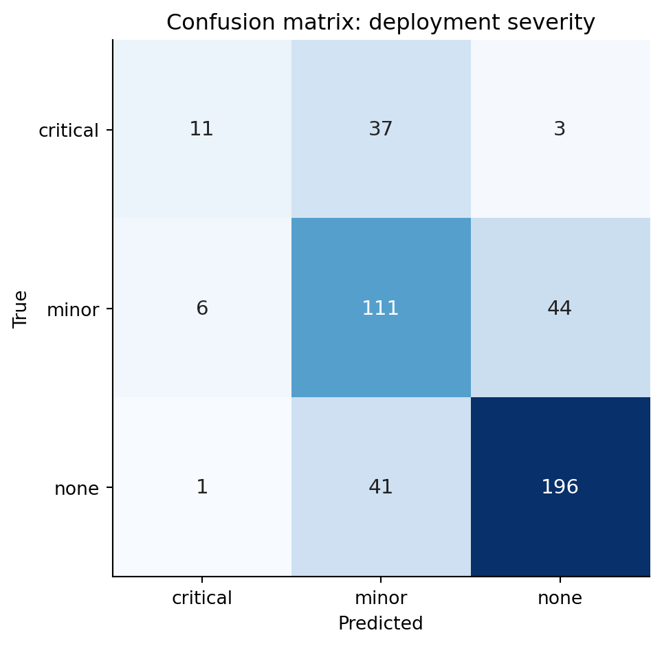
### Reading a multiclass confusion matrix {#sec-multiclass-confusion}
The binary confusion matrix has four cells. With $K$ classes you get a $K \times K$ matrix: rows are the true class, columns the predicted class. A perfect classifier puts every count on the diagonal; everything off-diagonal is an error, but *which* error matters.
```{python}
#| label: fig-multiclass-confusion
#| echo: true
#| fig-cap: "Confusion matrix for the deployment-severity classifier. Rows are the true class, columns the prediction. Diagonal cells are correct; off-diagonal cells reveal which classes the model confuses with which."
#| fig-alt: "A 3-by-3 heatmap of confusion matrix counts, with rows labelled none, minor, critical (true) and the same columns (predicted). Diagonal cells are darker, indicating correct predictions. Confusions between none and minor, and between minor and critical, hold larger error counts than confusions between none and critical, showing that the model's mistakes tend to be one rung off rather than catastrophically wrong."
y_pred_mc = clf_multi.predict(X_test_mc)
cm = confusion_matrix(y_test_mc, y_pred_mc, labels=clf_multi.classes_)

fig, ax = plt.subplots(figsize=(6, 5))
fig.patch.set_alpha(0)
ax.patch.set_alpha(0)
im = ax.imshow(cm, cmap='Blues')

for i in range(cm.shape[0]):
    for j in range(cm.shape[1]):
        ax.text(j, i, str(cm[i, j]), ha='center', va='center',
                color='white' if cm[i, j] > cm.max() / 2 else '#222',
                fontsize=11)

ax.set_xticks(range(len(clf_multi.classes_)))
ax.set_yticks(range(len(clf_multi.classes_)))
ax.set_xticklabels(clf_multi.classes_)
ax.set_yticklabels(clf_multi.classes_)
ax.set_xlabel('Predicted')
ax.set_ylabel('True')
ax.set_title('Confusion matrix: deployment severity')
plt.tight_layout()
plt.show()
```
Read the matrix one row at a time. The `none` row tells you what happened to deployments that were actually clean: how many the model called `none` (correct), how many it escalated to `minor`, and how many it wrongly flagged as `critical`. The `minor` row tells you how many real minor incidents were correctly identified, how many were dismissed as `none`, and how many were over-promoted to `critical`. The diagonal counts what the model got right; the off-diagonals are the mistakes.
In this problem, `none↔minor` and `minor↔critical` confusions are typically more common than `none↔critical` confusions — the model picks up the gradient of risk even when it lands one rung off. That structure is invisible if you only look at overall accuracy. A `critical` deployment misclassified as `none` is the worst possible outcome (you ship without the right level of caution); a `none` misclassified as `critical` is conservatively wasteful but not dangerous. The asymmetric cost lives in specific off-diagonal cells, and the matrix lets you see it.
### Per-class metrics {#sec-multiclass-metrics}
`classification_report` collapses each row of the confusion matrix into precision, recall, and F1 *for that class*, treating it as a one-vs-rest binary problem.
```{python}
#| label: classification-report-multi
#| echo: true
print(classification_report(y_test_mc, y_pred_mc,
                            target_names=clf_multi.classes_, digits=3))
```
For a class $k$, precision is "of the deployments the model called $k$, what fraction really were $k$?" and recall is "of the deployments that really were $k$, what fraction did the model find?" The two summary rows at the bottom are worth slowing down for:
The **macro average** treats every class equally — it's the unweighted mean of the per-class scores. Use it when each class matters equally regardless of prevalence, for instance when a missed `critical` deployment costs as much as twenty missed `none` deployments would. The **weighted average** weights each class by its support (the number of true instances). Use it when you want a single score that reflects how the model performs on the class mix you actually see in production.
The two can disagree sharply when the data is imbalanced. If `critical` is rare and the model handles `none` and `minor` well, the weighted average will look strong even when `critical` recall is poor; the macro average exposes the gap. For severity classification, the macro average is usually the more honest summary because the rare-but-costly class deserves equal weight.
### Predicting probabilities and choosing a class {#sec-multiclass-prediction}
The model returns a full probability distribution per row. The default decision rule is `argmax` — pick the highest-probability class — but that's a default, not a law.
```{python}
#| label: classification-report-multi-probs
#| echo: true
example = pd.DataFrame({'files_changed': [45], 'test_coverage_pct': [60.0]})
probs = clf_multi.predict_proba(example)[0]

print('Predicted severity for a 45-file deploy with 60% coverage:')
for cls, p in zip(clf_multi.classes_, probs):
    print(f"  {cls:>8}: {p:.3f}")
print(f"\nargmax prediction: {clf_multi.predict(example)[0]}")
```
The threshold logic generalises from the binary case. If catching a `critical` deployment is worth several false alarms, you can override `argmax`: predict `critical` whenever its probability exceeds, say, 0.20, even if `minor` or `none` is technically higher. There's no single "0.5 threshold" any more — there's one threshold per class, and they don't have to be symmetric. As in the binary case, you can also push the model to favour the rare class at fit time using `class_weight='balanced'`, which upweights minority-class errors during training. The principle is the same as @sec-class-imbalance; the mechanics extend per class.
## Summary {#sec-logistic-regression-summary}
1. **Logistic regression models the probability of a binary outcome** by passing a linear combination of predictors through the sigmoid function, constraining outputs to $(0, 1)$.
2. **Coefficients are in log-odds.** Exponentiate them to get odds ratios — the multiplicative change in odds per unit increase in a predictor. They are *not* changes in probability.
3. **The model is fitted by maximum likelihood**, not least squares. This requires an iterative optimiser rather than a closed-form solution, but the workflow — fit, inspect, predict — is the same.
4. **The decision threshold is a separate choice from the model.** Different thresholds trade precision against recall. Choose based on the relative costs of false positives and false negatives in your context.
5. **Evaluate with metrics that match your problem.** Accuracy is misleading for imbalanced classes. Use precision, recall, F1, and AUC — and report the confusion matrix so others can assess the trade-offs.
## Exercises {#sec-logistic-regression-exercises}
1. Regenerate the deployment data from this chapter. Fit a logistic regression, then plot the predicted probability of failure as a function of `files_changed` while holding the other predictors at their mean values. How does the shape of this curve compare to a straight line?
2. Using the deployment model, find the decision threshold that maximises the F1 score on the test set. Then find the threshold that achieves at least 90% recall. How much precision do you sacrifice for that recall target?
3. **Class imbalance experiment.** Take the deployment dataset and artificially downsample the failure class to create a 5% failure rate. Fit logistic regression with and without `class_weight='balanced'`. Compare the confusion matrices and discuss which model you'd prefer for a deployment gating system.
4. **Conceptual:** A colleague argues that logistic regression is "just linear regression with a different output function" and therefore has all the same limitations. In what sense is this true, and where does the analogy break down? Think about: the loss function, the assumptions, what "residuals" mean, and how you diagnose problems.
5. Load the breast cancer dataset (`sklearn.datasets.load_breast_cancer()`). Split into train/test, fit a logistic regression, and produce a full evaluation: confusion matrix, classification report, ROC curve with AUC, and precision-recall curve. Which metric would matter most to a clinician? Why?