---
# Content: CC BY-NC-SA 4.0 | Code: MIT - see /LICENSE.md
title: "From deterministic to probabilistic thinking"
---
{{< include /_common-imports.qmd >}}
## The comfort of determinism {#sec-determinism}
As software engineers, we've built our entire professional infrastructure on determinism. Tests assert exact equality. CI pipelines expect reproducible builds. Deployments are idempotent by design. Given the same input, a well-written function returns the same output — and if it doesn't, we file a bug.
```{python}
#| label: deterministic-example
#| echo: true
def generate_invoice(price: float, quantity: int, tax_rate: float) -> float:
    """Same inputs → same output. We bet our test suites on this."""
    return round(price * quantity * (1 + tax_rate), 2)

# This assertion will pass today, tomorrow, and on every machine
# in your CI pipeline. Your entire engineering practice depends
# on this being true.
assert generate_invoice(9.99, 3, 0.20) == 35.96
print(f"Invoice total: £{generate_invoice(9.99, 3, 0.20)}")
```
This is comforting. It's testable. It's reproducible. And it's not how the real world works.
You've probably already sensed this. If you've ever had a flaky test — green on Monday, red on Tuesday, same code, same inputs — your first instinct was "something changed." And you were right: timing, resource contention, network state. The inputs weren't really identical; you just couldn't see the hidden ones. That instinct is the seed of probabilistic thinking.
## When the same input gives different outputs {#sec-stochastic}
Consider a different kind of question: *how many customers will visit our website tomorrow?* You can look at historical data, account for the day of the week, factor in marketing campaigns — and you'll still get a different number from what actually happens. Not because your model is broken, but because the process that generates the data is inherently variable.
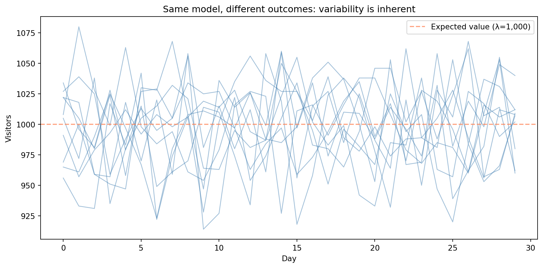
In statistics, we call this kind of quantity a **random variable**, a value governed by a probability distribution rather than determined by its inputs. When we model a quantity that evolves randomly over time (as with daily visitor counts), the collection of random variables — one for each time point — forms a stochastic process. Each trace in the figure below is a single run from that process.
```{python}
#| label: fig-stochastic-example
#| echo: true
#| fig-cap: "Ten independent runs of the same Poisson(λ=1,000) model over 30 days. The traces scatter around the expected value (dashed line) but each follows a different path — variability is inherent, not error."
#| fig-alt: "Line chart showing ten simulated time series of daily website visitors over 30 days. Ten blue traces each follow a different path, illustrating that variability is inherent rather than a sign of model error. All traces fluctuate around the expected value of 1,000 (marked by a dashed orange horizontal line), staying mostly between about 900 and 1,100 visitors per day."
rng = np.random.default_rng(42)  # modern NumPy RNG — preferred over legacy np.random.seed()

# Simulate daily visitors using a Poisson distribution — a model for
# event counts that we'll explore properly in the next chapter.
# For now, treat it as: "generate realistic count data with average 1,000."
fig, ax = plt.subplots(figsize=(10, 5))
fig.patch.set_alpha(0)
ax.patch.set_alpha(0)

days = np.arange(1, 31)
for i in range(10):
    daily_visitors = rng.poisson(lam=1000, size=30)
    ax.plot(days, daily_visitors, alpha=0.85, linewidth=1, color='#0072B2',
            label='Simulation run' if i == 0 else None)

ax.set_xlabel('Day')
ax.set_ylabel('Visitors')
ax.set_title('Same model, different outcomes: variability is inherent')
ax.axhline(y=1000, color='#E69F00', linestyle='--', linewidth=2.0, alpha=1.0,
           label='Expected value (λ=1,000)')
ax.set_xlim(1, 30)
ax.yaxis.grid(True, linestyle=':', alpha=0.5, color='grey')
ax.xaxis.grid(True, linestyle=':', alpha=0.3, color='grey')
ax.set_axisbelow(True)
ax.spines['top'].set_visible(False)
ax.spines['right'].set_visible(False)
ax.legend()
plt.tight_layout()
plt.show()
```
Every line in @fig-stochastic-example was generated by the same model with the same parameters. The dashed line marks the **expected value**, the long-run average that individual outcomes scatter around. The variation isn't error; it's the *nature of the process*.
::: {.callout-note}
## Engineering Bridge
If you've worked with concurrent or distributed systems, you've already encountered nondeterminism. Race conditions, network latency jitter, and load balancer distribution all produce different outcomes under apparently identical conditions. In systems engineering, we usually treat this variation as a problem to be eliminated — we add retries, idempotency keys, and saga patterns to absorb it. But you've also started characterising it: percentile-based latency dashboards and histogram-based alerting are already a step toward distributional thinking. If you use property-based testing (Hypothesis, QuickCheck) or fuzzing, you're already running controlled stochastic experiments. Data science formalises these instincts and takes them further — instead of just monitoring or probing variation, we model it and put it to work.
:::
## The data-generating process {#sec-dgp}
Behind every dataset is a **data-generating process**, the real-world mechanism that produces the observations we see. We never observe it directly; we only see its output. The goal of statistical modelling is to infer the properties of this process from the data it produces.
Think of it this way: if a function is a mapping from inputs to outputs, a data-generating process is a mapping from inputs to a *distribution* of possible outputs.
::: {.callout-note}
## Engineering Bridge
A data-generating process is like an API you can call but whose source code you cannot read. You observe the responses (data), form hypotheses about the internal logic (model), and test those hypotheses against new responses, but you never get to inspect the implementation directly. Reverse-engineering an API from its behaviour is something most engineers have done; statistical modelling is the same instinct applied to natural processes.
The analogy has limits. Unlike an API, a data-generating process has no documentation, no versioning, and no stability guarantees. The underlying mechanism can shift without warning. And fitting your model too precisely to past responses is like hard-coding an API client to match today's response format: it works until the next release breaks everything.
:::
We can express this mathematically. Let $y$ be the outcome we observe, $x$ the input, $f(x)$ the systematic relationship we are trying to model, and $\varepsilon$ (epsilon) the random component:
$$
y = f(x) + \varepsilon
$$
This replaces the deterministic $y = f(x)$. Here $\varepsilon$ (the **error term**) represents everything we cannot explain given our model. We construct the model so that $\varepsilon$ has mean zero given the inputs; any predictable component belongs in $f(x)$ by definition. What remains in $\varepsilon$ is a mix of two things: genuinely irreducible randomness that no model could capture, and reducible error that a better model — with more features or a different functional form — might explain. Disentangling the two is one of the central challenges of statistical modelling.
```{python}
#| label: fig-signal-plus-noise
#| echo: true
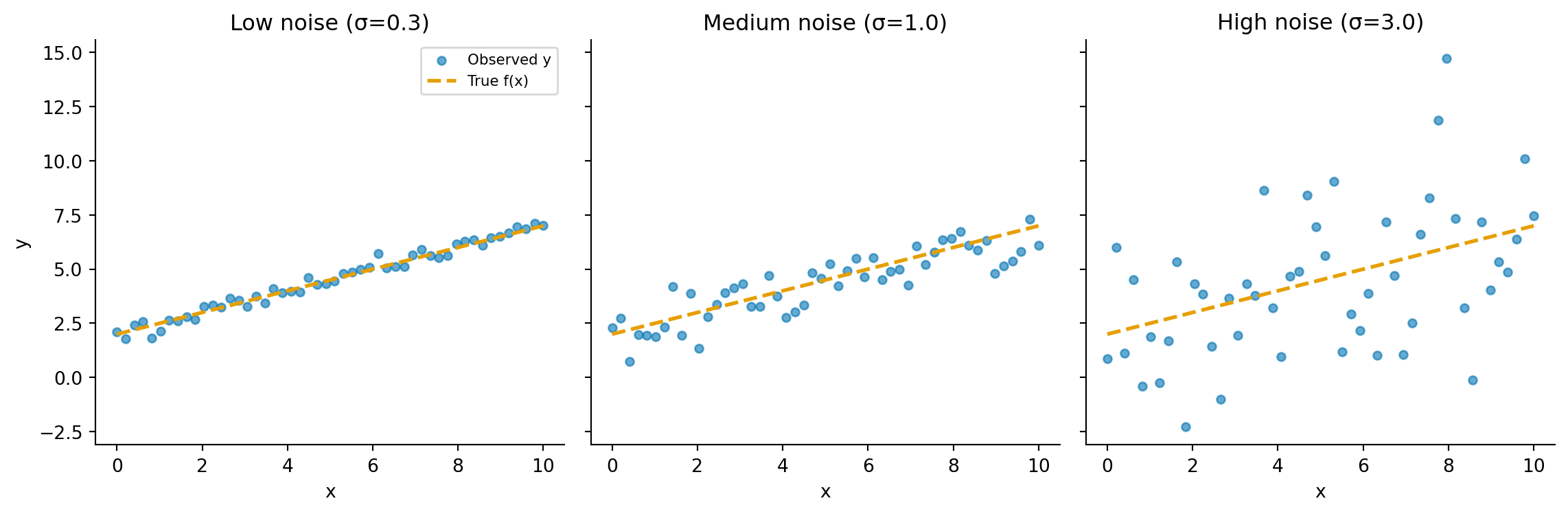
#| fig-cap: "The same deterministic function f(x) = 0.5x + 2 observed with increasing noise. The dashed line is the true signal; the scatter points are what we actually observe. As noise grows, the signal becomes harder to recover — but it's still there."
#| fig-alt: "Three-panel figure. Each panel shows the same straight-line function with scattered observations around it. In the left panel (low noise), points cluster tightly around the line. In the middle panel (medium noise), the scatter is wider but the trend is still clear. In the right panel (high noise), observations are heavily dispersed, making the underlying line difficult to discern."
rng_dgp = np.random.default_rng(42)

f = lambda x: 0.5 * x + 2
x_vals = np.linspace(0, 10, 50)

fig, axes = plt.subplots(1, 3, figsize=(12, 4), sharey=True)
fig.patch.set_alpha(0)

for ax, noise_std, title in zip(axes, [0.3, 1.0, 3.0],
                                 ['Low noise (σ=0.3)', 'Medium noise (σ=1.0)', 'High noise (σ=3.0)']):
    ax.patch.set_alpha(0)
    y_obs = f(x_vals) + rng_dgp.normal(0, noise_std, size=len(x_vals))
    ax.scatter(x_vals, y_obs, alpha=0.6, s=20, color='#0072B2', label='Observed y')
    ax.plot(x_vals, f(x_vals), '--', color='#E69F00', linewidth=2, label='True f(x)')
    ax.set_title(title)
    ax.set_xlabel('x')
    ax.spines['top'].set_visible(False)
    ax.spines['right'].set_visible(False)

axes[0].set_ylabel('y')
axes[0].legend(fontsize=8)
plt.tight_layout()
plt.show()
```
This additive model is the simplest version and works well when outcomes are continuous (values that can fall anywhere on a smooth scale, like temperature or duration). For count data like our visitor example, the relationship between signal and noise is subtler: in a Poisson process, the variance (a measure of how spread out the outcomes are) equals the mean, so the amount of noise scales with the signal rather than being independent of it. We will encounter richer models later; for now, the key insight is that $\varepsilon$ exists at all.
Understanding that $\varepsilon$ exists is the first step. Our job is to model $f(x)$ as well as we can, while respecting the limits that $\varepsilon$ imposes. That balance between signal and noise, between pattern and randomness, is the shift from deterministic to probabilistic thinking.
::: {.callout-tip}
## Author's Note
This is where engineering instinct most reliably fires in the wrong direction. The instinct says: if the model doesn't perfectly predict the outcome, the model is wrong. In a deterministic system, that instinct is correct: residual error really does mean a bug. But in data science, a model that perfectly fits every observation is almost certainly *overfitting*: it's memorising noise rather than learning signal. The natural response is to push harder (e.g., more features, more complexity, more capacity) and watch the training accuracy climb. But accuracy on new, unseen data starts going the other way. Accepting irreducible uncertainty as a feature rather than a defect takes genuine rewiring. You have to stop treating residual error as a bug to fix and start treating it as information about the limits of what the data can tell you.
:::
## Measuring uncertainty {#sec-measuring-uncertainty}
If outcomes are uncertain, we need a language for describing *how* uncertain. This is what probability distributions give us. Rather than saying "we'll get 1,000 visitors tomorrow," we can say "the number of visitors tomorrow follows a Poisson distribution with $\lambda = 1\text{,}000$, giving us roughly a 95% chance of seeing between 938 and 1,062 visitors." Here $\lambda$ is the expected rate, the average number of daily visitors.
That range is a **prediction interval**: it tells us where we expect future observations to fall. (Here we computed it from a known distribution; when distribution parameters are themselves estimated from data, prediction intervals widen to reflect that additional uncertainty.) This is subtly different from a *confidence interval*, which answers a different question entirely — not "where will the next observation fall?" but "how precisely have we estimated the underlying rate?" We will make that distinction precise later in the book.
How do we compute that interval? `scipy.stats` gives every distribution two key methods (we'll explore these properly in the next chapter). The CDF (`.cdf(k)`) answers "what's the probability of a value at or below $k$?" Its inverse, the quantile function (`.ppf(q)` in scipy), works the other way: "what value marks the $q$-th percentile?" Together they let us answer questions like "how likely are fewer than 950 visitors?" and "what range covers 95% of outcomes?"
```{python}
#| label: uncertainty-quantification
#| echo: true
from scipy import stats

# Poisson distribution with lambda = 1000
# Note: scipy uses `mu` for the Poisson rate parameter, while numpy uses
# `lam`. Both refer to the same quantity (λ) — this inconsistency across
# libraries is a genuine rough edge, not you missing something.
poisson = stats.poisson(mu=1000)

# For a discrete distribution we cannot place exactly 2.5% in each tail.
# ppf(q) gives the smallest k where P(X <= k) >= q, so actual coverage
# is slightly more than 95%.
lower, upper = poisson.ppf(0.025), poisson.ppf(0.975)
print(f"95% prediction interval: [{lower:.0f}, {upper:.0f}]")

# Show the actual coverage — not exactly 95% because of discreteness
actual_coverage = poisson.cdf(upper) - poisson.cdf(lower - 1)
print(f"Actual coverage:      {actual_coverage:.1%}")

# Note: for discrete distributions, CDF(k) = P(X ≤ k), not P(X < k)
print(f"P(visitors > 1,050) = {1 - poisson.cdf(1050):.3f}")
print(f"P(visitors ≤ 950)   = {poisson.cdf(950):.3f}")
```
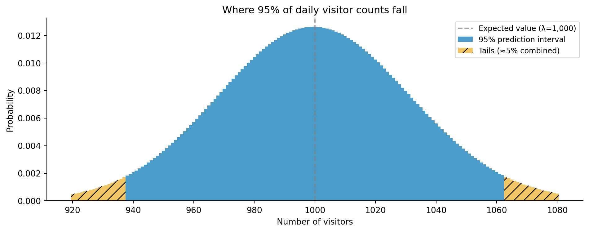
Running this gives a prediction interval of [938, 1,062], a roughly 5–6% probability of exceeding 1,050 visitors, and a similar probability of falling to 950 or below — roughly symmetric because the Poisson distribution is approximately symmetric at large $\lambda$.
```{python}
#| label: fig-poisson-interval
#| echo: true
#| fig-cap: "The Poisson(λ=1,000) distribution with the central 95% prediction interval highlighted. Values outside the interval (below 938 or above 1,062) are individually unlikely but collectively account for just under 5% of outcomes."
#| fig-alt: "Bar chart showing the Poisson distribution with lambda=1,000, centred around 1,000 visitors. Bars within the 95% prediction interval (938 to 1,062) are coloured blue. Bars in the tails outside this interval are coloured orange. A dashed vertical line marks the expected value at 1,000."
k = np.arange(920, 1081)
pmf = poisson.pmf(k)

fig, ax = plt.subplots(figsize=(10, 4))
fig.patch.set_alpha(0)
ax.patch.set_alpha(0)

mask_central = (k >= lower) & (k <= upper)
ax.bar(k[mask_central], pmf[mask_central], color='#0072B2', alpha=0.7, width=1.0,
       label='95% prediction interval')
ax.bar(k[~mask_central], pmf[~mask_central], color='#E69F00', alpha=0.6, width=1.0,
       hatch='//', label='Tails (≈5% combined)')
ax.axvline(x=1000, color='grey', linestyle='--', linewidth=1.5, alpha=0.7,
           label='Expected value (λ=1,000)')
ax.set_xlabel('Number of visitors')
ax.set_ylabel('Probability')
ax.set_title('Where 95% of daily visitor counts fall')
ax.spines['top'].set_visible(False)
ax.spines['right'].set_visible(False)
ax.legend(fontsize=9)
plt.tight_layout()
plt.show()
```
This is more useful than a single **point estimate** (a single best-guess value like "1,000 visitors") because it tells us not just what we *expect*, but how much we should trust that expectation.
::: {.callout-note}
## Engineering Bridge
This is directly analogous to SLOs (service-level objectives) and error budgets in site reliability engineering. You don't say "our API latency is 50ms." You say "our p50 latency is 50ms, our p99 is 200ms, and we have an SLO of 99.9% of requests under 300ms." You're already *consuming* distributional summaries — percentiles, tail probabilities, threshold-based SLOs. Data science asks you to go one step further: build the distribution yourself, from raw data, for a system with no prior SLO, so you can reason about scenarios you haven't observed yet.
:::
## Summary {#sec-deterministic-summary}
The shift from deterministic to probabilistic thinking comes down to three ideas:
1. **Real-world processes produce variable outcomes** — the same conditions can lead to different results, and this variation is information, not error.
2. **We model the data-generating process, not individual outcomes** — our goal is to understand the mechanism and its uncertainty, captured by $y = f(x) + \varepsilon$.
3. **Uncertainty is quantifiable** — probability distributions give us a precise language for describing what we know, what we don't, and how confident we should be.
In the next chapter, *Distributions: the type system of uncertainty*, we will formalise this by exploring probability distributions in depth.
## Exercises {#sec-deterministic-exercises}
1. Write a Python function that simulates rolling two dice 10,000 times and plots the distribution of totals. Why does the distribution have the shape it does?
2. Your monitoring system records API response times. These are stochastic — the same request type produces different latencies. What distribution might model this? What properties would a suitable distribution need? There is no single right answer — the interesting part is the reasoning.
3. Write a function `simulate_dgp(f, noise_std, x, n_simulations)` that takes a deterministic function `f`, a noise level, an input `x`, and a number of simulations, and returns an array of outputs. Draw $\varepsilon$ from a normal distribution with mean zero and standard deviation `noise_std`. Use it to show how increasing `noise_std` changes the spread of outcomes while the average remains close to `f(x)`.
4. **Conceptual:** The "data-generating process as API" analogy from this chapter says that statistical modelling is like reverse-engineering an API from its responses. Identify two properties of a real API that a data-generating process does *not* have, and explain why each missing property makes statistical modelling harder than API reverse-engineering.
5. **Conceptual:** The opening of this chapter draws a sharp line between deterministic and stochastic. But is the line really that clean? Consider: `sum([0.1] * 3) == 0.3` returns `False` in Python due to floating-point arithmetic (the sum is `0.30000000000000004`). Is this nondeterminism, or something else? How does it differ from the stochastic variation discussed in this chapter, and what does it tell you about the assumptions behind `assert`-based testing?